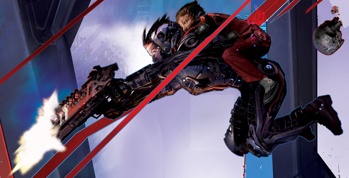
(Detail from Originator cover, illustration by Stephan Martiniere)
It is a new month, in a new year, and that means it is time again to kick off the year with a visual feast of fantastic art that we call Cover Story. The idea is to feature covers of books, magazines, short stories, etc. of the science fiction/fantasy/horror variety slated for release within the featured month.
My regular disclaimer stands as notification that I am not an artist, nor a trained art critic. I know what I like, and feature what catches my eye. I enjoy hearing your opinions, whatever they may be, of the art featured in Cover Story, and am open to suggestions for covers coming out this month that you feel are worth acknowledging.
I see commissioned cover art decreasing when I look at genre releases, and I feel it is important to showcase the artists who continue to get commissions, and the companies that commission their work.
Special thanks to John DeNardo and SF Signal for the post featuring releases in January 2015.
(All images featured are the copyright of the artists and the publications featured.)
Title: A Beautiful Accident
Author: Peter Oruillian
Publisher: Tor.com
Release date: January 13, 2015
Artist: Tommy Arnold
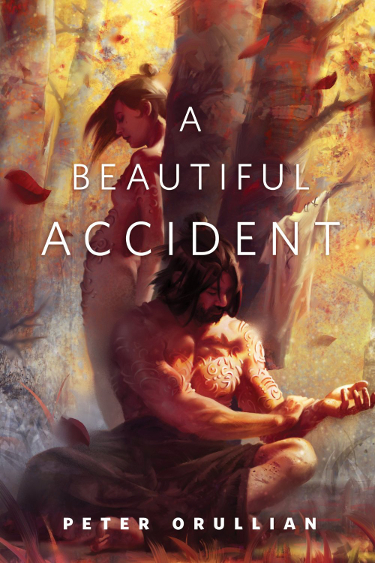
I don’t recall seeing the work of Tommy Arnold before, and this is a beautiful image by which to get acquainted.
Arnold’s illustration for Peter Orullian’s upcoming short fiction makes me long for the fall, with its warm autumnal colors and falling leaves. It also inspires thoughts of warmer days, given that the characters featured do not appear to be suffering from the cold. This is especially inviting given the artic temperatures we are expecting.
As good cover illustrations are wont to do, this one makes me wonder about the story. Who are these people and why do they seem to be ignoring one another? There is a tangible feeling of separation because of their relation to one another in the frame. Or perhaps my melancholy interpretation is way off base, the female character could be shy and be acting coy, for example. Your thoughts?
Title: Originator: A Cassandra Kresnov Novel
Author: Joel Shepherd
Publisher: Pyr Books
Release date: January 6th, 2015
Artist: Stephan Martiniere
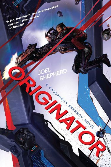
Stephan Martiniere’s covers for the original Cassandra Kresnov trilogy were some of the first Martiniere covers I purchased. I had heard good things about the books, but it was the covers that tugged most insistently on my wallet.
I have admittedly not be as impressed with the layout of the latest series, though I appreciate that Pyr Books has maintained the consistency of the artist and can also appreciate their effort to give readers a visual cue that this is a new series. My appreciation grew tremendously when I saw the cover for Originator.
It may just be the simple addition of some graduated wash of background color and a handful of interestingly rendered skulls, but this one excites me. I’m terribly curious about the kid (who is getting one heck of a ride), and I’m drawn to all the reflective surfaces and facets of the body armor that Cassandra is sporting.
The angles of laser fire juxtaposed against the angles of the larger structure create visual interest and I like the way Pyr incorporated the title and author text.
I have seen this cover up close and personal and it is a beauty. The detail featured at the start of this issue of Cover Story (which can be clicked on for a larger version) is my current work computer wallpaper.
Title: Twenty Trillion Leagues Under the Sea
Author: Adam Roberts
Publisher: St. Martin’s Griffin
Release date: January 13, 2015
Artist: Mahendra Singh
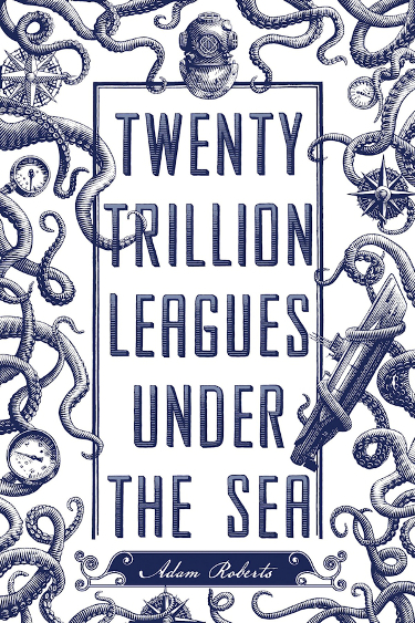
There is something about this retro-style, old-timey illustration that gets me every time. I love it. The illustration nostalgia that artist Mahendra Singh has tapped into for the paperback cover of Adam Robert’s novel has inspired a fun, balanced cover.
Roberts’ title of course hearkens back to the famous Jules Verne novel, and the title and accompanying artwork give readers an instant clue as to what the book may have to offer.
The line-work is great and I appreciate the way that Singh’s illustration is balanced, with the multiple tentacles reaching inward, and how those same tentacles also project movement.
It is fun how the accoutrements of a classic sea voyage are worked into the cover design–the compass points and gauges and the ship and diving helmet.
I hear the voice of Miranda‘s mother crying “Such fun!” as I look at it.
Title: Damage
Author: David D. Levine
Publisher: Tor.com
Release date: January 21st, 2015
Artist: Victor Mosquera
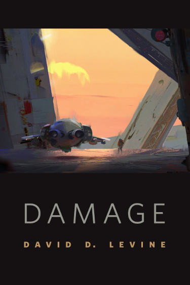
Space ships and man–or alien–made structures on other planets, or in the distant future of our own, never cease to remind me of what drew me towards science fiction as a young man. Be they highly detailed images, or loosely rendered concept pieces, like Victor Mosquera’s illustration for David D. Levine’s upcoming short, they fire that joy optimism that one day we’ll no longer be confined to good ol’ planet Earth.
The illustration, with its lone figure and lone vehicle, make for interesting speculation when viewed with the enigmatic title, Damage. Color me intrigued.
Speaking of color (yes, that was a horrible segue), the color that Mosquera used to capture the light does a marvelous job of evoking mood, doesn’t it? I also like the way the spots of color here and there along the larger structure not only give it a sense of shape, but convey a passage of time.
Title: Unbreakable: A Novel
Author: W.C. Bauers
Publisher: Tor Books
Release date: January 13th, 2015
Artist: Stephan Martiniere
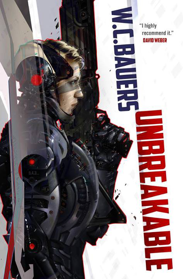
You will be forgiven if you exclaim, “Haven’t we already seen this cover here?”. It is readily apparent to even the untrained eye that Stephan Martinere’s cover image for the Tor Books release of Unbreakable: A Novel bears a great deal of resemblance to Martiniere’s work on Joel Shepherd’s latest trilogy for Pyr Books.
I’m not here to criticize, I think both of these covers are great. Though it does make me wonder if perhaps this was originally designed for a Shepherd novel? At any rate, Bauers has a great cover for his debut novel, and I only hope the similarity of covers does not detract from either author’s sales.
Martiniere’s rendering of futuristic armor is so good that I ache to play a game with characters designed by him. I cannot tell if the woman is fused with the suit, or simply wearing the suit, and I’m curious either way about this universe and this character. The textual placement of the cover keeps things clean and does not detract from the art, but instead works with it to create that eye-catching cover for which I am always on the lookout.
I want this book.
Title: Asimov’s Science Fiction, January 2015
Editor: Sheila Williams
Publisher: Dell Magazines
Release date: January 2015
Artist: Randy Gallegos
I don’t read Asimov’s Science Fiction as faithfully as I should, but I never fail to head to the bookstore to pick up the latest issue when the cover calls out to me.
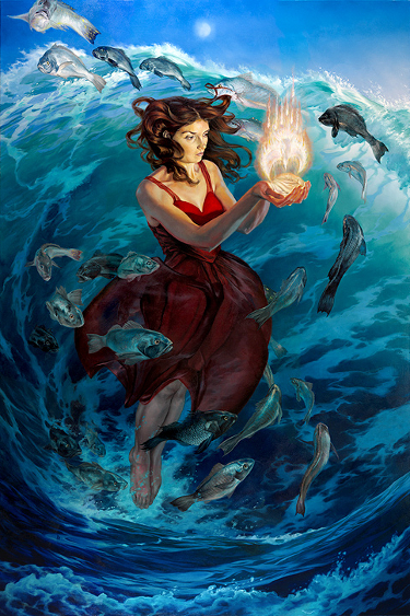
Randy Gallegos’ cover for the latest issue is one such cover. I’m featuring his artwork sans text because I could not find a scan of the issue with good resolution, and Gallegos’ image is beautiful and should be seen as clearly as possible. Trust me when I say that it looks nice on the cover of the January 2015 issue.
The piece has such great movement, reflected in the whirlpool effect of the water, the swirling of the fish, the contours of the fabric of her dress and the tendrils of her hair.
Her red dress, and the glowing image above her outstretched hands, makes the image pop.
Though I have yet to finish the image, my assumption is that it has little to nothing to do with the content. That certainly was the way of many of the pulp science fiction magazines in the past, and I get a strange sense of comfort that this is often the case with print and online magazines today. It is a grand tradition that, to me, presents the art as an additional piece of goodness for your dollar, a work that stands on its own.
Title: Clarkesworld, Issue 100, January 2015
Editor: Neil Clarke
Publisher: Wyrm Publishing
Release date: January 2015
Artist: Julie Dillon
Julie Dillon, hot off her 2014 Hugo win, continues to be an incredibly prolific creative force.
Her cover illustration gives Clarkesworld a strong kick off for 2015.
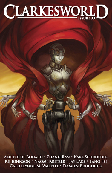
I like how Julie Dillon uses the fabric to fill the image while drawing focus to the central character.
And of course I am a big fan of robots.
The rich red color makes the image stand out, and it also helps the title and featured authors stand out. It is just a really strong cover, top to bottom.
It is also a fun image in that you can look at it and take it literally–a robot with multiple arms–or it can be seen as a representation of what we all sometimes wish we had: an extra set of arms…or three.
Title: Interzone 256
Publisher: TTA Press
Release date: January 2015
Artist: Martin Hanford
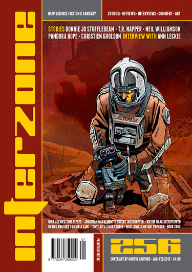
As I pointed out earlier, it is a new year, and that means Interzone is doing the usual: showing me cover illustrations from artists I hadn’t previously known and making me excited to see each new cover.
This is my first time seeing the work of Martin Hanford, and I am impressed.
Thematically it is right in my wheelhouse. It has an astronaut, a robot, and the hues of orange connect because orange is my favorite color.
It is a poignant image, one I see as a representation of the interconnectedness of science fact and science fiction.
I’m very curious about the large, shadowy robot figure in the background. Is it meant to reflect what is going on in the central figure’s head, or is something ominous at work there?
Well there you have it, the first Cover Story of 2015. Stay tuned for my Favorite Science Fiction and Fantasy Covers of 2014 post, and please feel free to share your opinions on what you like, or don’t like.
This is a nice start to the year, and I look forward to seeing what the creative forces at the book and magazine companies have for us for the rest of the year.
I love the monochromatic Twenty Trillion Leagues cover. Now I need to go see what the book is all about!
It is nicely done, isn’t it? I thought the book sounded interesting when I read the description.
The cover for Damage is fantastic. I had to go look it up and the catalog copy for the story is just as stark and compelling. Thanks for featuring all these. I am definitely picking up Levine’s story.
It is, isn’t it? I’ll be snagging a copy of Damage myself when it comes out later in the month.
Tommy Arnold was enrolled in Smart School this last semester. Even though we weren’t in the same class I monitored his class a bit and was blown away by his work. Good to see him doing covers. Love his style.
That is fun that you got to see some of his work in school, Kim. I bet there was a lot of great work there.
The cover of Damage would definitely stop me in the shop and make me pick up that book.
I really like the Tommy Arnold cover as well.
Then again, they’re all so pretty 🙂
Me too, and so I’ll be picking up the free short on Tor.com when it comes out the 21st.
Yep, it’s DAMAGE for me, too. It’s apparent to me the artist is influenced by John Harris, not a bad thing. The second pick is the Interzone cover. The story-thought I immediately got was a kind of cub and mother bear, the human “pets” the cub, unaware of the threat the adult poses, just behind him. Brrr.
Great to see a cover story post! A laways really, really enjoy them.
I can see the Harris touch there, Richard.
And I’m with you there, I can certainly see the cub and mother bear thing happening with the Interzone cover, nice call.
I’m going to try to be more faithful with them year. I think I missed four months last year, and some of those “missed” covers will be showing up in my Favorites of 2014 post here soon.