(Today’s post is a click-fest. Click almost all the pictures and you’ll find the paperback cover featuring this artwork. Most links will take you to further pictures as well. Click away! Not only is it interesting to see the artwork on the actual covers, but you will also discover some very melodramatic, entertaining tag lines.)
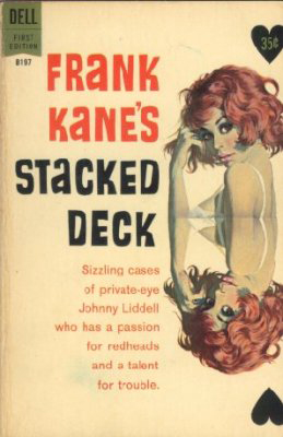
(Redheads in artistic images are my favorite and McGinnis captures the look so well.)
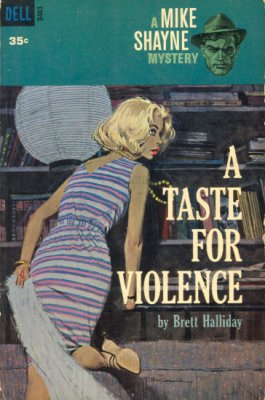
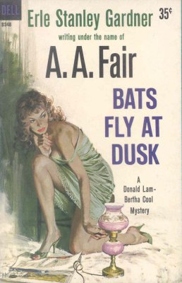
Today’s Friday Favorite features the incredible paperback cover art of Robert McGinnis. A few years ago while surfing the internet I discovered the work of Robert McGinnis and had an instant deja vu experience. The artwork looked so familiar. Starting with his first cover in 1958, Robert McGinnis has painted almost 1,100 paperback covers. Eleven hundred!!! No wonder his works looked familiar. Gracing the covers of mysteries, detective stories, westerns, romance, gothic tales and adventure stories the work of McGinnis was all over the place when I was growing up.
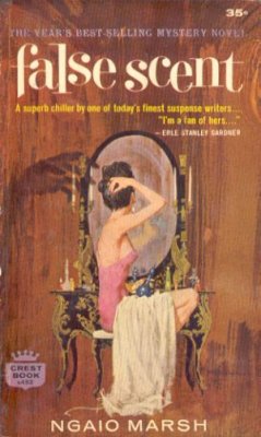
(I love the creepy hand shadow looming on the wall!)
Good book illustration draws one to the book and it is easy to see that McGinnis’ images are eye-cathcers. Like Frank Frazetta, the prolific nature of Robert McGinnis has made his work recognizable to the point that his female illustration style is referred to as the McGinnis Woman. There is so much detail in his characters, usually juxtaposed against a very sparse background which keeps the emphasis where it should be.

(I love how the yellow and white tones balance out the composition. There is almost a ying and yang thing going on there.)
And his use of lighting is masterful. Many of his illustrations demonstrate just how well he understands light and shadow and he uses it so perfectly to emphasize just the right areas of each painting.
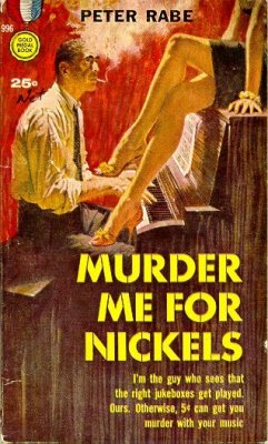
(There’s a sexy Casablanca feel to this one.)
With nearly eleven hundred works to choose from it was difficult to decide on the art for today’s post. To my knowledge all McGinnis’ works are not online but thanks to the dedication of Graeme Flanagan there is a proliferation of images out there from which to choose. Mr. Flanagan was gracious enough to allow me permission to use artwork from his page and every book cover you see when you click on the various pictures is from his site. Graeme’s site is a gold mine of images and information about Robert McGinnis, a site for both the casual and hard core McGinnis fan to enjoy. The main images used on this post are from the Painted Anvil site. Visit both sites for a much greater appreciation of the talent of Robert McGinnis.
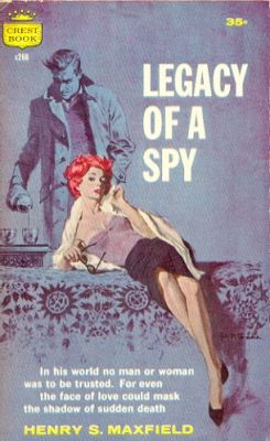
(The blue lends such depth and focus to this piece)
The colors used by Robert McGinnis no doubt reflect the era in which he was doing them and they create such a sense of nostalgia for me.
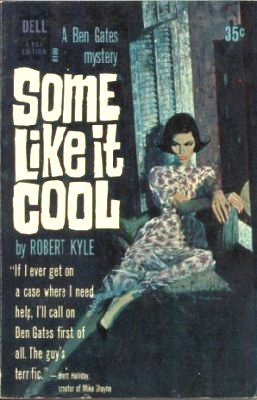
His use of color and light and the positioning of the subjects creates great mood and atmosphere in each piece.
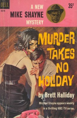
Most of McGinnis’ covers lean more towards stylized but realistic images though some of the less polished works look to me like the kind of art that would have influenced comic creators like Joe Chiodo and J. Scott Campbell.

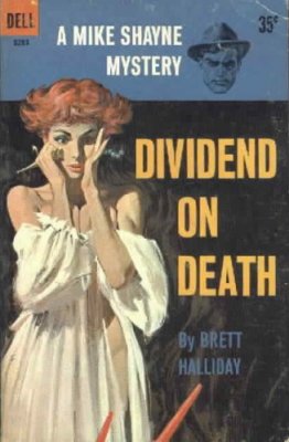
Whether it is grizzled detectives or sultry seductresses, it is obvious why Robert McGinnis’ art lives on so many paperback covers the world over.
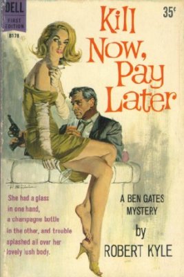
Like many similarly composed novel covers of that era I had always assumed that the interior stories would not hold up to the same quality as the artwork that sold them. Thankfully due to the blog sites of authors like James Reasoner and Bill Crider I have been discovering that there are some really good books out there and I actually own a few of them. I now look forward to giving them a good read.
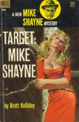
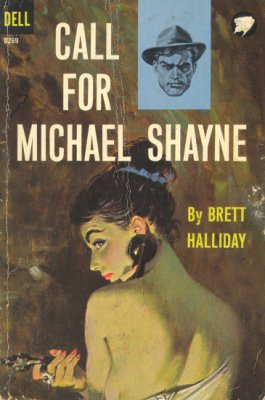
It is amazing to me that anyone can paint this well. McGinnis’ attention to detail, from individual strands of hair to the light glinting off lip-stick covered lips or the cold steel of a revolver make each piece seem so alive.
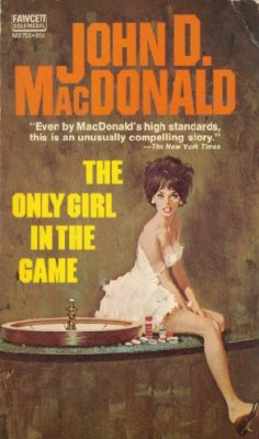
Although many of my favorite images come from the detective and mystery novels, Robert McGinnis has done a great deal of other types of cover work. Of the gothic romance novels that feature his art, my favorite is here. Of the more popular books that feature artwork by Robert McGinnis you may recognize that of Where the Red Fern Grows and my second favorite of the Anne of Green Gables series, Rainbow Valley.
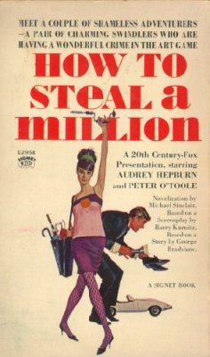
In addition to his book cover work Robert McGinnis has done a vast number of movie poster work including How to Steal A Million:
and the iconic Breakfast at Tiffany’s:

both of which tie in quite well with yesterday’s post! Robert McGinnis can capture such great likenesses as evidenced in this Bond poster featuring Sean Connery.
In wanting to find out more about him I recently purchased the excellent Art Scott/Dr. Wallace Maynard book The Paperback Covers of Robert McGinnis. In addition to 250 examples of McGinnis’ published works there are rough sketches, model reference shots, and the entire bibliography of the 1,068 books he had done covers for up until the year 2000. Robert McGinnis’ body of work has continued to grow since then and despite being 80 years of age he has recently produced covers for a number of new and reprinted works coming out under the Hard Case Crime label. These latest works can be seen here: 1, 2, 3, 4, 5.
There are also some novels with some hilarious, over-dramatic tag lines that I just had to include (click on titles for the image), my favorites are: Girl on the Prowl, Don’t Speak To Strange Girls, The Homicidal Virgin, and Francesca. Reading the tag lines aloud in the movie-tone voice brings about the desired humorous effect.
There are a few other sites besides the ones linked to above in which to satiate your desire for more McGinnis goodness: Vintage Paperbacks and Leifpeng’s Photo Set.
The art of Robert McGinnis: his sexy women, suave detectives, gothic romantic damsels, western portraits and his other many and varied works won him induction into the Society of Illustrator’s Hall of Fame in 1993 and it is well deserved.
The work of Robert McGinnis is recognizable for his iconic femme-fatales and its retro sexy appeal and I have enjoyed bringing his work to you (twice…explained in the comments section). I hope you all have a wonderful Friday and a fantastic weekend!
And a happy friday to you!
His works looks familiar to me as well and with 1,100 and growing covers I can see why. I think the cover to the paperback ” The Wrong Ones” is my favorite. The artwork is also much nicer with all the book cover text removed. I love the way he paints the ladies eyes. They really draw you in. All the different hairstyles are cool too. Each paintings characters are so individual. Some artists draw women and they all see to have a same certain style but I think he doesn’t fall into that trap.
Thanks for the post. I think I can make it through the day now.
Let me know when and if you want to borrow that Paperback Covers book Jeff, glad I could help.
Always worth looking forward to. Thanks Carl.
And again, you’ve picked a winner. Love the style, the slightly-tongue-in-cheek approach in some of the images, as well as the precise way in which he captures the glamour of the iconic femme fatales.
Nicely worded FM, I need to have you write my copy from now on!!!
Wow! Very retro sexy!
You too Jules!?! Everyone’s got the gift of fancy words today. “iconic femme fatales” and “very retro sexy”…I’ll have to use those!
And not to point anyone away from my site but you just HAVE TO check out the new trailer for Pirates of the Caribbean: Dead Man’s Chest. Go to Following My Fish here and it will start right up for you. This is the best trailer yet for this film and I am SO excited about seeing it. I’m not kidding…Go Now!!!
I went to change a word at work, hit ‘save’ and it deleted over half of my post. It has taken forever to recreate…great fun, let me tell you! If you were fortunate enough to look at my site during that hour that it was only half posted then you were able to read my real feelings at the time. The words have been deleted but the sentiment is the same! 😉
Wow, some images, great post! here via Michele’s
Excellent artwork. His style is so stark yet lush at the same time. Definitely typical of the 50’s and 60’s coverwork. Thanks for the pics, they were fascinating to look at.
Here from Michele’s.
(sigh)
Sexy broads in art just slay me. Thanks a lot for exacerbating my springtime frustrations even further, Carl.
Time for yet another cold shower.
Thanks for the visits everyone. Glad I could be of help rob! 😉
I miss the days with Connery as James Bond. So what is Sean up to these days?
Have just come across your blog and I am completely in love. Thanks for posting these.
May I simply say what a comfort to discover
somebody that genuinely understands what they’re talking about over the internet.
You definitely know how to bring a problem to light and make it important.
More people have to read this and understand this side of your
story. I was surprised that you’re not more popular since you certainly
have the gift.
This website really has all the info I wanted about this subject and didn’t know who to ask.