This is a Friday Favorites that has been on the back burner for some time and since this past week has been almost entirely about books I decided it was the perfect opportunity to combine the art of literature, the art of photography, and the art of the female form into this week’s Friday Favorite.
BookLogged actually posted something along similar lines last week which I thought might steal my thunder for this post but it turns out that the post actually expressed an opinion somewhat opposite mine…and a good one…and so I am soldiering on.
I love book covers…they are the things that attract me to the book in the first place and they have been my link to discovering many of the artists who fill my Favorites file to overflowing. I think photography is fantastic and the things that photographers can do with a camera and an artistic eye are just fascinating to me. And I love women. I don’t mean this in some sort of perverted, sexual, weird way. I think the female form (and not just the impossibly skinny ones despite what this post may end up looking like) is so perfectly beautiful. From an artistic standpoint women have good lines, whether one is talking about the entire figure or just the curve of a woman’s wrist, they are the sex that can easily generate an emotional response just from one tiny part of their body that catches one’s eye. Maybe its the same for women looking at guys but I’m not sure. I have noticed a trend in books recently, like Booklogged did, that uses photographs of women to sell books, but doesn’t show an entire female, just parts. As you’ll see from my examples, I don’t consider this a ‘sex sells’ sort of thing, at least not in the way that a book like this does, although the nature of attraction definitely factors in. I am talking about the more subtle use of lighting, focus, and concentration on lines and curves that lead the eye to draw one in to looking at the book.
I’m sure I’m not explaining this well and I do really know what I mean. Perhaps you can help me in the comments section. I don’t think there is anything wrong with a man admitting that women are beautiful, but the many and varied ways this can be interpreted leaves one open to criticism. So be it. The fact of the matter is that eventhough I haven’t read any of these books I LOVE the covers and think they are fantastic works of art in their own right. So enough with the talkie-talkie already, make with the purty pictures!
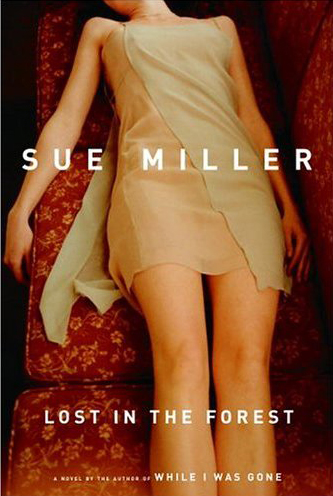
(Lost in the Forest by Sue Miller)
This is probably my favorite of the ones I am posting today. I love the tone of the colors. Red is one of my favorite colors, especially in decorating and I love this red couch. I love the positioning of the girl and the texture of her dress. The dress is almost elfin and is no doubt meant to be evocative of the forest. It is a very moody picture that has a somewhat unsettling quality because of the sharp cut off at the neck.
_________
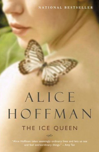
(The Ice Queen by Alice Hoffman)
This is one that I actually want to read. The image being slightly out of focus combined with the imagery and symbolism of the butterfly gives this work a fairy tale quality that I like. The colors of the skin and her lips juxtaposed against the green leaves in the background and brown of the butterfly work so well. And she has very beautiful lips. The hardback cover of this book is nice as well but has a more sensual quality. I like the lightness and innocence of this one better.
________
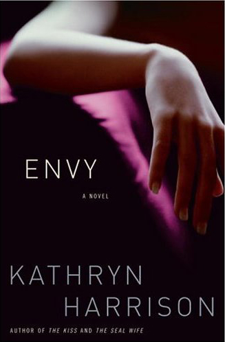
(Envy by Kathryn Harrison)
This one is fantastic. It is just a bare arm and yet it is so beautifully rendered. The way that the arm and wrist bend against the slight curve of the purple chair is a great piece of composition. The purple and black make the curves of the arm stand out so well. It is so simple and yet so effective.
________
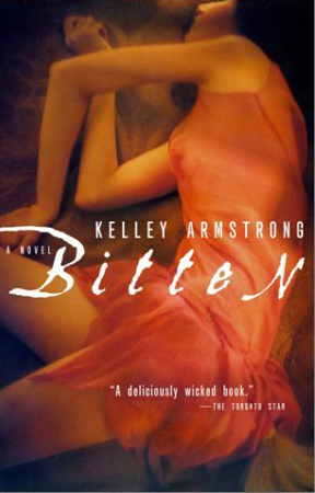
(Bitten by Kelley Armstrong)
I actually have this one around somewhere. It is out on loan I believe. I should have picked this one for my reading challenge! Like the Envy cover, this one stands out because of the bends and angles of the woman’s arms. With the soft focus, the tone of the lighting, the wonderful orange glow of the dress and its texture this picture looks beautiful and at the same time has an unnatural feel that lets you know almost instantly that this is some sort of scary/horror tale. Scott sent me this book a few years back and I was instantly taken by the cover. It is something strikingly original enough that I had it laying around my office for some time (hence it being borrowed) just because of the cover imagery
________
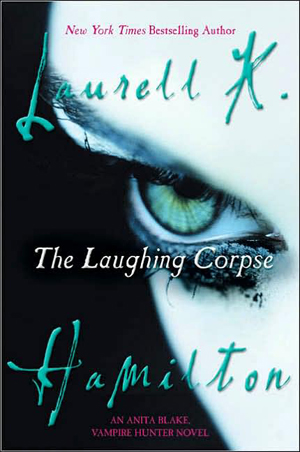
(The Laughing Corpse by Laurell K. Hamilton)
I might as well admit now, if I haven’t already, that I have a thing for goth chicks. Something about the dark eye make up, the light skin, the clothes…its there. This cover looks very gothic to me. The green saturating the image is so alive. I love how they captured her eye in such a menacing way and yet made it beautiful by punching up the rich, vivid color. The way it flows, the curve of the eyebrow and the face, and its position on the cover all come together to make a stunning image.
________
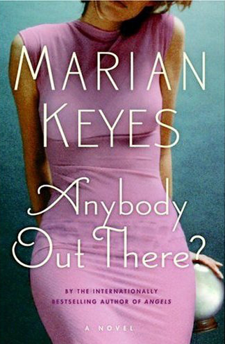
(Anybody Out There? by Marian Keyes)
This one is probably a little more obvious. The woman has a great figure accentuated by a great dress. I think the image would actually be better if you didn’t see her undergarments showing through. The way her head is tilted in the picture is great, showing just enough of her hair to make me think she has a great hairstyle. I like the way the one lock curves on her chin and the one hand peeking out at the bottom grasping what looks to be a crystal ball. It is an interesting visual clue that compliments the book title.
________
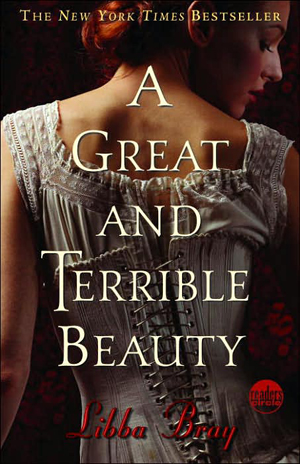
(A Great and Terrible Beauty by Libba Bray)
This is another one I really want to read as I have heard good things from so many of you marvelous book bloggers. Though this one doesn’t picture a headless body, I feel that it fits in this group simply because I think that it is a beautiful image. The corset and her hairstyle conjure images of Lucy Westenra in Bram Stoker’s Dracula. I like the rich red color where the light shines on her hair and how her face fades into darkness. It is a very effective picture to convey the subject matter of the book.
________
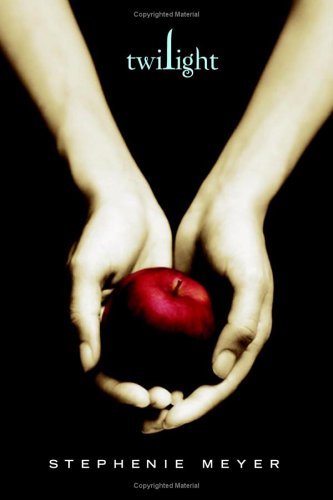
(Twilight by Stephanie Meyer)
Yet another one that the bloggers have me convinced I need to read. This cover is just perfect. Again it is arms and hands, both of which have very feminine beauty. The muted, almost sepia tone color of the arms makes the rich, deep red of the apple stand out even more. I love the way that the image draws you down the length of her arms to the apple cradled lovingly in her hands, like an offering. It is a very effective cover and reveals alot of subtle depth in relation to the type of story that it is. This image is just fraught with symbolism and it fascinates me.
I’m sure there are many, many more but these are the ones I have had saved for some time to include. I would love any examples that you may be able to suggest.
The genesis for this idea for a post came from seeing this picture of Jenn See on her photography site. There was more than one picture and she was calling them her ‘Hair Down’ series. The picture immediately made me think of these type of book covers which generated a search for them and their eventual placement here. I very quickly added a title to her picture and sent her a copy of the Lost in the Forest cover and my made-up book cover to show her what I was thinking. Here is my very poorly done book cover:
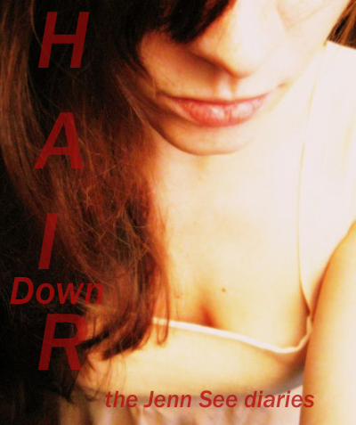
For those of you who don’t know Jenn See I encourage you to please read this and this. Seriously, please take a few minutes and read these. You owe it to yourself to know who Jenn See was and to mourn for her loss. Her shared site was a source of great joy to me that inspired me to share similar interests with those who read my ramblings.
I couldn’t post this without dedicating it to her and her mother, Cynthia and to Mysfit and Oldben. I had some fun ideas along these lines that I was thinking about emailing Jenn See to discuss on the very morning when I got to work to log in and discover that she had passed away. That was a Friday and I think of her and her loved ones left behind every Friday. Love and prayers your way.
Though this wasn’t my usual Friday Favorites fare I hope you will bear with me, can understand what I’m trying to convey in my appreciation for this type of book cover illustration, and will enjoy it all the same.
Have a great weekend everyone. Keep those R.I.P. lists coming. I am looking forward to cracking the lid on my first book this weekend.
I hadn’t intended this but it is interesting how several of these have a horror bent in light of the R.I.P challenge starting this week. I love it when an unplanned plan comes together!!!
I love these covers! I recently bought a Phillipa Gregory book based purely on the fact I love the cover. Check it out: http://img.tesco.com/pi/Books/L/01/0007190301.jpg
I just love the colour, and the swirl at the bottom rocks. Also, the cap reminds me of the one from Girl With A Pearl Earring, one of my favourite books of all time, (love the film as well). Come to think of it, I love the cover of that book too. If you have not read it, you have not lived.
The cover of The Laughing Corpse reminded me very strongly, to the point where I thought that it was the same book ofr a couple of seconds, of the cover of an excellent YA I read a couple of years ago and now really want to read again called The Raging Quiet. I’m not sure why it reminded me so strongly, because the covers aren’t that similar. Possibly it’s the colours.
http://www.fantasticfiction.co.uk/images/n25/n126979.jpg
And on a semi-related, book-art note, I love Paul Kidby’s Discworld stuff, particulary his dragons, and those of Susan. His website is Paul Kidby.com but it doesn’t really show off the art very well.
GG
I’m also a great admirer of Paul Kidby’s work. I love Josh Kirby’s Discworld art, but there’s something about Paul Kidby’s work that just strikes me more, gives more of a connection.
Actually this feature and a conversation I had yesterday have given me a blog entry idea – will post that later! 🙂
Went and checked out Paul Kidby’s site and he does indeed have some great artwork there. Very talented. Thanks for the recommendation as I hadn’t heard of him though I have seen some of the discworld covers.
Is it just me or does the cover for Bitten look like a modern take on Lord Frederic Leighton’s painting titled Flaming June?
Yes, it does actually. We had a really cool nightlight with that image on the front that we had in our bathroom for awhile.
I’ll admit it. I picked up A Great and Terrible Beauty because I saw it and said “ohhhh lingerie!”. I’m a sucker for lingerie.
I think I like the ones that only show us a small portion of the body better than the full – torso shots. The Ice Queen cover is just lovely, and there is something more weirdly compelling when all I see is a glimpse of an eye, or a hand, or a shoulder.
(I am reminded, for some reason, of The Illusionist and its sex scene. Which shows us absolutely nothing identifiable, and yet is very sensual all the same.)
Carl, I really think you’d enjoy the first few chapters of Captivating by John and Stasi Eldredge. They go into great depth about the beauty of a woman and what that beauty offers and why we are so drawn to it. I wept through the first half. Someone was finally able to put my own longings and feelings to words. I realize now that outward expressions of beauty are not at all vain shallowness but something deeply spiritual. I wish I could find a good excerpt, but there’s just too much good stuff to pick any certain part of their thoughts on the beauty of a woman. I think you would find it fascinating. When I put the book down, I was never so proud to be a woman and my appreciation of my daughters was greatly deepened. I really want James to read it.
All the pictures are beautiful. I am sure every woman would like a picture taken of them like the one of Jenn See. It’s so beautiful and stirring of the emotions.
I am a big fan of Stephanie Meyer’s covers. I think part of the reason I bought “Twilight” was for the cover. What always makes me sad is when the cover I have sucks when it doesn’t have to. Different countries get different covers, so sometimes I will like a cover in another country better than the one I have available. Another blog I read sometime in the passed was talking about the trend of headless women. That’s very true, though, lots off books are coming out where the heads of the front character is cut off, or as this post has shown, other parts are cut off. Wonder what is up with that…
I am guilty of reading books for their covers all the time, though. Normally the writing on the inside, though, is just as wonderful. 🙂 And if the book sucks, it makes a lovely table accent.
I went back and read your posts about Jenn See, and I cried. It was so terribly sad… I’m so very sorry for her family and for all those who miss her.
I think I understand what you’re saying about women’s bodies and book covers. I liked my edition of Charlotte Perkins Gilman’s The Yellow Wallpaper.
Hope that works…
Nope…it didn’t work. Maybe my html was sucky. Anyway, I could only find this little image of it online:
http://www.oxfordreadinggroup.co.uk/content/thumb_book_28.jpg
I’m hoping to see The Illusionist this weekend. It looks fantastic.
I’m a sucker for lingerie too Sassymonkey.
I’ve noticed that also about book covers from other countries Kailana. I almost always buy books because of the covers and am rarely disappointed. If I like the cover and the blurb grabs me it is usually a sure sign that I’ll like it. I do often see covers that I like but don’t particularly want to read the story, I just have a fairly good knack for picking up stuff I know I’ll like.
Thanks for the link Victoria and for reading about Jenn See. It is almost indescribable how awful it is to have someone that young die and full of life die.
Jules, I should read that book too. I think you’ll have to read it to James though! 😉
The interesting thing about Jenn See’s picture is that she took it of herself!
I agree with you in theory but I have to say that I would NOT buy most of the books you show just because of the covers. I have a penchant for paintings, rather than photographs on book covers. I absolutely adore the old Virago editions and wish that they had never changed them. Why change what works so well.
LOST IN THE FOREST – not too bad. the colurs are wonderful.
THE ICE QUEEN – too wishy-washy, mamby-pamby.
ENVY- a touch pornographic
BITTEN – better and yes it does yell Flaming June, doesn’t it?
THE LAUGHING CORPSE- I would suspect it of being “teenage fiction”.
ANYBODY OUT THERE? No way – it shrieks chicklit at me.
A GREAT AND TERRIBLE BEAUTY – aaargh! Book of the TV series type cover.
TWILIGHT- ah ha – promises of an Angela Carter, maybe?
Sorry Carl, you’ll probably never speak to me again after all that. It just shows how difficult it is for a publisher to get the cover right.
Of course I’ll speak to you Ruth! I value diversity of opinion. I love paintings on covers as well. You can look through my Friday Favorites and find a wide variety of painted, digital, photgraphic and illustrated book covers in the midst of the other art links featured. I just know what I like and the medium isn’t important.
Yes, you can lay down all these guidelines of what is likely to please you and then along comes something that breaks all your rules and you’re smitten.
I find the covers of The Laughing Corpse and Twilight really striking. The others I don’t find particularly appealing.
The picture of Jenn See is truly beautiful. I read your posts about her, and was extremely touched.
That is so true Ruth!!!!
I saw a book of short stories in the teen section today called Gothic. It had stories by contemporary authors including one by Gaiman. The cover reminded me alot of the one for The Laughing Corpse.
I appreciate your comments Ruth and Quixotic (and everyone else). I knew this Friday Favorite probably wouldn’t be everyone’s cup of tea but I really wanted to post this stuff today and I appreciate everyone’s tolerance with my whims! 😉
I’m not sure our views are totally opposite. I actually like most of the covers on my post and most of the ones on yours. What I don’t like is the ‘copy-cat’ thing. We see it in books, book covers, movies, tv shows, etc. And that’s not to say that many of the copy-cats are not good, maybe even better than the original.
I like it when someone decides to do something using some originality. I think that’s one of the initial reasons I loved “Girl in Hyacinth Blue” and “History of Love” – their unorthodox style.
I do think the covers that show only portions of a woman’s body are enticing. And I think it could be just as enticing using parts of men’s bodies.
I appreciated your artistic views. I have enough artistic knowledge to fill a thimble. The 2 covers that don’t appeal to me are “The Laughing Corpse” and “Anybody Out There?”. The last one a little too sleazy. Maybe if the undergarments weren’t showing, like you suggested. I would like to hear your artistic thoughts about the cover of “The Observations” by Jane Harris. I really like how the lighting focuses on the beautiful hands holding a well-used book. From there the eye is drawn up to the lips with that little touch of lace nearby.
Very fun post. Loved it!
I agree, there is a fine line between someone doing an homage to someone or something that influences them and downright copying. When it comes to advertising, the copy-cat syndrome does get old.
I don’t know that I have any artistic knowledge. I have always been a visual person and the need has just grown in me over the last several years to talk about this. I often feel that I just babble on incessantly but it is fulfilling a need that I have and I guess that is a good thing.
The cover for The Observations is very good…arguably better than the ones I posted today. I love the earthy greens and reds (oranges) in her dress. I like how there is something secretive and furtive about the way that she is position, as if she is conspiratorially leafing through that book. Like Twilight I like how your eye is drawn down from the top of the image through the curve of her body down her arms to the book in her hand. The lighting also helps draw your eyes to the book. I’m going to have to look now and see what this is about. The title font is fantastic as well.
Looking at the description now and seeing that she is indeed looking at a book that is not hers I think the art director did a marvelous job of conveying this with the image.
Nice post, Carl. Some cool covers too.
I picked up a Great & Terrible Beauty because of the cover, and when my publisher asked for ideas for my bookcover, that was one of the ones I cited as the kind of look and feel for mine. As you have seen, they actually took me at my word…and did it wayyy better.
I like the Philippa Gregory covers, but now everyone is copying them. The Borgia Bride, for example. And another book that I’m blanking on right now, which uses the painting and the cut-off female body, and the same sort of muted pastel colors…but just not as well. I’m darned if I can think of it, or find it on Amazon to refer you.
Anyway. Nice post. Thanks for coming by my site!
I’m a sucker for covers, too. However, like Booklogged, sometimes I will pass on a good book because I find the cover too…sensational?
I read Twilight based on the cover. Loved the image and the implied symbolism. And actually enjoyed the book, although it was sort of a “Buffy” take off and probably meant for young adults.
I particularly love science fiction and fantasy, but often despise the covers that frequently look cheap and sensational.
I especially liked the Hoffman cover, but in the last few years have not really enjoyed her books.
After reading all of the comments, I have to agree with Ruth: “It just shows how difficult it is for a publisher to get the cover right.”
I love the header and graphics on your site Colleen.
For those who are interested, here is a picture of the book cover for Colleen’s forthcoming book:
You can also visit her site here and her blog here.
It is interesting to note that most of the books pictured that I would indeed read are either young adult or are scary ones, or both. Lost in the Forest, Envy, and Anybody Out There? are not books that appeal to me at all eventhough I really like the covers, especially Lost in the Forest.
I don’t think I have ever read a book in which I thought the cover was too sensational. By and large I usually find that those kind of covers grace chick-lit, romance, or small press fantasy books. Many of the more well known fantasy writers today seem to be able to work with the same artists and the artists seem to do a good job of trying to capture a moment or moments from the book rather than just painting a sensational cover.
The very best cover artist in my opinion is Kinuko Y. Craft, at least if you are judging by not only talent but by using the cover to actually advertise the book itself. Her covers for Patricia A. McKillip’s fantasy books, covers that wrap around and continue on the back, are outstanding!!!
Her website is here, I recommend checking out her work…especially if you like painted works that have a touch of the pre-Raphaelite in them.
Carl, thanks so much for posting my cover and links. Very nice of you to do so.
I hope to be a regular visitor here, now that I’ve found you and have joined the RIP challenge!
Glad to do it Colleen!
once again, carl, fantastic images.
I’ve had more than a few author friends who have winced at their own book cover designs, as those not in the POD or self-publishing strain have very little say over what the cover looks like. The publisher turns it over to the marketing team, and they do what they believe to be the best cover that’s going to sell the highest number of books.
Glad to be back to see your work. I’ts been a long but good week.
I must admit I’m not keen on the ‘headless torso’ shots – the Keyes cover screams ‘cheap and nasty’ to me 🙂 What interests me is that all (I think all?) of these books are by women, and therefore perhaps might be expected to appeal more to a female audience. But I think Persephone Books have the best idea – all their books come packaged in the same plain pearly-grey covers – they let the books do the talking, not the covers 🙂
great post Carl. I think I like A Great and Terrible Beauty and the Twlight covers best of those above although many are wonderful. I must admit that a great cover will get me to pick up a book and read the back cover copy but I won’t buy them for the covers alone. If I’m not hooked by the story idea then a great cover just won’t get me to part with my money. I just pray those great covers are compiled into to art book someday. 🙂
Sounds like in a response above you say Craft is the best cover artist out there right now but you were on the fence a few weeks ago about picking a her out of a list of cover artists up for an award later this year at a Dallas fantasy con. What changed your mind and put her over the top for you in these recent weeks. just curious? I agree now as then with you as far her being the best fantasy cover artist out there right now.
I think it was more because with those awards they were each for a specific cover (I believe) and I’m not sure I liked her cover of Od Magic, which is still great by the way, as much as some of the other covers. With her you get the most bang for your buck coverwise as there are so many details to look at that come out at different points in the story. She’s pretty amazing.
rusvw, it’s so true that most publishers have the marketing department create the covers, often with little or no input from the author. It can be very disappointing and frustrating for the author to have a cover that doesn’t fit the book.
Most of my author friends’ publishers at least ask for input (as did mine), but, again the execution is based on what the marketing department comes up with.
I do have a friend who had a cover designed that her editor loved (but my friend didn’t), that really didn’t fit the book….then when the publisher’s sales reps took the book out to the big buyers at the bookstores (eg, BN, Borders), they came back with the verdict: change the cover, ’cause it didn’t the book. The stores and buyers recognized it, and now, fortunately, my friend has a book with a much more telling cover.
Carl, you probably didn’t mean for this to get off on such a tangent, but it’s been a very interesting topic and post. Thanks for bringing it up!
I love tangents! One of the things I know that would drive me nuts if I was a writer would be to not have creative input into the cover and make-up of my book. I’ve seen so many bad covers and poorly done books. It makes me hurt for the author knowing that it must take a long time to write a book and must be heartbreaking to have it turn out looking unlike anything they envisioned.