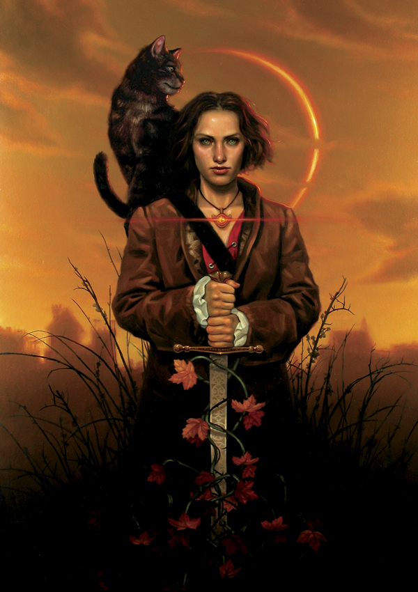
(Cover to The Duke’s Ballad)
Update: I have changed the post so that if you can click on any of the paintings (all copyright Daniel Dos Santos) and they will open up to larger versions for you to greater appreciate their awesome detail.
You can’t judge a book by its cover. Up until recently I always took that to have the one meaning…just because a book has a bad or uninteresting cover doesn’t mean that there isn’t a wonderful story in there. Sort of the ugly duckling syndrome. However the opposite is also true. Sometimes the cover of a book is so amazing that it outshines the book that it is advertising. Thankfully my experience has been that by and large when I am drawn to a book because of its cover I find that the entrancing image is simply wrapping for an incredible gift of story. Many of the artists who occupy my Favorites file have gotten there because I have discovered them through their book cover illustrations. It is getting to the point that I can often recognize certain artists’ work before I pick up the book for confirmation, which is really gratifying. And there are some artists whom I gravitate towards every time I am in the bookstore, even if I don’t end up buying the book. Daniel Dos Santos is one of those artists.
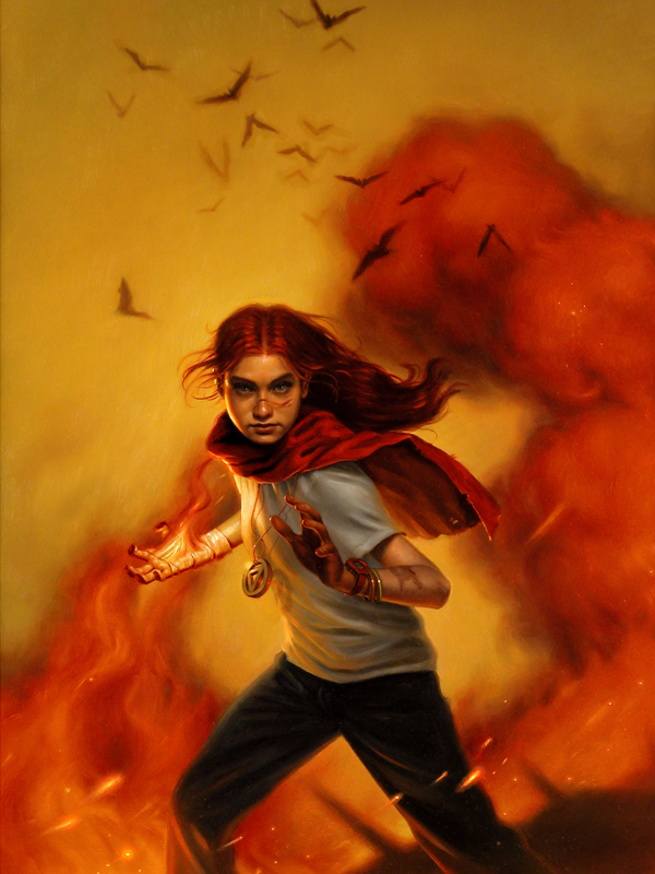
(Cover to The Shaktra)
Daniel Dos Santos’ work graces the covers of several young adult and sci-fi/fantasy books that are currently inhabiting bookstore shelves. Dos Santos grew up with a love of drawing and grew up drawing his favorite cartoon characters with his older sister. That artistic bent lead to copying comic books, then drawing his own, and eventually on to college where he learned the intricacies of the medium he currently works in: oils. The richness of Daniel’s oil paintings are what draws the eye to them immediately. There is such warmth and depth to his colors.
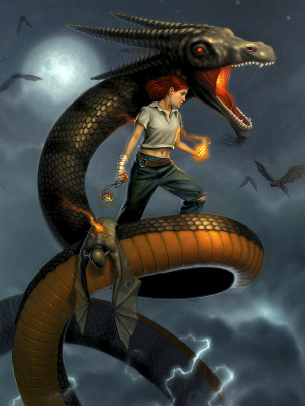
I especially like the use of reds and oranges in his work and find myself wanting to pick up one of the many books that he currently has work on just to have a piece of his artwork. Daniel Dos Santos does a variety of book cover work as can be seen by this cover for a new story about Bonnie and Clyde:
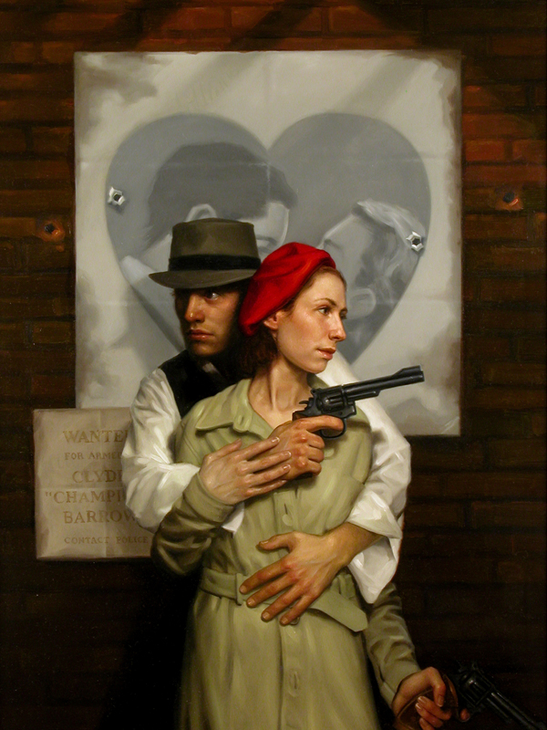
(Cover to Bonnie and Clyde: A Love Story)
If you click on this image it will open up a larger version. Just look at the detail on the hands and faces. It is amazingly lifelike.
Daniel Dos Santos’ website is fairly new and has some really interesting work featured including fine art oil paintings that he has done and as well as pencil sketches (which are also amazing) and some comic-style work that appears to be done digitally. In addition there is a really detailed tutorial featuring the cover work for the recently released book Moon Called by Patricia Briggs. Daniel also has some wallpapers of his work here.
An example of the artists’ sense of humor exists in his portrait in his biography section:
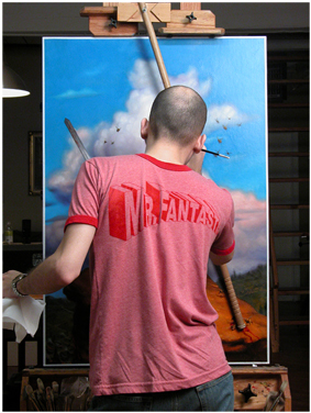
Well there is another Friday Favorites come and gone. Be sure to check out Daniel Dos Santos’ site for more examples of his incredible work. All of the pictures I feature here look so much better in their larger image versions that are on Daniel’s site. The richness of color and detail in his work continues to ensure that those books his covers grace will call out to readers to discover what treasures lie inside. I will leave you with a few more examples of work that I really like.
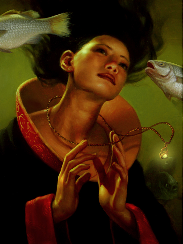
(Sea Princess)
The skin tones are just so beautiful on that image above.
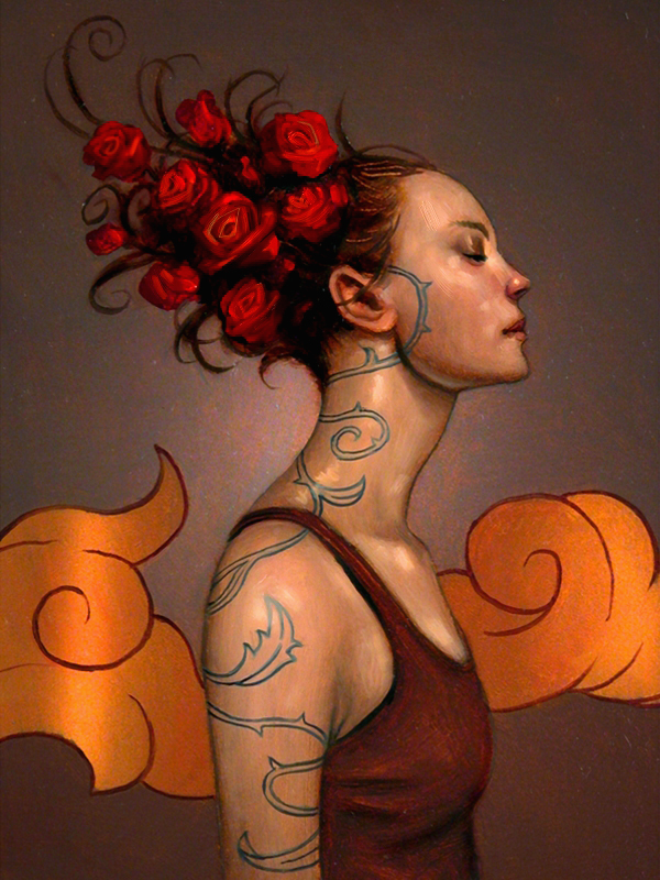
I really like this image. It purposefully doesn’t have the polish of some of the other images but I like it for that very reason. And the reds and oranges are so vivid!

(Cover to the forthcoming third book in the Alosha trilogy: Yanti)
Hope you enjoyed this Friday Favorite. Have a wonderful weekend everyone!
Those are some great pictures. the first one especially, love that cat.
Yes indeed, I thought the cat was well done also.
Anh, liked the others better. Not that I can draw, my 6-yr old is Van Gogh compared to me.
Just don’t let him cut his ear off Tom…or yours for that matter.
wow – nice. you mentioned the lack of polish on the one with the roses in her hair – it makes it looked like she is glowing from recent activity
i wish i could make my stick figure look as realistic 🙂 – i love the character on the dragon
You know Carl, you have such a peaceful blog. Thank you for always sharing interesting stuff and beautiful art. I needed to get away after my long hard week at work.
Thanks Jamie…it was indeed an interesting week at work. Glad its over!
Hi Carl!
Nice to “see” you again. Another great friday post. Have you changed your look? I too, like the piece with less polish (girl w/ roses in red hair). I also LOVE the self portrait. Very very wonderful. I’m making my own website right now, and it is hard to decide what pic to use for the self portrait. I was actually going to use a painting I had done of myself, but it is nowhere near as good as this…
Here from MIchele’s.
I meant what to use for the bio pic not the self portrait…. tiredness.
The detail in the portraits is amazing. This artist reminds me of the classical works of Carivaggio.
Sorry, forgot to say, “Here from Michele.”
Hi Carl, Michele sent me!
Stunning pictures! A pleasure to see. Michele sent me here.
Michelle must like your site quite a bit, Carl, as she frequently refers to it!
Great art work. The detail and realism is fantastic. I love his self portrait.
hey.
how lovely. i really liked the ‘less polished’ one and bonnie and clyde.
and i agree with jamie it really is a peaceful blog and i love that you share this art and books etc with us.
beautiful. i shall return! and thanks for dropping by*
Actually I get all the Michele visitors on the weekend because I, along with them, are playing the weekend visitation game at her site. Its a fun way to see new blogs and in turn extend the invite for others to visit yours.
Has he appeared in Spectrum Carl? Very nice work. I will also have to check out his site. His works seems familiar. I haven’t seen those images above though. Thanks for the post.
Yes, he’s been in Spectrum. I’m pretty sure I’ve looked for a website after past Spectrums and he didn’t have one so I’m glad he does now.