

You may recall that last year at this time, as part of the Sci Fi Experience, I featured cover art that grabbed my attention from the books published in 2008. I enjoy cover illustration so much I thought, why not go back to that well again?!?! So, using Locus Magazine’s 2009 cover gallery as a jumping off point, I reviewed illustrations that graced the covers of science fiction books and magazines last year. Then came the arduous task of choosing which ones to feature. While this is certainly not an exhaustive list of 2009 cover illustrations that I enjoyed, I do think it is a nice representative sample of some of the great genre art that is out there.
This is science fiction focused, so I’ve attempted to stick to illustrations for material that has a SF bent. There were a number of gorgeous fantasy illustrations that I have not included. May have to save that for the fourth annual Once Upon a Time reading challenge in March.
Enough with the banter, let’s get to the art!
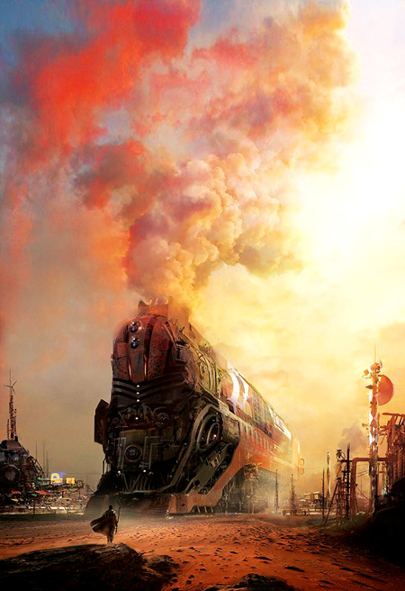
I thought I would start out with an image that may be familiar if you read my recent review of Desolation Road by Ian McDonald. It is by one of the most prolific SF/F artists of the last several years, Stephan Martiniere. Futuristic trains have been featured more than once in recent Martiniere cover illustrations, and I, for one, am a fan of his vision of future locomotion. Makes me want to go ride a train, or at least rent The Station Agent. For sticklers, this book was published in 1988 by a different company with a different cover. This image is from Pyr’s 2009 reprint.
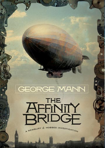
The next image is Viktor Koen‘s wonderfully retro steampunk cover to George Mann’s novel (published the previous year in the UK with an equally intriguing cover), The Affinity Bridge. There is a really cool site that shows the evolution of the book cover that contains several fantastic images on it: click here to check it out. I love all the parts and gears around the edge of the image, it gives it a lot of really interesting texture.
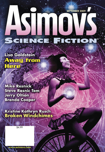
(click on the image above to see the actual magazine cover)
This decidedly fun image is from artist John Picacio. It is the cover for the September 2009 issue of Asimov’s Science Fiction magazine. John Picacio always captures the most vibrant colors in his digital paintings and collages. His work is instantly recognizable on bookstore shelves for all the right reasons. John has a really nice blog, and in this entry he discusses his inspirations for this cover image.
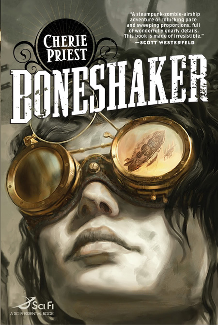
Cherie Priest’s novel, Boneshaker, was one of my favorites of 2009. It is not a stretch to say that it was Jon Foster‘s cover art combined with the title graphics chosen by Tor’s art department, that had me itching to get a hold on this book long before it hit store shelves. I was going to post the image without the graphics but it just didn’t look right. This is one of those rare instances when something as simple as the title and author name graphics are actually a part of the work of art. They could not have been more perfectly chosen if the designer had personally stepped into Priest’s alternate Civil War era Seattle and copied them from local storefronts.
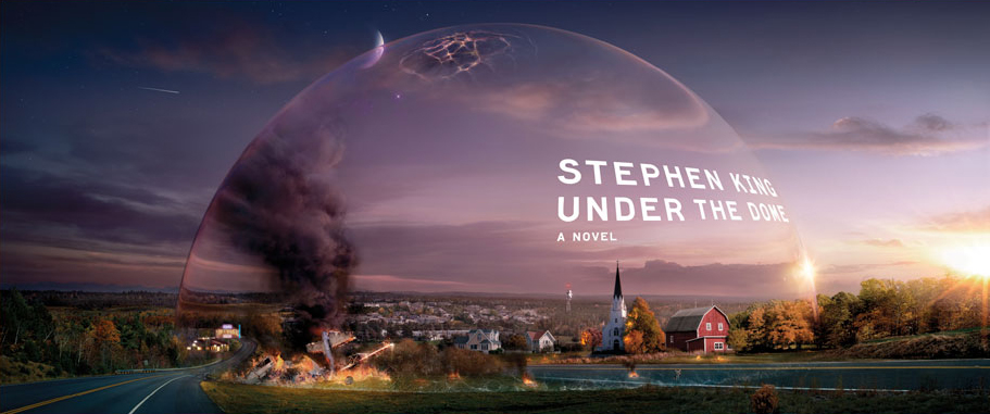
(click on the image to view the entire wrap-around cover image)
Feel free to argue with me if you do not consider Stephen King’s latest novel to be science fiction. From what little I have read about the book and from this eye-catching cover image, it certainly appears to have some sfnal elements to it. The long and short of it is that I think this is a terrific cover image and I wanted to share it with you. If this kind of image doesn’t hearken back to our remembrances of classic sci fi, I don’t know what does.
According to the website, a team of digital artists based in South Africa and New York worked on this image and I think the results of their work speaks for itself. They managed to create such an idyllic small town image that the dome surrounding it does not make it look absurd but instead makes you want to pick up the book to find out just what is going on.
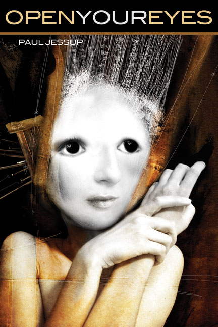
There is some eerie, attractive quality to this cover image for Open Your Eyes by Paul Jessup. The work is by Daniele Cascone. I highly recommend perusing the website, Cascone has some great collage style art featured there. This image has a Dave McKean quality to me. It is probably just me, but something about it reminds me of his work, which is another reason I couldn’t help but like it when I saw it.
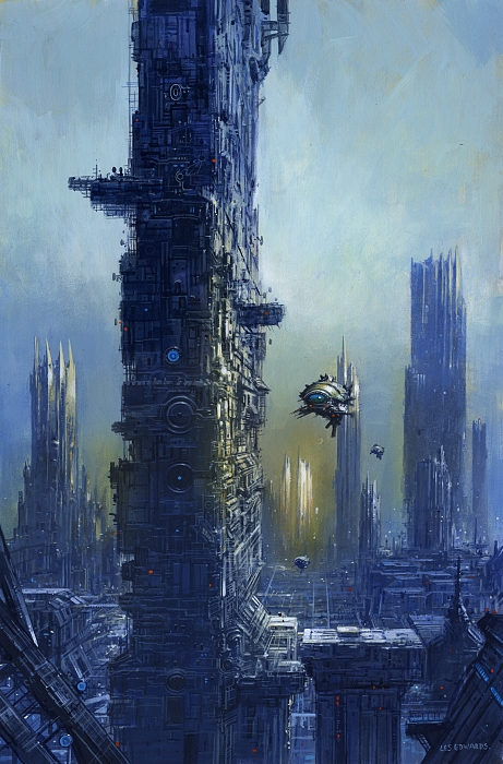
This is the artwork of another artist I have admired for years, Les Edwards. His artwork graced the cover of the August/September 2009 issue of The Bulletin of the Science Fiction and Fantasy Writers of America. Edwards’ paintings also have a throwback quality to them that brings on waves of nostalgia whenever I see them. Now if I could only convince Mr. Edwards to sell me Cygnus for a song!

I am not a fan of the “Daniele Steele” book cover–big name and title, no cover art–but when a cover has a good design, you don’t always need a lot of fancy art work. Such is the case with this cover for Wireless by Charles Stross. The colors chosen for this cover really work nice together and I especially like the black tendrils snaking across the page. The only Stross I have read it Halting State, but I really enjoyed it. May just have to snag a copy of this short story collection.
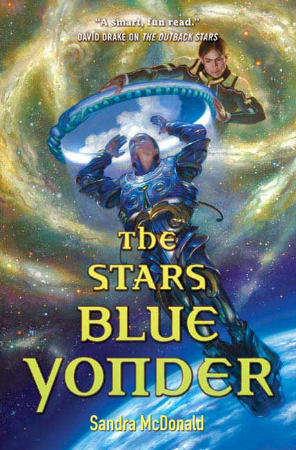
(click on image for actual cover)
I have long been a fan of the fine art stylings of Donato Giancola. More often than not I see them gracing the covers of fantasy novels, but occasionally Donato turns his brush towards science fiction and the results are always a pleasure. On the cover of Sandra McDonald’s The Stars Blue Yonder the combination of blues and golds work well together and the overall design of the image is balanced very well.

The Heart of Veridon by Tim Akers might be a stretch for being categorized as sci fi, but since it purportedly has steampunk elements along with mystery and urban fantasy, I decided to include it. Plus I just couldn’t choose which of the two Jon Foster covers I wanted to feature and decided, hey, why choose?!?! Jon Foster uses a soft color palette to such great effect. Personally I would like to see several different images of this clockwork angel (?) just to see what the rest of it looks like.
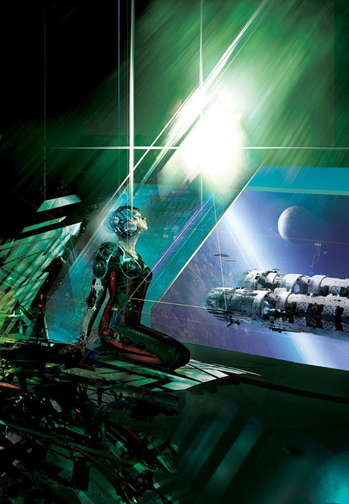
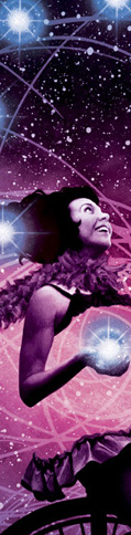
Burning Skies by David J. Williams features a cover image by Stephan Martiniere. I’m not sure if that is a ship or space station outside the window, but I like it! For some reason it makes me think of Star Wars. No, I can’t explain it. I like the way light travels around this image. I also like how you get the sense that information is flowing all around the woman’s outfit. It has a nice ‘tech’ look about it.

The covers for the Star Trek Vanguard series have been consistently top notch, thanks to the work of artist Doug Drexler. Having grown up watching the original series in syndication I have to say that there is just something about seeing those twin nacelles. On Star Trek Vanguard: Precipe by David Mack, Drexler really captures the nostalgia of the the original series while making everything look shiny and new. This cover is one of my favorites of the series thus far and even though I only have books one and two, I had to buy this one right away just so that I could have it sitting there, waiting for me to get to that point in the series.

I did not purposefully set out to have a Star Trek and a Star Wars image in this post, but when something serendipitous like this happens then you just go with it. The covers for all three novels in this trilogy by Troy Dennings have been great, my favorite being this one for Star Wars: Fate of the Jedi: Abyss
Takes me back to my childhood crush on Princess Leia. Luke was right, his sister was hot. 😉 Ahem…. The black and white image of the characters against bright colored backgrounds really make all of these covers stand out.

(click on image to see actual book cover)
An image this beautifully rendered really doesn’t need much in the way of description. If I didn’t already know from experience with his short stories that Paolo Bacigalupi was an author worth reading, Raphael LaCoste‘s cover for The Windup Girl would be all the motivation I need to pick this one up.

Adam Trewdoski has had a great run as cover artist for Interzone magazine over this past year and every time an issue comes out I am jealous of those who have a subscription. This image for issue 220 is my favorite. The earth tone colors of his work makes each image pleasant to look at. I really like the angle that this image is set at and the graphic design elements laid over top of the image adds a lot of interest to the eye.

(click on image for actual cover)
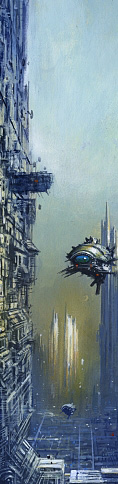
Sparth is an artist that I have only discovered in recent years, but like Martiniere, his digital works of art have a distinct look that I have been able to recognize more frequently on bookstore shelves. This cover for Haze by L.E. Modesitt, Jr. is the kind of image that makes me want to read or watch a good ol’ space opera. I really enjoy the viewpoint that this image is seen from. The use of light in his images always makes the colors so rich.
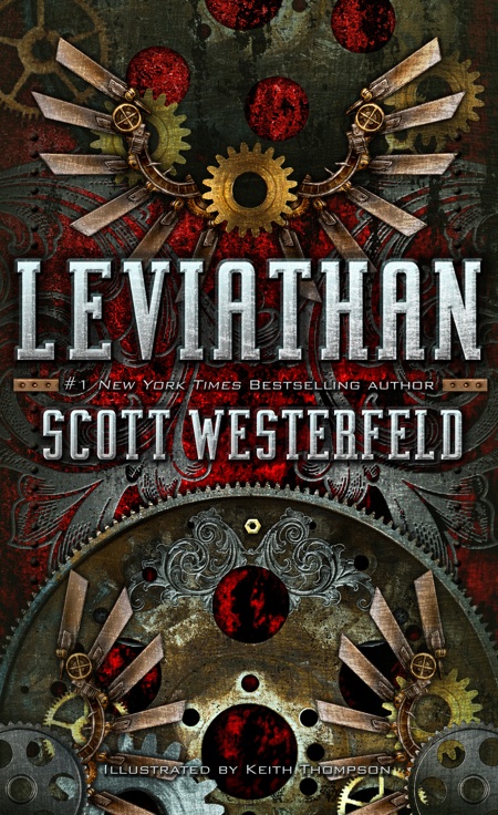
Speaking of rich color, Sammy Yuen‘s cover for Scott Westerfield’s steampunk young adult novel, Leviathan, is fantastic. The rich colors really stand out against the muted metal tones. This one is impressive for the synchronicity of its design. Again, I see this and I not only want to read it but I want to own it, I want to see it sitting in my house.

(click image for actual cover)
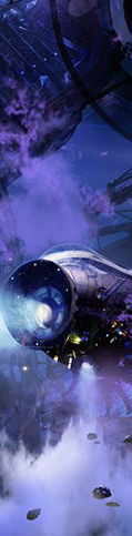
Since I started this post, after the break, with an image by Stephan Martiniere, it seems only fitting that I would end it with one as well. His cover for The Sunless Countries by Karl Schroeder is a real beauty. One of the many things that Martiniere does well is the aftermath of space battle. I look at this image and I so desperately want it to come alive. I want to be in that vehicle, exploring this wreckage. This is one book where I feel like the cover design did not take advantage of the art. The effect of the vibrant violet hues of this image are marred by what they decided to do with the rest of the cover. At least that is my opinion.
Well, that is all for now folks. I’m sure there are other covers for science fiction books released in 2009 that should be on this list, and I certainly welcome any additions that you think should be here. I strongly encourage you to spend some time visiting the sites of the artists featured here. Their sites are crammed full of stunning, incredible images.
*This post should have been up…and briefly was…late Thursday evening. The technological hand of fate intervened somehow and over half of this post disappeared into the ether when I hit ‘publish’. Thankfully a partial draft was saved on another computer so it didn’t take as long to recreate as it could have. Still, I found myself wishing I could pull a modern day Elvis and pull out a gun to put a bullet through my computer, and wireless modem, when it happened.
I hope everyone’s weekend is free of technological complications and is filled with fun and relaxation.
Few things are better for book lovers than the marriage of art and words. Thanks Carl for adding another incredible layer to the SF Experience.
I know that E-book reader’s and other forms of electronic reading is becoming all the rage right now but there not for me. I want to hold and feel the books in my hands. As cool as these images are above most of them are SO much better in person. The cover to Leviathan by Scott Westerfeld is a perfect example. It has bumps, impressions and a shine to it that the computer screen just doesn’t do justice too. I want to see it sitting in my house one day as well.
I must add that Stephen Martiniere is a visionary!!!
Beautiful. Thank you, Carl. I don’t often take the time to really look at the cover art of the books I am reading bu Sci Fi art does tend to grab me and pull me in. These are all wonderful images and thanks for the links!
wow..i have no trouble seeing why you like these artists!
Of those here my favs are: Donato Giancola. Doug Drexler. aRaphael LaCoste’..but of course they are all excellent!
Deslily: they are all excellent, but those three are fantastic. You have great taste!
Gavin: You are welcome. Those links can be some real enjoyable time takers! 🙂
Jeff: Eloquently put, I agree. And I too am not jumping on the Ebook train. You’ll have to pry the physical book out of my cold dead hands! I love it when book covers have textural details as well as the image. Yet another thing that brings pleasure to the experience of holding a good book in your hands while reading.
Stephan Martiniere is a visionary. I am so glad he is such a prolific book cover artist. I look forward to seeing what he comes up with next.
These are stunning!
I wanted to read The Wind-up Girl before now. Now I must read it. That was my favorite cover of them all even without knowing the book it was for.
gorgeous post! as for Under The Dome, it is sci-fi. don’t let anyone tell you different! I loved the Boneshaker cover when i first saw it. at first glance you think “cute girl, cool glasses” and then when you look at it again you realize the reflection in the glasses. now i just have to read it!
This is why I love science-fiction – it produces the most awesome book covers!
What a treat! You sure know how to whet the appetite, Carl.
Every time I see the (UK) cover of The Affinity Bridge in my local bookshop I pick it up. One of these days it is coming home with me!
Wow. Some really wonderful works of art there Carl. Still love the first one, Martiniere really is great at capturing my attention, that’s for sure.
So, do we get these every Friday again – I’ve missed them.
Neth: Oh I wish that were the case. I will be doing them, but nothing like it used to be. I just don’t have the time I used to with added work responsibilities. But hopefully I can do many more than I did last year.
Fence: I love that one to. I am so glad that, for me, the novel lived up to the cover.
Darren: I don’t blame you. I think if I had to choose between the two that I would pick the UK one.
Qugrainne: Thanks, all I’m doing is laying out the menu, it is the artists that whet the appetite! 😉
AlexJ: Yes it does!
Melanie: It was a really great book. On many ‘best of’ lists last year for good reason. It is the reflection in the goggles that really makes this image cool.
cbjames: I know, it is gorgeous, isn’t it?!?!
She Writes: They are, makes me want to be bad and buy a ton of books!
They’re all amazing but I love that first train one by Stephan Martiniere… gorgeous. Also love the Daniele Cascone and the Les Edwards. And the cover of Leviathon is wonderful too, must grab that from the library soon. Such wonderful, talented artists and thanks for show-casing them.
I met Stephan Martiniere at a comics-SF convention a few years ago, what a really nice man he is. I admire his work very much and the cover for The Sunless Countries is stunning.
Richard: I am so glad to hear that. I like his work so much, I’d hate to think that he is a jerk. And how cool that you got to meet him!
Cath: It is one of my favorites as well. Did you check out Cascone’s website? Great work over there.