
As each old year gives way to the new I like to reflect back on the various book cover illustrations that have graced Science Fiction and Fantasy books released over the past twelve months. I like science fiction and fantasy art. Since it is unlikely that the image above will ever be the view outside my front porch, SFF art is my window to the universe, both the real and the imagined. My house is full of books purchased because I wanted that art in my home. I am careful now to point out that these are my favorites of the year, not necessary the best. I don’t have an art degree nor any formal training, I am merely a fan. Who am I to say what is best? The beauty of coming from the position of fan rather than expert is that I can share with you what I like, why it works for me, and what influences I see. The beauty of art in all its forms is the engagement that we can have with it on a personal level.
These are the images that caught my eye, online or in the bookstore, and made me want to learn more about both the artist and the book. Several of these images caused that interesting phenomenon whereby money leaps out of the wallet into the hands of a bookseller happy to provide it a new home.
Special thanks to SF Signal for their monthly hits of book crack…er, posts showcasing the science fiction and fantasy releases each month. If SF Signal is not one of your regular blog stops, it should be.
Most of the images featured can be clicked on to view a larger version. All images are the copyright of the individual artist.

The Creative Fire takes its inspiration from the life of Eva Peron and artist John Picacio beautifully captures that revolutionary spirit with his cover image.
The composition of the image has an Old Masters feel and the muted colors accented by the flowing red, white and blue banners are highly effective in conveying a proud, patriotic fire.
I like the complexion that Picacio gives his interpretation of protagonist Ruby Martin. She is at once beautiful and accessible…real… I think the dichotomy of the work uniform and gun with the feminine touches of the necklace and flowing hair work well in representing the character created by Brenda Cooper.
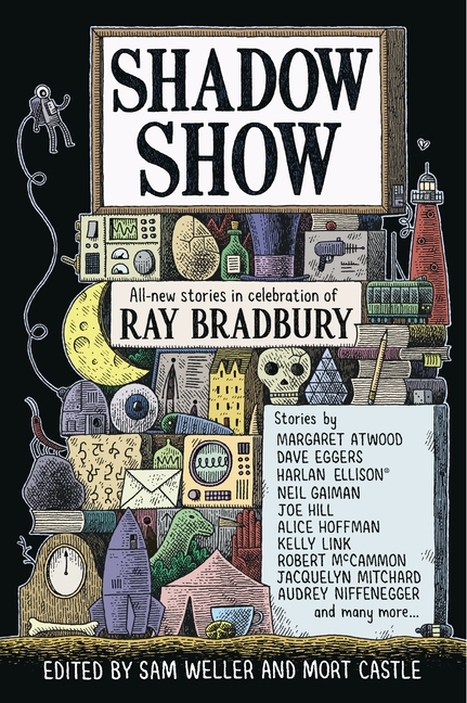
Author Ray Bradury, who sadly passed away June 5th, 2012, was an author whose stories spanned a wide variety of genres and were notably fantastical. Artist Tom Gauld has created a fun cover image that plays off of the fantastic nature of both Bradbury’s tales and those told in homage by the authors featured in this collection.
The pen and ink illustration evokes the work of Edward Gorey as it hints at wonders contained herein. I like how the use of color sets off the various items giving them depth and individuality while tying the elements together.
When I do finally sit down to read this book I know without a doubt that I will be referring back to the cover often, discovering new things with each viewing while looking to see if an item in the image corresponds with the story I am reading.
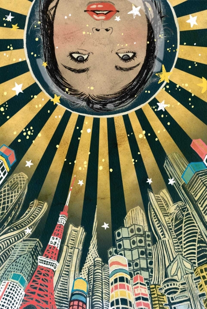
I am a sucker for characters in fishbowl space helmets and also for anime-style art so when Yuko Shimizu‘s cover illustration for The Future is Japanese anthology appeared on the internet I added the book to my list to purchase. And purchase it I did, as soon as it was released [side note: the opening story in the collection, “Mono No Aware” by Ken Liu, was one of the best short stories I read in 2012].
The iconic “Land of the Rising Sun” image is used to great effect here, radiating outward behind the astronaut’s head. The cityscape is rendered from a perspective that reminds me of gothic architecture, reaching heavenward, or in this case upwards towards the future.
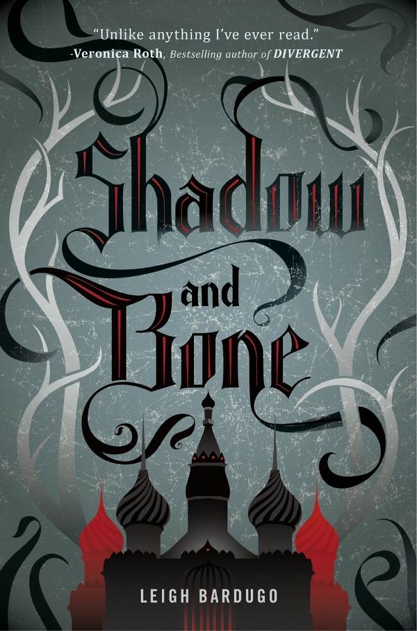
Artist Jennifer Wang‘s cover for Shadow and Bone is all about balanced design and it is one of those images that makes me want the book, irregardless of its subject matter. There is a disturbing trend seen across genres where book publishers settle for nondescript cover art featuring the author name and book title using one or two colors (I am looking at you A Song of Ice and Fire series). Jennifer Wang demonstrates that you can create an illustration with just a few colors that showcases the book’s title while at the same time celebrating the art of design. The near symmetry of the antlers (bone) woven through with tendrils of shadow are very pleasing to the eye and the Russian-inspired buildings work well to draw the eye to the author’s name. The image gives me delicious shivers as I envision a dark, cold, mysterious forest on the edge of the city.
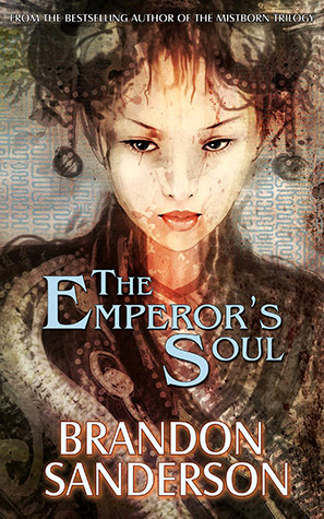
I can say from the experience of having read the book recently that the art created by Alexander Nanitchkov is perfect. There is a risk taken when rendering a protagonist on the cover of a book as it may not synch with the reader’s imagination. The almost ethereal nature of Nanitchkov’s illustration gives the reader a framework that captures the essence of Shai without hijacking the reader’s imagination.
There is an Asian flavor to Sanderson’s story and I feel that is represented well by the cover. Additionally Shai is something of an enigma to herself and those around her, a work in progress that is represented in the unfinished nature of the image.
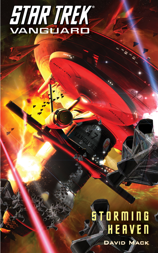
I believe I have had a Doug Drexler cover image from the Star Trek: Vanguard series in each of my Favorites posts for the last several years. Frankly it would be hard not to. As an original series based in the Original Series timeline, the art department was able to eschew the usual character image art, instead focusing on the ship and starbase designs that have excited fans for decades. I love the nostalgia that is evoked when I see images of these Starship Class vessels and I am also very fond of the starbase designs for this era of the Star Trek universe. This image is particularly satisfying to me because the red and yellow hues play well off the book’s title, evoking the hellfire of evil forces storming heaven. This is the final book in this series and the elements in this cover brilliantly bookend with the cover for the first book, Star Trek Vanguard: Harbinger, which also features the Starbase 47 and the NCC-1701.
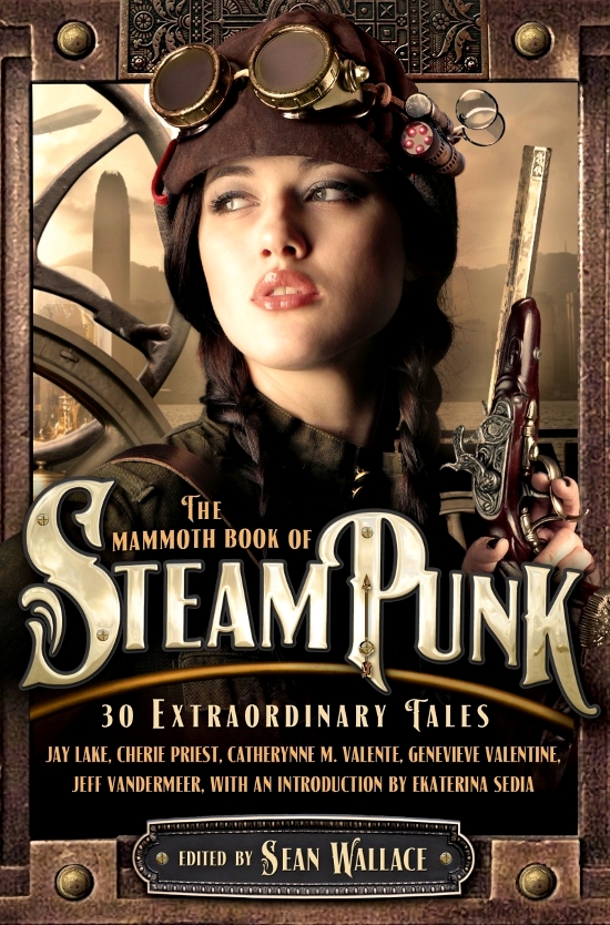
With all the steampunk fiction that exists today I have to admit that I’ve read surprisingly little of it. What I have read I’ve liked and literature aside I am a big fan of the steampunk aesthetic. Artist Joe Roberts hits all the right buttons with this one. The bronze and copper elements, dirigible in the background, goggles, and attractive girl all come together with the thematic title design giving readers no ambiguity as to the nature of the fiction contained within this anthology. This cover illustration is another that I saw first online and made sure to pick up as soon as the book hit store shelves. Rusty gears and burnished metal are a popular design element right now outside of the steampunk realm and they are elements I like to have placed around my house. This cover represents that same feeling. I am not sure what this taps into in me but I do know what I like.
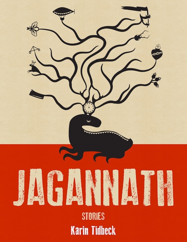
While a long search for the cover illustrator for Swedish author Karin Tidbeck’s short story collection Jagannath turned out to be fruitless in terms of discovering the artist, it did bear fruit in the form of this favorable review which sent me scurrying to the Amazon site to happily part with my $5.99 for the Kindle version. Like the cover for the Ray Bradbury tribute book Shadow Show, this cover illustration cleverly incorporates elements that I have no doubt are representative of the stories contained inside. The design is deceptively simple and that appears to coincide with reviews I have read today of Tidbeck’s stories. Sometimes simple designs can be as intriguing as intricate ones and that is indeed the case with Jagannath. [Update: author and editor Jeff VanderMeer came to the rescue, the artist for this awesome book cover is one Jeremy Zerfoss. Check out his deviant art site and laugh, like I did, at the space panda]
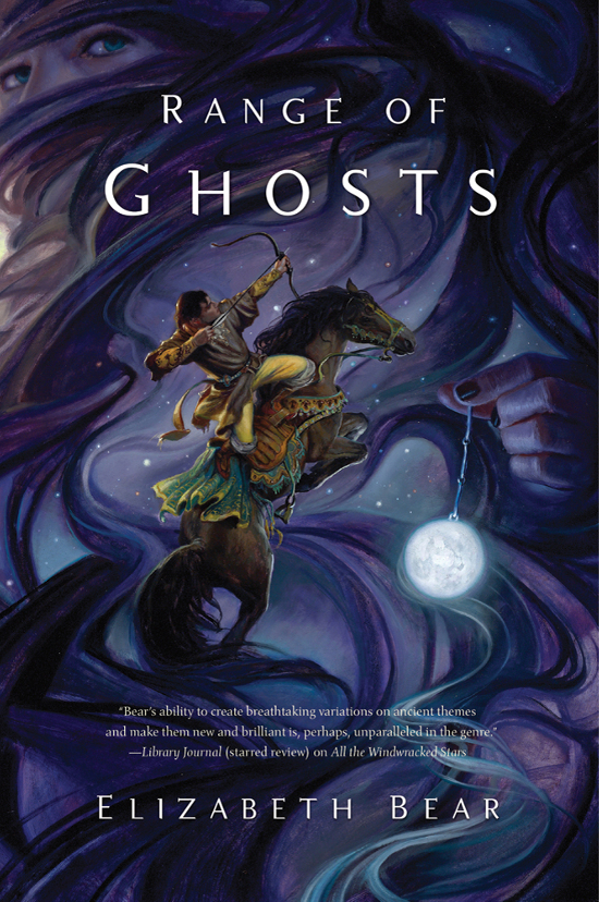
Artist Donato Giancola is a true master, creating gloriously realized imagery in oils that are the very definition of fine art. His cover image for Elizabeth Bear’s newest novel is in such contrast to much of his work that I’ve been exposed to over the last year, most notably his imaginings of scenes from The Lord of the Rings and his lovely painting of Joan of Arc. I had initially missed the figure wrapped in the purple gossamer wisps and when I did notice her the image just came alive for me. The glowing moon, the pinpoints of stars and the horse and rider posed as if a rendering of a constellation all work together beautifully. This image is so rich and vibrant. I had the pleasure of meeting Donato Giancola in Kansas City last year and seeing his work in person. It was an unforgettable experience. Perhaps I should email him now and beg him to bring this painting with him to Spectrum Fantastic Art Live 2 in May.
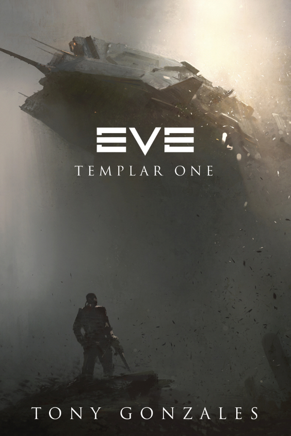
This is another book cover where I unfortunately cannot find mention of the cover artist. I am not sure if this is correct or not, but I refer to this style of art as “concept art” because it reminds me of the concept work that artists do for film and video games. Whatever the style is officially called, I enjoy it very much. The layering of shapes and shades of color over one another digitally reminds me of what artist John Berkey accomplished in oils.
This cover is particularly effective to me because of the minimal graphics and the monochrome color scheme. The image stirs up the feelings of darkness and dread that would be associated with the battle and yet the light at the top of the image also evokes a sense of hope. But who am I kidding. This illustration has a big space ship in it. I grew up with Star Wars and with Star Trek in syndication. Cool space ships are ingrained in my psyche.
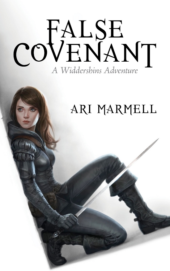
Artist Jason Chan‘s interpretations of the character Widdershins from Ari Marmell’s YA novels Thief’s Covenant and False Covenant pop and the image as seen on the computer screen just doesn’t do them justice.
Holding the book in your hand the white background practically glows and the muted colors of the character stand out starkly from it. I particularly like the angle and pose of Widdershins on this novel, but it was hard to choose between the two.
I have long been a fan of Chan’s work and it is great to be able to include his art in this year’s favorites post.
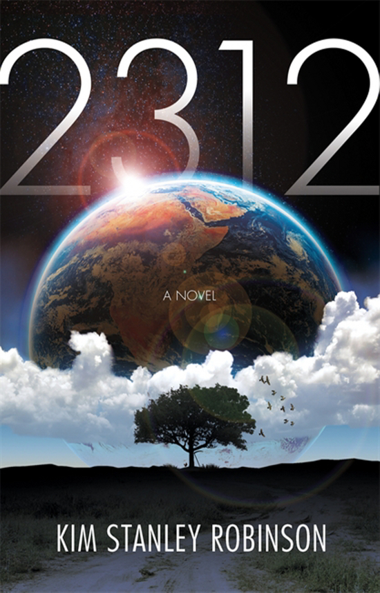
I have not read Kim Stanley Robinson (I know, send your hate mail to…) and I have heard both praise and criticism of his latest novel, but the cover of 2312 makes me want to own it. Despite any scientific improbability of planet sized object existing so close together I enjoy seeing art with multiple heavenly bodies on the cover. This illustration by artist Kirk Benshoff most likely isn’t meant to represent this but I cannot help but look at it and think of being on the moon and seeing Earth rising, or picturing Earth and New Earth from Matthew Kessel’s short story “The Sound of Old Earth”. It really is a gorgeous image. I like the lens flare and the way in which both the book title and author’s name work with the image rather than detracting from it. Earth as seen from space is quite the ol’ beauty and it proves to be breathtaking when included in a well-rendered illustration.
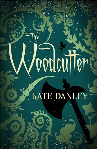
Kate Danley’s novel was self-published in 2010 and due to its success was picked up and published in print form with this great cover in 2012. I am sounding a bit like a broken record here but I cannot seem to locate cover artist information. Like that of Shadow and Bone, the illustration for The Woodcutter showcases a design that draws you to the cover and makes you want to pick the book up. The fairy and the axe give the reader a good indication of what the story might be about and the twirling tendrils of the vines make you want to step a little closer into the woods to see what you can see. Or maybe I am just certifiable and the rest of you sensible people would run the other way. “Simple” design, a few colors, a pleasing pattern and it all comes together in one tempting package.
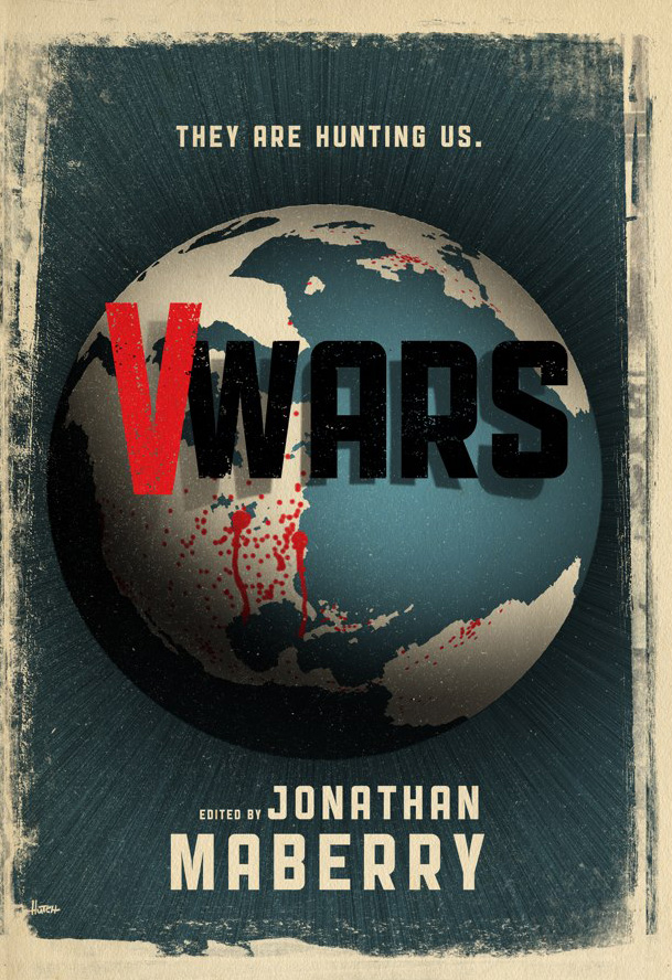
The cover for V Wars has a Fallout 3 vibe that sucked me right in. Graphically it reminds me of the opening shot of a 1950’s Cold War public service advertisement, one that would be followed with dire warnings and instructions for what would ultimately be unhelpful things to do were the vampires to descend up on us. I could also see posters like this hung haphazardly on fence posts and on the sides of buildings, slowly being worn away by the elements in cities long abandoned because of the fanged menace. Trever Hutchinson has some really fantastic retro designs showcased on his website but I think this one may be my favorite. It makes this collaborative author project look like it would be a lot of fun to read.
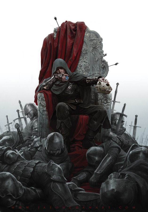
I did not realize it when I chose this cover as one of my favorites that it too is an illustration created by Jason Chan. If you have not been clicking on the images to see the bigger versions to this point, you are going to want to here. The texture on the blood-red cloth covering the throne is unreal, or rather it is so real you swear you could touch it and feel the velvet. The rich detail in the shading alone on that part of the image is….wow! There is also some great texture on the throne itself. Chan has captured a three-dimensional look with the carvings on the throne. Frankly I think it would be uncomfortable to sit on. I have seen this cover written off elsewhere as being too much like promotional work for HBO’s Game of Thrones, and that is a real shame as irregardless of inspiration this is a beautiful work of art.
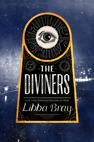
Another book cover, another mystery. Libba Bray’s latest offering sports a lush blue/purple cover with art deco elements that, pardon the visual pun, really catch the eye. (I’m sorry, but did you expect me to resist using the phrase here?).
The image is intriguing in its design elements. It gives off a bit of a sinister Illuminati-vibe when coupled with the city-at-night background. This is a book cover in which the flat image does not convey its style. The spine of the book’s jacket is as well-designed and as an overall package it stands out.

There is an undeniable sameness to the cover images for some of the YA/Teen fiction today and that familiarity can breed contempt for what would often be intriguing images if they were the lone example. While I can agree that this is a problem and that I would like to see a new spark of creativity, I do actually like many of the “woman on the cover” book covers in the YA/Teen/Adult fantasy sections of the bookstore. Chloe Foglia‘s design for The Unnaturalists is one of them. First off the dress the woman is wearing is just gorgeous. Stylishly cut and a lovely green. The greens and golds work well together and the image divides your interest between the girl and the mysterious green miasma that hangs over the city. Makes me wonder what might be mutating in Old London.

Daniel Dociu is one of my favorites of the concept style artists I mentioned earlier. Even as I type this one of his pieces, the cover image for Glen Cook’s Starfisher Trilogy books, is my laptop desktop wallpaper.
His futuristic science fictional ships and landscapes fire the imagination and his work has ensured that I have picked up both of the James S.A. Corey books in the Expanse series despite not having read them. I would be drawn to the cover of Caliban’s War even if the dome shape didn’t remind me of my favorite fictional space vessel, the Millenium Falcon. That vivid red sets everything off and the image as a whole makes me want to know what the story is, what exactly is being captured at this moment in time by the artist.
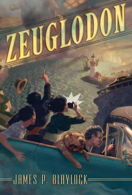
Cover by Jon Foster? Check! Story by James P. Blaylock? Double Check!!! Isn’t this one fun? I love how relaxed the dog looks as the automobile is careening down this wickedly twisted road. Foster’s art for this Subterranean Press publication has a Norman Rockwell feel and I’m drawn to the kinetic movement of the piece. This painting has a soft, almost dreamy quality to it. I long to see some of his original painted work.
I have long been a fan of Jon Foster and this is not the first time his cover illustration has found its way on to my favorites list. I am looking forward to reading this just to find out who this intrepid girl is snapping pictures.
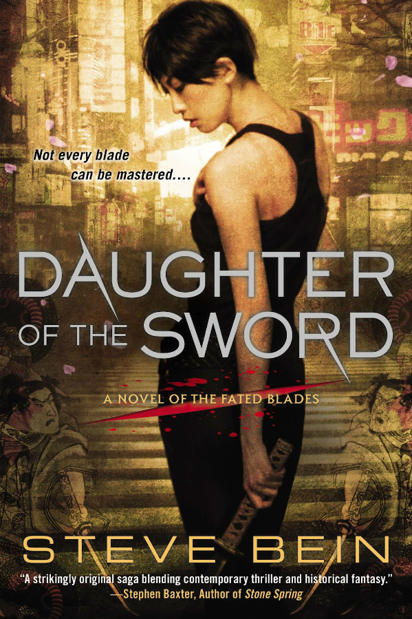
Chris McGrath has a perennial spot on the list. And why not? He is a wildly prolific cover illustrator and is one of the best illustrators of this urban fantasy aesthetic, and he was influenced in his early childhood by Frank Frazetta. That is my kind of guy.
His work is highly realistic, his men and women often posed in what actually look like human poses rather than the impossible contortions of some cover art. I was first drawn to Daughter of the Sword when I saw it in the bookstore. I like the character being the central focus of the image and the layering of other elements, presumably story influenced, add a nice dimension to the piece. The city background reminds me of the futuristic cityscapes of Stephan Martiniere. McGrath’s covers always make me want to buy the book.
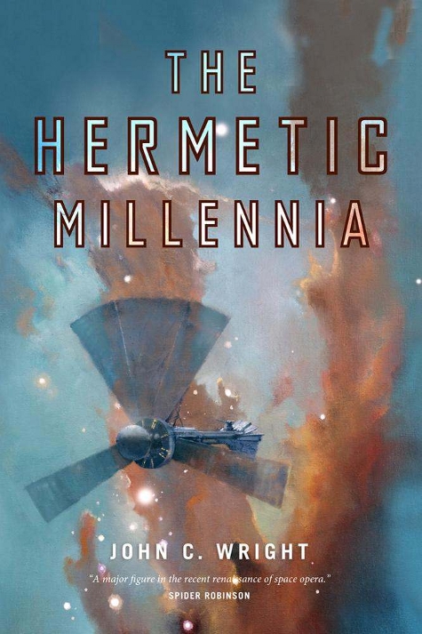
Pillars of Creation is one of my favorite space images and when I saw artist John Harris‘ image for John C. Wright’s latest book there was an instant connection. This one would work for me even without the ship in the foreground. Sometimes it is hard to fathom that we have telescopes that can take these kinds of images and it is always hard for me to fathom how an artist can paint like this. John Harris makes you want to venture out into the universe, and he works in these pastel hues that make his work instantly recognizable. I love Harris’ visions of the worlds out there.
I was excited upon arriving home the other day to see a package from Tor Books that had a copy of this book in it. Now I just have to track down a copy of the first book, which shouldn’t be a huge hardship considering it too has a great John Harris cover illustration.
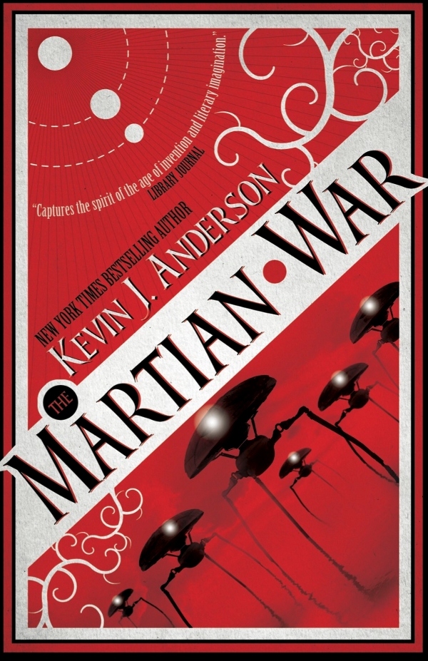
The cover design by Amazing15 provokes an instant nostalgia for H.G. Well’s War of the Worlds. That is purposeful given that Anderson’s book draws inspiration from the tale. This is the last of the “design” covers featured in my Favorites for the year. I like the angle that was chosen for the image as it messes with your head. It increases the menace of the alien machines though they are menacing enough without the added visual tension. The solar system element is a really nice touch as is the choice of using red for the primary color. This is a wrap around cover that continues with a nice design on the back. Very impressed with the way this is laid out, the end product is a great success.

Martin Bland‘s cover illustration for Madeline Ashby’s debut novel is what first caught my eye when I read the review of the book on the Little Red Reviewer site last year. If you click on the image to see a more high-res version you will no doubt see why. There is an H.R. Geiger-ish creepy quality to the image and the detail in all the robotics is scary-good. The face of the character stands out in stark contrast to the black of the rest of the cover, drawing you in to her despair. I am thrilled my brother bought this for me for Christmas as I have been anxious to read it. I hope the plan is to use Bland for the next book (assuming there is one) for continuity’s sake.
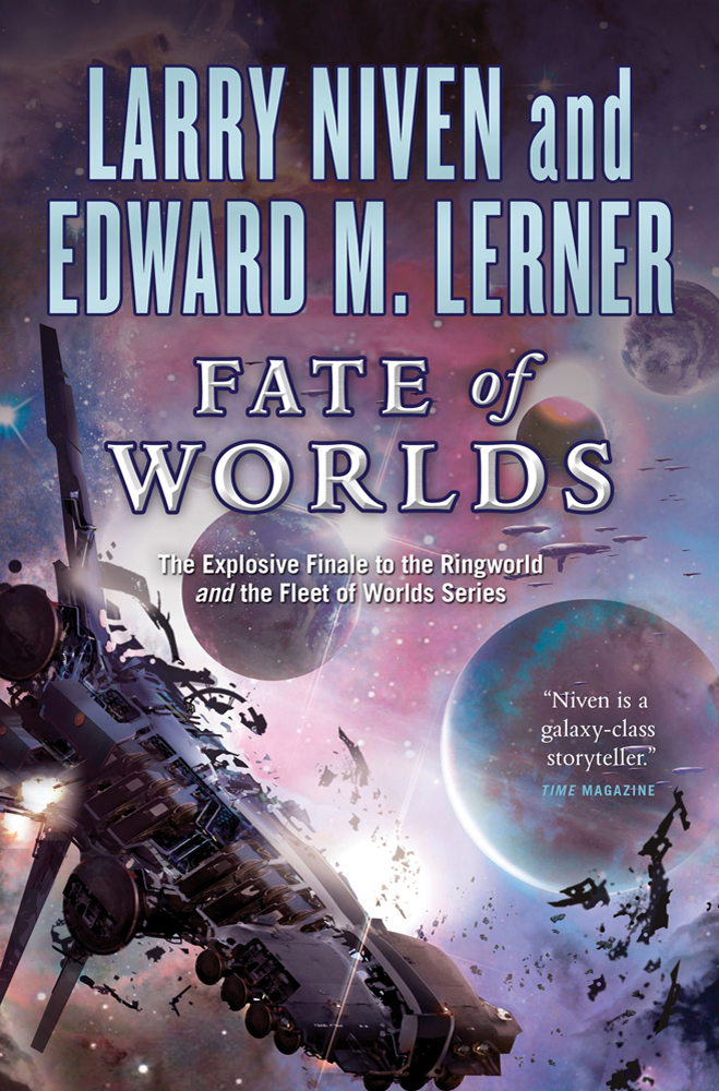
Stephan Martiniere is another artist who seems to make it onto the list every year. Some years he is more prolific than others but he always manages to create works that fuel my imagination and empty my wallet. I started reading this Niven/Lerner series in late 2012 and am slowly making my way to this one. When I do I’ll spend a good deal of time with my gaze fixed on the cover. Martiniere’s space scenes are the bomb. There are few artists working today whose space scenes excite me as much as his. There is something about his work that hearkens back to that of older SF illustrators with a contemporary edge that leaves me longing for a future filled with space travel. Stephan Martiniere’s work may look familiar because of his agreement to let me use his art for the 2013 Science Fiction Experience.
Thank you for taking this journey back through 2012 with me. It is never easy to choose the covers to include and there were many I left out simply because this enormous post would have been doubled in size. I am a huge fan of cover work past and present for science fiction and fantasy books and every trip into the bookstore is an adventure to see what will catch my eye.
I would love to know your thoughts on any of these images, agree or disagree, and would also be curious about what 2012 book releases had covers that excited you, be they in the SFF genre or not.
Many thanks for this. Really enjoyed reading and luxuriating in the cover art. You’ve introduced me to some new names.
Thanks Susan, I’m glad you enjoyed it. I always end up discovering new to me authors and artists too while researching this which leads to many pleasant hours of reveling in inspiring art.
I have to confess that the usual spaceship and lasers and/or sword and cowl and moody landscape SFF covers leave me cold. Some of the covers publishers deem suitable for their fantasy books especially are frankly embarrassing. You’ve avoided the worst of them here, but a couple are skirting dangerously close 😉
I’ve been loving some of the more retro covers from Angry Robot this year. Especially for Adam Christopher and Chris Holm –
http://angryrobotbooks.com/our-authors/adam-christopher/empire-state-adam-christopher/
http://angryrobotbooks.com/our-authors/chris-f-holm/dead-harvest-chris-f-holm/
But then it’s all just a matter of personal taste anyway, who can really say?
Here’s a vaguely related question: given so many people are using ereaders nowadays, does that make cover art more or less important? Ebooks don’t have covers, and they’ll soon make up most of the market (if they don’t already). Does that mean it’s not worth bothering, or mean the looks of dead-tree copies matter more as people attach more worth to them as actual physical things?
Sorry, I’m wittering now. Thanks for the genuinely enjoyable post.
You certainly are among many who feel that way Kamo, and there are definitely some embarrassing fantasy covers. Me, I have yet to tire of seeing spaceships on the covers of science fiction books.
Empire State was on my Favorite covers list last year, it is a very good one and I also like the cover for his follow up book, though it was one lost to that “this list is getting to huge” pile. I also like Dead Harvest. I saw that one recently and thought the cover execution was a really cool idea. In fact I considered including it but the reaching into the chest part of the image disturbs me and kept it from being a ‘favorite’.
I have yet to see any ebooks that don’t have cover images myself. Some of the self-published ones are horrible but they still exist. But that is my personal experience which is HUGELY limited since I’ve only been reading ebooks for a couple of months. But your point is still very valid and is one I’ll be asking some artists in interviews soon. I think there is a very good chance that ebooks will decrease the number of great SFF cover illustrations used for cover images. I think it has to and I think it will be all about money and less about the format itself. I can see publishers going with less expensive, lesser known artists if they get the idea that the general public doesn’t care about cover art in reading ebooks. Their profit margin will be that much higher then.
It makes me sad to think that given all the years I have been pulled into incredible stories because of cover art by talented men and women.
Feel free to witter away all you want, I love reading people’s opinions and what excites them or annoys them about SFF art.
Hey kamo, I just happened to be one of the artists featured up there and thought I might have a take on eBooks for you:
Cover art is just as important in the eBook field as it is on the book racks themselves — you still need to compete for eye space with other writers and designers when people are flipping through offerings or gazing at a website offering.
They still have covers, of a sorts in most cases, as that is usually the image that appears as a thumbnail in most readers (this is personal experience though, I can’t speak for every system)and for all the books I have done covers for released digitally through Cheeky Frawg (Jagannath and quite a few other amazing offerings) we even thought it’d be funny to include a ‘back cover’ of sorts of alternate art, just for people to find at the end.
Whether pulp or pixel, having an eye catching design is a great way to drive interest towards anything and , I feel, is still relevant these days, even when people carry 10,000+ books on a single device.
PS: Thank you for featuring one of the books I worked on here, it was a great collaboration of effort on the part of myself, the publisher and the author and really was aimed at the soul of the book itself in terms of realtability and simplicity.
– JZ
Thanks so much for weighing in, Jeremy Z! Kamo’s question brought back similar thoughts and conversations I’ve had and prompted me to write a guest post that will soon go up on Little Red Reviewer’s blog. If you don’t mind I may post your thoughts over there too or of course would invite you to do so when the post goes live.
I am obviously a fan of cover illustration and hope that art, more specifically good art, continues to be a integral part of the book process regardless of what format a book comes in.
I’m so impressed with your cover for Jagannath. As I said in the commentary on the image, it made me want to read the book and I promptly parted with my money to do so.
Very fun idea to do a back cover for ebooks. I love that!
Absolutely — feel free to use what you need, and more than happy to chime in if you think I’ll add anything to the conversation.
I also agree that a simple cover can drive more interest though a use of white space, much like some of the more striking classic covers through time (Catcher In The Rye, The Hobbit, etc), though the flash fantastic of science fiction action covers is also a wonderful thing.
It’s all wonderful. Ha.
Carl. JZ – I’m inappropriately excited that I’ve managed to kick off such an interesting discussion. If I could chip back in with a couple of thoughts. They seem connected in my head, but you’ll probably be a better judge of that.
A lot of the stuff I read about ‘the state of the publishing industry’ seems to suggest that it’ll boil down into ebooks for people to read, and hardbacks for people to have. Paperbacks look to be getting squeezed out. Not sure I go along with that entirely, but it’s an interesting point.
All the more so for me, because I live in Japan, so getting hold of English language books is a bit trickier and a lot more expensive than at home. And yet I’ve only just (this christmas) got an e-reader, despite it being very obviously the sensible thing to do. Having the physical things is almost a fetish. I’m fairly certain I’m not the only one who feels like this 😉
Case in point, this- http://www.penguin.co.uk/nf/Book/BookDisplay/0,,9781846140990,00.html# is just a gorgeous object to have, and I can’t imagine it’d be the same in paperback, let alone as an ebook. But then I have something of a map fetish as well.
And, in one of those cool little coincidences, one of my most recent purchases was Jagannath. I ordered it about a week ago and I’m still waiting for it to arrive. JZ, you seem to be doing your job very well. I was looking through a round-up post on another blog and the cover stood out enough to make me actually read that review in detail. Despite the cover, I wouldn’t have bought the book if it hadn’t sounded appealing (sorry), but then I might not even had looked at it if the cover had been different. So it worked pretty much exactly as you describe. Keep up the good work.
Thanks Kamo! I hope you’ll come over to my Guest Post over at Little Red Reviewer (no date yet, but sometime this month) which you also inspired with your comment.
I too saw Jagannath on a ‘best of’ list but I would not have looked at it more closely at all if not for the cover. All the little details coming off the horn told me a) this is a short story collection and I like short stories, and b) that I had to at least find out what this book might be like because I was itching to know what each symbol was in reference to! (Now I’ve just got to find time to read the book!)
I’ve heard that paperbacks are going away too but I’ve certainly not seen any evidence of that over here in the U.S. where, in the SFF market, we have many books that don’t get a hardback release at all and go straight to paperback. I prefer hardbacks myself but it is nice to have that less expensive paperback option and certainly makes it easier to tote around to read…as does the ereader.
And yes, there are some books that will just never translate as well to ereaders. You were mentioning maps and that is the first thing that springs to mind for me too.
I think it boild down to the same situation i have with music: I love, love, love the physicality of popping a CD into a player, dropping a needle onto the vinyl, throwing a tape into the player — and yet I have iTunes and thousands of songs in digital only format, tens of thousands in fact.
… and yet, when I look at the legion of tunes before me, the digital counter that tells me that I have 30 days of music lined up, were I to play it interrupted, it loses the appeal of selecting that one perfect album and just rocking out as I drive down the road.
Well put, Jeremy. I agree, though I haven’t even gotten so far as to purchase music online. I do access sites like Pandora quite often and create stations to suit my mood but when I really like a person/group’s music I end up purchasing the CD. I like to be able to do the same thing I do with books, I like to enjoy the cover, the liner notes, the CD design and I like the physicality of the entire process.
Exactly — I’m a sucker for special editions
This is a fun post. I loved seeing all the different types that catch your eye. I bet you are like a kid when wandering the aisles in a bookstore. If I had to choose, the Bradbury one is my fave–not sure why, but it speaks to me. It says, “buy me.”
The Bradbury one is really great, TBM, isn’t it? I neglected to mention that it also reminds me of the art of Richard Sala who does some really great comic book stories. There are always little details to excite the eye.
I go into bookstores pretty wide-eyed, I must admit. Every time. No matter why I go to BN, for example, I always wander the science fiction/fantasy aisles and not just to see if there is anything new. I like revisiting the covers that excited me the first time I saw them.
I find myself buying anything with a John Harris cover! I love your comment that Harris covers want to lure you into Space! Exactly! The cover on Brandon Sanderson’s THE EMPEROR’S SOUL is also a favorite. And, like you, I’d like to own every book HAFFNER Press publishes!
Me too George. I’ve collected so many books over the years that I have yet to get to because I found myself in the store saying “ooo, its a new John Harris painting!”.
Wouldn’t it be fantastic to have one whole section of your personal library with every Haffner Press book in it? A daydream like that makes me positively giddy.
I’m TBM, I love these posts, and Carl, I’m like you too, because a bookstore is a candy store no thanks to all the gorgeous cover art. Too many times to count have i bought a book just because it has pretty or alluring cover art.
Donato Giancola’s cover art for Range of Ghosts is so beautiful, soothing, and mysterious, I’d happily have a print of that as artwork on my wall. No matter where you look, there’s more to the artwork, more to the story.
complete other end of the stylistic spectrum is Daniel Dociu’s artwork for the James SA Corey books. I feel like I could take just one step forward and fall right into the picture.
Me too Andrea, me too. And it is a bitter disappointment when the cover is better than the book. Thankfully I haven’t had that happen too terribly often. I generally do take the time to do a little bit of soul-searching and study before I buy a book “just” because of the cover. Or at the very least I go with my gut and my gut does pretty fine by me. 🙂
Isn’t Range of Ghosts gorgeous? I have yet to see it in the store as my BN hasn’t had it, or its flown off the shelves before I could get to it.
Dociu’s website is just filled with eye-candy. I so want to see a movie filled with set design based off of his work.
Absolutely fantastic stuff! My faves are Future Japanese and The Emperor’s Soul. I envy artists and their vision. Sigh.
It really is, isn’t it Deb? I too am in awe of what artists accomplish. I cannot fathom how they get these images in their heads out onto paper, the computer, etc. It is amazing.
all good choices Carl… I do believe the cover can sell a book you had no intention on buying so these artists and many others are all fantastic!!
It sure can! I went back this morning and counted and of these I own 13, 3 of which were sent from the publishers (but I probably would have bought anyway) and the rest I purchased myself. Cover art played a huge part in these purchases.
so many great covers. love the genre for being so attentive to great art/ists.
They are very attentive and I hope that trend continues (as I will discuss in my upcoming guest post on Little Red Reviewer).
Hi! The cover of Jagannath, including the art, is by Jeremy Zerfoss, who does all of our covers here at Cheeky Frawg. Thanks!
Thank you so much Mr. VanderMeer, I will make that correction immediately. I suspect I’ll be thanking your for publishing the book soon too. 🙂
I don’t think I’ve been to SF Signal before, but I do regularly visit Muddy Colors (http://muddycolors.blogspot.com/) which is a blog run by several artists, many of whom regularly do SciFi and Fantasy covers. They do a lot to show their process, the kind of stuff that interests them, and a lot of other interesting things covering the art world, I’d highly suggest it.
When you asked for favorite covers from other people, I immediately thought of the ebook cover for Towers of Midnight, the 13th book of the Wheel of Time. Turns out it came out in 2011, but I love the cover so much I’m going to suggest everyone check it out anyway. http://www.tor.com/blogs/2011/01/raymond-swanland-and-the-towers-of-midnight-ebook-cover
Adam, you rock! Art link!!! I had forgotten about Muddy Colors. Some of my favorite artists are over there. The Spectrum Fantastic Art Live gang hangs out there, very cool, thanks for the link.
And Raymond Swanland’s cover for that is awesome!!! I hadn’t seen that one before, glad you suggested it.
These are some incredible covers. I remember seeing some of them in the bookstore, and thinking I needed to pick them up. Thanks for reminding me.
You are welcome, Alisa. Just keep remembering to think thankful thoughts when the bookstore is taking your money. 🙂
I’ll remember that. 🙂
I like 9 of the 24 you show. I think Caliban’s War and SteamPunk would be my favorites.
You are such a tease, Richard. You could have listed the other 7.
Caliban’s War is great, I think in large part because of the color choices made. I mean that read is so vivid. Every time I see it I want to jump past Leviathan’s Wake, which I have yet to read, and go straight to CW.
Further remarks after reading all the comments – – – book covers can make me want to read a book or turn me off and I’ll not even read the review. Which means an image has about 2 seconds, if that, to catch and hold my interest. I’m an Old Guy (closer to 70 than 60) and my eye for images is informed by the things I have seen over the years: early SF magazine and book covers, the work of artists in all mediums (I have English/art history and fine art degrees), the landscapes I have lived in (costal, desert, forest, etc. I will probably ALWAYS prefer a well executed painted cover over anything photographic, and I prefer paintings & drawings over all design/text covers. Photographs reworked so they look painterly are okay.
Many of the Haffner books are OP if I’m not mistaken, so a complete set is no longer a possibility, sadly. I have several but at $30-$45 each it’s an investment.
Wow, I didn’t realize your degrees where in art history and fine art. I *think* I knew you had and English degree. I love painted covers too, and they are one of the things I am afraid of going away or decreasing as ebooks become more the norm. I hope that isn’t the case because there are some amazing artists today who work in paint on canvas and I would hate to see that go away in regards to book covers. I do appreciate and like a lot of digital art as well.
I know that in order to own all the Haffner books I would have to be super rich, of course, and if I was super rich I could probably afford to pay the exorbitant prices other collectors would want to actually get a full set. If I’m going to dream, I’m going to dream BIG!
Nice round-up! There are some I haven’t seem before.
Thanks Angela! I know, I’m always surprised when I see book covers pop up online and I think “why didn’t I see that book on the shelf?”
Wow, quite a collection of amazing, intriguing, very different images. Somehow that King of Thorns cover is the one that’s really grabbing me. I’m not sure it’s a book I want to read, but…! Something so gripping about the image.
Yes, I really like that one. I too don’t have a strong desire to read the book, thought it was on several best of lists I saw this year.
I love Holmes! Glad to hear you had fun with it. I’m not sure what my favorite short story is–I remember liking the Speckled Band though. Holmes and Watson are one of the great pairings of literature–Holmes could never tell his own story, but Watson wouldn’t be as interesting without Holmes!
If you’re in London, you should go on the Sherlock Holmes Walk, put on by London Walks. I went when I was there and it was wonderful–the guide takes you around to places in the book and tells a lot of the stories. Really excellent!
And I totally just put a comment into the wrong window–AUGH, this is what I get for having multiple blogs open! Sorry for the incomprehensible, irrelevant comment…not intended for this post!
I was reading that and going, “Huh?!?!”. LOL! No worries, I always have multiple windows open at the same time too.
oh hooray, tomorrow is thursday! *giggle*
Yes it is! Sent out the questions for the group read today. I assumed you didn’t want to get them but I can email them to you if you would like me to.
READ 2312. Also, Caliban’s War won’t disappoint; the story is as good as the cover. I didn’t realize that the same artist did both that and Starfishers, the last of which I finished a couple weeks ago.
I’m pretty much a philistine with covers though. No eye for art and it rarely figures into my reading decisions. That said, Desolation Road needs to be a poster on my wall. Re: The Future is Japanese – Haikasoru has a lot of striking covers. I wonder how many of those buildings Kamo and I could identify.
How were the Starfishers books? Those are another group I’d like to buy simply because of the covers but would actually like to know if they are worth reading.
The cover for Desolation Road is amazing. I saw some prints of it at the Spectrum Fantastic Art Live show last May and it looks awesome. I think Martiniere sells prints from his site.
I would be lieing if I didn’t say I am highly curious!!
I love covers and I love this post.
Firstly, Prince of Thorns – I love the covers for both these books – I suppose that might be slightly prejudiced by the fact that I love the actual content that lies in between!
There are some great covers here. I also love the Shadow Show and Range of Ghosts covers – the cover for Ghosts is seriously lovely.
Thanks for this. I always look forward to posts like this 😀
Lynn 😀
Thanks Lynn! I enjoy doing them every year, they are one of the treats I look forward to as a year closes.
Isn’t Range of Ghosts lovely? That rich violet/purple color is just dazzling. And I love the way he rendered the glowing moon.
I love the covers you’ve chosen. Makes me excited for new books. 🙂
Out of your picks, my favorites are:
The Woodcutter – lots left up to my imagination. It really has me wondering about the story, intrigued.
Eve Templar One – that’s a spaceship? My first thought was a huge tank, but even with my confusion I LOVE the simplicity of it.
Range of Ghosts — wow! Beautiful. I want to know what the story is behind that cover. I want to read this book, AND I don’t think I am even a Elizabeth Bear fan – based off one book that I just could get myself to trudge through.
The Emperor’s Soul – LOVE this cover. I just bought the book because the cover is stunning to me, AND because of your glowing review, AND because I do love Sanderson’s writing.
Shadow and Bone – the simple color use makes the image pop….it has me wondering about the story. I am curious. But don’t think I am curious enough to read the story – must actually read the summary on this one. 😉
My top ones that I’ve chosen as my favs from your list would be The Emperor’s Soul and Range of Ghosts.
This was a fun post. thank you.
I ended up snagging The Woodcutter on the Kindle because it was one of those $1.99 daily deals. I’ll probably read it for Once Upon a Time this year.
I’m assuming the Eve cover is a spaceship, I suppose it could be some other kind of vehicle.
I’m glad you bought The Emperor’s Soul. It is a really nicely told story. I think you are going to be quite pleased.
Shadow and Bone was on a lot of best-of lists this year but I’m not certain I’ll get around to reading it either.
Awesome post.
My favourite sci-fi cover of 2012 is technically 2 covers from the same book. The hardback and the paperback editions of Alastair Reynolds’ ‘Blue Remembered Earth’ have different covers, but both of them are very beautiful.
Hardback: http://tinyurl.com/abytkok
Paperback: http://tinyurl.com/ahmo7fk
Loving the blog (which I’ve only just discovered btw!)
Best,
Tomcat.
Thanks so much Tomcat! I almost included Blue Remembered Earth as I like that one very much. Have yet to read the book but I snagged it right when it came out because I like Reynolds and the book looked great. I actually like the paperback cover even more and wish I could get that one in hardback. Wow! Thanks so much for sharing those and for the visit, I’ll be over to check yours out as well.
I love the woman on the cover of The Creative Fire! The cover of Shadow Show is fantastic (and the book was immediately added to my TBR when I saw it here!) and I really love the cover of The Woodcutter. Great assortment of covers here.
Yes, John Picacio did such an amazing job with that one. I’m so happy for him and how his art is progressing. He won some major awards this last year.
I keep meaning to pick up a copy of Shadow Show when I am at the bookstore and then end up forgetting while there.