
(Picture of one of my favorite illustrators, Frank Frazetta. Photo Credit)
For much of my blogging life I have tried to maintain a commitment to not only discuss books but also to showcase artists past and present whose work I admire. While I have gotten away from that to some degree over the years (need to fix that!) one of my annual pleasures is sharing the book cover illustrations that I found most exciting from science fiction and fantasy books published in 2011. This is in no way meant to be an exhaustive list and I understand that we all have different tastes. I am well aware of the fact that I am not a definitive authority on what is “best”, I simply know what I like and venture to explain why I like it. Book covers draw me to books, it is as simple as that. Even when it comes to reading authors whose work I have previously enjoyed, I will go out of my way to find a cover that attracts my eye if more than one cover is available. This is especially true with science fiction classics.
Here then are the book covers that I’ve liked best from what was published in the United States this year. Rather than grouping them in any special order, I chose to display them in order of publication, from the beginning of 2011 through the end. Special thanks go out to Locus Magazine online for their annual posting of the covers and artists of genre-related material, to SF Signal for their Cover Art Smackdowns, and also to Fantasy Book Critic for their monthly spotlight posts, which provided a clear, concise format for me to review this year’s releases.

In former posts about book cover illustrations I have mentioned my partiality to the color orange, so an orange hued cover immediately grabs my attention. In the case of Jo Walton’s wonderful love letter to childhood reading, Among Others, the cover not only nicely reflects the magical mood of the book but the photo of the young girl accurately reflects the protagonist and the mood of the story. It is a cover that shines out on a bookstore shelf for a novel that glows with real warmth and passion.

(Cover illustration by Sparth)
It wasn’t long after finishing Starman Jones last December that I first saw the cover for Paul McAuley’s then forthcoming book, Cowboy Angels. For some reason it reminded me of the train scene early in Heinlein’s novel. Is it just me or have trains been cropping up on SFF covers with more frequency over the past few years? Whatever the case, more often than not I find myself drawn to them. The orange train looks good against the electric blue glow of the Stargate-like gates. Though it remains on my to be read pile I commend Pyr’s art director for selecting a cover that tempted me to snatch this one up on its release day.
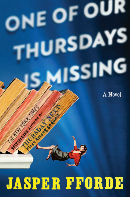
(Cover image by Thomas Allen)
Jasper Fforde’s Thursday Next series, set in a world where literature comes to life and the creativity of artist/photographer Thomas Allen are a match made in heaven. I wish they would re-release all of the series with Allen covers. You can see more of Allen’s wonderful work here. I did a feature on his work in 2007 which resulted in a few email conversations and Mr. Allen showed himself to be a very nice and generous guy in addition to having a wildly creative imagination. His artbook, Uncovered, is a great deal of fun.

(Cover art by Ralph McQuarrie)
Haffner Press has released some wonderful books over the years bringing authors back into print and bringing together complete collections of various authors’ works. This, the 8th volume of Jack Williamson’s short fiction, has a cover by original Star Wars concept artist Ralph McQuarrie which recalls the artwork created in the glory days when exploration into the galaxy seemed a certainty. Beware, if you follow the link over to the Haffner Press site you are bound to come away with a shirt wet from drooling and possibly a lighter wallet.

(Cover image by Stephan Martiniere)
I don’t know why, but science fictional stories set on Mars stir up an extra level of excitement within me. I imagine that is because it is the next planet outward from Earth, because we are already exploring it with robots, and because it is far past time that humanity mount some form of manned expedition to the Red Planet. Stephan Martiniere captures that excitement with rocket ships of familiar shape resting on the red dust of the martian plain. There are several cover illustrations by Martiniere in which he features a ship of some sort blasting off in the background and I never tire of seeing that. This is the first time ever it has made me sad, however, as it reminds me of the end of the Space Shuttle era. I recently acquired a copy of this book and am thrilled to have it as part of my collection.

(Cover image by Stephan Martiniere)
Some of you may know that Chris Woodring’s novel Retribution Falls actually debuted in England in 2010. In the spring of this year a U.S. version came out with a slightly altered version of this same cover. I saw Woodrings’ novel cropping up on “best of” lists often at the end of 2010 and was quick to pick up a copy when it hit store shelves in America. Looking at the empty platform in the foreground I cannot help but imagine what it would be like to be standing there, waiting to board that airship. It looks like the kind of vessel Han Solo or Malcom Reynolds would helm were they to exist in a steampunk science fiction universe.

(Cover image by Michael Kormarck)
I wasn’t aware of Jack Campbell’s Lost Fleet novels until I began actively searching out military science fiction late last year. Even then the covers did not stand out to me until the release of Dreadnaught. Michael Komarck has created a cover image reminiscent of the WWII posters of Allied Forces. I’m not generally attracted to men on the covers of SFF books, but with the chisteled features and heroic pose it makes me want to pick up this novel so that I can imagine myself in his shoes. He looks to be a man’s man and the kind of guy who would make women swoon. It used to be well outside of my character to pick up any book in a series without purchasing the previous volumes, but precedent has been set over the past few years and while I’ve resisted the palpable temptation to snag this book more than once this year, I am not sure I can hold out indefinitely.

(Cover image by Jeremy Geddes)
Every year I find myself waiting in anticipation for the announcement of the cover image for the latest volume of Eclipse with as much excitement as I do in waiting to get my hands on a copy. I have been most pleased with each cover and volume four was no exception. There are some fairly dominant color schemes in SFF and while I generally like that aesthetic I also enjoy it when a cover image captures me that is out of the norm. The pink/purple hue coupled with one of Geddes’ astronauts works well for me and did so even before the image of a space suit brought with it reminders of Dr. Who.

(Cover image by Daniel Dos Santos)
Every year it seems that Daniel Dos Santos creates several cover images that I cannot help but like despite the fact that they often grace books that on first look don’t appear to be my cup of tea. This year was no exception and I had to limit myself to only showing a few of his covers. This one is a favorite, more so when seen sans text and slightly larger, as you can see here. Dos Santos captures light and the way it reflects off the skin of his characters in such an interesting way. They practically glow. He also uses a very rich color palette that makes his images pop. This series of books by Celia Jerome features a protagonist who is a graphic artist and I enjoy the way in which Dos Santos renders the comic book characters in the background of the illustration.

Daniel H. Wilson’s novel of robotic terror made a huge splash this past summer and at the time it seemed like every time I turned around I noticed its striking cover. The metallic blood-red of the eyes and the book title stand out remarkably against the pure white of the android face. It is an effectively disturbing image and although I am only three quarters of the way through the book I can attest to how artfully it captures the feel of the story.
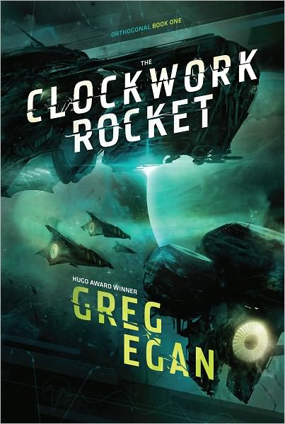
(Cover image by Cody Tilson)
Tilson is a versatile artist whose illustration for the first novel in Greg Egan’s Orthogonal trilogy reminds me of artists like Stephan Martiniere, Raphael LaCoste and Sparth. I am a man of simple pleasures and I have yet to tire of science fiction covers featuring starships with glowing drives and intriguing planets in the background. I especially like the greenish cast of this cover. Yet another very tempting book.

(Cover image by Kieran Yanner
Yanner’s cover for this recently released Silverberg collection calls to mind some of the old-style science fiction covers I enjoy coupled with the more contemporary style of not-quite-finished art. All I know for certain is that if the woman pictured is the space witch in question, count me in on the hunt! This is such a fun cover. The colors are so vivid against the stark white background. This is one I will soon be adding to my collection.
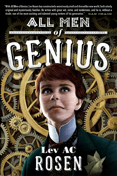
(Cover image by Scott McKowen)
Rosen’s debut fantasy sports a cover image that reminds me of German woodcarving. The style, with its incorporation of gears and its title font, give it a delightful steampunk vibe. All Men of Genius is a combination of two of my favorite plays: Shakespeare’s Twelfth Night and Oscar Wilde’s The Importance of Being Earnest.The 1952 film version of Earnest is my favorite rendition of the play in no small part because of Dorothy Tutin’s portrayal of young Cecily. McKowen’s image, which I take to be that of protagonist Violet Adams, reminds me of Tutin.
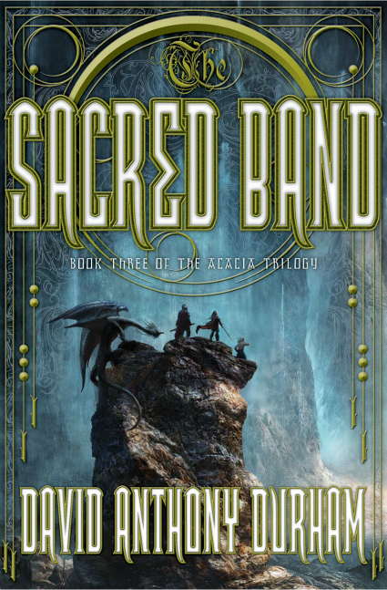
My internet search has not yielded the name of the cover artist for Durham’s novel, Sacred Band, but I must state that I am impressed, and not just with the cover illustration but with the cover as a whole. I am rarely fond of cover illustrations that are dominated by text, but in this case I find the ornate design of the cover text to be quite eye-catching and it frames the characters of the art nicely. The image sans text is great too, as can be seen here. The colors chosen for the text work well with the color palette of the image itself.

The cover for Catherynne Valente’s book, Silently and Very Fast, is simply gorgeous. The warm oranges and purples and pinks against the metallic grays gives light to the image and makes it shine. The angles of the image and the repeating circular pattern of the gears works so well causing the eye to flow across the image. It is a beautifully rendered image.
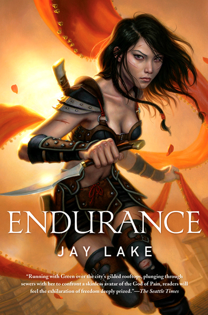
(Cover image by Daniel Dos Santos)
Yes, it is Daniel Dos Santos once again. And once again he delivers a dynamic and richly colored image. The curves in this image, from the figure of the girl to the fabric stretching out behind her, bring movement to the piece. You can see the unedited image here. He manages to make the girl look lovely and dangerous at the same time.
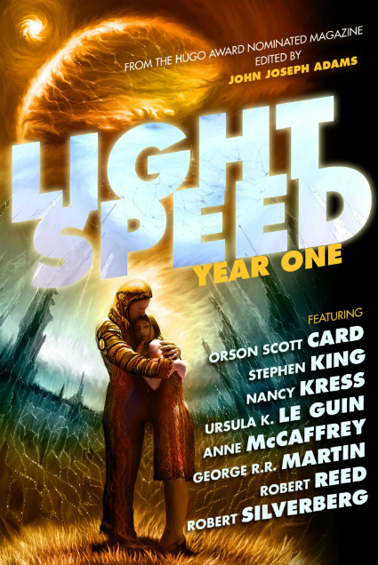
(Cover image by Vitaly S. Alexius)
I must have been in a cave over the past year. What other explanation could there be for my lack of awareness of John Joseph Adams’ online magazine, Lightspeed? In order to make up for my ignorance I promptly purchased this volume the moment I saw it on the bookstore shelf. And if I were honest I would tell you that it was this electric image by Vitaly S. Alexius that drew me in. There was no way I could pass up the opportunity to see this book in my collection.
I have used, or at least have been tempted to use, the word “glowing” often throughout this post. That may not be a surprise given that the covers that leap out to me are often those that do possess some sort of glow. Lightspeed Year One is no exception. The image of the space man with his arms wrapped protectively around the girl is arresting. In a piece of design brilliance by the folks at Prime Books, this part of the image is repeated on the spine, making for a great look when shelved.

(Cover image by Cody Tilson)
Artist Cody Tilson makes his second appearance in this year’s list with his cover illustration for Rob Ziegler’s novel, Seed. I am very fond of trees and Tilson’s rendering of them branching out (pun intended) from the book’s title are really nicely done. I admire the way in which the design of the book’s title is incorporated into the art itself. It is a nice juxtaposition of the design of man-made technological marvels merged into nature. It is the kind of book cover that makes me wonder right away what the book is about. The design and color choices remind me of the three dimensional artwork of Rachael Direnna and the paintings of artist Ashley Wood.

(Cover image by Lauren Panepinto)
Panepinto’s cover designs for Philip Palmer’s books are brilliant fun (you can see the rest of them by clicking the link above). She describes Palmer’s novels as having a “pulp scifi feel” and she captures that feel with cover images that incorporate retro-looking toys and a distressed design. When I see her work I cannot help but think of the hours I spent playing with army men and other plastic toys during my childhood. And any book cover that can do that is an instant favorite. I had wanted to pick up one of Palmer’s novels in the past and the image for this book, coupled with its description, finally pushed me over the edge. It didn’t hurt that the look of Artemis reminds me of the work of one of my favorite vintage science fiction illustrators, Richard Powers. Kudos to Panepinto and Orbit Books for a really fun cover.

(Cover image by John Harris)
Few artists bring me to a halt as I walk down a bookstore aisle or surf book-related websites like John Harris. Harris was one of the artists I noticed when I was young and seeing his work never fails to bring on waves of nostalgia. John Harris makes me want space travel to be possible. I want to fly in his ships and I want to visit the planets he renders from his imagination. This book was just released this past week and you can bet I will be searching for this book the next time I am in my local bookstore so that I can have another look. You can see the painting unadorned by the title art here.

(Cover image by Will Staehle)
And finally, Will Staehle’s illustration for Adam Christopher’s book is a design beauty. The art deco style of the 1920’s, especially in architecture, is a particular favorite and in reading the book’s description it looks to match the alternate history setting of the story perfectly. I really admire the sleek lines and balanced design. Yet another just-released book that has me itching to see it on bookstore shelves.
UPDATE:

(Cover image by Michael Kormarck)
Jeff was kind enough to remind me in the comments that the last book in George R.R. Martin’s Wild Card series had been released last week and we had both been talking a few weeks back about how much we loved the cover. There was no way I could pass up the opportunity to edit the post and give Michael Komarck a second mention in this year’s list of my favorite SFF covers. The small image above does not do it justice at all, please click here to see a larger version. Komarck does such a great job of rendering people in near photo quality and the gold cast of the Wild Cards covers actually works really nicely with the elements he painted into this image.
_______________________________
As I said in the opening, these are my favorites. There is no guarantee that any will be yours and it is highly likely that there are other books published in 2011 that caught your fancy that I did not include here, especially as I limit this post to science fiction and fantasy. So please, let me know your thoughts on any or all of these covers (even if you disagree with me) and also please feel free to share book covers that captured your imagination regardless of the genre.
I often wonder about the fate of traditional book cover illustration in a future dominated by ebooks, but for now I rejoice in the presence of another year in which I found new releases in science fiction and fantasy whose covers made me sit up and take notice.
Like you, I really love the color orange, and I am judging Among Others by its cover right now.
Oh Lorren, if you haven’t read Among Others I urge you to give it a try. It has deservedly earned its praises this year and I hope to see it included in awards lists in the coming year.
What a coincidence, I read this then open an email from the Sony Reader store and Count to a Trillion is one of the Staff picks! I think that means I should pick up a copy now 🙂
These are some great covers. The lady on the Endurance cover reminds me of Xena so that looks like another one to pick up too.
The book covers that stood out for me this year were:
The Emerald Atlas by John Stephens
The Night Circus by Erin Morgenstern
Snuff by Terry Pratchett
The Map of Time by Felix J Palma
Six Days by Philip Webb
Bunheads by Sophie Flack
The Floating Islands by Rachel Neumeier
And I believe if artists continue creating such lovely covers, physical books will be around for a very long time. It’s often the cover illustration that helps me decide whether to purchase the physical copy or ebook it.
Sarah, any excuse to buy books is a good one in my way of thinking! 🙂
I really liked the cover of The Night Circus as well and I almost included it but then decided it was just enough outside of what I was considering as ‘fantasy’ that I decided against it. It is a really nice design too.
Didn’t think of the girl on Endurance looking like Xena, but you are right, she definitely has the Xena garb, doesn’t she?
I really like the Floating Islands cover. I’ve seen many artists do renditions of that sort of thing and it never fails to excite my imagination.
Bunheads is a super creative cover.
I’m certainly hoping for the sake of artists that ebooks don’t have a negative impact on the creation of illustrations, as we would be missing out on some lovely art if that were to happen.
Amazing collection.
I think I like Seed best.
Thanks Caroline, Seed is a very creative cover.
Great post! Beautiful covers!!! My favorite’s of those above are The Lightspeed cover ( I’m going to buy one of these soon ) and the Among Others cover if I had to narrow it down to my top two. I love these types of year end posts!!!
I will add a few more covers that captured my eye this year.
I am Half-Stick of Shadows by Alan Bradley. Each of this series of covers are incredibly captivating when you see them and hold them in your hands.
The Night Circus by Erin Morgenstern. That is cover is magical.
Leviathan Wakes by James S.A. Corey. This one caught my attention every time I saw it in the book store. I was so glad I received it as a gift this year.
The Unremembered by Peter Orullian. This cover reminds me of so many of the fantasy series I read as a teenager. Once those memories were rekindled I just had to take it home with me.
Wildcards II: Aces High – Edited by George RR Martin. Artist Michael Kormarck has been creating stunning covers for this series of latest releases from TOR these past 3 years. This years cover was the best yet IMHO.
American Gods 10th Anniversary edition by Neil Gaiman. Another cover like the Alan Bradley book that looks and feels so much better in person than in just a stock photo on the Amazon website.
I agree about the Bradley books. Pictures of them do them no justice at all, but when you actually pick one up the design and the production choices really stand out. Everything from the size to the art printed right on the cover make them very interesting and charming books.
I came really close to adding Leviathan Wakes and probably should have. I could never quite decide if I really liked it or if it was just the “type” of cover I liked. I have no doubt the second book will be on the list at the end of next year though because I am very drawn to that cover.
I like The Unremembered as well.
I’m kicking myself for not including the Wild Cards cover. I LOVE that cover, it is for sure the best one yet. I had it in my head that it was actually coming out next year. Me thinks I’ll go back right now and add it to the end of the post. It is just too good not to.
And the American Gods re-release does indeed look better in person, as do some of the covers I included in my list. Many of them I’ve seen first hand and so I at least know how impressed I was by the covers in the store.
Yes. I remember you commenting how much you dug that Wildcards cover too. Kormarck is a top tier artist to me now days like Matrinere.
I understand what you mean about the Leviathan Wakes cover and I do think next year’s book two cover that series looks even better.
Yes he is, I look forward to seeing if his work graces any covers in 2012.
That’s a lot of cool covers! There are many of those I want to read…
That is one of the dangers of doing these sorts of posts–I discover all kinds of books that weren’t on my radar but are now simply because the cover images are so tantalizing.
What an inspiring post! So many possibilities… 🙂
Yes, and so little time! 🙂
I just found another Cathrynne M. Valente cover contender and a good possibility for Once Upon a Time I’ll have to remember: http://www.amazon.com/Myths-Origin-Four-Short-Novels/dp/1890464147/ref=tmm_pap_title_0?ie=UTF8&qid=1325127633&sr=8-1
Just had to share.
Glad you did, lovely cover. Seems like every time I turn around there is a new (to me) Catherynne Valente book.
You sure picked some beauties! The Seed cover is brilliant, and of course I love the Valente cover.
If I end up spending all my gift money on beautiful books, I’m gonna blame you! 😉
Ha! I guess I can live with that, only because I end up doing the same thing to myself. Fortunately I already own 8 of the books.
wow, these are some fabulous covers, thanks for sharing them–as well as accompanying them with comments. and now I’ve added more to my tbr, and with excitement.
i really love the attention paid to the art/form in the sci-fi tradition. i wish more genres would/could do the same.
I do too. And you are welcome. There was just no way I could go without commenting on them even if I had wanted to. At the very least I like to try to give people some idea of why I chose a cover rather than leaving it to everyone’s imagination. 🙂
Frazetta and Boris have always been two of my favorite painters.. but there are soooo many out there and the books that get the interesting artists are the lucky ones..because 1/2 the battle of selling is having someone pick it up to see what it’s about..and the cover does that. I don’t think we could ever give all the book cover artists all the credit they deserve… but it’s the reason I always take the paper cover off when I read the book and put it back when I am done…the art is too good to damage.
Yes indeed, they are both great!
I know what you mean and I often do that same thing with dust jackets.
I feel so bad when I see a book with a truly awful cover. The odds are still stacked against the possibility of a writer getting a book published in the first place, and then to have something wonderful like that happen and have it marred by an awful cover makes me so sad.
I can’t tell you how many books I’ve bought over the years because I loved the cover art. Like you I’m am also anxious about the future of cover art in a world dominated by e-books. I don’t think people buy e-books based on the cover art the way people buy books based on their covers, which makes me think cover art’s future may not be all that bright.
On the other hand, one thing that may keep actual books around as an object is artwork, both covers and illustrations. I think there is a set of people who would pay a bit more for an illustrated book. So, maybe there will be a small expansion of artwork overall.
I’m hoping.
On one hand I think it is really cool that the ebook versions of Robert Jordan’s Wheel of Time series, for example, have gotten some truly wonderful updated “covers”, but I am worried that trend will not continue as it no doubt cuts into the overhead. I have a terrible feeling that plain bland cover art like that on George RR Martin’s books will be the norm for ebooks, if not for print books also. I’m hoping with you CB.
I love all the covers you presented especially LIFE ON MARS, ENDURANCE, and COUNT TO A TRILLION (which is at the top of my Real Real Soon stack). You might also like the cover on Jack McDevitt’s FIREBIRD (another great John Harris cover) which was published in November.
I actually had started to add Firebird to my list but couldn’t find a very good image online and decided to cull back a few books, especially since I did have Harris already. But I agree with you, it is another great Harris cover. I truly loved his cover for the previous book, Echo.
Okay, i can’t remember the name of the book (doh) because I’ve scrolled down and read everyone’s comments – but I like the book with the dragon on it. Anything with dragons is cool. Plus I like the Xena girl cover and the one for Seed with the tree. Lovely.
Thanks for sharing.
I’m a sucker for covers – even though you shouldn’t judge a book, blah blah, blah – I still like me some nice artwork.
Lynn 😀
At the very least I judge a book’s effectiveness to get me to pick it up by its cover. And it is terribly disappointing when a book doesn’t live up to its cover. I don’t feel quite as bad reading a good book that has an ugly cover…or at least then I feel more bad for the author than for me. But when a gorgeous cover houses a mediocre or worse book it seems really unfair.
Thanks for letting me know your favs of the above image, Lynn.
Oh, I do appreciate beautiful book covers! Oftentimes, that’s how I am attracted to a book or author with which I am unfamiliar. I hope the book in printed form will be around for a long, long while.
That happens to me all the time too, Charlotte. And I have those same hopes and wishes. Print books are worth saving.
So, I did a quick browse to the Amazon store and took a look inside the Silently and Very Fast pages. On the cover page it lists the artist as Julie Dillon. Sometimes Google doesn’t have all the answers, but the first pages of the books usually do!
Here is her gallery: http://www.juliedillonart.com/
Thanks for the link. Back when I did this post the book was not yet listed on the Amazon site and no other Google search was giving me the name I wanted. Since then I’ve gotten my own copy of the book and it is lovely in person.
Now I finally figured out who the girl on the cover of “Endurance” reminds me of. Aubrey Plaza from Parks and Recreation! That has been bothering me for a year now… it’s a great cover but the resemblance is uncanny. 🙂
You are so right, she really does look like Aubrey Plaza! Hadn’t noticed that but once it is pointed out it is so obvious.