
I like science fiction and fantasy art, particularly as pertains to the art that graces the covers of books. Fantastic art is my window to the universe, both the real and the imagined. My house is full of books purchased because I wanted that art in my home. A journey down the paths of my memory would yield image after fantastical image of book covers by artists whose work sparked my imagination, generating a lasting emotional bond to those works.
One of the things I enjoy doing every year is to look back on those cover illustrations that grabbed my attention. I want to clearly point out that these are my favorites of the year, not necessary the best. I do not have a degree in art nor any formal training, I am simply a fan. Who am I to say what is best? The beauty of coming from the position of fan rather than expert is that I can share with you what I like, why it works for me, and what influences I see. The beauty of art in all its forms is the engagement that we can have with it on a personal level.
The choice of red for the main cover color is eye-catching. I’m a fan of the look of beauty and fashion of the 20’s and early 30’s and La Boca captures this nicely. I like the way the girl’s slightly upturned head, closed eyes and puckering lips hint of romance.
I’ve picked up this book in the store and it is surprising how the illusion of the layered image makes you think you are going to feel those layers on the cover. It is a fun effect.
These are the images that caught my eye, online or in the bookstore, and made me want to learn more about both the artist and the book. Several of these images caused that interesting phenomenon whereby money leaped out of my wallet, or bank account, into the hands of a bookseller.
A sad phenomenon coinciding with the rise of ebooks is the decline of illustrative cover art, though in truth this decline had already begun. Whether this has been a move on the part of publishers to attempt to legitimize genre fiction by moving it away from stereotyping imagery or a business decision to decrease costs by moving design in-house or both of those reasons plus many more, I must admit that this forty something dinosaur has not embraced the change.
The science fiction and fantasy books I appreciate the most are those which bear an artist’s interpretation of the story housed within. If I had my way every book would include art created by the kind of artists one finds in the annual Spectrum: The Best in Contemporary Fantastic Art. I hate to see this venue for artist exposure become more limited. That being said, I am also a visual person and do appreciate good, creative design including some book cover illustration using photos or photo-realistic imagery.
This is what I liked. Whenever possible I include the information of the artist who created the work. If any do not note the artist and you have that information, I welcome it. If I have made any errors in crediting creators, please let me know and I will correct said errors. And now to the book covers.

John Harris, John Berkey and Vincent di Fate are three artists whose science fiction illustration hold a similar place in my heart. Their work acts as a visual representation of the passion I feel for science fiction.
John Harris was a big presence on the SFF art scene in 2013, in large part because of the serialization of John Scalzi’s novel, The Human Division. Tor books commissioned Harris to create images for each of the thirteen weekly chapters in addition to the featured cover image. What a thrill it was to get a new John Harris image plus a new John Scalzi short story for thirteen straight weeks.
I am partial to orange which drew my eye to this piece right away. For the hard cover dust jackets of John Scalzi’s novels, Tor Books features the raised lettering on the title and artist name which is a very nice touch. It gives the book a pleasurable additional texture as you are holding it in your hands to read.
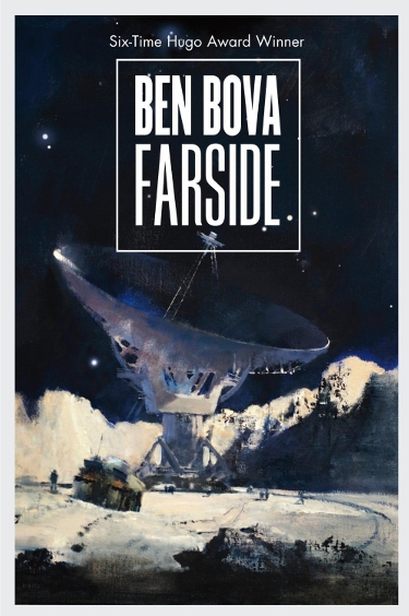
There were four John Harris covers that could not be left off of this year’s list of favorites. The second and third images were also from Tor Books and graced the covers of novels by author Ben Bova.
This image, for the book Farside, depicts the luminescent surface of the moon in a way that captures its stark beauty while conjuring images of mankind’s brief presence on the lunar surface.
While some artists have imagined robust lunar cities sporting futuristic design, Harris’ image has a realistic quality that makes me sad. Isn’t this, at the very least, what we thought might be occurring on the moon in our lifetime?
Oh to stand in the shoes of the person off to the left of that lunar vehicle and look up to see the majestic beauty of planet Earth. Those men and women who have gazed upon Earth with their own naked eyes while orbiting Earth have been truly blessed.
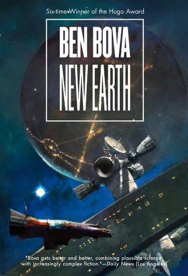
The joy of good science fiction illustration is not only in capturing something real but also in being able to illustrate that which only exists in our dreams.
John Harris has his own unique style which is evident in all of his science fiction work but can be seen most readily in these next two image, and that is in regard to his spaceships. My earliest recollection of his work is for the cover of Ender’s Game. There was that triangular yellow ship in the foreground flying over an industrialized planet, with another planetary body rising in the background. I can pretty much always spot a Harris by the presence of one of these ships.
I like the composition of this piece with the planet it the background showing signs of technological advancement with the space station hovering between the planet and the ship in the foregrounds.
The predominately blue and white cover with just a spot of purple and orange is very pleasing to my eye and makes my imagination soar, wondering what the living and working spaces in these places might be like.

The final John Harris cover to make the cut this year is work commissioned by Orbit Books for debut author Ann Leckie’s novel, Ancillary Justice.
This book has garnered much praise, and conversely some criticism, for the new author and I’m thrilled for her not only because of her success but also because she got a John Harris cover on her first book! How cool is that?
The full unedited painting can be seen here. The bright red of the space vessels really pops against the white of the moon and the gray of the larger vessel.
The full painting includes two additional ships which gives the piece a strong sense of movement and activity.
Kudos to Orbit for not only choosing such a word class illustrator for a debut novel but also for the choice to give the title lettering a degree of opacity which manages to clearly advertise the book’s title without taking so much away from the cover at.

Artist Stephan Martiniere continues the glorious tradition of artists like John Harris and John Berkey, creating his paintings with digital tools, imagining ships and planets and landscapes which fuel the passion for a future in which mankind travels among the stars.
I cannot tell you how thankful I am that Martiniere is such a prolific presence in the world of science fiction and fantasy illustration as I can be assured that several times a year I will be wandering through my local bookstore only to find myself drawn in by one of his works. James Gunn’s novel Transcendental, one of the more recent releases by Tor Books, features a piece that is quintessentially Stephan Martiniere. I find myself being so envious of the person standing in the foreground, gazing ahead to this glorious structure that speaks of the promise of adventure in space.
The monochromatic color scheme is particularly effective, lending the image an emotional weight, or presence. In some ways I am reminded of one of my all time favorite SF paintings, Cygnus by Les Edwards. There is a thematic similarity between the two which increases the pull this image exerts over me.
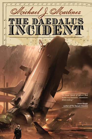
Sparth is another artist working in the digital medium whose illustration excites my interest. His cover work for The Daedalus Incident by Michael J. Martinez, coupled with the design elements over which the title and author designation are placed, make for a striking cover.Night Shade Books commissioned this work by Sparth.
One of the fears of non-science-fiction readers is that science fiction places ideas and technology and science over and above the human element, or perhaps in place of the human element. While that may be true for some books, much of what I read combines exciting science fictional concepts with a strong human element that makes the stories accessible. Images like this one by Sparth convey the majesty and wonder of the feats of science, technology and engineering that would have to come together to make space travel possible while also placing a person in the image for us to identify with, someone we know we can travel with and hopefully befriend on the incredible journey the book cover promises.
The muted color scheme of this image gives it an old-world feel juxtaposed against the futuristic world represented by the space craft. Given the description of the story I think it is an apt choice.

Tor Books commissioned artist Allen Williams to create the cover for Ellen Datlow and Terri Windling’s gaslamp fantasy anthology, Queen Victoria’s Book of Spells, and wow did he come up with something stunning.
The color palette expertly projects the kind of fantasy the reader is sure to find within the pages of the book. The choice to have the female character have white, glowing hair brightens what might have been an image that was too dark. With that choice Allen Williams has created a character who is both beautiful and as mysterious as the headless man who is her escort.
Skillful design allows for editor and book title information to be prominently displayed as well as a teaser of some of the included authors without in any way marring Williams’ lovely painting.

Artist Dan Dos Santos is another artist whose work is frequently showcased in my best-of-the-year posts. As with John Harris I had a difficult time picking which images to include; there was never any doubt that there would be more than one.
Dos Santos is the artist commissioned by DAW Books for the Esther Diamond books by Laura Resnick. Though I have yet to give these novels a try, I always pick them up in the bookstore and enjoy them for their cover illustrations.
The composition of The Misfortune Cookie reminds me of books I read as a teen where a variety of story elements would be captured in one image. It is a fun style that is shown with particular effectiveness in this image. The various things going on in this image drop hints as to story elements without giving anything away. He does something similar with the Gini Koch books and I’m fond of those covers as well.
The protagonist is attractive while not contorted in a physically impossible pose. The red, black and white color scheme works well, particularly with a predominately white backdrop.

I want to own every one of Patricia Briggs’ Mercy Thompson novels because of Dan Dos Santos’ depiction of the Briggs’ creation. I have enjoyed every one of his cover images for this series and I hope Ace Books continues to commission his work for as long as Briggs keeps writing these books.
There is a certain indescribable (by me) something about the art of Dan Dos Santos. His images have a certain quality and tone, perhaps in the way he renders the light that interacts with the objects in his paintings. There is a distinct look to a Dos Santos cover and I can tell at a glance that it is his work. I think it is amazing when an artist can do that and have their work stand out as something uniquely theirs, a signature that embodies the quality of their work without putting it in a box.
Dan Dos Santos manages to incorporate Mercy’s culture and references to her skills as a mechanic in each cover image without them getting old.

Dan Dos Santos’ skill with rendering light is on display here in the cover illustration for the third Star Kingdom novel, Treecat Wars. Baen Books surprises with design and illustration choices that are different than their standard cover aesthetic.
I love the way Dos Santos has captured the reflection of the girl and treecat in this image. The choice of a largely blue background echoes the emotion conveyed in the girl’s reflection and body language. As an observer you find yourself wanting to stand where she is standing, to see what is causing the light outside the window. And while windows in a space faring vessel might be not be the best design choice in reality, they are necessary from a purely romantic perspective. Who wouldn’t want to stand gazing out into space while traveling through it?
I enjoy the texture of this piece. There is a tangible quality to it that I cannot put my finger on (pun intended) and yet it is right there.
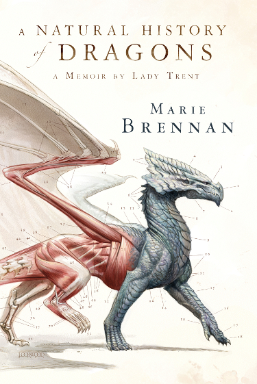
I first saw the illustration for The Natural History of Dragons by Marie Brennan in late 2012 and I knew then that the cover by Todd Lockwood, commissioned by Tor Books, would be on my favorites list for this year. The entire image, thus the entire dragon, can be seen here on Todd Lockwood’s website. You should really click over and check it out, it is lovely.
Who knew an anatomical diagram of a dragon could be so beautiful? Todd Lockwood is a talented artist whose work always catches my eye. This one was a surprise largely because the execution is different than what I am used to in his work. The dragon looks so great that I want to see it animated. I want to see it continue its walk across the cover and out of frame, tail swishing.
Great design choice to keep the background clean and the title/author font simple so as to let Lockwood’s illustration sell the book.

Last year artist John Picacio‘s illustration for The Creative Fire by author Brenda Cooper was on my list of favorites and it is no surprise that the illustration for the second novel of the duology, The Diamond Deep, is here this year. I am pleased that Pyr Books secured him for both novels as they tie together so well visually.
The two-book story is based loosely on the life of Eva Peron and Picacio captured that sentiment in the first image while showcasing a different side of the protagonist here. I have long enjoyed John Picacio’s work and felt that the cover for The Creative Fire was a turning point in his career. That is echoed in this image. Once again I enjoy the way in which the muted color scheme keeps the focus on the main character, Ruby Martin.
Martin looks so determined here and I like the way in which her suit and helmet, coupled with the view out the portal, signify a journey, no doubt a continuation of the character’s journey embarked upon in the first novel. The illumination from the portal creates a glow around the character which provides a nice visual symbolism of who Ruby Martin is and what she feels called to do.
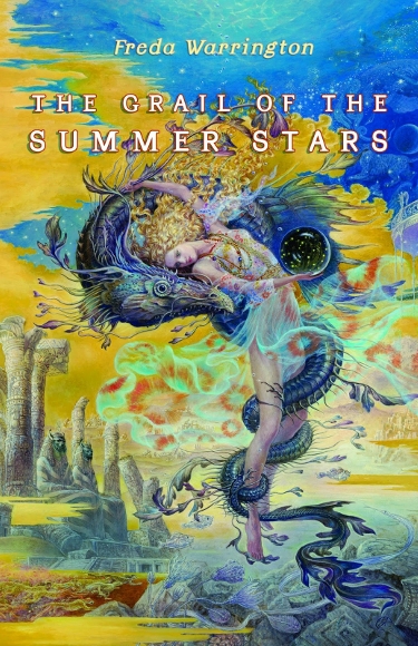
I became a fan of Kinuko Y. Craft‘s work when she began illustrating cover images for the books of author Patricia A. McKillip. It was obvious after reading some of these books that Craft either was reading the books herself or getting some incredible synopses. Her illustration for Freda Warrington’s novel, The Grail of the Summer Stars, is up to her usual quality of beautiful, graceful illustration.
Craft’s female characters are always classic and ethereal and her images are filled with items that reward careful viewing. Several of her paintings have been turned into puzzles and they are a delight to put together because of all the elements you discover as you complete it.
It seems to me to be lazy to describe this image as ‘magical’, but that is the way I feel about Craft’s work. Her work is never harsh or angular, it is always filled with these wonderful flowing curves.
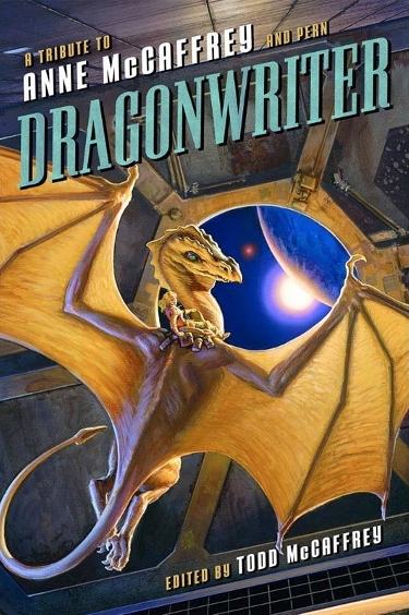
I had the privilege of seeing the original version of this painting by Michael Whelan at Spectrum Fantastic Art Live 2 last May and was also able to hear him tell the story of its inspiration. I have long been a fan of Whelan’s work, including his many paintings for Anne McCaffrey’s Pern series and Smart Pop books proved the first part of their company name was accurate in commissioning Michael Whelan to do the cover for the tribute book, Dragonwriter.
Whelan’s imagery is as iconic as McCaffrey’s creation, the two now inextricably linked. The composition of Michael Whelan’s painting demonstrates the science fictional underpinnings of what is often confused as a fantasy novel because of the presence of dragons. The dragon in the ship approaching Pern gives some background into the origins of the people and dragons who inhabit this sometimes hostile world. I love the way the dragon and the dragon rider are looking over their shoulders, gazing back towards the viewer.

Another constant on my list of favorite covers of the year has been the work of artist Daniel Dociu on the Expanse series of novels by the writing team who is James S.A. Corey.
Orbit Books has commissioned Dociu since the first release, Leviathan Wakes, and each cover tops the previous one in igniting my science fiction passions. The cover for Abaddon’s Gate is gorgeous in its use of bright yellows and oranges that light up the whole image. The ships are complex and interesting and invite the reader to pause in the reading of the novel every so often to go back to the cover to gaze and be inspired.
Daniel Dociu’s work on this cover sells the book and the designers made a great choice to not cover up too much of the art with written information. I look at this image and I want to know what inspired it. I want to climb in those ships and go on an adventure with their captain and crew.
It is safe to say now that the Dociu’s cover for the fourth novel, Cibola Burn, will be in my list of favorite sff covers for 2014.
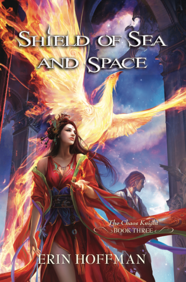
I have been drawn to the beauty of the cover art for all three volumes of Erin Hoffman’s Chaos Knight trilogy. Artist Dehong He created the works for Pyr Books for all three of these novels.
There are a lot of flowing lines and movement here, echoed in the young woman’s sleeves and hair and the flames of the Phoenix. I enjoy the way the red of her dress mirrors the deeper reds in the bird’s flames and both elements are highly effective against the cool blue background.
I also like the choices made as to where to begin the viewer’s angle of sight. Having the image pushed upward emphasizes the rise of the Phoenix while at the same time pushing the viewer’s eye towards the intricate work on the pillars and vaulted ceiling.
Though I have yet to purchase any of these books, I honestly pull them out and look at the covers any time I am in the bookstore and run across one.
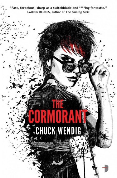
Angry Robot Books has maintained a consistent cover scheme for Chuck Wendig’s Miriam Black books and it is a look that works well. Illustrator and Designer Dale Halvorsen, as JOEY HI-FI, renders these great black and white covers, with just a touch of color, that grab your attention from across a crowded bookstore.
JOEY HI-FI doesn’t simply draw an image of the main character, which would be cool enough given his skill. He weaves in all these story elements and uses those various parts to make up the whole–the “whole” being some really flat out cool rendering.
This is the style of image that challenges you to look more closely. I would fully expect to be turning back to the cover often while reading to see if I could line up the visual clues on the cover with threads of the story. The hint of color makes the image come alive.
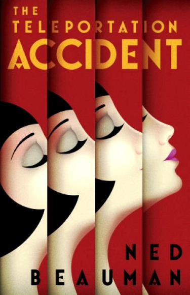
The design by La Boca for Ned Beauman’s novel, The Teleportation Accident, is fun. The book is published by Bloomsbury USA.
I enjoy the way in which the design very simply, deceptively simply, conveys the idea of teleportation. By breaking up the image of the young woman it demonstrates movement.
The choice of red for the main cover color is a good one as it makes the book stand out. I’m a fan of the style of fashion and beauty of the 20’s and 30’s and La Boca conveyed this nicely with his design of the young woman. I like the way her upturned head, closed eyes and puckering lips hint of the romance present in this novel.
I have picked this book up in the store and it is interesting the way in which the layered image tricks you into thinking you are actually going to feel those layers on the cover. It is a nice optical illusion.
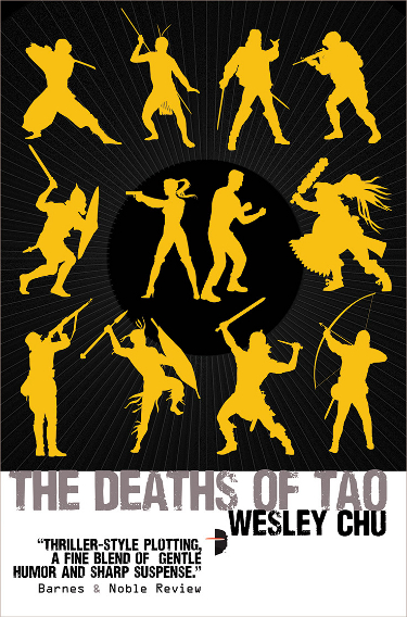
I could have just as easily picked the cover for The Lives of Tao as for The Deaths of Tao. The covers for both books were designed for Angry Robot Books by Argh! Oxford.
I must admit that I would didn’t give The Lives of Tao more than a cursory glance the first time I saw it. It took a couple of glowing reviews from readers I trust to convince me to read the book. Once I started I realized how truly brilliant these covers are.
The crux of the story involves the presence of aliens inhabiting human beings, in a partnership relationship, throughout history. Knowing that and knowing who some of these historical figures are makes the silhouettes which make up the cover design work perfectly.
I like the yellow on black and the composition of the central characters surrounded by all the others just a smidge better than the first novel cover, which is why this one gets the nod.
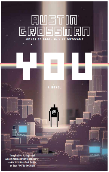
The cover of You by Austin Grossman is just plain FUN. And that is no small compliment, though it may seem so. The cover is from a video game app called Swords and Sorcery that was designed by the team at Superbrothers.
You is a book that involves gaming as a major story element and the choice to create an 8-bit style cover was a nice touch.
8-bit games could have some really garish color and I think it a nice touch that they went with a more warm palette. The mostly purple…lavender?…cover is nice. I like the added element of the person sitting at a computer screen in the lower left hand corner and other screens also glowing blue in the lower right.
And the spotlight on the black figure in the center of the book, under the large “YOU” title draws the eye.
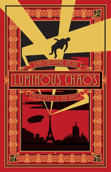
The choice of including Luminous Chaos, the sequel to Aurorama, by Jean-Christophe Valtat may not be obvious at first. Sure, the design by Mahendra Singh is really well done, but what makes this cover stand out is that its design is printed directly onto the thick, sturdy boards. This is no dust jacket, it is an old-school style book creation and it is really lovely when you hold it in your hand.
It is such a great looking book that it makes me want to grab Aurorama off my shelf so I can get to this one. Precious few books are printed this way, but those who are fans of books as art will understand why this kind of book is special.
Melville House Books has done a really nice job in creating a high quality dead tree edition, made more important in a time of growing electronic book consumption.

Though it can be easily argued that there are FAR TOO MANY photo-based or photo-realistic covers, particularly in the Teen Fiction section of the bookstore, there are always some each year that stand out and catch my attention. Cliff Neilsen‘s design for Clockwork Princess, the third volume in Cassandra Clare’s Infernal Devices series, is one such cover.
It is a stunning image, to be sure, not in any way hampered by the beautiful young woman who occupies the majority of the image. What makes this stand out for me is the muted color scheme which draws the eye to the area of greatest light and color, the book that the young woman is holding. I enjoy the way in which there are opaque layers of images in the background that reward giving it a second, and third look.
The choice of the dress with its layers of fabric and flowered bodice adds beautiful lines to the image.

Author Freda Warrington gets a second mention in this year’s cover overview, this time with an image based on photography and digital design instead of traditional painting.
This is the cover for the Titan Books reissue of A Taste of Blood Wine. I like this one for much the same reasons as the cover above. The model chosen for the center image is classically beautiful and dressed and made up gorgeously but in a classy fashion.
The background includes ghostly images of a man in uniform and candleabra which gives the cover a haunted feel which may tie in well with the book’s theme. I’m impressed with the design elements around the top of the book and the way in which the woman’s dress flows into this rich pool of blood which also makes up some design elements around the bottom portion of the cover.
I cannot readily find the designer, which could just be my oversight or may be one more thinking pointing to why I prefer straight artist work over publisher in-house design. I want to know who makes the covers. I want to read about them and see examples of their other work.

It was a cinch that the cover image for my favorite book of the year would make it to my favorite covers list. Kirk Benshoff designed the cover, using photography by Erin Mulvehill to create a cover that is perfectly fitting for the book.
Sadly the image shown online does not do the cover justice. The image on the physical book is overlaid with vellum creating an illusion of ice, a reference to the cryogenically frozen women in Will McIntosh’s novel, Love Minus Eighty. It is a great concept that is not entirely practical as vellum does not wear well. I would love to own a physical copy of this book but I’ve only seen copies in stores that look like they were kicked around the store. This was the condition of the copies I saw in my local BN on release day. I wish they could have coated the vellum somehow to give it some strength. Irregardless it is a really inspired design that fits the story wonderfully.

Oh but the folks at Orbit books are clever. This is such a fun, creative cover. The cover was designed by the wonderful Lauren Panepinto, who I had the pleasure of being introduced to at Spectrum Fantastic Art Live 2.
The photographic image is so clear that it gives a three dimensional quality to the cover, so much so that you expect to be able to pick up the book and see these large raised buttons with actual pills in them. It is another one cover that looks so much better on the book itself than the picture can show.
The color scheme is perfect, the glaring red emphasizing the danger and the blue pills standing out in contrast. The perforations where the pills can be torn off and the small bumps seen when the light shines just so on the cover give it the illusion of a tactile quality. What a great idea this was.
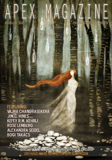
Finally, I wanted to break my “book cover” rule to include this cover for November 2013 issue of Apex Magazine. The art is by Galen Dara, and illustrator I discovered this year through her work accompanying free fiction on Tor.com.
I appreciate her style. Her works are very evocative of mood. My birthday is in November and I’m very fond of Autumn and this piece feels very autumnal. It is beautiful yet mysterious, dark and intriguing. It is an image that makes me desire a physical copy of the magazine.
When I look at this image I want to know what the lady is running from, if she is indeed running. Her looking back over her shoulder gives me the feeling she is being followed, or that she is afraid she may be being followed. I’m very impressed with the work.
Well, there you have it. My favorite science fiction and fantasy covers of 2013. It is never an easy choice but I get a great deal of pleasure out of reviewing a year’s worth of work and ruminating on why I am drawn to various images. I also like promoting artists and publishers. Books are cherished treasures, for their cover art and packaging as well as the stories they contain.
Many thanks go out to John DeNardo at SF Signal for his monthly posts showcasing all the SF/F/H books being published each month. It is where I discover so many of these great books, at great risk to my pocketbook.
Let me know what you think of these covers, where I hit it, where you think I might have missed it, and please share any of your favorite covers of the year, even those not in the SFF genre.
These are so eye-catching and imaginative. My favorite is probably Queen Victoria’s Book of Spells – so much detail that you don’t see at first glance.
Aren’t they, Tanya? I was able to see a larger image of the cover for Queen Victoria’s Book of Spells at Spectrum Fantastic Art Live 2, sans words, and it was even more impressive.
I can see why you bent the rules for the Apex cover, it’s gorgeous. Joey Hi-Fi is perhaps the only cover artist artist whose name I know and work I can identify, which perhaps tell you about the kind of literary circles I follow, but should also count as a ringing endorsement. I was no fan of Blackbirds, but I’m seriously considering getting the other Miriam Black books just for the covers.
Have you seen the slated sequel to A Natural History of Dragons? The cover for that looks just as good.
I love these posts, btw. Great to see so many great covers all together like this.
It is funny because the description of the Chuck Wendig books lead me to believe that I wouldn’t enjoy them, but the covers make me want to own them anyway.
I did just see the cover for the sequel to A Natural History of Dragons last night while I was working on this post and you are correct, it is a beautiful image.
Thanks Kamo, appreciate your comments as always.
I’ll admit to being consisantly impressed by the covers of Infernal Devises, despite never picking one up.
I wasn’t impressed by the cover for Ancillary Justice, but the full painting does make me look a bit closer and from there, revise my first opinion.
The Ancillary Justice cover isn’t my favorite of Harris’ work, but like you I was more impressed by the full image and I like it as a change from what he often does as the colors are much brighter.
All the Infernal Devices covers are nice, you are correct. They employ a uniform look which is one of the things I appreciate. It is so disappointing when, in the middle of a series, a publisher decides to change the look of the art.
If I had to pick one out of all of these, I’d have to go with the Lockwood A NATURAL HISTORY OF DRAGONS. Second place would be harder. Picacio, maybe. Or the cover for Ancillary Justice. Or Abaddon’s Gate. Or…
I hear you Paul. That’s why I didn’t choose one as my absolute favorite. Wouldn’t have been easy.
The John Harris covers remind me of SF paperback books I bought in the 1960s. My favorite is the radio-telescope on the moon. Yes, one should be there now, and it’s a shame that it’s not.
But in terms of just eye catching graphic design I like The Teleportation Accident.
The Misfortune Cookie catches me eye and makes me want to study it. But the book I’d buy because of the cover is transcendental.
Jim
I was thinking about you last night when I read this review for Transcendental:
http://io9.com/james-gunns-transcendental-feels-like-a-lost-golden-ag-1450372189
I think, based on the cover and that review (although it isn’t entirely positive) that I’m going to be buying this book soon.
One of the reasons I enjoy Harris’ work so much, referencing your comment, is that it generates a feeling of nostalgia for older SF covers.
That’s funny. I was going to comment and say the covers for Freda Warrington’s other books are great, too, but you had them covered. (I bought that book in December… And Lorrie bought me her other trilogy. Still never read anything by her.) I always love Patricia Brigg’s covers even though I personally don’t think they match who Mercy actually is as a character. Lots of other great looking covers on here. Embarrassed by how many of said books I own… I buy too many books, Carl. haha
Speaking of Mercy, I now want to know why there is a new book in her series out and not a new Alpa & Omega. I like Mercy better anyway, but I still want to see more in the other series…
I think there is a new Alpha and Omega book coming out this month…yes, Hunting Ground on January 7th! There, a post-Christmas gift. 🙂
I own several of them too and have plans to buy a few of the ones I don’t own. Those covers’ll do that to me every time.
just too many good artists eh Carl?…..
well you know my favorite so we won’t even go there! But he is fantatatic! lol
Yes there are, Pat. Too, too many. But it is a good problem, methinks.
I’m really hoping Michael Whelan will be at SFAL3 this year.
Of the covers you show, my favorites are FARSIDE, ABBADON’S GATE, and SHIELD OF SEA AND SPACE. The first two are pretty traditional in the sense they remind me of the great covers on SF novels I saw on paperbacks when I was a teenager in the late 1950s and early 1960s. Classic. The latter cover is fresh, sinuous, colorful and pretty. I like the earlier cover in that series.
I look forward to your favorite book and favorite cover posts each year. Thanks.
Those are all good ones, Richard, and a nice variety there in your own choosing. I have a copy of New Earth and plan on picking up a copy of Farside soon. I’ve not read Bova and both of these novels intrigue me.
The first cover in the series by Erin Hoffman is the best, I agree, and it is so lovely.
Thanks so much Richard, these are really fun to do.
I love the Queen Victoria one. It’s delightfully eerie. 🙂
“delightfully eerie” is a great description!
Really good selection. You have to hold the Love Minus Eighty book to appreciate it. Joey Hifi is killing it with the covers. He did a South African version of the Shining Girls with Lauren Buekes’s photos that is just stunning. A Natural History of Dragons is one of my favorites too.
I agree, Peter. It is a shame though that they aren’t more sturdy as far as the vellum goes. Still, I really desperately want a good physical copy of the book and will be making an attempt to get one soon.
I’ll have to look up that version of Shining Girls.
Interesting to see your take! I think we have fairly different tastes – I generally like ‘minimalistic’ covers (remember those ‘grown-up’ covers for the Harry Potter books, or the simple UK covers for the ASOIAF re-issues?) but I’ll join the praise for Queen Victoria’s Book of Spells. I love that title, too. 😀
Is that ‘sun and outer space’ image at the top of the page from a cover, by any chance?
I can appreciate minimalist covers if they are also artistic, like the cover for Simon Ing’s forthcoming book Wolves, for example. But I dislike the U.S. versions of the ASOIAF books, for example. They are unattractive and unimaginative to me.
The image at the top of the post is wallpaper from some free wallpaper site (linked).
Can we all say “john Harris for the Hugo!” So long overdue.
I second that!
No.
I get that he’s your friend and all, but why is it so hard to paint what’s in the book? His stuff reminds of Chris Foss, but not in a good way. A random painting of junk that doesn’t appear in the story.
It doesn’t have to be a literal transcription of a scene in the book, but it should bear some minor passing resemblance of the contents of the novel.
Michael Whelan’s covers are brilliant for exactly that reason. Nowhere in The White Dragon does that scene appear, but damn if that cover doesn’t look like Jaxom and Ruth and promise epic adventure.
While I agree with your sentiments that it is preferable when a book cover reflects something from the book, there is much in this comment that I don’t agree with. Harris and Foss have unique styles and I’ve never seen Harris do the kind of paintings that Foss does.
Secondly, of the covers shown here by Harris, at least two of them do reflect stuff from the book. Every John Harris cover for the Ben Bova Grand Tour books are paintings that feature the planets that the stories are set on so to lay a charge at Harris’ feet that his cover illustrations don’t reflect the books is not entirely accurate.
Thirdly, artists are directed by the company’s Art Director, oftentimes, as to what should be on the cover. Not all artists have an opportunity to read the book or even have a reasonable summary of the story from which to draw their inspiration.
Michael Whelan is a fantastic example as many of his covers do reflect scenes in the book. I spoke to him once in person and once via interview about this and he, like I imagine many artists, much prefer to have a chance to paint something from the book. But even Michael Whelan has SEVERAL book covers which are just purchased images of his and have nothing to do with the book other than that they somewhat reflect the book’s genre.
Again, I agree with the spirit of what you are saying but don’t agree with Harris’ work being “random painting of junk”.
Honorable mention to the cover art of The Republic of Thieves by Scott Lynch.
That is a nice cover!
The cover for Austin Grossman’s ‘You’ was designed by the team at Superbrothers. Great artists from Canada that recently worked on a beautiful iPad video game called Swords and Sworcery EP that uses the same style as the cover.
Thank you so much, when I get a chance to get a decent internet connection (I’m out of the city), I’ll make the appropriate changes to the post.
The “YOU” cover is actually an app/mobile game repurposed as the cover. The app is called Super Brothers: Sword & Sorcery EP.
Thanks Kai, appreciate the info.
Pretty happy with how these covers turned out.
—> http://transcendenttales.com/
They might be a little too “comic book” for some, especially when compared to the type of covers we are seeing lately in the industry.
Thanks for sharing the link, AJ. I think there is room for “comic book” style covers too. Variety is the spice of life, as they say.
I love the cover for Queen Victorias Book of Spells, Luminous Chaos, The Teleportation Accident, and A Natural History of Dragons (I bought this as a gift for a friend and may have to borrow it back at some point!). Apart from that one, I’ve not really heard of or read any of the others so will be investigating them.
I’d love to give a shout out to Jack Glass by Adam Roberts – A gorgeous cover that I found myself staring at for many a minute!
I too like the cover for Jack Glass, I’m glad you mentioned that one. It stands out as very different from many of the book covers which makes it stand out on the shelves as well.
I’m a huge fan of Dan Dos Santos. Several Jay Lake books have his work (Green and Endurance in particular), and I am always drawn to his covers even if I am not familiar with the author. I guess that is the point of a great cover artist.
I hope one day the ebook stores and ebook readers will highlight the covers more. They are little more than thumbnails in todays readers, and once open the book cover is impossible to see in full screen mode. This is the case where paper books (hardcover in particular) will always draw me in.
Oh yes, Ian. His Jay Lake covers are really fantastic. As are Stephan Martiniere’s Jay Lake covers. I especially like Dos Santos’ cover for Endurance. It is one of my favorite images of his.
One of the big reasons I got a color ereader was to be able to at least attempt to enjoy cover art on ebooks the way I do on print copies. It isn’t the same, but I need the color image.
Speaking of Stephan Martiniere: Marooned in Realtime (http://www.martiniere.com/shop/index.php?l=product_detail&p=45) and also Bright of the Sky (http://www.martiniere.com/shop/index.php?l=product_detail&p=3) are amazing covers.
Yes, they are indeed. I like most of Stephan Martiniere’s images. I have two signed prints framed in my living room, the image for the cover of Life on Mars and the cover for Tour of the Merrimack. Such great work. The Merrimack one is of course the same image I was given permission to use for The 2014 Sci Fi Experience.
Count me out of the Harris/Berkey/DiFate/Foss lovefest.
Surely I’m not the only one who is bothered when the cover bears no relation to the stuff described in the book. Doesn’t anyone else get annoyed by these generic covers that look like a random speed painting with a basic font slapped over them?
I have a hard time taking seriously a comment that would refer to the work of Harris/Berkey/DiFate/Foss as “random speed painting”. As I responded in your previous comment, I am in agreement with you in preferring covers that have something to do with the book. But as I explained above this is not always an artist issue and would suspect it is actually rarely an artists issue. Some of the paintings chosen for covers are done simply because the company wants a certain artist’s work, something that is available now. Several of Michael Whelan’s Personal Visions paintings grace book covers and they have no relation save general genre familiarity to the work inside the book. That doesn’t reflect on the quality of Whelan’s work, does it?
The cover art for “You” by Austin Grossman is done by the Toronto creative collective Superbrothers. You can see other artwork they did as well as the popular game “Sword and Sworcery” that made their style popular at http://www.superbrothershq.com.
Thanks Sheldon!
Orbit Art Director Lauren Panepinto created the cover design for PARASITE by Mira Grant: http://muddycolors.blogspot.com/2013/06/welcome-lauren-panepinto.html
I’m a big fan of Lauren Panepinto. Had the pleasure of meeting her at Spectrum Fantastic Art Live 2. I didn’t know if that was her cover or not, thanks for the link, I’ll make that change this weekend.
What I love more and more are the retro elements on a cover that’s obviously a modern SF narrative. A font, an image, a pose – kind of like the new line of Detroit muscle cars that pay homage to their originals – but they still tell you they are a faster ride.
I enjoy that too, and that is a great way to describe it.
Great list, and thank you for the very nice compliments.
The ‘Parasite’ cover ranks as one of my all time favorites as well. The cover effects just pushed it over the top for me. I thought you might like to know that it was designed (I believe in it’s entirety) by Orbit’s Creative Director, Lauren Panepinto.
Oops. I see I was a little late with that info. 🙂
A pleasure to see you comment over here, thanks! And I appreciate the heads up on Lauren Panepinto. I’m about to make that change in the post above.
Thank you for continuing to provide such outstanding cover work to the books we love.
I love the Patricia Briggs covers. The Love Minus Eighty cover with the velum reminds me of the cover they did for Karen Marie Moning’s ShadowFever book.I also happen to like most of McGrath’s covers.
That ShadowFever cover is really nice. I like the overlay.
Yes, Chris McGrath is one I really enjoy. I liked both of his covers for the William C. Dietz books Andromeda’s Fall and Andromeda’s Choice which came out in 2013. I like that he consistently does the Jim Butcher books. I was just on his site a couple of days ago and found images that made me go track down the books they were on to add to my list, one was the third part of a trilogy that I hadn’t known was even out.
I had to see if you had included The Teleportation Accident. My husband and I were so impressed with the cover and the premise that we bought the book the day we saw it, as a joint purchase. I am a sucker for great covers. Hope I like the book as well.
Lovely covers in this post. I love the look and feel of great book covers.
I look forward to reading your review. I vaguely remember something about the description giving me pause, but now I don’t remember what that is.
Many thanks for picking some of our Angry Robot titles (I’m the art director here), including those on books that perhaps don’t appear to be quite your thing on first glance. Job done right there, I’d say.
Hey Marc! Thanks for coming by. You guys are doing some great stuff over there. Wish I could remember what about Chu’s books didn’t click with me on first glance, but I’m glad I read it, as are the people thus far I’ve gotten to read it based on my gushing over it. Look forward to seeing what Angry Robot has to offer in 2014.
Wonderful cover artwork! Like you, I’m a big Harris fan. THE HUMAN DIVISION cover may be my favorite of 2013. Sorry about the Kansas City Chiefs in that Colts game. Luck is amazing!
Great stuff, eh George? The Human Division is one of my favorite Harris covers to date, not the least of which because orange is a big favorite color of mine.
Yes, the Chiefs shot themselves in the foot with poor defense and Luck took advantage of the wide open receivers. What an ugly game.
Hey thanks for the great in-depth cover write-ups! glad you liked so many orbit ones.
Just to clear up the Ancillary Justice issue on the cover – the full painting is for 3 covers – the first 3 books will make the full cover art when put together. (it’ll also be repeated as a 3-part spine image). Although this does cut down on John’s usual amazing dynamic compositions when looking at 1/3rd, you’ve all noted how amazing it is as a single big image. Delayed gratification FTW! I can’t wait to see all 3 in print together…
And I agree with Irene…JOHN HARRIS MANDATORY HUGO!
Now that you mention that Lauren, I remember reading that and had forgotten it. I’ll need to update the post. Can’t wait to see all those covers together, that will be fun.
And Harris will be on my Hugo ballot this year.
I still really want to read A Natural History of Dragons – but it’s the cover that makes me want to do so, mostly. It’s so perdy!
I do as well, especially as it may feature prominently in the upcoming awards season nominations. I have heard many good things about it.
Some great covers there! But you missed some of Telos Publishing’s 🙁 In particular this amazing cover by Martin Baines for Sam Stone’s KAT ON A HOT TIN AIRSHIP! http://www.telos.co.uk/wp-content/uploads/Kat-on-a-Hot-Tin-Airship1.jpg
If you are interested in topic: earn online by clicking gas oven –
you should read about Bucksflooder first