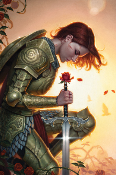
Hello fellow book lovers! Each year I look forward bringing you my annual review of the cover illustration/design for science fiction and fantasy books that caught my eye. I am quick to report that the covers showcased are my favorites. I am not an art critic; I simply know what I like. The problem inherent in an annual review is that there is always more great work than can be reasonably captured in one post.
I work from the assumption that passionate readers everywhere can relate to the hypnotic draw of a well-designed book cover. We can all relate to that feeling of being arrested mid-stride in a particular row of the bookstore, or library–or virtually in this online age–unable to resist the siren call of a book’s cover art.
In my earlier days, Stainless Steel Droppings featured art and artists on a more frequent basis and one way I would like to bring that forward is to do a monthly review of the covers that excite me for scheduled releases of science fiction and fantasy books/comics. From this monthly feature I will draw my favorites for the annual review, and this will also give you the opportunity to suggest covers I might have missed, thus giving all of us a broad view of all the worthy science fiction and fantasy book cover illustration and design that 2014 will offer.
Here is what January 2014 has to offer.
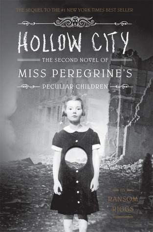
The appeal of the cover for Hollow City by Ransom Riggs, follow up to his successful debut, Miss Peregrine’s Home for Peculiar Children, is that Riggs is inspired by odd vintage photographs, several of which are the inspiration for characters in the novels. The first book featured several of these photographs and the new one promises to do that as well.
There is an interesting collector’s market for such photographs and Riggs is one of those collectors. The cover design for Hollow City is by Doogie Horner and it captures the eerie atmosphere of this science fiction/suspense series, published by Quirk Books.
On January 23rd I will be attending an author event featuring Ransom Riggs hosted by Rainy Day Books. I look forward to the event not only to hear and meet Ransom Riggs but also because I will be coming away with a copy of the book, one I am anxious to read.
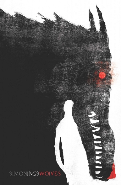
Wolves by Simon Ings, published by Gollancz, features a fabulous cover.
The illustration is the work of artist Jeffrey Alan Love. The use of the negative space to create part of the image is brilliant and the sparse color palette, particularly in choosing to emphasize black and white together, really draws your attention.
Jeffrey Alan Love has done a number of cover designs for Gollancz books which you can see on his blog.
In addition to finding the illustration interesting in and of itself, I like the way in which the cover plays off the book’s title while projecting an assumption of what the book is about, an assumption that is not entirely correct if you read a synopsis of the book. The novel features a future-tech aspect that reminds me of Love Minus Eighty while at the same time promising a much different read. I won’t simply be admiring this cover, I’ll be reading the book.
Update: I just noticed over on Jeffrey Alan Love’s blog that the illustration for Wolves won the Gold Medal in teh Books category at the Society of Illustrator’s competition. Congratulations Mr. Love!
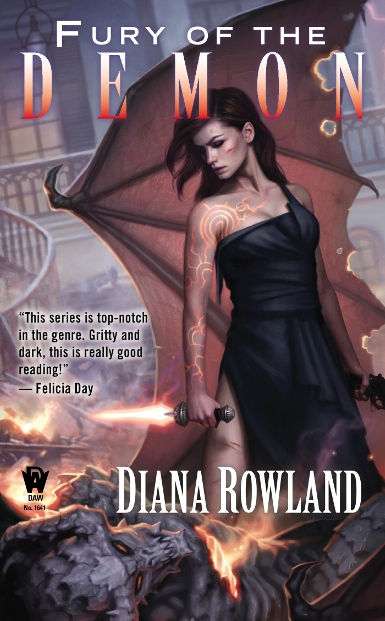
Fury of the Demon by Kara Gillian features cover art from an artist consistently on my favorites list, Dan Dos Santos. The book is published by DAW Books.
Art Directors seem to work very well with Dan Dos Santos. It is a fairly consistent trait that the title and author text, as well as any additional copy, work well with his work rather than overshadowing it. Instead of being a distraction, the print gives way to allow the cover illustration to draw the reader in. In this case the title coloring also reflects the color used in the painting which helps with the integration.
I have shared before that the color orange, in its varied tints and hues, is one of my favorite colors and the way it is used to reflect fire and light and the glowing tattoos on the main figure are of particular interest to me. I like the way in which Dan Dos Santos captures the texture and folds in the fabric of her dress. Interestingly enough the dress reminds me of the bride’s maids dresses at my daughter’s recent wedding, sans the torn strap, of course.

Solaris Books is re-issuing A Different Kingdom by Paul Kearney this month. The cover is a design by artist Pye Parr.
This is another cover whose design is effective because of the use of just a few color washes, colors that are very complementary. The blacks stand out and create a nice sense of atmosphere in both the shadows of the church and in the trees.
And oh, what trees. I am very fond of trees and Parr’s small forest has some great tree shapes.
Also striking is the angle at which the image is set. Not having read the story, I am unsure as to the significance of the circular shape in the center of the image. Pertinent to the story or not, it adds a nice design element to the overall piece.
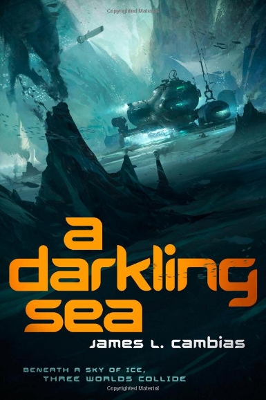
I have long been in awe of the sea. I remember in elementary school wanting to be a marine biologist, not because of a fascination with biology but because I had this romantic image of being able to spend my days exploring the deliciously frightening wonders of the ocean depths.
The cover for the debut novel by James L. Cambias brings back those adventure-filled daydreams. Tor Books is publishing A Darkling Sea this month, the cover art is the creation of Thom Tenery, who created concept/design art for my favorite film of 2013, Oblivion.
I look at this cover and I long to be on that undersea adventure. I want to know all the details of the moment this image captures. I have read some criticism of the color choice for the book’s title but it is not an opinion that I share. The cover art is effective because of its darker tone, given that it is set in the depths of the ocean. In order to make sure that the title information is not lost in that darkness, the choice of a bold color is wise.

I am a big fan of the Eddie LaCrosse books, though I must confess being a few novels behind. Forgive me Alex Bledsoe. I do keep buying the books though! The first novel in the series featured great art by Justin Sweet. Along the line the series left that publisher and was acquired by Tor Books. I miss Sweet’s art, but the photographic illustration by artist Larry Rostant imagines Eddie in a way that I can get behind.
I like the choice of model used for LaCrosse. He isn’t Fabio-manly, which I appreciate, and Rostant makes sure to establish him as a rough and tumble character. The cover for the recently released He Drank and Saw the Spider might be my favorite of the Rostant covers.
I like the choice of the earthy colors and I love that title font for these particular books. If you are not reading the Eddie LaCrosse books, you are missing out on some fun story telling.
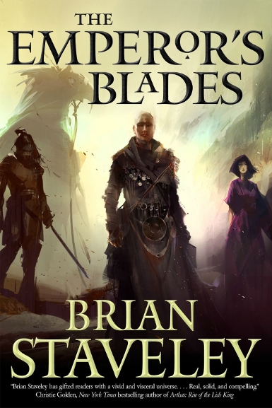
At the risk of turning this into the Tor Books Show, I had to include Richard Anderson‘s cover art for The Emperor’s Blade by Brian Stavely, out now.
The first time I was exposed to this style of art was in seeing concept art for movies and video games and I cannot help but classify it that way when I see it, which is undoubtedly an inaccurate descriptor.
There is an impressionistic feel to this work. I enjoy the way in which the work has that unfinished quality that attracts me to the aforementioned concept art.
If you look closely at the image you can see how the light shines on the title text. The dust jacket has the raised lettering that I am so fond of. It gives that wonderful texture to the book when you are holding it in your hands. If you follow the title link above the first seven chapters of this novel are available on Amazon Kindle for free.
And finally, the image that opened this post is the gorgeous cover art created by Dan Dos Santos for Issue #136 of Fables. It was technically released the last day of December, but I am cheating because a) it is beautiful and b) I didn’t pick up the issue until January.
What really needs to be said in defense of this being “eye-catching”? I mean, Wow!!! Dos Santos creates such interesting texture in his paintings. I look at this and get the impression that if I reached out to touch it I would feel the contours of the design on her armor.
It is absolutely beautiful.
Dan Dos Santos is one of many artists that will be featured at this year’s Spectrum Fantastic Art Live 3. Tickets are on sale now, you won’t want to miss it.
Well here is where you get a chance to contribute to this discussion. Not only can you share your feelings about the art I chose as standing out for the SFF released in January 2014, you can suggest your own favorites in the comments section and I will, as time permits, post those images here at the end of this post. Check the date to be sure that the cover image is for a book, etc. with a January 2014 publication date. If it is later in the year, save it until that month’s post comes along and I will include it there.
I love the simple yet telling cover of Wolves. Those are the type of covers I like have people see me reading. It just catches the eye and interest. Maybe I am a bit vain about what people see me reading =)
I think we all might be a little bit that way, Nathan. And of course the opposite holds true of books we like to read with covers that make us want to hide them away.
You should check out Love’s other similar covers for Gollancz on his blog, they are equally compelling.
I love all the covers! Dan Dos Santos is terrific! You have a great eye for fine art.
He is pretty special, isn’t he?
Hi Carl, thanks for the kind words about the Different Kingdom cover! The trees took me absolutely bloody ages, so I’m really glad thats what struck you when looking at the art!
I think my favourite in this list has to be the Wolves cover though – amazing stuff
I can only imagine. Last night as I was working on this post I saw your cover for the next Kearney book and it is equally great. I suspect when the time comes it will wind up on that version of this post.
gorgeous artwork!! The Paul Kearney and James Cambias immediatly draw my eye!
Have a blast at the Ransom Riggs event! You’ll be doing a post all about it. . . right?? of course you will!
Oh yes, certainly. This independent bookstore is so active in bringing in authors, I am so happy that they make the effort. I was able to meet Hugh Howey through one of their readings.
I’m really excited about reading the Cambias book.
Wonderful art! I especially like the Dos Santos, really gorgeous.
Makes me proud to be a fan of genre art.
Curious use of lighting in that cover. The sun seems to be behind the subject yet the armor is lit and there is even a reflection on the sword blade…
Yes, I hadn’t noticed that. I love the way the light behind the knight is rendered. So beautiful.
I really want to read the new Eddie LaCrosse but I have read the series out of order, want to do it from the beginning, and can’t find my copy of book 1. 🙁 I love the covers, too. I also really like Peregrine books. The inside is usually just as nice as the outside, but I haven’t read the new one yet. (I do have it, though.)
I was tempted to start reading the new Eddie LaCrosse when I brought it home earlier this week but I am going to be good and read them in order. Alex Bledsoe posted a really great, non-spoiler article on his blog recently about what he will and won’t do with Eddie and is girlfriend and I was most pleased.
Dos Santos does do lovely covers. I quite like the pye parr cover also, the trees are gorgeous, you get the feeling that the flip side city image is English Countryside/European and the tiny wolf running out of frame on the right… 😀
I just discovered the Eddie LaCrosse books yesterday! now that I know you like them, they’ll get bumped further up my read list! 😀
I can’t tell you how many times I looked at that Kearney cover before I noticed the wolf.
The Eddie LaCrosse books are such a fun genre mash-up. I don’t see enough people reading/talking about them, which is a shame. I am glad they are doing well enough that Bledsoe keeps writing them and Tor keeps publishing them.
I’m a big fan of the simple yet striking covers, and I think the Wolves cover is right up my street. Looks awesome.
I’m also a big fan of the Eddie La Crosse books too, but I didn’t like the last photo cover, that new one works really well for me though.
There was something about the overall color of the last LaCrosse book that made it my least favorite of the bunch. This one feels like it has a similar tone to Dark Jenny while being its own image, if that makes sense.
Simple design, when done well, can really be striking.
Oh, my. that cover for Wolves is gorgeous.
Isn’t it great? You really should check out the other Jeffrey Alan Love covers for Gollancz books. I want to own them all.
All of these are gorgeous covers, and there is a lot of variety in the styles. I want to read the series by Ransom Riggs; my husband has both books so I will get to them sometime, soon I hope.
Aren’t they?
Has your husband read them both?
My husband has read only the first one. The 2nd just arrived in the mail recently. He is looking forward to reading it.
I saw it in the bookstore the other day and was tempted to buy it even though I already have, lol, since I’ll get it at the book signing and was pre-purchased.
Fantastic post. My favourite is A Darkling Sea because like you I have a ‘sea’ thing going on. LOL. Off to AmazonUK now to look the book up as it sounds rather good.
Thanks Cath. I’m really looking forward to reading that one here in a few weeks.
Thank you so much for the kind words about my work – it’s greatly appreciated!
You are very welcome, congratulations on the Gollancz gig, those are such great images.
The Fables cover is amazing. I’m a sucker for some shining armor. I also like the Parr cover.
The Wolves cover is… interesting. I don’t know if I love it, but it certainly draws your eye. If I saw it on a shelf, I would have at least picked it up to see what it was about.
Have fun at the Riggs event! Yay for indie bookstores!
The art for the Wolves cover is certainly of a particular style that I can see some loving and others not. I think if I had seen it on a shelf I would have assumed it was a book about werewolves and wouldn’t have picked it up (not that there is anything wrong with werewolves), so I’m glad the cover drew my eye enough to research it and find out that the book actually sounds like the kind of science fiction that I enjoy.
Great choices! I love book cover art, especially SF/F.
I’m trying to decide what order to read the Eddie LaCrosse novels. I read “The Wake of the Bloody Angel,” but none of the others, and am not sure whether to start with the next one or go back to square one. 🙂
I would certainly recommend going back to the first one next. It really does set the stage for who Eddie is and why he does what he does.
Ok, I’ll start with the first one then. 🙂
Of what you show, the cover for A DARKLING SEA is by far my favorite. I don’t care much for “photographic art”, and other covers, though fine graphically, just have no pull to me.
Yes, Darkling Sea is great. And I’ve read some early promising reviews, which interests me even more.
I meant to say… except DIFFERENT KINGDOM, which is smashing.
Yes it is, and his cover for the next book is great too.
I think you’ll enjoy it. And by the way, this article by Alex Bledsoe regarding his inspirations for each story is interesting:
http://www.tor.com/blogs/2014/01/sources-of-inspiration-eddie-lacrosse?utm_source=newsletter-