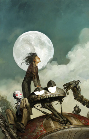
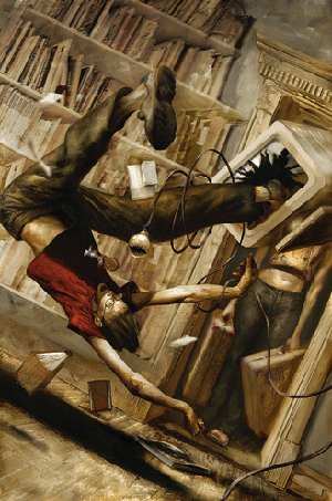
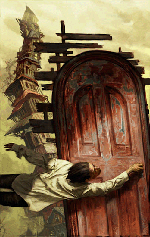
Category Archives: Art/Photography

Friday Favorites: John Jude Palencar


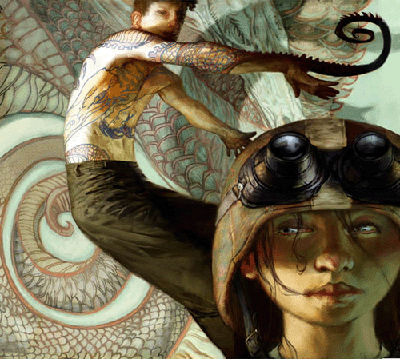
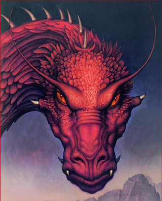
(Cover to Eragon by Christopher Paolini)

A favorite artist of Jeff and mine, John Jude Palencar, is also a source of frustration. Palencar isn’t a true “Friday Favorite” in that he doesn’t have a website, nor are there any current art books with his work in them.


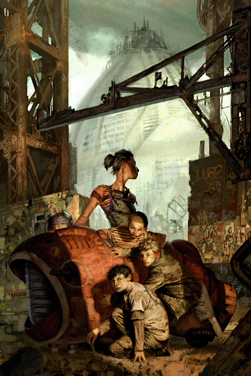
(Cover to Eldest by Christopher Paolini)

John Jude Palencar is an illustrator whose works have graced hundreds of book covers over the years and yet examples of his artwork are hard to come by even on something as grand as the internet. The reason why is a complete mystery to me. Thus, in honor of Jeff’s birthday yesterday, I am bringing you the work of John Jude Palencar in mostly book cover form.

Continue reading Friday Favorites: John Jude Palencar →

Friday Favorites: Jon Foster


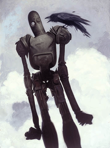
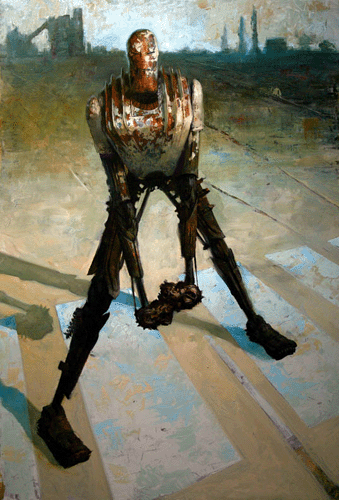
(Crowbot…cover to Progressions: The Art of Jon Foster)

Jon Foster is an amazing artist who first came to my attention with the above image because, let’s say it together now, “I like robots!”. In fact this is still one of my favorite robot images…I like crows too, big creepy birds that they are. I decided to feature Jon Foster today because a portion of his work fits in real nicely with one of the subjects of the last post: Star Wars.


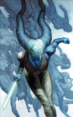
(Cover to Star Wars comic #33)

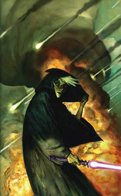
Jon Foster has done a number of covers for Star Wars books as well as the Dark Horse line of Star Wars comics. His comic imagery has been very dark, focusing on storylines of characters who fall into the evil category.


(Cover to Star Wars comic #30)


(Cover to Star Wars comic #35)

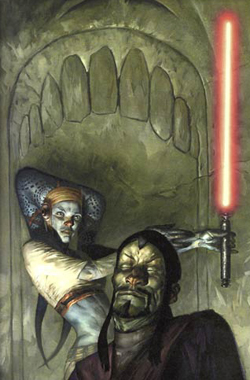
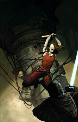
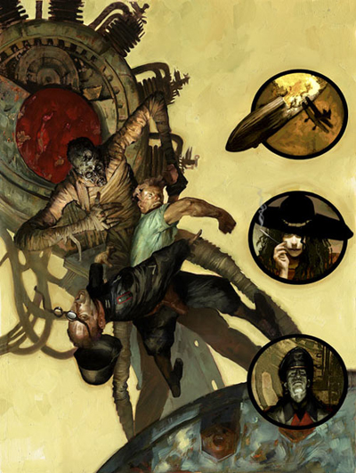
Foster utilizes models, most notably his wife Melissa Ferreira as well as friend Lars Grant-West. In this article you can see how he used them both to form the reference for the image of bounty hunter Aurra Sing:


(Cover for Star Wars #28, The Hunt for Aurra Sing)

Jon Foster then uses the photo reference as a basis for his oil painting. After a painting is finished he occasionally uses digital media to tweak the colors. I suggest going to the above linked article to see some more dark jedi art and to read more about Jon Foster. One of the pictures in that article is of a Star Wars roleplaying book featuring Mara Jade…I love the way he paints her.

Jon Foster paints some excellent Star Wars art but in addition to that he has illustrations gracing book covers all over the local bookstore. One of my favorites is for the Young Adult Fiction book Orvis. It is a wonderful story that I was drawn to because of the cover (wonder why?):


(Cover to Orvis by H.M. Hoover)

If you look here you can better see how Foster altered the picture to make it fit the story.


(Cover to Books of Magic comic)

Jon Foster’s art is extremely kinetic. His characters are often long and lean and have such severe, abrupt movement to them. At time it feels as if the characters are being ripped off of the image.


(Cover to Conrad’s Fate by Diana Wynne Jones)

It is as if he captures the action in a moment in time and can paint that energy of movement into each piece. Another cover that I really like is this one from Timothy Zahn’s Dragonback series:


(Cover to Dragon and Soldier by Timothy Zahn)

In fact all the covers from this series are excellent Foster works and I am tempted to buy the books just for the covers. Timothy Zahn is of course famous for his trilogy of novels set after the events of Return of the Jedi. These were some of the first post-trilogy novels to come out…see how this all comes together!

Whether he is painting gritty urban science fiction images like this


(Cover to The Earthborn by Paul Collins)

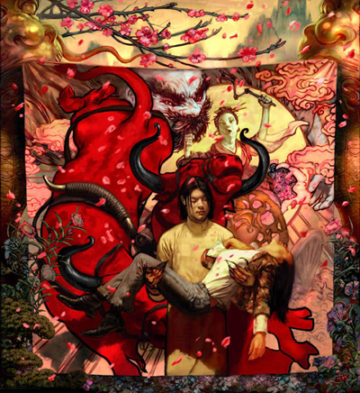
or the James Jean-esque images seen in the following two illustrations, his work is rich and vibrant and the colors practically glow.


(Cover to Snake Agent by Liz Williams)


(Cover to the forthcoming Demon and the City by Liz Williams)

Jon Foster is one of the first artists I gravitated to when I started buying the Spectrum art books and it should be easy to see why. His active illustrations draw the eye immediately when walking down the book aisle and they practically call out to one to purchase said book, regardless of the contents. Lucky for us it appears that Jon Foster has done the covers for some incredible authors on a number of books that I intend to pick up.

The combination of the subject matter, the rich oils, and the frenetic movement of Jon Foster’s illustrations will keep me coming back to his site to get more. I wish you a happy, wonderful Friday and a terrific weekend. I will be with the family in St. Louis checking out the sites and look forward to sharing thoughts and pictures upon my return. Talk it up out there this weekend as I won’t be around to keep the conversation going. As I go I’ll leave you with the obligatory robot picture. You know you want it.

Friday Favorites: Jeff Soto


(The Protector. All pictures copyright Jeff Soto)

A little over a year ago I picked up my first copy of Juxtapoz magazine and was fascinated by the many and varied examples of underground, urban art. I occasionally pick up a copy depending on my interest in the featured artist and I can always count on coming across at least one work by Jeff Soto.


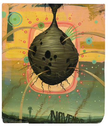
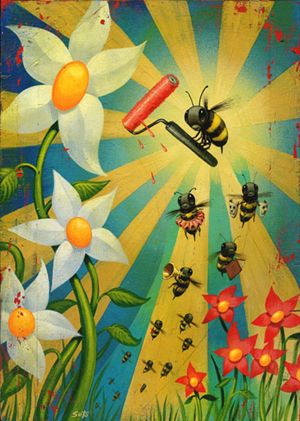
(November Beehive)

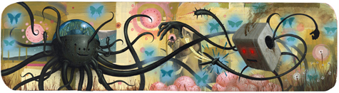
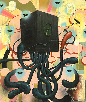
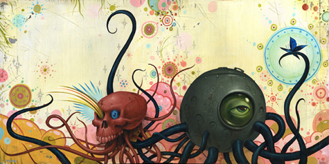
There is so much going on in a Jeff Soto painting and that amalgam of images and symbols along with the warm, vibrant colors are what immediately caught my eye and is part of what keeps me coming back for more. There is a wackiness to Jeff Soto’s work that is very attractive. That and the fact that there are robots! (Do you sense an ongoing theme here?)


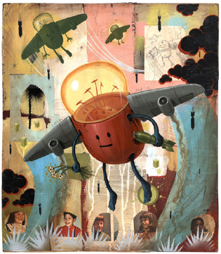
(Savechildren)

It is always interesting to read interviews with artists whose work you connect to. Sometimes the differences between you and the artist is a chasm and other times there is an instant kinship that illuminates a reason for your attachment to their work. The connection in the case of Jeff Soto is due to childhood interests.


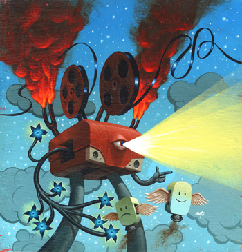
(Film Monster)

Born in 1975 Jeff grew up fascinated with Star Wars, Robotech and Transformers. Those things, and nostalgia for his childhood in general, are reflected in his creations. Jeff Soto is a man after my own heart: he continues to collect toys, build models, and embraces his childhood through his work.


(Butterfly Swarm)

Jeff Soto’s art is filled with the things that interest him: the aforementioned robots, cacti, retro science fiction, the skateboard scene, graphitti. I also see a 70’s sensibility given a modern twist. In an interview here he expresses that he likes to juxtapose images of nature with man-made things like weapons. He states, “I like to combine beauty with destruction”.


(The Duel)

Despite some obvious state-of-the-world reflections in his art Soto’s desire is to convey hope with his paintings. That hope can be seen in the flowers and plants and other things of nature in his work.

Jeff Soto’s works are often a combination of layers of painting, collage, drawing…he builds on each piece until he feels it is finished. Jeff’s more recent works show a trend towards painting only though these continue to exhibit depth. I also enjoy the fact that Jeff Soto often paints on old pieces of wood, etc. that lend an interesting texture to his work.


(Box Jellyfish: an example of collage can be seen in the naked lady in the lower right-hand corner and the writing up above)

As I mentioned before, one of the things that struck me right away was the colors Jeff employs. There is a unity in the color scheme and the warm tones blend together so well. I especially love the pinks and greens. The images themselves are often so outlandish and bold that I appreciate Soto’s use of a more delicate palette that enhances rather than detracts from the images. There appears to me to be an Asian influence in Jeff Soto’s work as well. Not traditional Asian, but the kind of influence reflected in the vinyl toy craze that is sweeping Japan and making its way over here. Jeff Soto is actually on the forefront of blending these two mediums as one of his characters has been made into a toy and a really cool vinyl toy is in the works (prototype viewable here. It has to be really cool to see one of your two dimensional creations being made into a 3 dimensional product, especially when it is being done so well, and I am really excited for him.


(Halifax)

In addition to his painted work Jeff Soto has done alot of what is termed “installations”. An example can be seen here. These art installations include paintings and other 2 and 3 dimensional items and the results look so cool that it has to be amazing to see one of his gallery shows.


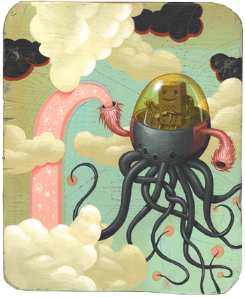
(Snowmaker Octopi)

The art of Jeff Soto and a few of his contemporaries (who I may feature in the future) is really enjoyable and I remember being so floored by it the first time I saw it. Week after week it can be hard to describe a person’s artwork in such a way that is different from what I said about the last work I featured and that is why I am so glad that I can post pictures. That way I can just say “Look! Enjoy!!!”.


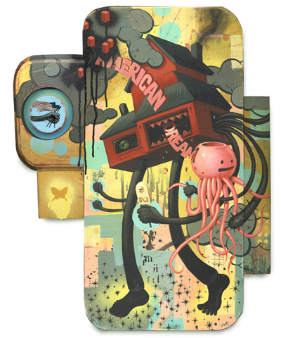
(American Dream)

And the works of Jeff Soto can be looked and and enjoyed over and over. The amount of detail going on encourages repeated viewings and while the work can seem somewhat abstract there is a concreteness to the subject matter that ties it all together.

Some weeks I know way ahead of time what I am going to post on for Friday Favorites…next week for example is all planned out and it will make perfect sense when you read it. This week, however, I really poured through my favorites files to find something that would jump start me. I always want to do justice to the artists whose creations I bring to you. I was feeling so uninspired until I got down to Jeff Soto and it was almost like I could here Emeril’s “Bam!” in my head and I knew this was the week for Soto.


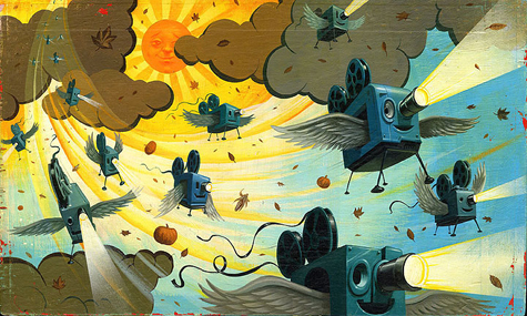
(Flying Projectors)

I have really enjoyed sharing Jeff Soto’s work with you and want to point you to some more sites to take in more of his fascinating paintings. You can see a picture of Jeff Soto here. Much more of Jeff Soto’s work can be found at the Jonathan Levine Gallery. You can find even more examples of Jeff’s work here and here. Jeff Soto also has a book out with some of his artwork entitled Potato Stamp Dreams (limited edition and regular edition can be seen here).


(Falling)

Have a creative, inspiring Friday and rest of the weekend everyone!

Friday Favorites: Robert McGinnis

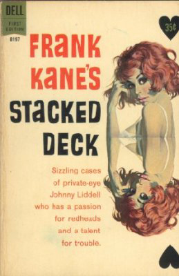
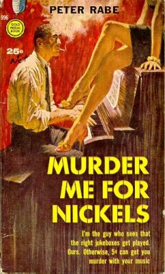
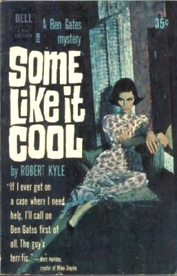
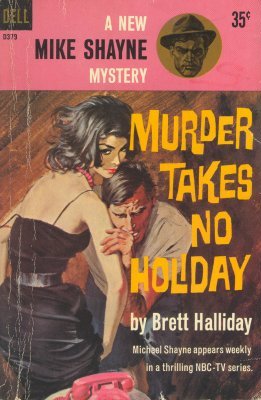
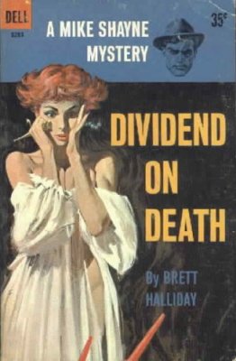
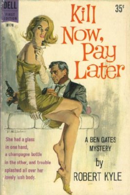
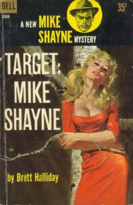
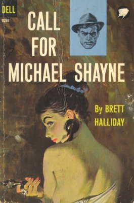
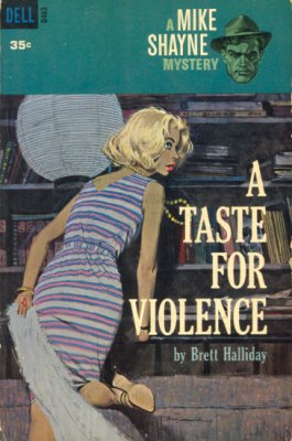
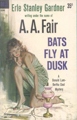
(Today’s post is a click-fest. Click almost all the pictures and you’ll find the paperback cover featuring this artwork. Most links will take you to further pictures as well. Click away! Not only is it interesting to see the artwork on the actual covers, but you will also discover some very melodramatic, entertaining tag lines.)
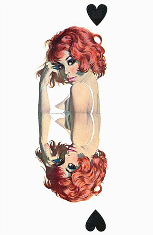

(Redheads in artistic images are my favorite and McGinnis captures the look so well.)

Today’s Friday Favorite features the incredible paperback cover art of Robert McGinnis. A few years ago while surfing the internet I discovered the work of Robert McGinnis and had an instant deja vu experience. The artwork looked so familiar. Starting with his first cover in 1958, Robert McGinnis has painted almost 1,100 paperback covers. Eleven hundred!!! No wonder his works looked familiar. Gracing the covers of mysteries, detective stories, westerns, romance, gothic tales and adventure stories the work of McGinnis was all over the place when I was growing up.


(I love the creepy hand shadow looming on the wall!)

Good book illustration draws one to the book and it is easy to see that McGinnis’ images are eye-cathcers. Like Frank Frazetta, the prolific nature of Robert McGinnis has made his work recognizable to the point that his female illustration style is referred to as the McGinnis Woman. There is so much detail in his characters, usually juxtaposed against a very sparse background which keeps the emphasis where it should be.


(I love how the yellow and white tones balance out the composition. There is almost a ying and yang thing going on there.)

And his use of lighting is masterful. Many of his illustrations demonstrate just how well he understands light and shadow and he uses it so perfectly to emphasize just the right areas of each painting.


(There’s a sexy Casablanca feel to this one.)

With nearly eleven hundred works to choose from it was difficult to decide on the art for today’s post. To my knowledge all McGinnis’ works are not online but thanks to the dedication of Graeme Flanagan there is a proliferation of images out there from which to choose. Mr. Flanagan was gracious enough to allow me permission to use artwork from his page and every book cover you see when you click on the various pictures is from his site. Graeme’s site is a gold mine of images and information about Robert McGinnis, a site for both the casual and hard core McGinnis fan to enjoy. The main images used on this post are from the Painted Anvil site. Visit both sites for a much greater appreciation of the talent of Robert McGinnis.
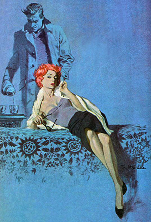

(The blue lends such depth and focus to this piece)

The colors used by Robert McGinnis no doubt reflect the era in which he was doing them and they create such a sense of nostalgia for me.

His use of color and light and the positioning of the subjects creates great mood and atmosphere in each piece.
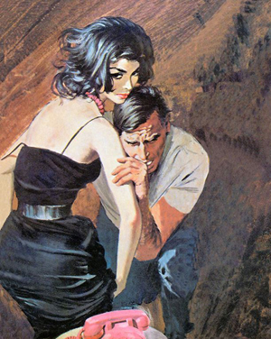
Most of McGinnis’ covers lean more towards stylized but realistic images though some of the less polished works look to me like the kind of art that would have influenced comic creators like Joe Chiodo and J. Scott Campbell.

Whether it is grizzled detectives or sultry seductresses, it is obvious why Robert McGinnis’ art lives on so many paperback covers the world over.

Like many similarly composed novel covers of that era I had always assumed that the interior stories would not hold up to the same quality as the artwork that sold them. Thankfully due to the blog sites of authors like James Reasoner and Bill Crider I have been discovering that there are some really good books out there and I actually own a few of them. I now look forward to giving them a good read.

It is amazing to me that anyone can paint this well. McGinnis’ attention to detail, from individual strands of hair to the light glinting off lip-stick covered lips or the cold steel of a revolver make each piece seem so alive.
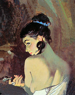
Although many of my favorite images come from the detective and mystery novels, Robert McGinnis has done a great deal of other types of cover work. Of the gothic romance novels that feature his art, my favorite is here. Of the more popular books that feature artwork by Robert McGinnis you may recognize that of Where the Red Fern Grows and my second favorite of the Anne of Green Gables series, Rainbow Valley.

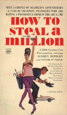
In addition to his book cover work Robert McGinnis has done a vast number of movie poster work including How to Steal A Million:

and the iconic Breakfast at Tiffany’s:

both of which tie in quite well with yesterday’s post! Robert McGinnis can capture such great likenesses as evidenced in this Bond poster featuring Sean Connery.

In wanting to find out more about him I recently purchased the excellent Art Scott/Dr. Wallace Maynard book The Paperback Covers of Robert McGinnis. In addition to 250 examples of McGinnis’ published works there are rough sketches, model reference shots, and the entire bibliography of the 1,068 books he had done covers for up until the year 2000. Robert McGinnis’ body of work has continued to grow since then and despite being 80 years of age he has recently produced covers for a number of new and reprinted works coming out under the Hard Case Crime label. These latest works can be seen here: 1, 2, 3, 4, 5.

There are also some novels with some hilarious, over-dramatic tag lines that I just had to include (click on titles for the image), my favorites are: Girl on the Prowl, Don’t Speak To Strange Girls, The Homicidal Virgin, and Francesca. Reading the tag lines aloud in the movie-tone voice brings about the desired humorous effect.

There are a few other sites besides the ones linked to above in which to satiate your desire for more McGinnis goodness: Vintage Paperbacks and Leifpeng’s Photo Set.

The art of Robert McGinnis: his sexy women, suave detectives, gothic romantic damsels, western portraits and his other many and varied works won him induction into the Society of Illustrator’s Hall of Fame in 1993 and it is well deserved.

The work of Robert McGinnis is recognizable for his iconic femme-fatales and its retro sexy appeal and I have enjoyed bringing his work to you (twice…explained in the comments section). I hope you all have a wonderful Friday and a fantastic weekend!

Friday Favorites: Chris Turnham

Each of the following images can be clicked on to open a larger version. I do this because the work looks so much better in a larger format.

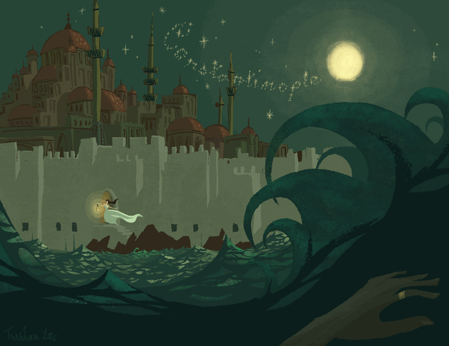
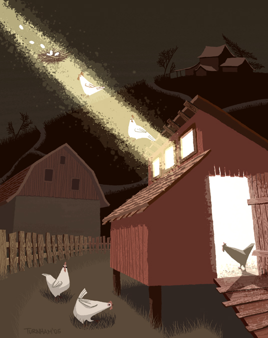
Yes, despite what your calendars tell you it is indeed Friday. Or it will have to be for this week because Friday I will be posting a review of Silent Hill. And so not to deprive you of my Friday Favorites I give it to you a day earlier. Chris Turnham is a recent discovery for me but one I am thrilled to have made for many reasons. A visit to Chris’ site will reveal not only a sampling of his amazing 2 dimensional work, but also his 3 dimensional work in the computer graphics/gaming realm and some really great animated work in progress.

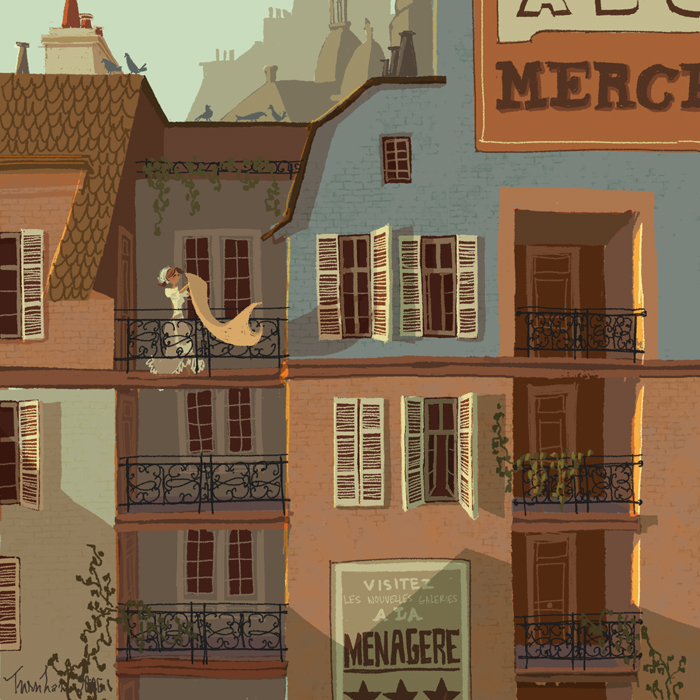
One of the things that impresses me about Chris Turnham’s illustration is his use of light and the light source. I really love it in the image above. You can really sense the rising of the sun (or setting depending on your interpretation) and the glow it gives to different surfaces of the building. I also enjoy the light given off by the moon in the picture at the top of this post. (Did you notice the hand in the lower right corner?)

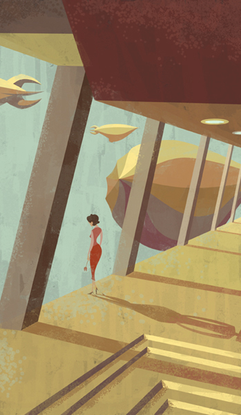
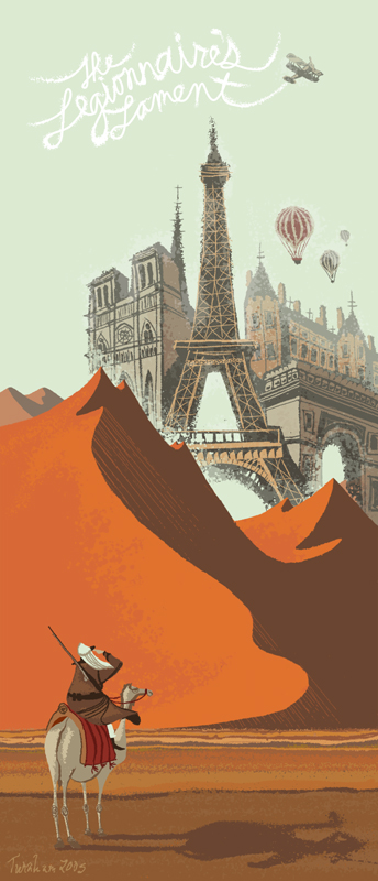
Chris’ work features a muted color palette and line work that reminds me of 1950’s and 60’s ad illustrations and cartoons. I really like that also. And of course I like blimps, so my attraction to the above image was a foregone conclusion.

This style of art is reminiscent of Darwyn Cooke’s work on the New Frontiers series that captured my attention last year. Cooke’s work has a slightly more modern cartoon feel to it but I get the same nostalgic vibe off the work.

There is a real sense of fun in Chris Turnham’s work as well.

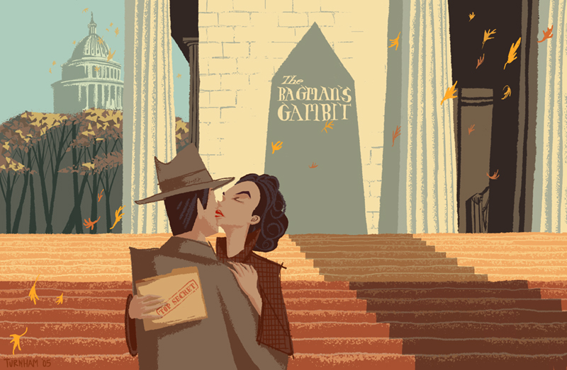
Orange in its various hues and tones is a favorite color of mine and there is a healthy use of this color in Turnham’s work that pulls me in.

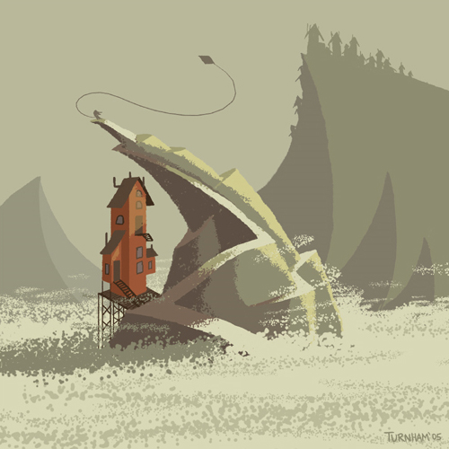
Chris’ two dimensional work also consists of a number of concept art pieces for an animated film Abigail Frett and the Fifty Foot Threat that Chris is working on with his roommate Kevin Dart. There is a website with more concept art and preproduction workings for the film here. The preproduction art consists of a number of pictures of Abby flying a kite atop a twist, craggy hill next to an interesting looking old house. There is a real sense of adventure to these pictures and I hope you check out the rest on his website.

If you go to Chris Turnham’s 3 D portion of his site, located here, and scroll down you will come to a link for an animated short that Chris did with his college roommates. If you are a fan of Tim Burton’s work, most especially of his animated short Poe, then you really should check out Gertie Gutless. It is a brief but fun film that is worth the download time to watch.

I enjoyed sharing something a little different with you this week and hope you continue to tune in for more.