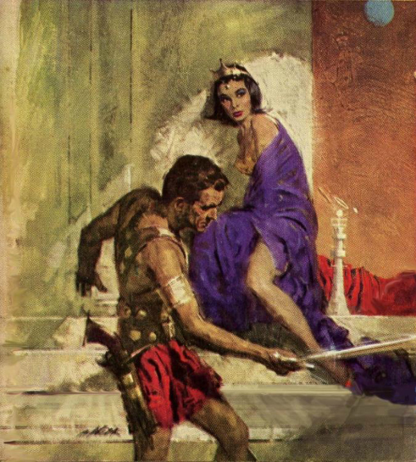
I’m pretty psyched about Edgar Rice Burrough’s Barsoom series right now. As I mentioned in my review of John Carter the movie, I started reading these stories not all that many years ago and they have not been far from my thoughts since cracking open the cover of A Princess of Mars. One of the most prominent reasons for that is the many and varied artists who bring their own unique style to ERB’s characters. As I anxiously anticipate my second theatrical viewing of John Carter (happening tonight), I thought it might be fun to share a little of that art with you.
Artist Robert Abbett created the above image for the 1963 Ballantine version of A Princess of Mars. It is a lovely work and is a cover I have yet to collect. Dejah Thoris is a real beauty in this illustration, calling to my mind a young Elizabeth Taylor.
Come along with me and check out some more artwork. I hope you have fun and share what is one your mind.
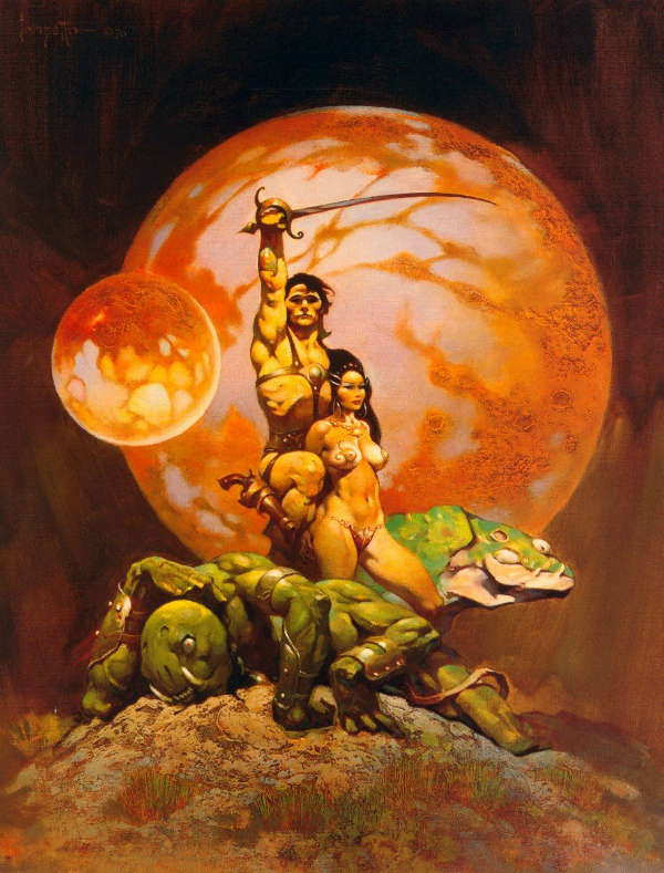
Of course the first that comes to mind when I think of John Carter and Dejah Thoris is the cover created by the one and only Frank Frazetta. I’ve waxed poetic about Frank Frazetta before (part 1, part 2, part 3) so here I’ll be brief. Frazetta’s men were towering pillars of strength and his women were sensuous and curvaceous. When I think of any of the works of Edgar Rice Burroughs, my first thought is always of Frank Frazetta. I have a small collection of Frazetta ERB books that I do hope to add to one day.
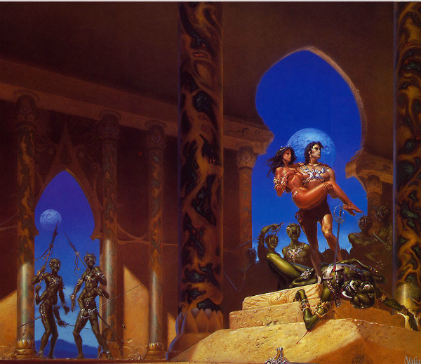
The above illustration by artist Michael Whelan graces the cover of the paperback copy of A Princess of Mars that I first read 5 years ago and am reading again today. Whelan manages to capture the largely unclothed nature of the humanoid women as described by Burroughs without creating a cover that would have to wear a paper covering to protect the eyes of the innocent.
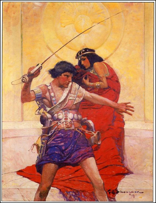
Frank Schoonover created this cover image for the first hardback edition of A Princess of Mars. The story had been serialized in 1912 and was later gathered into book form in 1917. Schoonover studied under the famous artist Howard Pyle, perhaps best known for creating the version of Robin Hood that is best known today.
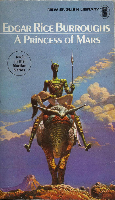
Artist Bruce Pennington created the illustration for this 1975 New English Library release. I hadn’t recalled seeing this one before I began image hunting but I must say that I like it. There is a bit of a Whelan feel to the rendering of Dejah Thoris and in some ways this Thark looks more like the way they were created in the film.
In addition to cover illustrations, a simple Google Image search of “John Carter” or “Dejah Thoris” will generate a plethora of artistic renderings. If you do so be warned, a great deal of NSFW imagery will come up. There are artists of great talent the world over who have not hesitated to present Dejah Thoris as Burroughs describes her. Some of the safer images that I liked are included below.
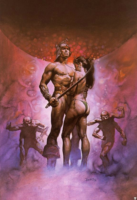
This Boris Vallejo image was a new discovery for me as well. I like the work of both Boris Vallejo and Julie Bell and yet my preferences generally lie with the Frazetta style. I do like this image though, despite the fact that Dejah Thoris looks a little to timid in her pose. Though I suspect that is not the image that Boris was trying to convey, but was instead wanting to demonstrate that Dejah has a nice derriere. 🙂
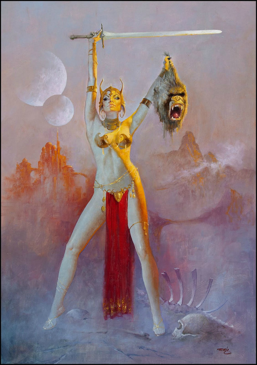
Artist Enrique Torres-Prat’s vision of Dejah Thoris calls to mind the work of artist Jim Silke as well as Frank Frazetta (in the clothing, particularly the headdress).
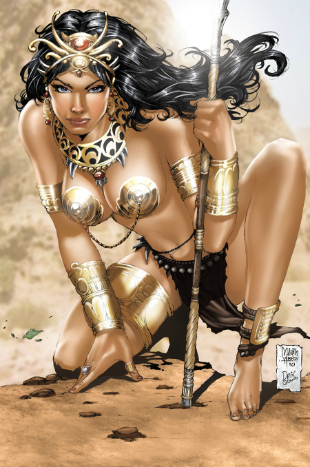
The most abundant imagery to be found when searching for John Carter inspired artwork is of the comic book style. Artist Marcio Abreu and digital colorist Drix created this fine example.
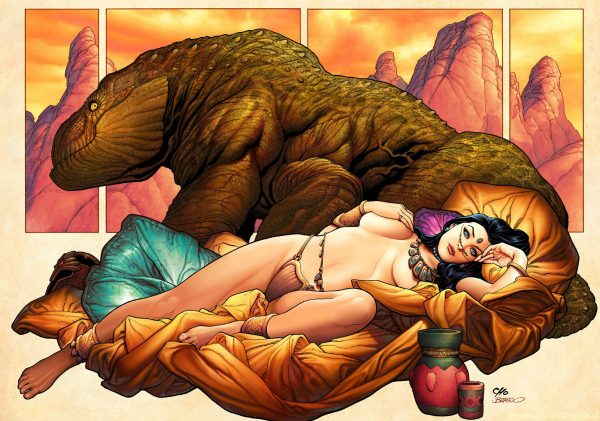
Perhaps the most famous, and certainly one of the most talented, comics style artists to render ERB’s Barsoom heroine is artist Frank Cho. Cho’s women hearken back to the work of artists like Frank Frazetta, who weren’t afraid to show that women need not be rail thin model types to be attractive. Frank Cho’s line work is some of the most gorgeous work you’ll ever see.
And before I close the post I couldn’t resist sharing a couple of images from another favorite of mine, artist Roy G. Krenkel, Jr. His illustrative work is first rate.
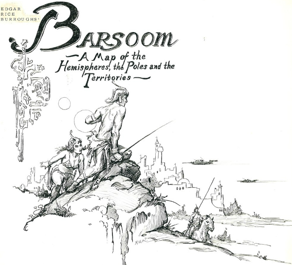
And even though this Krenkel image is from a much later book in the series, I couldn’t resist sharing it.
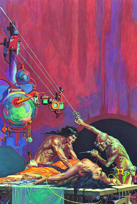
There is little doubt when looking at the illustrations inspired by Edgar Rice Burroughs’ Barsoom novels that they fit firmly within the pulp genre. And yet some of these illustrations also indicate the that there is much more to these stories than the stereotypes we would affix to them as we look back on them through twenty-first century eyes. Although Dejah Thoris functions in some way in the stories as an attractive damsel in distress, she is still a powerful character in her own right and I applaud the way that the film makers chose to focus on this aspect of her character.
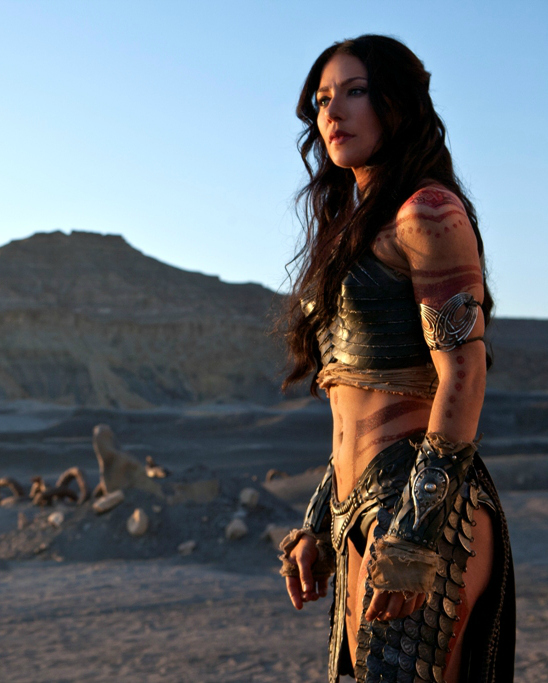
Actress Lynn Collins is indeed gorgeous in the role, but more than that she radiates strength and intelligence and determination and as such is a worthy ally to fight alongside John Carter. I hope you enjoyed looking at some of the art inspired by Burroughs’ novel A Princess of Mars and hope that you’ll consider reading the series. It is nostalgic adventure at its most fun. I also hope you’ll give the film, John Carter, a try. It may divide the critics, but the a majority of genre fans are celebrating it as a success.
______________________________________
Links for the above images include the following:
Wonderful gallery of ERB artwork! Like you, I enjoyed JOHN CARTER and hope Disney makes some sequels. Hopefully, the movie generates interest in ERB’s Mars novels.
ERB certainly has inspired some great art over the decades. I too hope for a sequel. Wiki says the producers are already working on it, but then again that might just be wishful thinking now that the opening weekend numbers were so low. Worldwide it has made about $101 million so far, but that is still so far short of the cost that it doesn’t look good. I’m hoping now that the blu ray will have a bunch of cool extras on it.
well now… much of this art is familiar to me lol..I guess it has to do with owning Frazetta and Boris books huh? lol I like the Enrique Torres-Prat’s painting..a bit hard to believe skin is ever that smooth even at birth, but I do like it lol. I kinda like the use of so many “skin colors” in the Krenkel painting too. but for some reason (colors maybe) I always liked Boris a tiny bit better than Frazetta..maybe because most the men WERE Boris and he’s very handsome! heh.. yeah yeah thru the eyes of a woman tsk tsk. The one boris cover you have here IS Boris when he was young of course lol.
Frazetta and Boris certainly have some images where they do a good job of showing that there are flaws in the body and yet it is still very beautiful. I think Boris’ work is amazing. The guy’s talent for creating realistic looking images (even if they are largely made up of men and women the way we “wished” we looked) is unbelievable.
I like that in the Krenkel cover as well. It draws in the rest of the colors from the painting really well.
Thanks Carl. I enjoyed seeing the artwork. I wish I could wander through your library. I have a feeling that you pay a lot more attention to the covers than I do. I usually go for quantity and not quality.
Thanks for taking the time to check it out. I definitely am a cover image person. I’ve been known to pay a bit higher price on ebay for old paperbacks with covers I like rather than buying them new in the store with covers I hate. To me the cover is as much a part of the experience of reading a book as anything else.
Feel free to fly over from Merry Ol’ England anytime to peruse the shelves. 🙂
Love the pictures, especially the Schoonover (I’m a huge fan of the Brandywine school of illustration.) Oddly enough, I’ve yet to read any of ERB’s Barsoom novels, though I have ready and collected many of Alan Burt Akers’ ‘Dray Prescot’ series of sword and planet novels.
I’ve heard of the Dray Prescot stories but haven’t read any of them. I believe I actually have one in my basement library that a friend gave me. Perhaps this is a sign that I should move it up the pile!
They’re a fun read, good for when you want something entertaining and not terribly demanding.
I’d be willing to bet you have one of the old DAW paperbacks – they were pretty common back in the 70s and early 80s when I was just starting to explore the genre.
I do. I wish that I could think of the name right now. I actually have read the first couple of chapters and could tell it was going to be something I enjoyed. Just got distracted with something else.
My memory didn’t help me, but Wiki did. It is Transit to Scorpio that my friend gave me. One of his favorite older SF books.
The classic Frazetta was the first image of Barsoom I saw, but I really like the McGinnis-like one by Robert Abbet. I wish he had done a series of paintings. Or if he did, where have they gone?
Robert Abbett actually did covers and (I think) interior illustrations as well. I know there are a series of John Carter paperbacks with Abbett’s art on the covers, and he does have a real McGinnis feel.
I have two Abbett covers, four Whelan covers, two Frazetta two-book hardbacks and now I’m thinking I’d like to complete runs of all of these. Gives me something to look for in used bookstores! (As if I need more to look for).
You can actually see all Abbett’s cover’s here:
http://www.erbzine.com/mag3/0301.html
Check out the initially unused on for Thuvia. That gorgeous painting looks A LOT like a McGinnis painting.
Wow! Now that I see them, I recognize all of those covers, I saw them in the bookstores when they were new. I recognize the Tarzan covers, too. Thanks for the links, Carl!
My pleasure! I didn’t realize until after I posted it that the Tarzan covers were on there as well.
Love love love looking a book covers and these are great! My favorite is the Frank Schoonover. It’s very Antony and Cleopatra.
I tried reading A Princess of Mars last July. I wasn’t feeling it at the time but I intend to give it another got. And I wasn’t really feeling the movie either because of the trailers.
Then I read your review (and saw the fan made trailer you posted in the comments, which was awesome and what should have been used!) and I’ve been seeing comments here and there on other sites where people have been really enjoying the movie. I guess I shouldn’t have written it off!
It is, isn’t it? I’m glad you enjoyed the covers/art.
I can certainly understand that. Sometimes you just have to be in the right mood/frame of mind to really enjoy a certain book.
That fan trailer is the bomb. It captures the spirit of the movie so perfectly.
An art post! WOOO! HOOO! ( The crowds cheers the hero/heroine )
The Frazetta is painting is my favorite followed closely by the Michael Whelan and Frank Cho images. I dig the Krenkel a lot as well and the Pennington painting is very cool, too.
I can’t wait to see John Carter later this week myself now. 🙂
Surprise, surprise!!! Its been awhile! (January’s book cover post?)
I’m actually very fond of the Pennington cover too. I’d snag a copy of that if I came across it in a used bookstore.
Frazetta is the man! I credit his art with getting me into Conan and John Carter. At the very least his work sparked that interest that finally got me to move towards picking these up.
I hope it works out to see John Carter with you on Friday. It is something we should see together.
I can’t tell you how happy I was to read this one. Love fan art and love Barsoom! I think my favorites here are:
Abbett – John Carter didn’t look like Heman in my head and I like that he looked pretty normal here. The movement in the sword swing is pretty great too. Looks like it could be a fresco or something.
Torres-Prat – I love that headdress and I really wish I could have seen that head getting chopped off.
Cho – What a cool, sexy lady. But who doesn’t love a buxomly lady in repose?
Thank you so much for sharing these!
Cool! Glad you enjoyed it Jeremy. Sorry I missed your comment for this long.
Your favorites are all excellent choices!
I wish Cho would get back to doing Liberty Meadows. I miss that series something fierce.
So, I wasn’t aware of Liberty Meadows but let’s just say…now I am 🙂
Oh, you definitely have to get the whole series and read it start to finish. Great stuff! Wonderful art, unrequited romance, great comedy, tons of fun geek references…well worth reading.
I started reading “A Princess of Mars” because people keep asking me about the movie vs. book comparison, forcing me to admit that I hadn’t read/seen either. Based on what I’ve read so far, the cover art featuring the least clothing is the most accurate, lol.
Several of us joked about that when we knew the movie was coming out. We were complaining, tongue in cheek, that we weren’t going to get accurate costuming in the film version. 🙂
Princess of Mars is a fun book. I’ve got a few chapters left in my re-read of the book. As you know from my review of the movie I LOVED it. Saw it three times (each with different friends who also were very pleased with it). It has its flaws, but despite the bashing of critics it is a very nice adaptation of the book. Well worth seeing.
I’ve been wanting to see it, but I don’t like seeing movie adaptations before I’ve read the book. So far I’m enjoying the book. His writing style reminds me a bit of H. G. Wells, but with less social commentary and more nudity. It’s interesting to see how the voice that sci-fi is written in has changed over time; this has the feeling of someone telling a story by the fireplace.
I’m with you most of the time. I’m glad I saw the LOTR films before reading the books though as I am not critical of the films as I might have been had I read the books. I did enjoy having read A Princess of Mars because I caught little nods to the story that I wouldn’t have otherwise and that made the movie just a little more special.