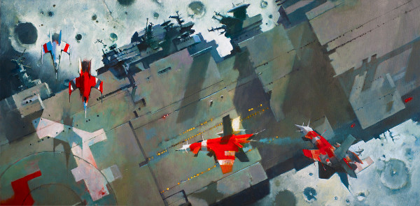
(Ancillary Justice X 3, painting by John Harris for Orbit Books)
I have been writing about my personal favorite science fiction and fantasy covers on an annual basis for many years now, and in 2014 expanded the art coverage with a monthly Cover Story post, showcasing work being released in that month. In looking back over 2014 there is a massive amount of eye-catching, wallet lightening cover art commissioned for works that came out from January through December. I could have posted many more images, but one must stop somewhere, right?
All works of art featured here are the property of the artists and the publishers who commissioned them and are featured with the sole intention of shining a spotlight on creators of Fantastic Art and on those publishers, large or small, who are doing their part to keep the tradition of illustrated/designed cover art on science fiction, fantasy and horror publications. As I peruse the genre shelves of my local bookstore I see too many photo stock covers. Some of them are quite creative and garner my interest. But I am old school in that I want to see the work of painters, sketchers, designers (traditional and digital) on genre covers.
I don’t claim to be an art critic, I just know what I like, and want to share these with you in hopes of introducing you to artists, authors, and publishers of whom you may not have been aware.
Title, publisher, artist, author information for each featured image is followed by the cover image and some text, in brief, related to the illustration. I usually say more about these images in the monthly Cover Story posts, but I have been merciful to you here.
For those images that accompany Tor.com short stories, you can click on the story title to be taken directly to the story online. Magazines featured will take you directly to that online issue with a simple click on the title.
Thank you to all the Art/Creative Directors who commissioned these works, to the artists for creating them, and to the publishing houses that continue to get great work like this on their publications. I salute you, keep fighting the good fight.
Title: New Frontiers
Author: Ben Bova
Publisher: Tor Books
Artist: John Harris
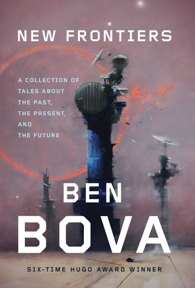
The wide open vistas and futuristic structures of a John Harris landscape inevitably set me to wishing that mankind had settled among the stars long, long ago. The pastel skies of this alien world set the buildings off nicely. Hollywood has got to come calling, I need to see a film with John Harris set design.
Title: Fables Issue #136
Author: Bill Willingham
Publisher: Vertigo Comics
Artist: Dan Dos Santos
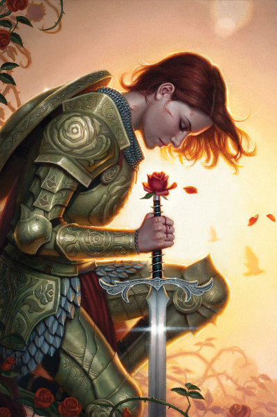
What really needs to be said in defense of this being “eye-catching”? I mean, Wow!!! Dos Santos creates such interesting texture in his paintings. I look at this and get the impression that if I reached out to touch it I would feel the contours of the design on her armor. It is absolutely beautiful.
Title: Lightspeed, Issue 44, January 2014
Editor: John Joseph Adams
Artist: Mukesh Singh
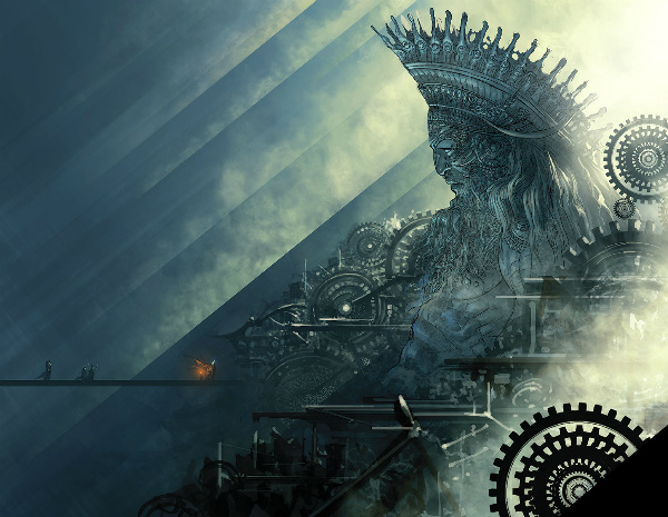
Lightspeed kicked off 2014 with a strong cover. Is this a massive statue surrounded by the cogs of some great mechanism, or the god in the machine? Artist Mukesh Singh created a great, monochromatic illustration that is even more impressive when seen in its entirety. Click on the image above to see it in full.
Title: Wolves
Author: Simon Ings
Publisher: Gollancz
Artist: Jeffrey Alan Love
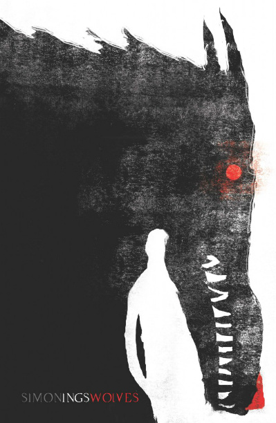
This Society of Illustrators Gold Medal winning cover illustration introduced me to the work of Jeffrey Alan Love as 2013 came to a close and my admiration for his work has only grown over the last year. Wolves brilliantly uses negative space to create an image within the image. It is an impressive use of light and dark and Love’s technique stands out in the world of contemporary SFF covers.
Title: Where the Lost Things Are
Author: Rudy Rucker, Terry Bisson
Publisher: Tor.com
Artist: Chris Buzelli
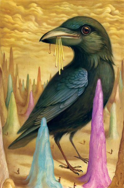
Buzelli’s illustration is fun and a little bit creepy all at the same time. I love it. I like the inclusion of splashes of color to contrast against the large black bird. Are the tiny people going about their business below potential snacks? I have always been drawn to the use of birds in art, and this one is impressively rendered.
Title: Clarkesworld, Issue 88, January 2014
Editor: Neil Clarke
Publisher: Wyrm Publishing
Artist: Waldemar Kazak
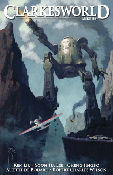
A giant retro-style robot guns ablazin’ with planes in the background and foreground of the image? What’s not to love? Kazak’s image begs for prose accompaniment. Thankfully it easily inspires sci-fi daydreaming.
Title: Dryad-Born
Author: Jeff Wheeler
Publisher: 47North
Artist: Magali Villeneuve
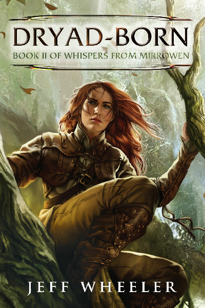
Magali Villeneuve has created a beautiful, realistically proportioned woman dressed for the environment she inhabits. That alone would make the cover eye-catching. Her use of complimentary earth-tones is particularly inviting. This cover makes me long for Autumn rambles in the woods.
Title: Apex Magazine, Issue 62, July 2014
Editor: Sigrid Ellis
Publisher: Apex Publications
Artist: Ashley MacKenzie
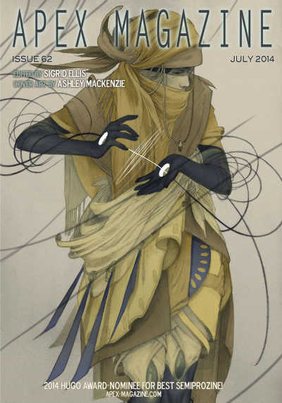
This is a striking cover illustration. The element that stands out the most, for me, in this lovely image is the holes in the palms of the figure. The bright whites of the inner part of the circles makes them shine, and raises all kinds of questions about who this person is and what capabilities the character may possess.
Title: Clarkesworld, Issue 89, February 2014
Editor: Neil Clarke
Publisher: Wyrm Publishing
Artist: Julie Dillon
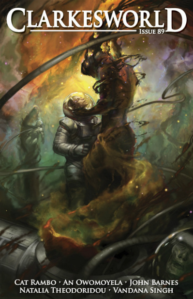
2014 was a big year for artist Julie Dillon. Not only did she continue her prolific output, but her work in 2013 earned her the Hugo Award for Best Professional Artist. It was a well-deserved win and you can see by this illustration that she might just find herself nominated again this year.
Title: The Gospel of Loki
Author: Joanne M. Harris
Publisher: Gollancz
Artist: Andreas Preis
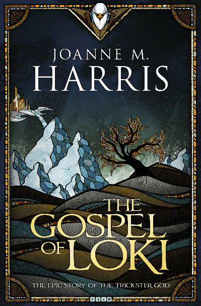
I like everything about this cover, from the mosaic design elements around the border to the color choices that present a winter aspect without limiting it to shades of white. As I have gotten older, I have begun to find beauty in the stark, muted colors of dormant nature. I am especially drawn to the patterns and colors used on the face of the snowy mountains. The illustration creates a sense of texture and depth because of Preis’ design and color placement
Title: Lagoon
Author: Nnedi Okorafor
Publisher: Hodder & Stoughton Ltd
Artist: Joey Hi-Fi
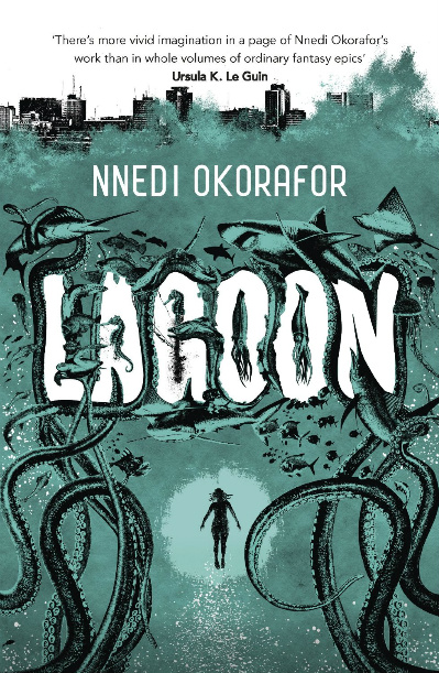
The cover for Lagoon is just plain fun, which is something I’ve come to expect in the brief time I’ve been aware of the work of Joey Hi-Fi. The one color on top of blacks and whites works well and the image tells its own story and sets up interesting expectations for the book. I like that the book’s title is actually worked into the design of the cover as it eliminates the problem of title graphics detracting from the cover art.
Title: Mrs. Sorensen and the Sasquatch
Author: Kelly Barnhill
Publisher: Tor.com
Artist: Chris Buzelli
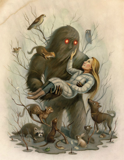
Speaking of fun, artist Chris Buzelli makes it on the list again with this FUN image. I enjoy the way the wispy branches of the trees frame the sasquatch. Buzelli’s animals are not only Bambi-cute, but they are also deliciously unsettling with their pupil-less glowing eyes. It is such a great menagerie, drawing your eye all around the image.
Title: The Tropic of Serpents
Author: Marie Brennan
Publisher: Tor Books
Artist: Todd Lockwood

Lockwood’s work is generally more fleshed-out and filled with background detail and it is fascinating to see how effective these dragon images are rendered against a white background. His work couldn’t be more perfect for the kind of story Brennan has created.
I like the way that the cover for The Tropic of Serpents incorporates movement, which contrasts nicely with the more posed image of the dragon on the cover of A Natural History of Dragons. The image shown above is of the complete wrap-around cover.
Title: Lightspeed, Issue 46, March 2014
Editor: John Joseph Adams
Artist: Mark Zug
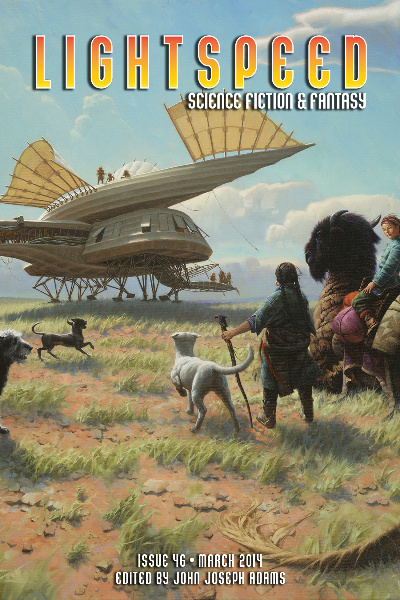
Life in a fantastic or science fictional world is still just that: Life. I enjoy the way that Mark Zug’s cover illustration captures the simplicity and normalcy one would expect in a real alien world (or past/future Earth). I am curious about this culture, and cannot help wondering where this airship is bound.
Title: Frostborn
Author: Lou Anders
Publisher: Crown Books for Young Readers
Artist: Justin Gerard
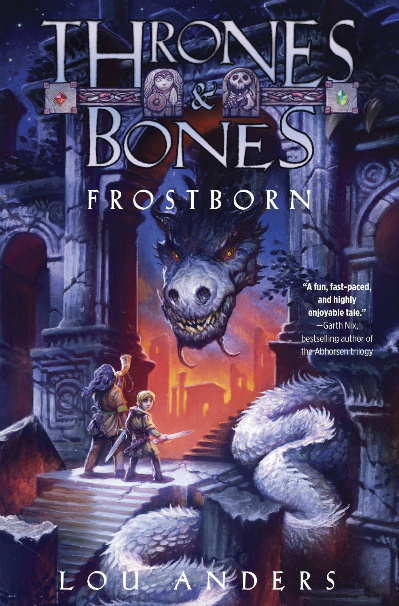
I remember how excited Lou Anders was to show the cover of his debut novel. And why not? Justin Gerard’s work is fantastic. I like the details around the title, the fact that the novels two main protagonists are present on the cover, and Gerard’s dragons are always cool. This one is no exception.
Title: Unwrapped Sky
Author: Rjurik Davidson
Publisher: Tor Books
Artist: Allen Williams
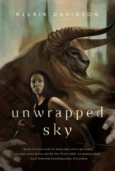
Minotaurs have always fascinated me and the way in which Williams rendered this creature Wow’s me. And oh, the detail. That minotaur looks wise and protective and frightening all at the same time. We get a sense of the scale of the creature in the way Williams rendered the image with the young girl in the foreground. Tor does a really nice job with keeping the necessary book text to a minimum, allowing the illustration to stand out.
Title: Ancillary Sword
Author: Ann Leckie
Publisher: Orbit Books
Artist: John Harris

It was such a brilliant idea for Orbit Books to commission a painting that could be sectioned to three parts, one for each book of the trilogy. They are going to look great sitting on the shelf together. I like the way the title and tagline text match the color of the ship in the foreground. Those bright colors stand out boldly against the gray metal background of the much larger ship in John Harris’ painting. Wouldn’t you love to fly in one of Harris’ ships? I would.
Title: Clarkeworld, Issue 90, March 2014
Editor: Neil Clarke
Publisher: Wyrm Publishing
Artist: Matt Dixon
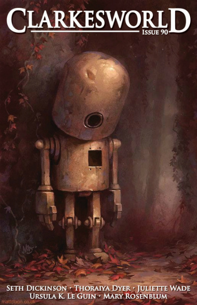
I have not been shy about my affection for robots, and their presence on the cover of genre fiction is sure to make me sit up and take notice. Dixon’s robot looks sad, with his downcast posture and empty chamber where one would expect the heart to be. That melancholy feeling is echoed in the autumnal elements/colors.
I cannot help but want to take this little guy home.
Title: Doppel
Author: Lindsay Smith
Publisher: Tor.com
Artist: Jeffrey Alan Love
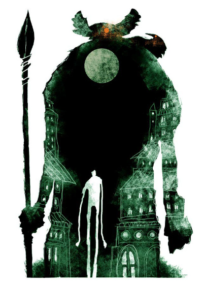
I admire the way that Love uses the dominant figure in the image (I am so intrigued…who/what is that?) as a backdrop for additional artistic details–the city, the moon, the lanky, mysterious smaller figure. Jeffrey Alan Love utilizes minimal colors to such great effect. The illustration for Doppel has a photographic negative feel, with its bright white negative space.
Title: Authority
Author: Jeff Vandermeer
Publisher: Farrar, Straus, Giroux
Artist: Eric Nyquist

The covers for The Southern Reach Trilogy novels, when seen on a computer screen, do not do them justice. The work of Eric Nyquist, which is seen more fully when you open up the cover and see the end pages, really pops on the actual physical book.
Title: The Walking-Stick Forest
Author: Anna Tambour
Publisher: Tor.com
Artist: Karla Ortiz

I admire the way the varying degree of focus with the trees conveys a sense of depth, and Ortiz’ central character exhibits a three-dimensional feel. This illustration is particularly arresting in that it transmits a real sense of something ominous happening. Part of the effectiveness of the piece is that the branch covering this young girl’s eyes gives the illustration a sinister vibe.
Title: All Those Vanished Engines
Author: Paul Park
Publisher: Tor Books

In researching this cover, I found this, click on the link to learn more and see more pictures:
The pipes and their layout appeals to the steampunk/industrial design aesthetic that I enjoy.
Title: Cold Hillside
Author: Nancy Baker
Publisher: ChiZine Publications
Artist: Vincent Haig
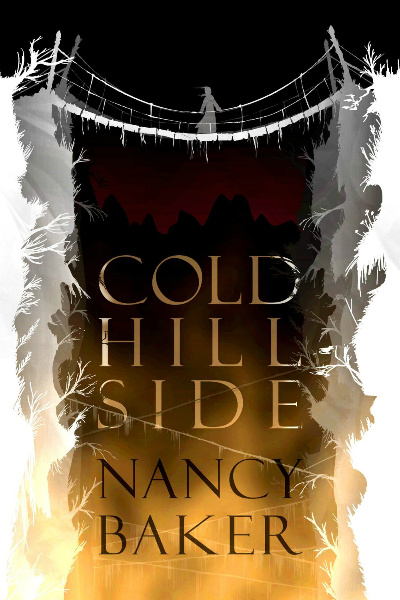
Vincent Haig’s cover for Nancy Baker’s new novel is somewhat minimalist, and yet highly effective, which is why it caught my eye. The white of the canyon walls and the rickety bridge, covered with ice, reflect the book’s title with strong imagery that pops out from the darker hues of the background colors.
The cover makes me shiver, in more ways than one.
Title: A Cup of Salt Tears
Author: Isabel Yap
Publisher: Tor.com
Artist: Victo Ngai
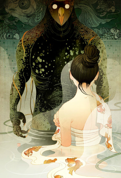
There is so much to see in this image. First and foremost is, of course, the young woman in a very vulnerable position, turned towards a mysterious, dark figure who most likely came up behind her. Beyond that we see that there is a detailed mural in the tile of the bath house. And if you look again you’ll see the fish motif there echoed cleverly in the woman’s outfit. I LOVE the way her wrap drapes in the water in such a way that the one fish appears to be swimming in the water next to her.
Title: Reach for Infinity
Author: Jonathan Strahan, editor
Publisher: Solaris Books
Artist: Adam Tredowski
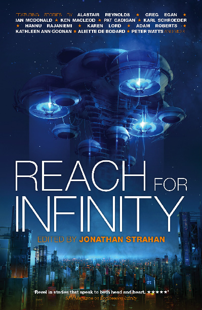
I am such a sucker for spaceships, and Adam Tredowski’s starships and science fictional landscapes are daydream-inducing. The blue emanating from the ship’s engines makes the vehicle glow against the similar blue background. I want to go for a ride.
Title: Lightspeed, Issue 52, September 2014
Editor: John Joseph Adams
Artist: Steve Tung
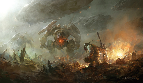
Tung’s image, of a large battle mech, with large spaceships in the sky behind and a lone soldier in the foreground, speaks of war and destruction. It is exciting and devastating at the same time, especially if you see the full version (click on the image above). I like the concept art style of this piece…and it makes me want to play video games.
Title: Cibola Burn
Author: James S.A. Corey
Publisher: Orbit Books
Artist: Daniel Dociu

I have been a fan of Daniel Dociu’s work for several years now and I am pleased that Orbit Books has chosen to maintain continuity with the Expanse series by repeatedly commissioning him to create the cover illustrations. This series is space opera on a grand scale and I think Dociu’s work conveys that scale in the massive ships he envisions. The series also has its share of battles and Daniel Dociu reflects that in his illustrations as well.
Title: Apex Magazine, Issue 58, March 2014
Editor: Sigrid Ellis
Publisher: Apex Publications
Artist: Julie Dillon
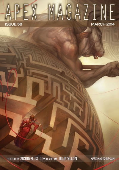
I saw two minotaur covers in 2014, and liked them both. The similarity in color of the minotaur and the maze allows the girl in the red dress to stand out, and the red thread/rope weaves through the image, effectively drawing your eye throughout Julie Dillon’s work.
Title: Shattering the Ley
Author: Joshua Palmetier
Publisher: DAW Books
Artist: Stephan Martiniere
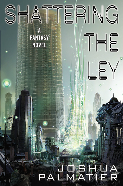
Come on, its Stephan Martiniere. Do I really need to say more? Martiniere’s futuristic cityscapes are every bit as imaginative as his space scenes. His digital illustrations are so fluid. They make me feel like I could travel forward a few hundred years…or to another planet…and see the physical manifestations of his concepts. Stephan Martiniere’s creations make me want to visit the future. And gratefully I can do it by getting lost in his images.
Title: The Mirror Empire
Author: Kameron Hurley
Publisher: Angry Robot
Artist: Richard Anderson
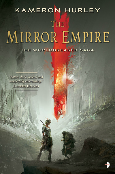
2014 was a prolific year for Richard Anderson. It will be interesting to see if his array of work, and the quality of that work, can generate enough buzz for a Hugo nomination this year. The largely monochromatic look of the bulk of Anderson’s image, which is eye-catching in and of itself, is set off brilliantly by that bold streak of red that draws your eye. It is a great visual representation of the series’ title, “The Worldbreaker Saga”.
Title: Interzone Magazine, #255, November/December 2014
Author: Various
Publisher: TTA Press
Artist: Wayne Haag
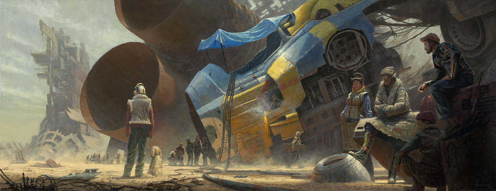
I look at this image and want to know how this moment arrived. When did the ship crash, and are they living in it, fixing it, salvaging parts? I enjoy the way that Haag economizes with brighter colors, using them sparingly in this image to communicate setting and mood. The full image is fantastic and can be seen by clicking on the Interzone cover.
Title: Little Knife
Author: Leigh Bardugo
Publisher: Tor.com
Artist: Anna & Elena Balbusso
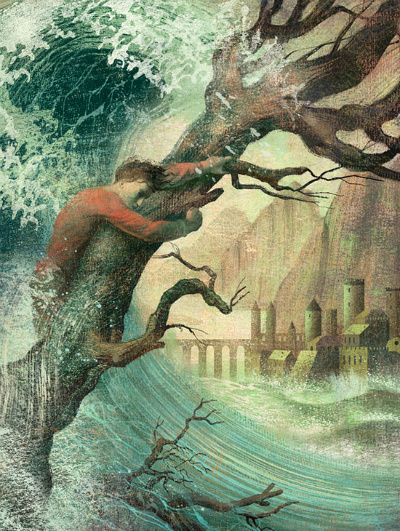
Anna and Elena Balbusso were commissioned by Irene Gallo to do a number of illustrations for Tor.com shorts in 2014, and I liked each one. There is something about each image they create that feels as if it hearkens from another time. There is an old-world sensibility there, and I mean that as a compliment. I love their creativity, and the way in which, for the Tor.com stories, they capture elements of the story in the images they create. The wave not only frames the city in the distance, but it also draws your eyes up to the man clinging desperately to the trunk of the tree that diagonally bisects the piece.
Title: The Lady
Author: K.V. Johansen
Publisher: Pyr
Artist: Raymond Swanland
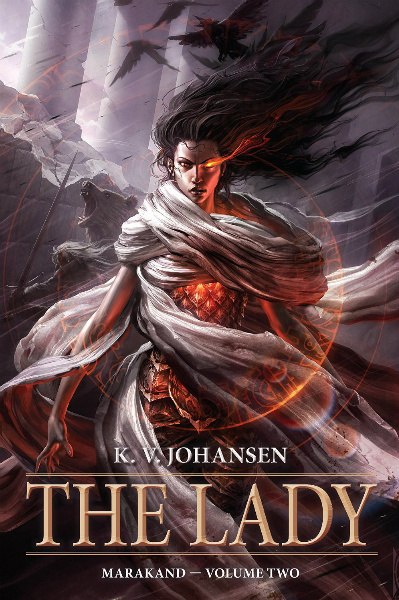
Every time I see a Raymond Swanland cover it makes me want to buy the book. Here, the warm colors really stand out. I use the word “flow” every time I try to (inadequately) describe a Swanland cover. I do so because his covers always have this sense of movement, as if the air around his subject matter is both powerful and electric. There are interesting things going on with the character, and the bear, and the birds, in the background, but it is hard to take my eyes off of this strong central character. You would definitely want to stay on the good side of this powerful lady.
Title: Clarkesworld, Issue 96, September 2014
Editor: Neil Clarke
Publisher: Wyrm Publishing
Artist: Ian McQue
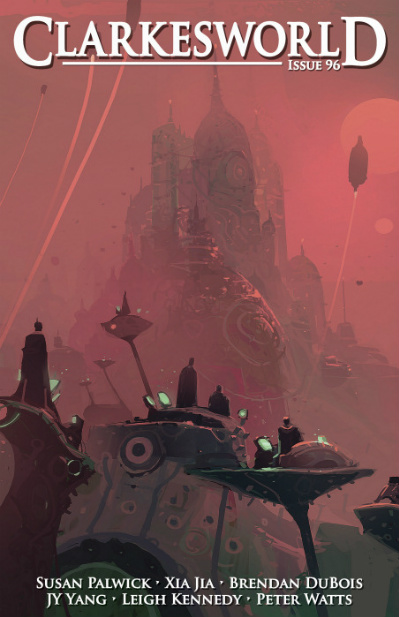
Ian McQue is an artist who creates a variety of intriguing images. A trip to his website triggers so many of my science fiction hot buttons. This glowing image reminds me strongly of the classic cover illustrations of artist Paul Lehr, particularly in the shape of the buildings in the background. There is something almost dream-like in the way the image is rendered. It is a very effective dominant color choice.
Title: Friends ‘Til the End
Author: Bethany Neal
Publisher: Tor.com
Artist: Ashley MacKenzie
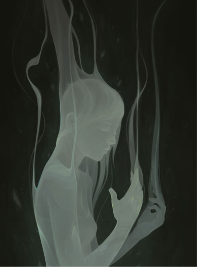
There can be great beauty in simplicity, and this piece by Ashley Mackenzie is proof. I love the way the mist, vapor, smoke has such an ethereal quality to it. I am impressed by the way in which definitions of the character are there underneath. The choice of a completely dark background keeps the focus where it needs to be and allows the image to be at its most effective.
Title: Spectrum 21: The Best in Contemporary Fantastic Art
Editor: John Fleskes
Publisher: Flesk Publications
Artist: Rebecca Guay
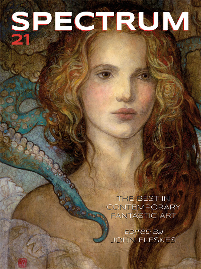
Rebecca Guay’s entry was a fantastic choice for the cover of Spectrum 21. The way in which she has rendered the young woman makes me feel as if she is channeling the artistic spirit of an earlier time, but familiarity with her work allows you to see her very unique talent. She creates such beautiful images. I like the way that it appears that she is standing in front of some painting or mural, and suddenly the two-dimensional image becomes three-dimensional as the tentacle reaches over her shoulder.
Title: Echopraxia
Author: Peter Watts
Publisher: Tor Books
Artist: Richard Anderson

Oh my, does Richard Anderson create visually exciting work. Not surprising that he made this list with more than one cover image. It is such a great looking scene, cool spaceship, astronaut floating outside the vessel. And the colors, reds against oranges, light the entire image and make it glow.
Title: Coming Home
Author: Jack McDevitt
Publisher: Ace Books
Artist: John Harris
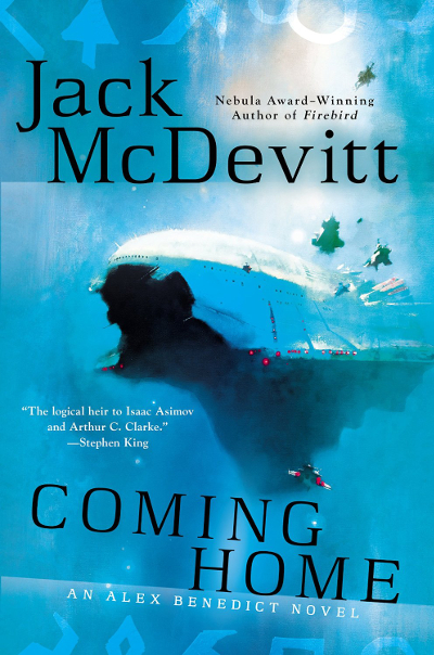
I started with John Harris, it seems fitting to end with him too. When it comes to artist John Harris, the only thing I like better than his science fiction landscapes are his spaceships. The open space around the main ship not only services the publisher, giving them space for book and author text, but it also serves as a reminder of the vast openness of space. The smaller ships give a sense of perspective at how massive this ship is. I enjoy Harris’ covers for Jack McDevitt’s novels as they generally have one main color, often something bright and visually arresting, and they stand out beautifully on the shelves in a brick and mortar bookstore.
Thank you to John DeNardo for his monthly cover posts at SF Signal, a source for much of what you see here.
Apologies to Tor.com. I know there are A LOT of your commissions here, but there could have been a lot more. Jump on over to this Tor.com post to see a pictorial listing, with links, to all their short fiction produced in 2014.
Apex, Clarkesworld, and Lightspeed all have cover galleries. Visit them. Your eyes will thank you.
If you are just visiting and like these posts, come back next month for Cover Story: February 2015…guaranteed to make a dent in your book-buying budget.
And as always, please let me know your opinion on any or all of these illustrations, and let me know of any of your favorites that were not featured here. If I get enough suggestions that are not on my list, I might just do a post featuring your favorite SF/F/H cover illustrations of 2014.
Liked all of these except Throne and Bones. When I started reading SF there were a lot of bad covers. Although there were exceptions with illustrations Like Richard Powers, Ed Emshwiller and Leo and Diane Dillon. Now most of the bad covers come from Baen Books.
I should do some posts about the older SF illustrators sometime. Emshwiller, Powers, Lehr, Paul Alexander, Vincent di Fate, Jerome Podwil. I’ve done John Berkey, and Frazetta several times (although he is more fantasy than science fiction). I’m sure there are others I’m not thinking of right now whose work I admire.
I give Baen a pass because I admire their efforts to keep some older science fiction in print. I enjoy several of Bob Eggleton’s covers on the Heinlein reprints. Liked the cover for the recent Weber/Zahn release, A Call to Duty, and enjoy some of the covers for the Lee/Miller books. But you are right, there are some cringe-worthy efforts there as well, some from artists whose work I generally like, so I wonder how much art direction has to do with that.
This just goes to prove I mailed “that package” to the right person!
MY favorites are almost always the women and men who are outrageously gorgeous even if they are a “witch or warlock” lol.. my favorites here are : dan dos santos, Magali Villeneuve, and Todd Lockwood….
Those are great, aren’t they? And yes, I’ll be enjoying that package VERY much!!! Can’t wait to crack into it here in a few days.
Magali Villeneuve’s image is one of the best female characters I’ve seen on a cover in a long time. I love it, and it is even more gorgeous when you see a high resolution, larger version.
http://ecx.images-amazon.com/images/I/91GvF4ermcL.jpg
So many beautiful images, but the one that intrigues me most from a technical perspective is the cover by Eric Nyquist. I’ve never seen an animated cover before, and am wondering how this works in practice. Under what circumstances is the animation visible? Is the code for it part of the ebook? Is this the beginning of a new era of enhanced ebooks, or is that era already here and I just haven’t noticed yet?
I would assume it is just code for the ebook, or something the company just did for promotion. The covers without the motion are very cool, but the animation on this was so fun I had to include that version.
There are certainly enhanced books in the digital realm, though I haven’t read any of them. Words and a nice cover image are good enough for me, even on the Kindle.
Thanks for visiting Patricia, and sharing your thoughts.
Beautiful! Thanks for this.
I love promoting the works of creative people. Give me a megaphone and a platform and I’ll cheer these great artists (and publishers, Art Directors, etc) from the mountain top.
I was just lurking on your blog the other day, need to take the time to actually comment.
I’ve looked through all of these covers again; I like all of them. Excellent choices and neat descriptions.
Thank you, glad you enjoy the post. 🙂
I never realized that we were looking at a single painting for the Lecke books. Obviously I knew the style was similar, but that is a pretty cool twist. This is the problem with e-books, I get the convenience, I loose some little connections.
I had only know because I sought out the first image last year for my favorite cover image post and came across Orbit’s post on the full image. It is a great idea and I like seeing it executed across these three covers.
Wow! Fabulous artwork! Like you, I’m a big John Harris fan. That COMING HOME cover is dazzling! I hadn’t seen Karla Ortiz’s cover before but I’m ordering a copy of THE WALKING-STICK FOREST right now!
Karla Ortiz is one of our special guest as Spectrum Fantastic Art Live 4 this year, and I’m looking forward to meeting her. She was actually at 3 but I did not realize it. Her work is really sophisticated.
Very thorough post, Carl thanks! That Dos Santos FABLES cover is stunning, one of the best of the series which has a history of great covers. I was a big fan of the covers James Jean was doing for the comic, too.
I really like Martiniere’s cover for SHATTERING THE LEY, but the font for the title is garish and detracts from the whole image. They should have used the same font for the title as they did for Joshua’s name.
I enjoy doing these in part because I still end up discovering books, mags, etc. that I missed during the year.
I was so sad when James Jean stopped doing the Fables covers, though I’ve been impressed with all the other artists as well.
I’m with you on the Martiniere cover. The font looks like something I would see on a quick self-published cover. Not sure why DAW went that route. But the illustration is gorgeous.
Great post, I hadn’t seen most of those covers and I was in awe. Beautiful. I’m amazed by talented people.
Thanks Bryce, I am consistently in awe myself. So many of these artists were new to me in the last two years. It is fun discovering them, and rediscovering the work of long-time favorites.
There is so much amazing artwork in this post, thank you for sharing. I know many of these would grab my attention in a shop.
I’m thinking I may need to get a second job just so I can buy books (as art…I mean there is no way I can get to everything to actually read it), prints, originals, etc.
Or maybe just stop eating and use that money.
So many great images there!
I think overall my favourite is the cover to The Mirror Empire, but it’s hard to pick just one 🙂
The Mirror Empire really jumps out at you with that bright red splash of color in the center of the cover.
Richard Anderson does some great work, I love what he’s doing for Staveley’s books, too.
Yes, the Staveley covers are nice and could/should easily be on this list. If I nominate for Hugos this year, Richard Anderson will be one of my nominees.
I agree. I only found out about him last year. He is awesome. Same for the cover he did on that Dinosaur Game of Thrones book.
I think Shawn King deserves mention in this conversation. His work for Ragnarok has created a feeling for what they publish and is steadily impressive. He also did Mark Tufo’s latest Lycan Fallout book (though he is usually paired with artwork–he did great solo on my Scavenger titles, I think).
Yes, he has done some nice work, thanks for mentioning him.
I haven’t seen the dinosaur Game of Thrones book, I’ll look that up.
It is technically called The Dinosaur Lords http://www.tor.com/blogs/2014/09/dinosaur-lords-cover-reveal
Wow, I like that one!
I loved the cover for Mercedes Yardley’s Pretty little dead girls – read the book last week and loved it too.
http://d.gr-assets.com/books/1410038594l/23163610.jpg
That is a really nice cover, and Galen Dara is not only a talented artist (Hugo award-winning) but a nice person too. Had the pleasure of seeing her at Spectrum Fantastic Art Live 3 last year.
Isn’t it great when a great cover is just the start, and the book is great too? That is when I consider the book as physical object, as art, a given. Love it when that happens. I’ll have to check the book out.
Fabulous looking covers! I loved the Fables cover. I actually just read the trade that included that as its cover last week. 🙂
I’m so far behind in my Fables reading, but the series is just about to end, so maybe I’ll take that as a cue to get caught up. The need to do another Fables Covers book when it is all done, this time including all the covers in it. I’d buy that in a heartbeat.
That’s a great collection of covers. That little bot from the Clarkesworld cover is etched on my memory from when it was released earlier this year. I want to take him home too! Clarkesworld has really had some nice covers this year.
I love the Wolves cover, and I see the same artist did that Doppel cover. I just love that effect. I rather like the Lagoon cover, too (currently reading).
Yes, that one stood out to me in my memory before I even started reviewing the year to gather my list. Clarkesworld was fantastic this year, wasn’t it. So many awesome covers.
Jeffrey Alan Love has done covers for all the Gollancz releases/re-releases of Simon Ings books and they are all great fun. I’d love to have them all on a shelf together.
I’ll be interested in your review of Lagoon. I’ve not stumbled across any that I can recall.
What a great gallery. The Dos Santos piece is great, I agree, and I like the retro Clarkesworld as well with the robot. Mark Zug’s cover has that sense I get from Whelan’s stuff, a sense of something fantastic happening- and the cover of Reach for Infinity has probably prompted me to buy that anthology. 🙂
It is, there were some really lovely books, etc. that came out last year. I haven’t read all the Infinity volumes, but Edge of Infinity, the anthology that came before this, is amazing. I need to get to reading Reach.
Massive indeed. I’ll have more comments later, but for now I’ll just say that I’ve seen all these before and the one that tugs at me the most, the one I wish I had a signed print of, out of all of them is the cover art of Clarkesworld, Issue 88, January 2014. I just love it.
Yes, that is a great one, and the image looks even nicer sans text on his Deviant Art site
http://waldemar-kazak.deviantart.com/art/Guten-Morgen-289066767
As I said, the Kazak. You know I love Harris, so both of his images are favorites. The cover of Wolves (Love) continues, each time I see it, to impress. Another fine cover for a prozine, Lightspeed 44 (Singh), though the best part left off of your crop of the image, explains some, not all. Yet again Clarkesworld, this time Issue 89 (Dillon), wonderful shape, color, story. Gospel of Loki (Preis) agree with everything you said, color and shape, depth and simplicity. Like you I love the story aspect of the cover of Lightspeed, Issue 46, that one is a real favorite as well. Beautifully rendered and painted, it reminds me of some of the less frenetic covers of older digests like ASF and Galaxy.
That cover for Clarkesworld, Issue 90 just breaks my heart. Like you, I want to take that little fella home, shine him up, give him a brand new heart and make him a part of the family. Cold Hillside (Haig) is great in it’s simplicity. Think how different it would be if the color in it was cool rather than warm!
Echopraxia (Richard Anderson) is really terrific. It could be an abstract with no loss of impact. I love it, that may be my third favorite of the bunch. It makes me want to take out the box of paint tubes and a paint board.
This is an outstanding post, and I shall derive hours of pleasure just revisiting it and also visiting the websites and galleries of the artists. My biggest take away? That the electronic SF-F magazines seem to have the best covers. While so many print publishers are going to the cheaper, but much less attractive, photo or photo-edited covers, the periodical market is taking the artistic lead. How I wish Clarkesworld would make it’s covers available as prints!
It is outstanding what these creators can do. I’m always in awe of the imagination and the ability to get that imagination out of their heads and on paper, canvas, screen, etc. Wow!
I was sorry to see that Waldemar Kazak doesn’t have the cover for January Clarkesworld available as a print on his website or Deviant Art site. He has some great stuff over there. I particularly like the Soviet stuff.
Cold Hillside is one that would be interesting to see with the background colors changed to a variety of different looks. I imagine it would completely change the mood that it evokes.
The electronic magazines are indeed going out of their way to get your attention with cover art. I’m not always drawn to a particular Lightspeed, Clarkesworld, Apex, Interzone, etc. cover, but they are generally always a piece of art, as opposed to Asimov’s occasionally mailing it in with shot of the universe (which is lovely, but I want art!!!!).
I need to start paying more attention to small presses too, as I have a feeling I am missing out on some interesting cover art.