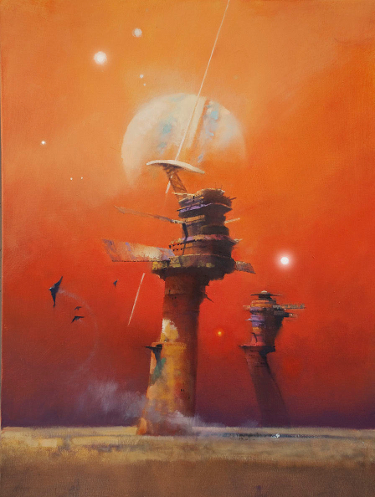
Back in January the website io9 re-posted my Favorite Science Fiction and Fantasy Book Covers of 2013. The discussion that ensued included a question from Tor Books’ creative director, Irene Gallo, asking if now was the time to consider long-time science fiction artist John Harris for the Hugo Award for Best Professional Artist.
I responded with an emphatic “Yes!!!”.
I have long been a fan of the work of John Harris, and consider him one of my all-time favorite genre illustrators. His work fueled my imagination well before I ever read a book graced by one of his covers. His style is iconic, and yet I don’t want to give the impression that I think John Harris deserves a Best Professional Artist nomination for the work he has amassed over a long career.
To the contrary, his published output in 2013 speaks loudly and boldly proclaims the worthiness of his presence on the nominee list.
John Harris’ cover illustration for John Scalzi’s novel, The Human Division, pictured at the start of this post, may be my favorite of his paintings published in 2013, but I must admit that it is a close race, subject to change on a whim.
John Harris was especially prolific in 2013, in large part because of the work he created for the episodic release of The Human Division. Harris created thirteen separate pieces of art, one for each of the weekly episodes. All thirteen paintings can be viewed here.
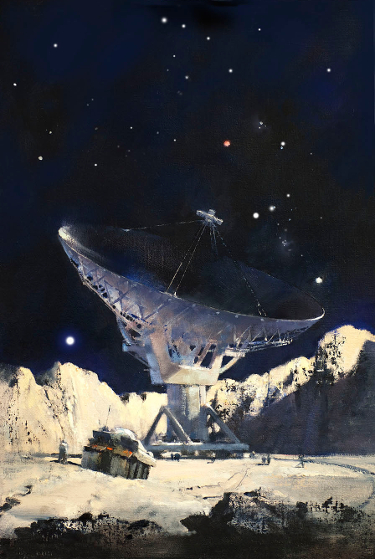
The painting to the left, which is printed on the cover of the novel Farside, by Ben Bova, maintains a close second place in my affections.
Irene Gallo’s trumpet call was not without its detractors. A handful of very vocal critics were quick to dismiss Harris’ work as too “old school” for consideration today, while others all but called his technique “amateurish”. We all have the right to our opinions, that is one of the beauties of art.
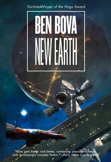
I view the current work of John Harris to be every bit as impressive as the work which first caught my eye many decades past. He has a distinctive style. While others may be able to create images like John Harris, there is a look that comes from the stroke of his brush that cannot be accurately mimicked.
I detect a soft quality to John Harris’ finished work that evokes a feeling that is best described as “romantic”. The romantic idea of travel…of existence…in outer space fires the imaginations of authors and readers and John Harris captures moments of that imagined existence with such clarity.
In the John Picacio nomination post I mentioned personal criteria for considering an artist and his/her work worthy of a Hugo Award. To those criterion I would add that an artist who can create images that make me not only want to possess that work, even if it be simply a book with the image on the cover, but who also inspires me to come back to gaze at that work frequently, is an artist worthy of accolades.
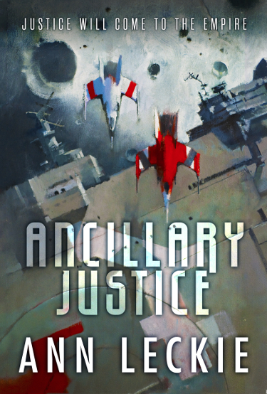
As of this writing I have acquired each of these books, and others published in 2013 with John Harris cover illustration.
Spaceships and planets may be the stuff of science fictional tropes, but it is images based on these themes that fueled my passion for science fiction when I was young and I continue to be impressed by skilled artists who render spaceships and planets in their work.
John Harris is among the best artists in this regard.
I contend that John Harris deserves a Best Professional Hugo Award Nomination for the body of work published in 2013. It would thrill me to see his name on the nominations list among those incredible artists who have made the list over the years, and those who will be shortlisted here in 2014.
Eh, I like the old school look just fine. Second one down especially, a barren space landscape. I am paying attention to covers for the first time this year BTW, thanks to you and Staffers mostly. Cool stuff.
Me too, Nathan!
I’m glad you are paying attention to covers, and to have had even a slight amount of influence that way makes me happy. Thank you.
I’m a big fan of John Harris’ artwork! I love the cover on THE HUMAN DIVISION. I confess that I’ve bought books just because they had a John Harris cover on them!
Me too! I love his work on the Ender’s Game novels long before I ever read any of them, and as I’ve purchased them I’ve made sure the only versions I want to own are the ones with Harris covers.
I really liked all the Human Division covers and what a unique opportunity for an artist, to be able to illustrate every ‘chapter’ of a book.
Yes, I thought it was a heck of a cool move on the part of Tor to commission John Harris to do that many pieces for the book.
Hard to choose, but I think my vote would go here. This is SF art that speaks to me as art, whether it’s generic instead of specifically about the book. That said, I do love Manchess’ work too. So difficult…
He certainly is one of my favorites, and has been for a long time. And when he uses orange, like in that first image, he wins me over even more because it is one of my favorite colors and really pops on SF/F book covers.