
(Art by Victor Mosquera)
As the year comes to a close I like to embark upon one of my favorite annual traditions: a review of the genre book and magazine covers that caught my eye and that I consider favorites for the year. I would not be able to successfully complete this venture without the hard work done over at SF Signal. Every month SF Signal compiles and posts an art-heavy post featuring the various science fiction, fantasy and horror stories slated to be released that month. Even in weaker months it provides a visual feast of genre art.
It is never easy choosing favorites, and even with efforts to pare down the list, this has proven to be a long post, albeit one filled with gorgeous cover art.
My standard disclaimer is that I am not an art critic, an artist, or one who has artistic talent. I simply know what I like, and can occasionally craft a statement explaining why I believe I connected to that piece of work. There are constants who tend to show up every year on my list. It makes me happy to know that art attributed to artists I admire are prolific, resulting in new pieces to consider each year.
I am always interested in your opinions on the covers I have chosen, as well as any nominations for ones you feel should be on the list.
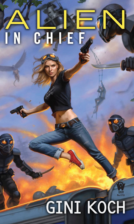
The “constants” I mentioned earlier starts right away, with a couple of Daniel Dos Santos covers for author Gini Koch‘s Katherine “Kitty” Katt series. It is rare that one of these covers gets left off of my Favorites list, and this year Koch was doubly prolific, with two novels released in the series. Since I could not decide between the two, both had to be included.
Dos Santos has done a great job with keeping Kitty’s look consistent over these twelve novels and each painting is so much fun that I can easily see why readers would pick up this series because of the cover art. I love the cute little alien creature on Kitty’s shoulder on the Alien Separation cover below.
Dan Dos Santos lights his images with a signature glow. I particularly like the way that Kitty is back lit in the cover below.

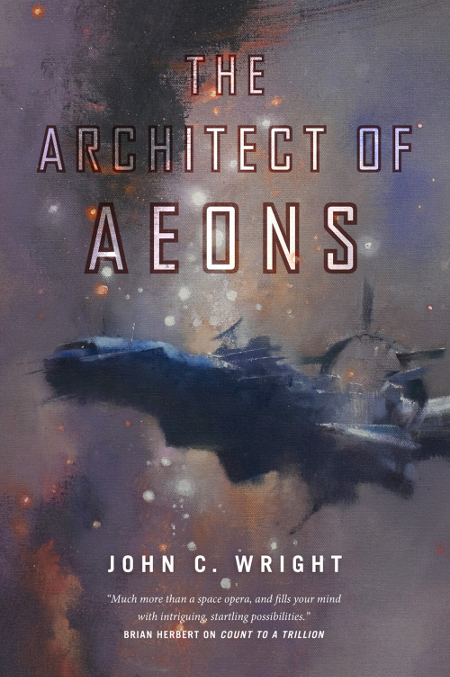
I have long been an admirer of Irene Gallo‘s taste in cover artists. In her Director duties at Tor Books, Gallo has been responsible for introducing genre art fans to many up and coming artists. She is also good about keeping the work of acknowledged Masters, like John Harris, in front of the eyes of book buyers.
I have enjoyed each of the Harris covers for John C. Wright‘s Count to a Trillion series. If space travel were our current reality, John Harris is one of the handful of artists I would want to tap for ship design. His creations are beautiful.
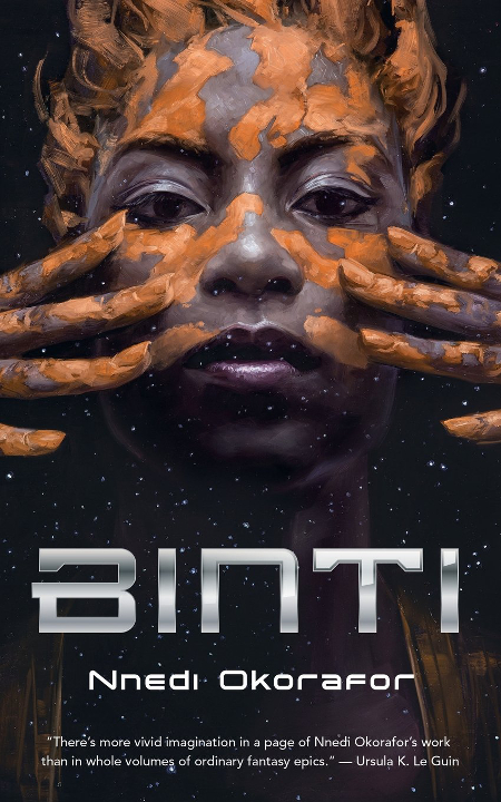
David Palumbo has created a beautiful cover for the Tor.com novella, Binti, by Nnedi Orkorafor. Palumbo infuses Binti with such intensity both in the way her eyes lock on to you as you look at the image along with the emphasis on her application of war paint. I like the way that the primary character dominates the painting and yet the way the character fades away, showing the field of stars in the background, gives readers a visual clue to the space setting of the story.
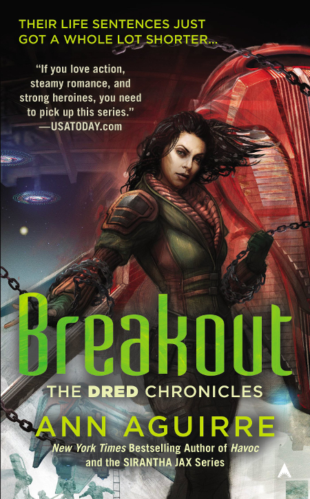
Artist Scott M. Fischer has created great covers for the Sirantha Jax series by Ann Aquirre, and he has continued that with her new Dred Chronicles series. I have not read any of these novels, so I cannot vouch for his accuracy in capturing each series’ protagonist. Nevertheless, I have consistently enjoyed these paintings both for the way he renders the characters and for the science fictional elements that round out the illustrations.

Artist Stephan Martiniere is another perennial favorite when it comes to picking the genre covers I enjoy. After a year or so where it seemed, to me, that he was not as prominent a part of the science fiction/fantasy new release scene, Martiniere came back with several covers that have made my list, each showcasing the variety of his style and subject matter.
This cover for The Dark Forest, the second in author Cixin Liu‘s lauded science fiction trilogy, is gorgeous, particularly without the author and title text. I highly suggest visiting the cover release article on Tor’s website. While there, scroll down to see the cover art sans text.
Martiniere uses such rich purples and blacks in this image, and I am equally impressed by his rendering of the planet and spheres as I am of the other design elements.
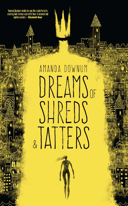
I discovered the work of Jeffrey Alan Love a few years ago and am consistently impressed by the work he is creating, both for book covers and for personal projects that he has been working on. Love uses interesting creative techniques, and if you follow him on Facebook you can see some videos of his creative process.
I enjoy the way he uses blacks, negative space, and often just one other color for emphasis. This is one of the rare Love covers where white isn’t a factor. I like the way that the use of the yellow color on Amanda Downum‘s novel lights the image, creating a scene of a city at night that plays off the word “dreams” in the title.
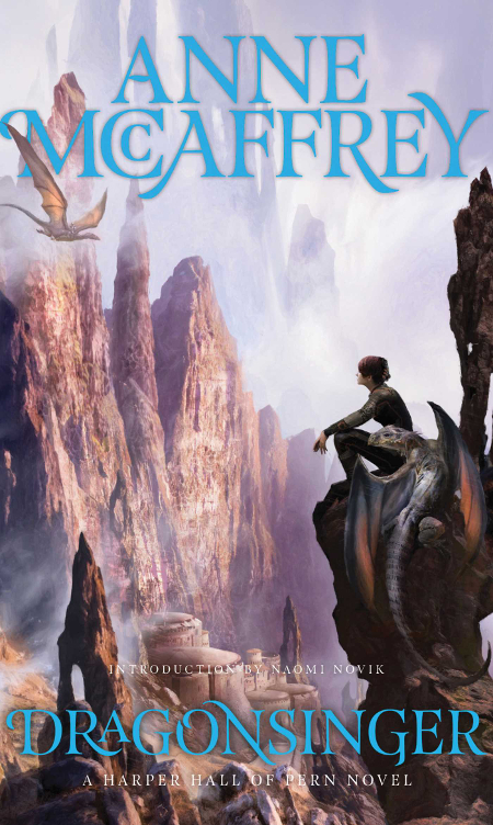
This past September, Saga Press published a boxed set re-release of the Harper Hall Trilogy by author Anne McCaffrey, and artist Stephan Martiniere‘s work is featured on each cover and used again for the box that houses these three paperback novels.
I like all three covers, but this is my favorite. The majority of work I’ve seen from Martiniere are science fictional settings, but his occasional fantasy pieces demonstrate his talent in creating fantasy settings. I like the way he has positioned the young protagonist and the dragon on the cliff in the foreground, and I am impressed by his rendering of the city nestled into the mountainside.
This is a series I am interested in reading.

It is extremely important to me, once a cover artist is established, that a book publisher use that artist throughout an author’s series. Irene Gallo and Tor Books has done this with John Scalzi‘s Old Man’s War series to great effect. John Harris has created some lovely paintings for this series, as well as the pieces he has done for the chapter-by-chapter releases for these last two OMW novels.
I don’t often see Harris place his massive space vessels in a blue-sky atmosphere. I like it.

I have enjoyed every cover for these Japan-centric anthologies published by Haikasoru. They are fun, colorful and have an engaging design element to the art. Artist Yuko Shimizu has created a nice one for Hanzai Japan, an anthology of futuristic crime and mystery stories.
I absolutely love the cherry blossoms framing Shimizu’s illustration. If I could freely travel wherever and whenever I wanted to, visiting Japan during that season of the year would be high on my priority list.

I don’t often feature Teen novels, or horror novels, as part of my review of the year’s genre favorites. The reason for this is that I do not keep tabs on the Teen releases throughout the year like I do those shelved in the adult science fiction and fantasy section of bookstores. There are some stunning covers in both the Teen and Young Adult section of the bookstore.
I just happened to be stopped in my tracks by the cover for The Dead House, by Dawn Kurtagich, when picking up a book for my wife (which cover will be featured later), for Christmas.
It doesn’t translate as well on the screen as it does on the cover itself, where you can see the creepy yellow glow in the girl’s eye and where the tree branches seem to wrap the character and the house in claustrophobic dread. I am drawn to images and photographs of deliciously creepy trees.
Despite digging, I have not been able to find the cover artist/designer for the book. If I could request one thing of authors: give your cover artists/designers love…lots of love. It should be the easiest thing for a curious explorer to discover who had a creative hand in the realization of your book cover. Every post squeeing about the cover should prominently name and link to the artist/designer.

The cover for Love in the Age of Mechanical Reproduction, by Judd Trichter, is the work of designer Rob Grom. In looking at Grom’s site, he has done a number of nice covers, but this is by far my favorite.
I like the way that he has used mechanical elements to represent the fact that the woman featured on the cover is, in fact, an android. The colors used are quite different than those of many science fiction covers, making it stand out on the bookshelves, and the lens flare effects are eye-catching.
I purchased this when it came out to strong reviews, and have had a friend tell me how much she enjoyed it. While checking on the cover I pulled it out and added it to the pile of books I hope to get to as The Science Fiction Experience continues.
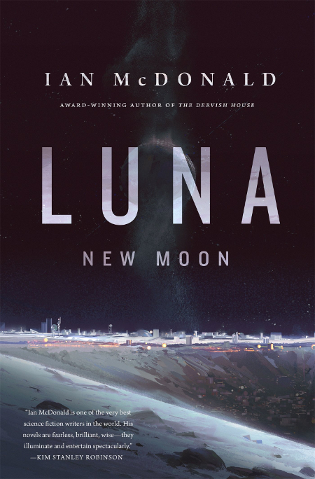
I’m fond of artist renderings of what colonization on the moon might look like, be it our moon or a moon, and so I was quickly drawn to cover of the newest Ian McDonald novel. Artist Victor Mosquera has created a beautiful piece of concept-style art, that has to bee seen without the title/author text. You can do so by clicking here.
I like the way this image is lit, with the sunlight setting the moon’s surface aglow.

I am a big fan of the aesthetics of science fiction art and design from the so-called Golden Age of Science Fiction. I also like the look of mystery/detective/noir design from that period. Designer Will Staehle channels both in his wrap-around cover design for the latest novel by Adam Christopher, Made to Kill.
I read and reviewed the novel in early November and gave it high marks. As is often the case, a great cover enhances the reading experience, helping to set the mood and heighten the atmosphere created by the author.
Staehle’s simple, yet effective design and bold color choices make this a stand out among genre covers released this year.
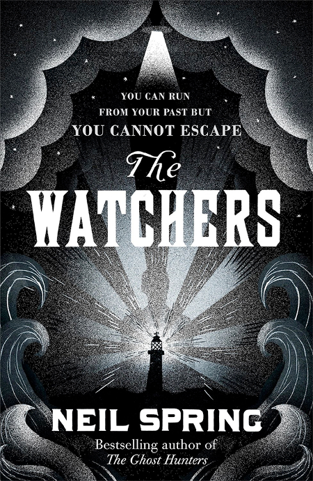
Another strong design that caught my eye when looking at book covers is the work Leo Nickolls did for The Watchers by Neil Spring. I like the matching layers of both waves and clouds that frame the picture. The monochromatic palette is very effective at setting an eerie mood, and the silhouette of the figure in the shadows behind the lighthouse is creepy.

Orbit Books picked a winner when choosing the cover artist for the James S.A. Corey Expanse series. Each cover by artist Daniel Dociu has been great. The machines and structures that dominate his science fictional landscapes fire the imagination.
I have been enjoying SyFy’s television adaptation of the first Expanse novel. While I like the art direction for the episodes, I wish the show’s budget and the production choices had allowed for set design that more closely mirrored Dociu’s work. That would make for some beautiful eye-candy for the viewers.

Stephan Martiniere‘s covers for this second series of Cassandra Kresnov novels is something of a style and color departure from much of his other work. In the case of the cover for Originator, I really like it. Martiniere’s work for Joel Shepherd‘s first trilogy was strong as well.
Some of the cool factor of the space suit is lost because of the size restrictions of the image I could post here. You can see much more detail here.
I like the bold reds and blues and the sense of movement that you get from this illustration.
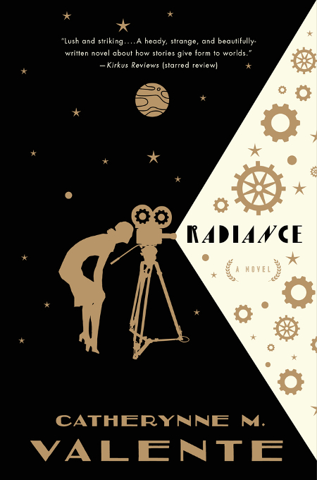
Will Staehle makes the list again with his cover design for the new Catherynne M. Valente story, Radiance: A Novel. Reading the story synopsis, he really seems to capture the nostalgic look and feel of a novel with science fictional leanings which also includes the nostalgia of early Hollywood film making. I like the way the light from the movie camera draws back the curtain, exposing the design elements that reflect the novel’s decopunk aesthetics.
This is another book that looks more attractive when holding the book in hand. The flat image on the computer screen does not represent the cover as effectively as the dust jacket.
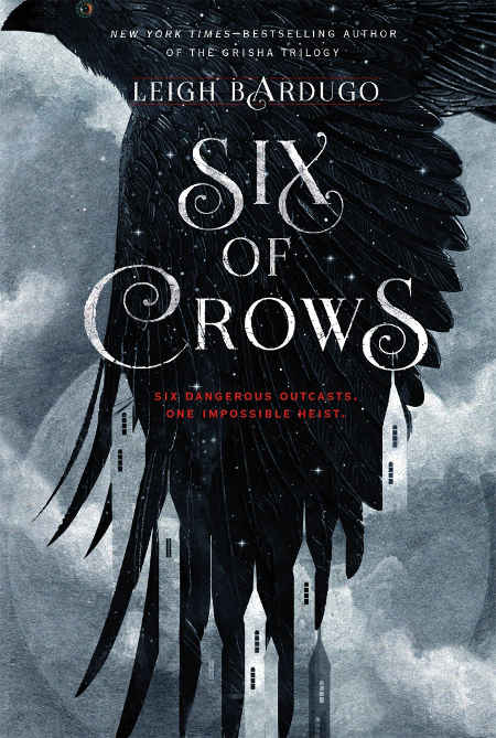
The reason I noticed the cover for The Dead House, featured earlier in this post, is that I was in the Teen section picking up a copy of Six of Crows by Leigh Bardugo. Six of Crows is a beautiful book, with art and design duties credited to Rich Deas. The design of the crow, and the way its feathers outline the spires and towers of the city appeals to me.
What makes the book even more lovely is the black-edged pages and rich red endpapers that make the whole book pop. I have been impressed with all of Leigh Bardugo’s book covers and the one short story of hers that I’ve read made me impressed with her writing skills.
Methinks I may have to “borrow” this gift from Mary to read myself.
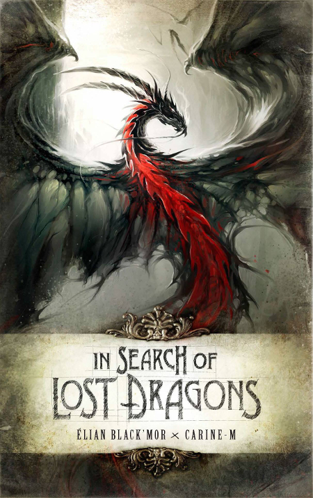
Author/artist Elian Black’Mor is someone I had not heard of before seeing the cover for In Search of Lost Dragons.
I like the way that the dragon is framed in the illustration. I am also drawn to the way in which this dragon, as opposed to the others in the distant background, dominates the image.
Black’Mor’s work on this cover reminds me of the work of Raymond Swanland, in the way that the wings flow, for lack of a better way to describe it. I’m a big Swanland fan, so that is a compliment.
The use of mostly grays is nice, making the dragon’s red underside stand out.
I’m not sure if this is truly mixed media, but the filigree above and below the title scroll looks three dimensional. Either way it is a really nice touch.
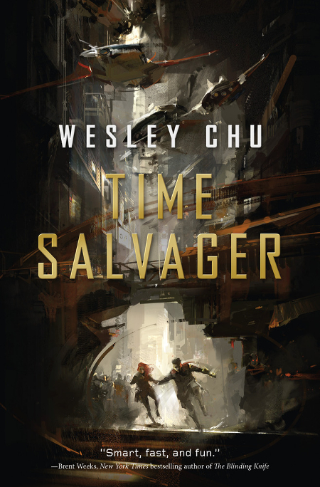
If I hadn’t already been a fan of the writing of Wesley Chu, the cover for Time Salvager would have made me want to pick up this book anyway.
Richard Anderson is everywhere of late, and that is a good thing. Like Stephan Martiniere, I seem to see his artwork on covers wherever I turn and that makes me happy because his work is very exciting.
Such a great color scheme, and so much movement, from the characters running in the lower part of the image to the vehicles zipping by overhead. Anderson’s work has that loose feel of concept art, and whenever I see it I cannot help but want to see films based on these concepts.
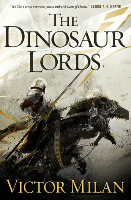
And for a little sense of deja vu, I bring you another Richard Anderson cover.
It is fun seeing these images back to back, contrasting one with the other. Where Time Salvager is a much darker image, The Dinosaur Lords, by author Victor Milan, offers up a large, almost white background with the central figure’s darker color scheme making it stand out boldly in the foreground.
I say “almost white” because it isn’t simply negative space, you can look closely and see things populating the background. It makes the image intriguing and adds a feeling of expectation. I enjoy the way the banner fades into the background.
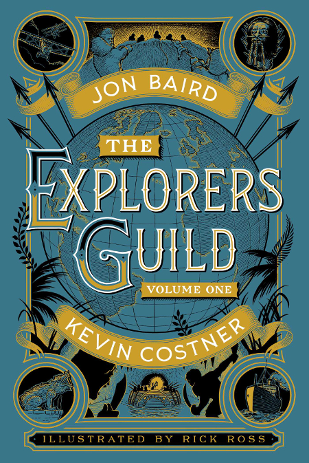
The cover and interior illustration of The Explorer’s Guild: Volume One, by Kevin Costner and John Baird, is the work of Rick Ross. It is hard to appreciate the old school style of this novel without picking it up and feeling the design etched into the cover itself. Although it is a rare thing to see covers like this on new books, it has become less rare over the years and that makes me happy. The gold color is very striking on the book itself and I am not surprised that they used that to emphasize the authors names, especially given the celebrity status of one.

I was kind of surprised that Tor Books and Pyr Books had releases in the same month that had Stephan Martiniere covers that were so similar in color and theme, but that didn’t stop me from finding both of them worthy of recognition.
It is an interesting cover, with the protagonist taking up the left side of the image and the right side being reserved for author, title and a lot of negative space. Having the cover focus solely on Promise Paen, the character created by W.C. Bauers, we get to see the detail of the armor and weapon that Martiniere designed. It makes me wish that Stephan Martiniere was designing the armor for the next Mass Effect game.
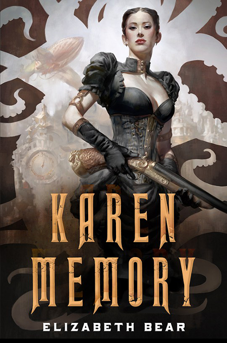
Karen Memory, by Elizabeth Bear, is blessed with a great cover by artist Cynthia Sheppard. Sheppard’s work is gorgeous.
The steampunk aesthetic is represented well here, in the little details present in the image–like the airship in the background and the designs on the gun and the character’s outfit–as well as the sepia-toned hue of the overall color scheme.
What would have been a great book cover had it just been the character and the background cityscape is made even better by the cutout design that borders the image with its writhing tentacle shapes. It is not only a fun detail, but it frames the character and draws the eye around the image.
And in this case, Tor does a great job of making the title prominent without detracting from Cynthia Sheppard’s great work.
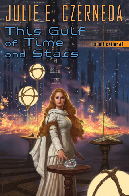
I wasn’t fully aware of author Julie E. Czerneda until earlier this summer when I purchased one of her novels on a book-buying vacation, and started noticing that I really liked the cover art on her books. The cover for her latest novel is the work of artist Matt Stawicki.
I like the overall execution of this cover. It is different than a lot of what you see on the shelves in the SFF section. The central character is beautifully rendered by Stawicki, and yet the background is not just an afterthought, but a fully detailed part of the illustration, grounding the image in the world Czerneda has created.
Stawicki’s is the kind of cover that makes me curious enough to research the series to possibly give it a try.
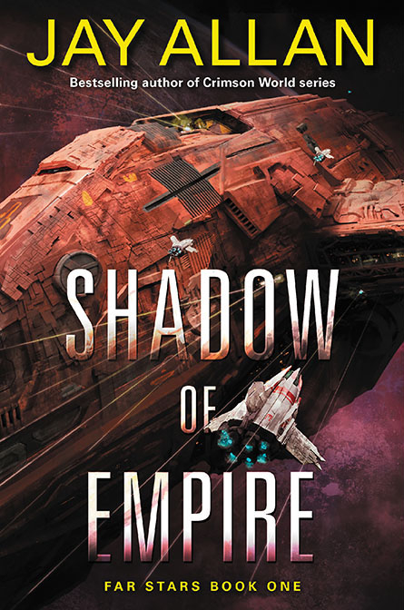
Artist John Harris created a triptych for Anne Leckie’s science fiction series, and artist Marc Simonetti has done something similar here, although with a different orientation. The Far Star trilogy, by author Jay Allan, will be graced by Simonetti covers that, when put together, are one complete image oriented from the top down. You can see the full image here, which will be broken up between the three covers.
I like any variation on the color orange, and so already this illustration had a claim on my affection. I also enjoy seeing smaller ships juxtaposed against a much larger one. I look at this cover and I want to see more of that larger ship, and find out more information about its size, its crew and the stories of its adventures.

I had a difficult time finding the designer of Burning Kingdoms, by Lauren DeStefano, but one site indicated it is the work of designer Regina Wamba.
I am drawn to this in part because of the start contrast between the deep black background and the white porcelain of the bust. I also believe it stands out because of the three dimensional look of the broken bust contrasted with the two dimensional design elements that surround the shattering figure. There is an interesting sense of recent action with the pieces of the bust flying to the right side and right off the cover.

I have been a fan of Adam Tredowski’s work since I first saw it on an issue of Interzone Magazine, and his work never fails to catch my eye wherever it might crop up.
I have enjoyed his work on this Weird Space series, and this latest novel, in which Eric Brown transitions the storytelling role to author Una McCormack, has the best Tredowski cover yet.
I love the greenish light cast over all parts of the image. The planet in the upper background of the image lends some sense of scope to the space station ring and to the ship.
I enjoy seeing all the detail on the ring and the ship, as well as the various lights that give a sense of life, of activity, going on inside both of these man-made spaces. When I see art like this I long for more science fiction focused video games and films…I also long for actual space travel, though that dream is far less attainable in my lifetime. Still, it is a testament to how much I enjoy this art that it makes me want to look up at the night sky and let my imagination take flight
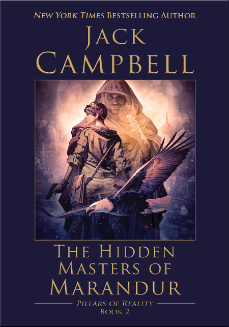
I really like the work of artist Dominick Saponaro, and as a bonus I have met him on a couple of occasions and he is a really nice guy.
The color palette for Jack Campbell‘s book, The Hidden Masters of Marandur, glows with an interesting magenta haze. It reminds me of the light of a particularly memorable sundown. I like the collage of imagery and am very curious about the young lady with the flight goggles on her head. She is featured on Saponaro’s cover for the first novel in this series, The Dragons of Dorcastle. It is another strong cover.
I haven’t read any Campbell’s popular Lost Fleet series, and now I am equally curious about this new fantasy series he has started.
The Magazines
I will wrap up the amazing art in this post with some favorites from the various SF/F/H magazines published in 2015
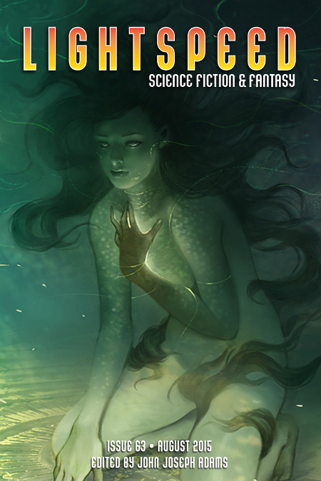
Issue 63 of Lightspeed Magazine sports a gorgeous cover by artist Reiko Murakami.
I am assuming this young lady is underwater, based on the blue-green color of the background and the way in which her hair is flowing around her…yet interestingly, she doesn’t appear to be a traditional mermaid-type creature. The glow behind her hand catches my eye and makes me wonder if it is emanating from her palm or from her heart.
Murakami has created some stunning pieces, and this is one of them.

Lightspeed Magazine, Issue 64, has a cover created by artist Craig Shields.
There is an Autumnal color palette that I am drawn to, but it is the character herself, surrounded by debris and flashes of light, that makes me pause to look more closely. I like the sense that this is an image snapped at a key point of action, as this figure appears to have been propelled outwards amidst a field of debris.
I love this cover, it practically glows.
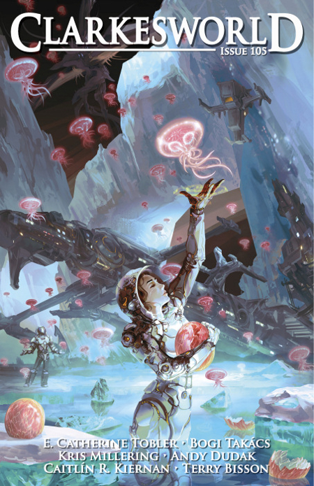
Clarkesworld Magazine also had a strong year of covers. My favorite of the group, which stands out strongly against a worthy field, is the cover for issue 105, by artist Liu Junwei.
It is such a gorgeous cover, with the jellyfish creatures giving it a real sense of fun. I like the choices of color and I’m also fond of the white hard-shell suit of the woman in the foreground. There is something sweet about the image, as it looks like she is helping to release these creatures from their eggs, rather than being there to capture them at the moment of their birth.
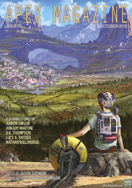
The cover for the October 2015 issue of Apex Magazine is the work of artist Joshua Hutchinson.
The young boy and his robot are a lot of fun, but is is the wide landscape that they are overlooking which makes me stop and stare. There is an old world vibe being given off by the distant village and its surrounding fields that almost seems anachronistic when compared to the technology of the robot and the marvels worn by the boy.
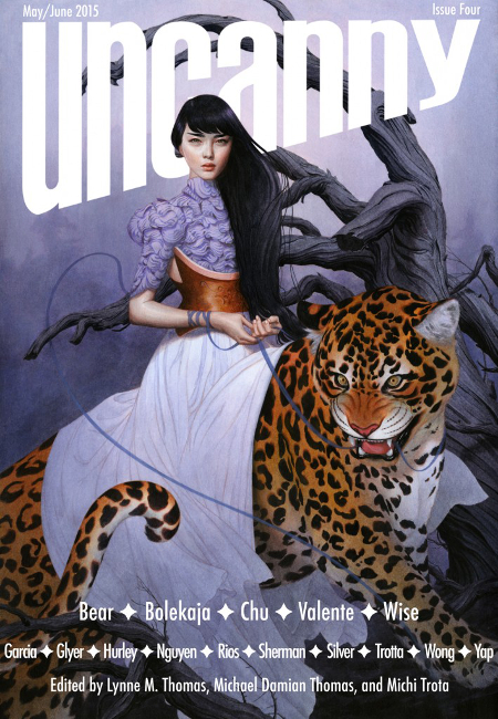
Uncanny was the new kid on the block, and all year they offered up great cover art, showing that they were here to compete with the more longstanding genre zines. Of all their great covers, this one by artist Tran Nguyen is my favorite. Her work is always lovely and showcases a tremendous talent. She is one I recommend following, as her work always inspires awe.
Well, another year of great genre cover art has passed us by, as hard as it is to believe. With it comes this post, which has become something of a tradition for me. Trust me, I like showcasing art and artists whose works I enjoy. I do hope you will share your feelings, whatever they may be, in regards to the artistic creations I have featured here.
I look forward to the art and design that 2016 will have in store for us.
A fantastic selection, Carl! I love seeing this post each year, and you always find covers that are new to me. I’ve enjoyed several of these books, including Binti and Radiance, and you’ve reminded me of others that I need to find time to read (Luna and Karen Memory). And thanks for listing the artists, they hardly ever get recognized!
I purchased Binti on the Kindle after working on this post. It seemed to interesting to pass on.
For me this is all about the artist recognition, so I’m glad you enjoyed that. I think the work of the cover artist/designer needs to be championed. All of my life, from my earliest memories, it is the work of artists that has influenced what I’ve read as well as had a hand in my feelings about what I was reading. I think that is why the work of creative directors like Irene Gallo and Lauren Panepinto and others are so important. They have it in their power to not only pair books with artists that will create something to make readers want to read that author’s work, but they also keep the tradition of book cover illustration alive in this increasing digital age.
Carl, you seemed turned on my girls with guns.
Great selection and variety of beautiful covers. I share your visual appeal of cover art.
Uh….okay….
I certainly feel better after looking over this year’s offerings again in prep for this post. There are still far too many covers that don’t feature anything approaching “art” at all, especially on older books that are being released in electronic versions. I don’t expect publishing houses to spend big money on art for these, but often the work doesn’t approach basic Photoshop skills.
Amazing covers! Like you, I’m a huge fan of John Harris’s work. But there are plenty of wonderful artists on this page that I want to see more of! Excellent choices! You have an eye for talent!
Thanks George. I’m so glad Harris continues to create work for the covers for authors like Scalzi and Ben Bova and John C. Wright. It is nice to see new paintings from him each year.
Have to say I love Richard Anderson’s work, his art always appeals to me.
Plenty of others that I haven’t heard of, but some wonderful covers up there, and I share your wish that the cover artist should be mentioned in the credits section of books. So often it is so difficult to find out.
In the days where you can find anything on the internet, it should simply be a matter of clicking over to the author or publisher page to find out the cover artist. Sadly that is not always the case.
Anderson is great, isn’t he? And not just because he has a super-cool last name. 😉
Some really amazing covers! And such a wonderful variety too. I really like that art is such an integral part of the SFF reading experience, you just don’t get that in many other bookish places.
That is true, Stefanie. I think there are some who would use that as a complaint against the way SFF is portrayed, cover-wise, as they feel the art puts the books in a niche that keeps general fiction readers from taking it seriously. For me, I think SFF should embrace what it is, and that includes in the use of professional art for covers.
What an amazing collection of gorgeous covers, indeed. Just a few days ago I was discussing with a fellow SFF enthusiast about old covers, and how they could be sometimes quite embarrassing: it seems as if those days are over, and cover art has finally gained the respect it deserves.
There is still some embarrassing stuff out there, to be sure, but I understand what you mean. There is more of a tendency with the bigger companies to hire skilled professional artists who create art that you can grab a reader’s attention and not cause you to want to hide what you are reading while in public.
A truly fine wrap-up cover art post!
Before I comment further, I want to point at the cover of Daniel Polansky’s THE BUILDERS. It looks like Anderson, but I’m not sure. I like it a lot.
I’ve read just 3 of the books you show, and one, the McCaffrey, in a much older edition. Of the remaining 2, the Scalzi and Bear, I liked one, not the other, but I very much liked both covers, and got the Bear on the strength of that cover.
Other thoughts:
Binti – is she putting it on, or rubbing it off?
I really like the cover of In Search of Lost Dragons.
That Apex cover is fabulous.
Polansky’s cover is Richard Anderson’s work, and it is fantastic. I’ll try to add the image to this comment in editing so others can see it.
I’ve read Made to Kill and Time Salvager, both of which I liked very much, and Love in the Age of Mechanical Reproduction, which had some narrative problems and too much adult content which tainted an otherwise page turning story.
I’m not sure about the Binti, but I’m assuming she is putting it on. I just bought it on Kindle and hope to get to it here soon.
My favorite cover this was Dinosaur Lords. Anderson being amazing – as always 🙂 I was also very impressed with Karen Memory. I’m like 99% sure that Cynthia Sheppard’s first ever book cover (I believe I heard it on a podcast interview of Bear).
And speaking of Richard Anderson: I’m going to Boskone in February where he is going to be the Official Artist. Hopefully I’ll be able to get him to sign a few of the covers I have done by him 🙂
I think you are right about that being Sheppard’s first cover. I have enjoyed her work for awhile now, so I hope it is not her last. It is a brilliant debut.
Dinosaur Lords is great, as is so much of what Anderson does. Very excited for you to be seeing him in Boskone. I would definitely try to get some covers signed. I had a few artists do that for me at various SFAL shows. Those books are even more treasured now than they were previously.
Absolutely gorgeous covers! Anderson’s artwork consistently blows me away. And I’ve just discovered a few books that I’ll need to add to the pile – great post! 😀
Thank you! You’ve hit on the danger of seeing posts like this. Whenever I get one ready I find myself adding books to my list as well.