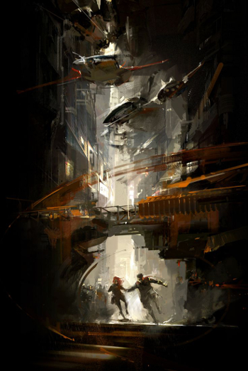
July is here! I don’t know about you, but I feel somewhat astonished that we have just stepped over the midpoint of 2015. It hardly seems possible, yet here we are.
It has been a few months since I’ve produced an issue of Cover Story, and this seems a fine time to remedy that grievous injustice. Pull up a chair for your very own visual feast, for Cover Story is all about eye-catching book and magazine art gracing publications due out this month. July looks to be a really good month, though perhaps not for your bank account.
Before continuing on with this month’s showcase, I want to add the usual disclaimer that I am not an artist, nor am I an educated art critic. I know what I like, and armed with that insight I make an effort to be open-minded enough to allow a variety of art and design styles to pique my interest. In the end, the images featured are the ones that caught my eye, they are the books or magazines that I would pick up and give a second glance (and perhaps bring home) were I to see them on a bookstore shelf. The inclusion of each image and the thoughts associated with them are mine alone, and I welcome opinions on each work featured, be they in agreement with my own or not. I also welcome you to submit any images you think should be included in this feature.
There are a number of reasons that I enjoy doing these posts, but the primary purpose is to bring attention to the artists who use their skills to create engaging genre art/design and to give a shout out to those publishers who continue to make the effort to use art and design work to sell science fiction, fantasy and horror publications.
As always, I thank John DeNardo for the monthly jumping off point that I use to begin my review of each month. You can see hundreds more July 2015 releases on his post here.
Welcome to July 2015. Enjoy!
(The opening image, featured again later in this post, is property of artist Richard Anderson)
Title: Nightborn (Thrones and Bones)
Author: Lou Anders
Publisher: Crown Books for Young Readers
Release date: July 14th
Artist: Justin Gerard
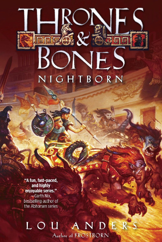
Lou Anders returns to the world and characters he introduced in his debut novel, Frostborn, and thankfully he once again brings artist Justin Gerard along for the journey.
Justin created the cover art and interior illustrations for Frostborn, and I look forward to seeing the visual delights that await within Nightborn‘s pages. While we wait, we have tremendously fun cover to whet our appetites.
The cover for Frostborn reflected an intense, suspenseful part of that story, and no doubt Justin Gerard’s action-packed cover for Nightborn gives us a hint of what some of this novel may have to offer.
Justin Gerard’s art brings to mind the kind of imaginative fantasies I had when I read or daydreamed as a child, which means that I feel a great sense of joy every time I see his work.
Update: If you haven’t seen them, be sure to check out the awesome maps that Robert Lazzareti has created for the worlds of Thrones and Bones. You can see them here.
Title: The Year’s Best Science Fiction & Fantasy Novellas 2015
Author: Paula Guran, ed.
Publisher: Prime Books
Release date: August 6th
Artist: Julie Dillon
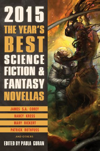
It was such a pleasure to meet artist Julie Dillon at Spectrum Fantastic Art Live 4 this past May, a pleasure that will be repeated in 2016 when she is the Artist Guest of Honor at ConQuesT 47 in Kansas City, MO. She had some really great examples of her artwork at the show, this image being one of them.
This piece was previously featured on issue 89 of Clarkesworld Magazine. Julie Dillon has been featured often in these Cover Story posts, because she is a prolific artist, but more so because the quality of her work is consistently outstanding and her rich, vibrant colors combined with the sense of movement, or flow, that each piece exhibits never fails to elicit an emotional response. “Awe” may be the most apt one-word description.
Title: The Baba Yaga
Author: Eric Brown, Una McCormack
Publisher: Abbaddon
Release date: Available Now
Artist: Adam Tredowski
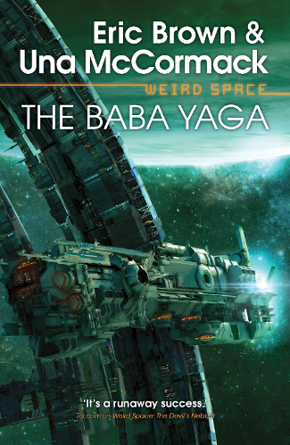
I have been a fan of Adam Tredowski’s work since I first saw it on an issue of Interzone Magazine, and his work never fails to catch my eye wherever it might crop up.
I have enjoyed his work on this Weird Space series, and this latest novel, in which Brown transitions the storytelling role to author Una McCormack, has the best Tredowski cover yet.
I love the greenish light cast over all parts of the image. The planet in the upper background of the image lends some sense of scope to the space station ring and to the ship.
I enjoy seeing all the detail on the ring and the ship, as well as the various lights that give a sense of life, of activity, going on inside both of these man-made spaces. When I see art like this I long for more science fiction focused video games and films…I also long for actual space travel, though that dream is far less attainable in my lifetime. Still, it is a testament to how much I enjoy this art that it makes me want to look up at the night sky and let my imagination take flight.
Title: The Best of Gregory Benford
Author: Gregory Benford
Publisher: Subterranean Press
Release date: July 31
Artist: John Harris

Speaking of imagination, I have a difficult time picturing a scenario in which a forthcoming book or magazine sporting a John Harris cover would fail to make it onto my list of eye-catching covers.
The man is a master for a reason, not only because he is a master of his craft, in the technical sense, but also because he has developed and continues to perfect a way of imagining futuristic landscapes, buildings and spaceships that is uniquely his own.
I like the juxtaposition of a tropical, sunny world that looks very contemporary against a distant, massive science fictional structure that rises and shines into the dark, starry heavens. The color scheme of this one is great, and I appreciate the way that the folks at Subterranean Press chose to use opacity and color to blend the author’s name into image rather than completely covering it up.
Title: The Empress Game
Author: Rhonda Mason
Publisher: Titan Books
Release date: July 14th
Artist: Reminds me of both Scott M. Fischer and Dan Dos Santos.
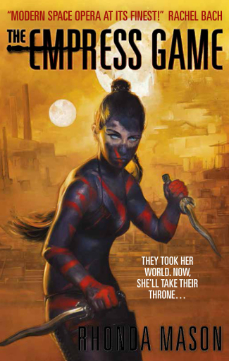
This is striking, isn’t it? So often with covers, the central figure is most brightly lit, drawing all the focus of the various light sources. In this case, she is presented somewhat in shadow, with the light coming at her from behind, and it makes the cover as a whole pop in very interesting ways.
I like the way that the woman is rendered more fully while the background is more hazy and indistinct. It gives off an impression of heat and warmth that the sun(s) alone would not do.
On her website the author states, “I love everything about it. They couldn’t have captured Kayla, the female protagonist, any more perfectly.” I enjoyed reading that. While every cover need not be a 100% detailed representation of part of the story, I do like it when a character on a cover resembles what is described in the story itself.
Title: Time Salvager
Author: Wesley Chu
Publisher: Tor Books
Release date: July 7th
Artist: Richard Anderson
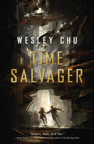
Richard Anderson is everywhere of late, and that is a good thing. Like Julie Dillon, I seem to see his artwork on covers wherever I turn and that makes me happy because his work is very exciting.
I have been anxious to read Chu’s new novel, having enjoyed the first of the Tao novels so completely, and I was thrilled for him…and for me…when the cover reveal showed what Anderson had come up with for the story.
Such a great color scheme, and so much movement, from the characters running in the lower part of the image to the vehicles zipping by overhead. Anderson’s work has that loose feel of concept art, and whenever I see it I cannot help but want to see films based on these concepts.
Title: The Dinosaur Lords
Author: Victor Milan
Publisher: Tor Books
Release date: July 28th
Artist: Richard Anderson
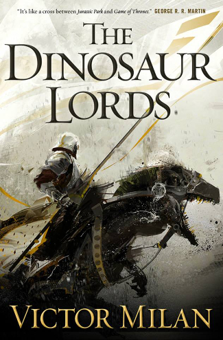
And for a little sense of deja vu, I bring you another Richard Anderson cover.
It is fun seeing these images back to back, contrasting one with the other. Where Time Salvager is a much darker image, The Dinosaur Lords offers up a large, almost white background with the central figure’s darker color scheme making it stand out boldly in the foreground.
I say “almost white” because it isn’t simply negative space, you can look closely and see things populating the background. It makes the image intriguing and adds a feeling of expectation. I enjoy the way the banner fades into the background.
Title: Islands Off the Coast of Capitola, 1978: A Tor.Com Original
Author: David Herter
Publisher: Tor.com
Release date: July 8th
Artist: Wesley Allsbruck
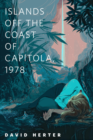
There are a lot of things going on that cause me to feel a connection to this image. I like the tropical color scheme, reminding me of vacations and adventures. The woman laying down is interesting in the way her body…her limbs…her hair…curves over and around the landscape. In comparing her to the figure in the boat, I wonder if she is represented in the correct aspect to this person, or is the person in the boat just an aspect of the story that the artist is working into the image? Or are these one and the same person? And what happened? The illustration makes me want to read the story to find out. Isn’t that what cover art should do?
Title: Lightspeed Magazine, Issue 62, July 2015
Author: John Joseph Adams, ed.
Release date: Available Now
Artist: Euclase
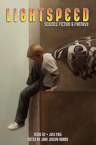
There is something simple, yet highly effective about the July cover of Lightspeed. The magazine tile and issue information is unobtrusive, per usual, but it is much more noticeable in the way that it allows this work by Euclase to stand out.
I don’t know about you, but this image is both exciting and terrifying to me. The indistinct background means that the viewer has no sense of just how high up this young man is. I think we have all had dreams of wanting to fly, and seeing a child with wings brings back those early dreams and desires. That is fun, it is exciting. But the image also terrifies me. These don’t look like the massive, angelic wings that would seem capable of supporting this character’s weight. These wings seem unsubstantial, perhaps even inadequate. Or at the very least, untested.
Maybe it is the result of being a parent, but seeing this young man as he appears to be preparing himself to take a literal “flying leap”, makes me want to coax him off the ledge.
Title: Uncanny Magazine, Issue 5, July/August 2015
Author: Lynne M. Thomas, Michael Damien Thomas, Michi Trota, ed.
Release date: July 7th
Artist: Antonio Caparo
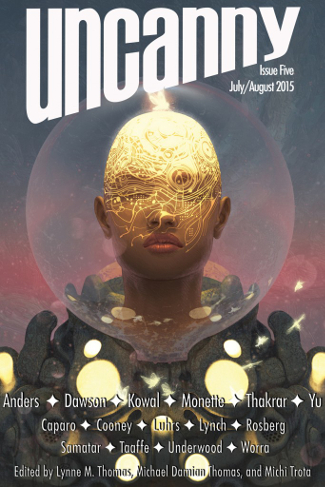
Uncanny is still one of the new kids on the genre magazine block, but five issues in they have proven to be serious about advertising their authors’ content with great art. Wow, this one is fabulous! In execution it reminds me somewhat of the work of Julie Dillon.
I have been and will likely always remain a fan of the big glass “fish bowl” style helmet sported by space-faring beings. It elicits a sense of nostalgia for pulp-era and golden age art and storytelling. The central character reflects the diversity that is coming to the forefront of genre fiction, making this an exciting time to be a reader, even if it is also a contentious time in the overall community.
I like the way that the insect inside the helmet lights the image. Is the pattern on the woman’s head something we only see because of this light? Is this on the surface of her skin or sitting just below the surface? It is a really eye-catching effect either way.
Title: Nightmare Magazine, Issue 34, July 2015
Author: John Joseph Adams, ed.
Release date: Available Now
Artist: Dennis Carlsson
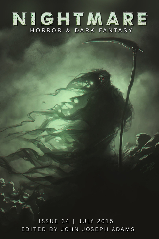
Not that I need any excuse to long for Autumnal temperatures, but Dennis Carlsson’s cover for the latest issue of Nightmare Magazine makes me long for October nights, chilly temperatures, and stories about things that go bump in the night.
That green color always makes me think of spectral beings, and the way in which (presumably) Death’s cloak flows, becoming more ethereal as it stretches away from his person, is eerie in all the right ways.
Echoes of the words of E.A. Poe and H.P. Lovecraft reverberate in my mind as I the light in Death’s eyes leaves me transfixed.
Title: Neverwhere, Author’s Preferred Text
Author: Neil Gaiman
Publisher: William Morrow
Release date: July 28th
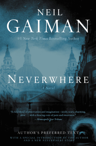
Confession: While I do like this cover well enough, it is not the art, but the existence of the book itself that made me want to include it in this post revealing eye-catching covers for July 2015 releases.
People who know me well know that Neil Gaiman is my favorite author. The seeds for that devotion were sewn when my friend Scott introduced me to the Sandman series at the end of its run while I was visiting him in New York. But the true blossoming of my affection for the way in which Neil Gaiman tells stories came about when I wandered into a Borders store in Tulsa, OK one afternoon to discover Neverwhere on the new release shelf. I took it home, began it immediately, and have loved it ever since. It consistently sits along with the Bram Stoker novel Dracula as my absolute favorite book of all time.
I’ve said often that Neverwhere is that one novel that I would have wanted to write were I an author. Its basic premise reminds me of the kind of daydream fantasies I had when I was a kid. The Author’s Preferred text has been in existence for some time, both in an audio format and a limited edition hardcover, both of which I own but have not read. I’m not certain why I have not “read” either of these, other than perhaps my deep affection for the story as it exists in its original text form (and I admit that I like the low-budget television show too).
But it is time to delve in and find out what makes this version Neil’s preferred text, and so I plan on picking up a copy of this when it comes out July 28th and diving right in. It has been a few years since I went on the journey with Richard Mayhew, and I find myself missing these characters something fierce.
Well, there you have the July 2015 edition of Cover Story. I would love to know what you think of the featured images, if any of the books are on your list to buy, and what covers you have seen for July 2015 releases that excite you, irregardless of whether or not they are genre fiction publications.
Really love this feature, Carl! My favorite covers this month are Time Salvagers, Lightspeed and Nightmare. I love that the zines in particular always have such wonderful cover art.
Me too, Tammy. I wish some of these ‘zines were in print form, I would love to have physical copies of them.
I am about 50 pages in to Time Salvager and I’m enjoying it. I thought the first chapter was a little bit all over the place, but the second and third drew me right in.
I really love the cover of Time Salvager. Every time I see it, I’m tempted to give the book a try, but I didn’t really get into the Tao books. Mostly a case of ‘not for me’. 🙂 You’ll have to let us know how it is!
I’ve only read the first Tao book, but thus far this one feels quite different to what I remember. It has the grittiness of James S.A. Corey’s Expanse series, and I am a sucker for time travel stories of any length.
What a great post. I love the cover for Time Salvagers and Nightmare gives me the chills. And, I love that cover for Neverwhere!
Thanks
Lynn 😀
Thanks Lynn, they are fun, and time consuming. But it is worth it to showcase the art and to encourage people to read more books. Though I’m generally preaching to the choir with this crowd. 🙂
I’m looking forward to adding that edition of Neverwhere to my collection.
I already have The Empress Game on my TBR list, it looks great. I was thinking of adding The Dinosaur Lords, because I loved the cover, but Tor had an excerpt and it didn’t relaly do it for me.
Really nice to see you back doing the Cover Story posts Carl, they’re great.
That is one good thing about those excerpts, although they too can be deceiving. I read the excerpt of The Emperor’s Blades by Stavely and loved it, then got the book and did not like the second chapter (which introduced a group that would be an alternating part of the story line) at all.
I think Empress Game looks and sounds good too, I love space opera.
Thanks, always nice to have your thoughts on the cover art.
Every issue of Uncanny Magazine has gorgeous cover art! This issue and the last one are one favorites so far. Their second issue’s art was done by Julie Dillon, too.
Richard Anderson is one of my favorite artists. I love his style; it’s so unique. If I ever wrote a book, he would be who I want to do my cover.
They do, don’t they D.J.? I look forward to finally giving the magazine a read with issue 4 that I just bought.
Anderson is great, and anyone who is getting a cover done by him is one of the lucky ones.
Great eye-catching covers! TIME SALVAGER has been getting a lot of buzz. And a new edition of NEVERWHERE needs to be checked out. It’s great to see so many new artists producing such exciting artwork!
I’m 100 pages in to Time Salvager and I’m hooked. I’m not sure exactly where Chu is going to take the story, making each chapter exciting. I had a hard time putting it down to go to bed last night.
What lovely covers!
I’m particularly intrigued by Dinosaur Lords – I love to see what authors can do with existing concepts and creatures.
It is an interesting cover, isn’t it?
Yes, the Milan and Chu covers are very striking: Richard Anderson is great!