It is the February 2015 edition of Cover Story, the monthly post where I feature a handful of cover images from books and other story formats that will be coming out this month.
I feature the images because I am a fan of SF/F/H genre illustration, believe the artists and designers who create these covers should be lauded for their work, and want to promote the publishers who commissioned the illustrations and the authors whose works they adorn.
I am not an art critic, nor an artist, and my descriptions of why I am attracted to these covers will quickly reveal my nonprofessional, fan status. Nonetheless I do judge books by their covers, at least initially, and am curious about what does, and does not, catch the eye of other book lovers and Fantastic art fans.
This month is a short list, but one that has the potential of damaging my wallet all the same (In fact, it already has!).
I highly encourage you to follow the artist links to check out more creations by each featured artist/designer. Be an encourager, and when you can be, a patron of the incredibly talented women and men who create this work.
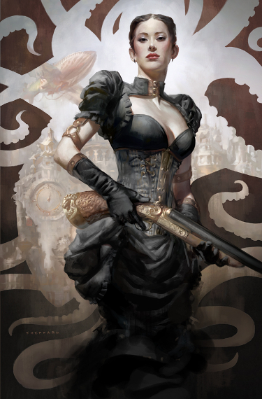
(The opening image is the work of artist Cynthia Sheppard. This work and all featured artwork is the property of the artist/designer and the publisher.)
Title: Covenant’s End
Author: Ari Marmell
Publisher: Pyr Books
Release date: February 3rd, 2015
Artist: Jason Chan
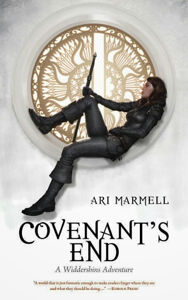
Each Jason Chan illustration for this series is better than the last, and that is saying something, because Ari Marmell’s series started with an amazing cover.
One of the most arresting things about the Widdershins covers, this one included, is how the character pops against the bright white background. The black on white works so well.
I like the way that Jason Chan has introduced a bit of color with the design in the window.
The protagonist looks so pensive in this picture, making me wonder what she is contemplating, and perhaps who, or what, she is waiting there for.
Title: The Very Best of Kate Elliot
Author: Kate Elliot
Publisher: Tachyon Publications
Release date: February 11th, 2015
Artist: Julie Dillon
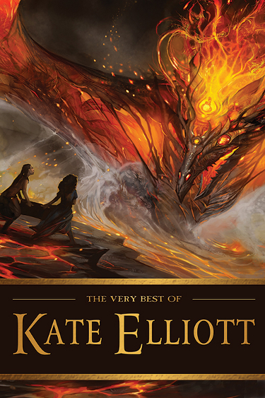
Julie Dillon is fast becoming the most featured artist in the Cover Story posts, and it is easy to see why. Regardless of the color palette she chooses, whether warm or cool, bold or subdued, her illustrations are so full of light…they almost have a backlit quality to them.
Kate Elliott’s short story collection is graced with this fiery, arresting cover.
The creature in the background is awash in flame and I like the way in which the creature seems to be half ethereal, as if it is a partially a tangible being and partially created of fire itself.
I am very curious about the two characters in the foreground and what they are carrying between them.
Title: Love in the Age of Mechanical Reproduction
Author: Judd Trichtor
Publisher: Thomas Dunne Books
Release date: February 3rd, 2015
Artist: Rob Grom

You know a book cover has truly caught your attention when, after seeing it online, you are inspired to go out to the store on release day to pick up a copy, especially when it is an author’s debut novel. That is what happened when I saw the cover for Love in the Age of Mechanical Reproduction.
The robot/android theme always grabs my attention, particularly when done effectively, and designer Rob Grom does just that with the cover for Trichter’s novel.
I like how the use of the photograph of the women’s face becomes mask-like as it merges with the machine parts that reveal what she is. The color choices are attractive and they make the book stand out amidst other science fiction titles on the bookstore shelf.
Being a fan, rather than a detractor, of J.J. Abrams’ post-production choices, I like how there is a lens flare effect in the design.
Normally I am put off by title copy that completely covers the book’s illustration/image, but in this case I like it, and the lighted hearts on the “as novel” line are a nice touch given the book’s theme.
Title: Karen Memory
Author: Elizabeth Bear
Publisher: Tor Books
Release date: February 3rd, 2015
Artist: Cynthia Sheppard
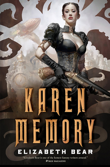
When the cover for Elizabeth Bear’s new novel was revealed several months ago, Cynthia Sheppard’s illustration immediately made me want to know who that character was, and what her story might be.
The steampunk aesthetic is represented well here, in the little details present in the image–like the airship in the background and the designs on the gun and the character’s outfit, as well as the sepia-toned hue of the overall color scheme.
What would have been a great book cover had it just been the character and the background cityscape is made even better by the cutout design that borders the image with its writhing tentacle shapes. It is not only a fun detail, but it frames the character and draws the eye around the image.
And in this case, Tor does a great job of making the title prominent without detracting from Cynthia Sheppard’s great work.
Title: The Eterna Files
Author: Leanna Renee Hieber
Publisher: Tor Books
Release date: February 10th, 2015
Artist: ?

The cover for The Eterna Files is more a case of design/photography than art in the illustrative sense, but for all that it catches my eye and makes me curious about the novel.
It does so in part because of its simplicity– a few props set against a moody background– and because those props are part of a gothic theme that I enjoy. Put a crow, raven or blackbird on the cover and you get me to sit up and take notice. It has to be the discovery of Edgar Allen Poe in junior high that has burned this into my brain.
I enjoy the way that the presence of the bird, hat and chair make me curious about the person who is absent, the character whose doffs this hat and whose companion, or pet, this bird might be.
The title font gives the image a sense of depth, with one word behind the chair and the other sitting in front of it. It is a minor touch, but small details like that make all the difference. Covering the dark shapes of the bird or hat would have taken something away from the cover.
Title: Clarkesworld, Issue 101 February 2015
Editor: Neil Clarke
Publisher: Wyrm Publications
Release date: February 1, 2015
Artist: Atilgan Asikuzun
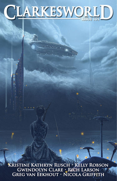
I believe it was last month that we discussed the fact that Clarkesworld is very consistent in putting out great covers month after month.
So it should not be surprising that they have done so again.
Asikuzun’s use of one primary hue perfectly sets up the mood of the piece, and the firefly touches give it a twilight feel. I love the way that nature is juxtaposed against technology and engineering with the young lady sitting on the bank and the city and spaceship on the other side of the shore.
It is almost anachronistic to see this lady, in simple dress, fishing off the bank with such a futuristic scene in the background. Her look, the act of fishing, the toadstools, the fireflies…these could be a part of our present or distant past…yet the overall image shows this to not only be in the future, but perhaps on another planet as well.
Aren’t you curious about what she might pull out of the water?
Title: Apex Magazine, Issue 69, February 2015
Editor: Jason Sizemore, Sigrid Ellis
Publisher: Apex Publications
Release date: February 2015
Artist: Loika
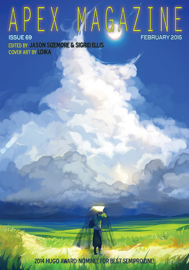
I love this cover.
It is clean, simple, effective.
It evokes feelings of joy and warmth…feelings that are much needed today when it is deceptively sunny while temps are in the single digits with sub-zero wind chills. Brrrr.
From as far back as I can remember I have been as enamored of clouds as I am of the stars. It must be a sky thing. My imagination is fired when I look up.
Loika’s clouds are rendered beautifully. I am especially drawn to the way they begin to flair around the sun, creating something of a partial Halo effect. That framing actually intensifies the warmth of the illustration.
I like the open, unspoiled vista laid out before the single character. It makes me think of a journey, of discovery.
That is Cover Story for February 2015. As always I would like to thank John DeNardo for his monthly cover post, which provides a starting point for my perusal of new and upcoming cover art.
Thank you to the artists and designers for their creativity, and for book publishers and Art Directors who continue to make the effort to make the book cover a place for creativity to flourish.
As always, please share your opinions. Tell us what you like, what you don’t, and what I might have missed that should have been included in this month’s post.
And be sure to check out my review of my favorite SFF covers for 2014, and the January 2015 Cover Story if you missed them.
Thanks for the recommendations. I also liked the “Love in the Age of Mechanical Reproduction,” even though like you I’m normally not a fan of white writing over an image (four words: first Thor movie poster).
Yes, those words over faces posters for Thor weren’t the greatest idea ever.
I picked up the book and have read the first couple of chapters. So far, so good.
I look forward to your monthly posts, Carl! You’ve got another great round-up of stunning covers. I especially love the cover for Karen Memory and Love in the Age of Mechanical Reproduction. Oh, and the Kate Elliott cover, gorgeous!
I have fun doing them. I love looking at the slate of books coming out, it always excites me…and lightens my wallet.
Cynthia Sheppard’s work on Karen Memory is great, isn’t it? Wow!
Funny how people will interpret things differently. I see the subject of the cover of Covenant’s End (is her name Widdershins?) as a prototypical bad ass in her black leathers, careless of convention about what is or isn’t an appropriate place to rest.
Isn’t the clock on the cover of Karen Memory also an eye of the octopus?
I see something far beyond an ordinary halo effect on the cover of Apex, an intentional contrast to the, low tech, entirely natural person in the foreground.
Whatever we make of them, thanks for showcasing more good art that I would otherwise never have seen.
I can definitely see that as well, Will.
Nice catch on the “eye”, I cannot imagine that placement was random. I hadn’t noticed that at all, but is very obvious once you pointed it out.
On the Apex cover, it is that “halo effect” that is the only thing “magical” for lack of a better word, about the image and it makes me very curious about what the artist was trying to capture.
Very much appreciate your take on things, Will. Art should generate opinions, insights, discussion. I like seeing these through your eyes.
Liked the covers for Clarkesworld and the Eterna Files. Karen Memory and Love in the Age are okay. Covenants End-50% of the covers in B&N’s mass market SF/F section have tough chicks in leather. So over it.
Thanks for commenting, Steve.
I don’t disagree that there are a lot of women in leather covers out there. From what I’ve read of the series, though, the outfit fits her description and doesn’t needlessly show off flesh to be sexual, so in that way these covers are certainly different.
I’m certainly going to be getting the Kate Elliott one, I love her work, but that cover is great too. I might get the hard copy rather than the ebook…
And the Apex cover is lovely, & intriguing too.
I’m looking forward to giving her work a try. It is entirely possible that I’ve actually done so in some magazine or anthology, but I don’t recall doing so.
Another fine Cover Story post, and my thanks for it.
My favorites:
1. cover of The Very Best of Kate Elliot, art by Julie Dillon
2. cover of Apex Magazine, Issue 69, February 2015, art by Loika
3. cover of Karen Memory, art by Cynthia Sheppard
Tor certainly does a very good job with art, as does Clarkesworld. Again I plead for a collection of Clarkesworld covers. Maybe a Kickstarter campaign is in order.
Happy to be of service, Richard.
I’m so glad I looked up Apex before I hit the “Publish” button this morning. Their magazine doesn’t usually go live until a few days into the month and so I don’t always give myself the opportunity to post their covers when I like them.
I would love to see a Kickstarter for the Tor short story images Irene Gallo commissions and for the Clarkesworld covers.
If Mr. Clarke would set it up, I’d certainly kick in!
I contacted Neil and he said “it’s on my wish list, but won’t happen soon”. So maybe someday…
At least it is on his radar. I too would be contributing to that. We will have to keep one eye open and warn each other if the Kickstarter ever does pop up.
I’ve been seeing that Elizabeth Bear cover everywhere since the book is getting lots of buzz, but you’re right the cover is really fantastic. Love the Clarkesworld cover. It does make me curious what the woman on the shore will pull out of the water!
I have too, Stephanie, for the past few months. I’ve been anxious for February to roll around so I could finally post about it in the Cover Story post.
It couldn’t be a normal fish, could it? Nah…I didn’t think so….
Good looking books! I really must read Elizabeth Bear. I have some other books by her that have really great covers and are unread… I really like the Kate Elliott book, but she is another author all ready on my TBR that I have not read yet…
I’ve read some of Bear’s short fiction, but never any of her novels. That is one thing I need to get to one of these days. Do you have this Best Of book for Kate Elliot? Maybe that could be our Once Upon a Time book we read together this year?
I don’t have it, but I will buy it! I am going to go email you… 🙂
You have an eye for great cover artwork! Like you, I’m completely baffled why ebooks have such inferior cover artwork (or something generic).
I don’t get it. I wish that up and coming artists would be more organized and create a space where self-published and small press publishers could access good art for fair but reasonable prices so that ebooks could have better cover art.
Great covers! My favorites are Karen Memory (I wish I could wear a dress like that) and The Eterna Files (for the same reason – Poe).
It is a great dress, isn’t it? I don’t think I would look good in it, though. 🙂
Cover art always catches my eye and I always appreciate when the publisher has something original. A few years ago I had 2 books from different publishers with the same photographic art!
I have seen that happen myself. I assume the companies are accessing the same stock photo images and aren’t checking to see how they have been used.