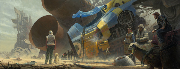
(Sky Burial, by Wayne Haag. Copyright Wayne Haag)
It has been awhile, I know.
The new feature I began this year, Cover Story, was meant to be monthly and, as of this post, I believe I have done seven out of twelve months.
*Sigh* There is always 2015.
At any rate, welcome to the December 2014 Edition of Cover Story, the monthly feature showcasing genre cover art for works scheduled for publication within (or around) the current month. I do judge books by their covers, at least on the first pass. It was the art on science fiction book covers that drew me in as a young reader, and I believe it is important to promote the artists and designers, and the book companies that employ them, for the efforts made to keep alive the grand tradition of eye-catching genre cover art.
The opening image is by artist Wayne Haag, and is featured, in an edited format, below.
(Monthly Disclaimer: I am not an art critic and have no formal artistic training. “Eye-catching” means exactly what it says, these images caught my eye and drew my attention to the works they grace, compelling me to search out more information about the book. Opinions contrary to mine, and suggestions for works that I missed that caught your eye, are always welcome.)
The December 2014 list is not lengthy, but it is packed with some eye-popping, gorgeous illustrations. Enjoy, and stay tuned near the end of the year for my Favorite Science Fiction and Fantasy Covers of 2014 post…it will be packed!
With those formalities out of the way, let’s get to the cover art, shall we?
Note: if you click on each image it will open up a new window with a larger version of the illustration for your perusal.
Title: Andromeda’s War
Author: William C. Dietz
Publisher: Ace Books
Release date: December 2nd, 2014
Artist: Chris McGrath

I swear this cover is not on the list simply because there is a quote from me on the back cover.
I have long been a fan of Christian McGrath’s work. It was his cover for Andromeda’s Fall that inspired me to pick up that book, which was my first experience with the work of William C. Dietz.
The colors come off a little muted on the actual cover image. If you click this picture you can see the unadorned illustration and how nice it really is.
Lady Catherine “Cat” Carletto, aka Andromeda McKee, is hiding out in the Legion and is supposed to be unrecognizable because of a disfiguring scar on her face. McGrath, and Ace’s Art Director no doubt, have chosen to minimize the jarring effect of the scar (though you can see it), and show that the beautiful socialite that Cat was before her life collapsed is still there underneath the uniform.
Title: Cold Hillside
Author: Nancy Baker
Publisher: ChiZine Publications
Release date: December 31st, 2014
Artist: Vincent Haig
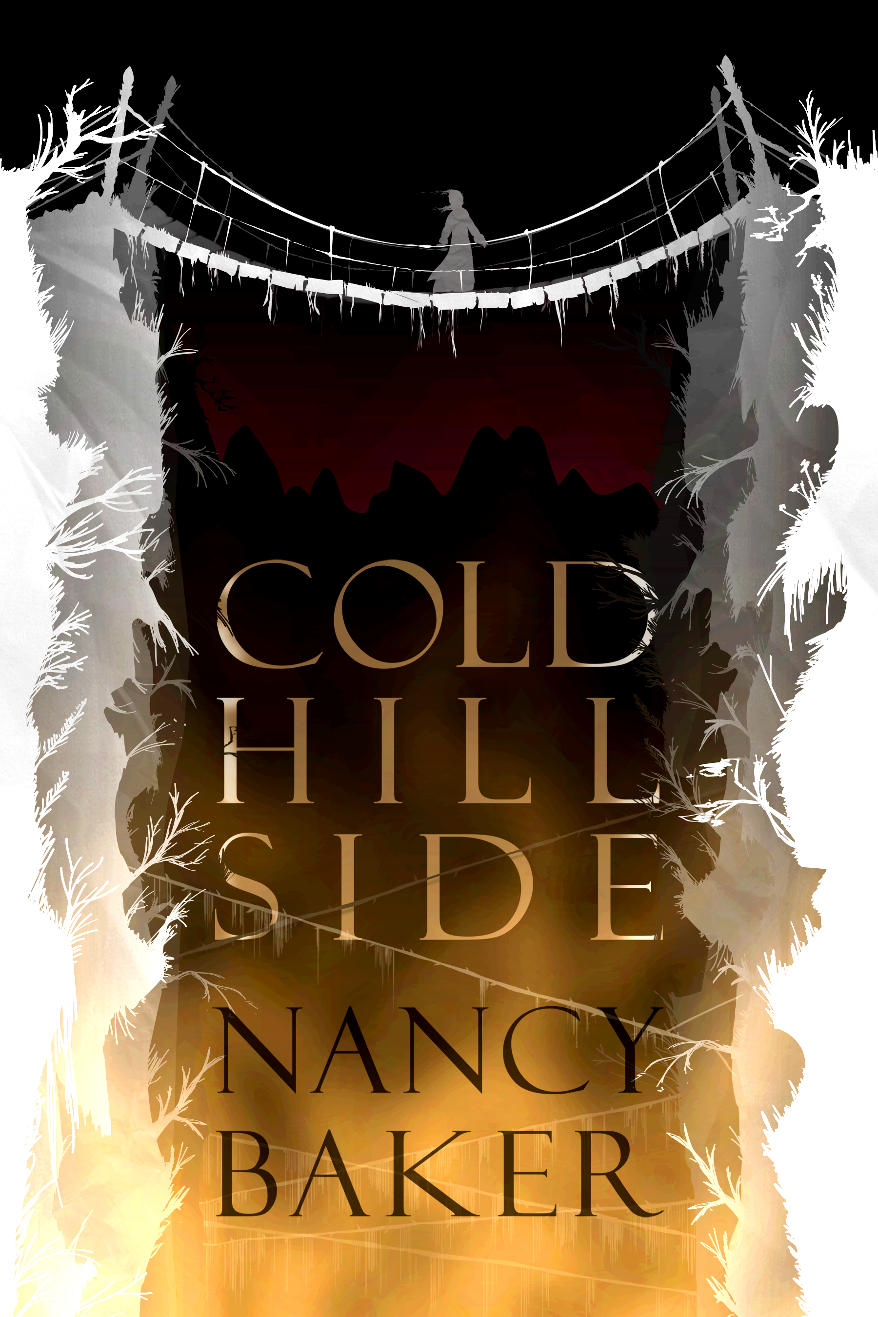
Vincent Haig’s cover for Nancy Baker’s new novel is somewhat minimalist, and yet highly effective, which is why it caught my eye as I was looking at the December releases.
The white of the canyon walls and the rickety bridge, covered with ice, reflect the book’s title with strong imagery that pops out from the darker hues of the background colors.
The cover makes me shiver, in more ways than one.
I enjoy the way that the branches or roots that litter the canyon walls look like eerie hands, ready to reach out and grab you if you were to slide off the bridge. Which would be worse, the long fall or actually being grabbed by these icy, spectral hands?
And what are the ice-covered lines that stretch across the lower part of the image?
The cover is effective not only because it is an interesting, balanced design but also because it makes me very curious about the story.
Title: Universal Alien
Author: Gini Koch
Publisher: DAW Books
Release date: December 2nd, 2014
Artist: Dan Dos Santos

I know I read like a broken record, but I sometimes feel like I need to qualify the fact that I am a huge Dan Dos Santos fan. Which is silly, because his work is great.
There may be others who illustrate like Dos Santos (feel free to point them out, as none spring to mind), but there is a quality to his brush work, and the way he illustrates light, that is unique, and it captures my attention.
I think there has been a Gini Koch book cover on my Favorites lists for several years in a row. They are just so much fun.
Often the Koch covers have a solid color background, which is effective in making the foreground characters stand out, but I really like this sky/constellation pattern background.
It really is well past time that I give this series a try.
Title: In Search of Lost Dragons
Author: Elian Black’Mor and Carine-M
Publisher: Dynamite Entertainment
Release date: December 30, 2014
Artist: Elian Black’Mor
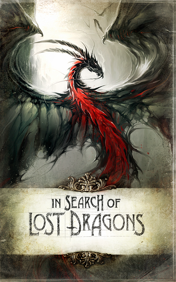
This is my first exposure to the work of Elian Black’Mor…where have I been?
I’m dragon-conscious of late, having recently watched the Extended Edition of The Desolation of Smaug, as well as the extras about how they created the dragon, so as I scrolled through the images of the December release books, this one instantly stopped me in my tracks.
I like the way that the dragon is framed in the illustration. I am also drawn to the way in which this dragon, as opposed to the others in the distant background, dominates the image.
Black’Mor’s work on this cover reminds me of the work of Raymond Swanland, in the way that the wings flow, for lack of a better way to describe it. As you’ll see soon, I’m also a big Swanland fan, so that is a compliment.
The use of mostly grays is nice, making the dragon’s red underside stand out.
I’m not sure if this is truly mixed media, but the filigree above and below the title scroll looks three dimensional. Either way it is a really nice touch.
Title: The Lady
Author: K.V. Johansen
Publisher: Pyr
Release date: December 9th, 2014
Artist: Raymond Swanland
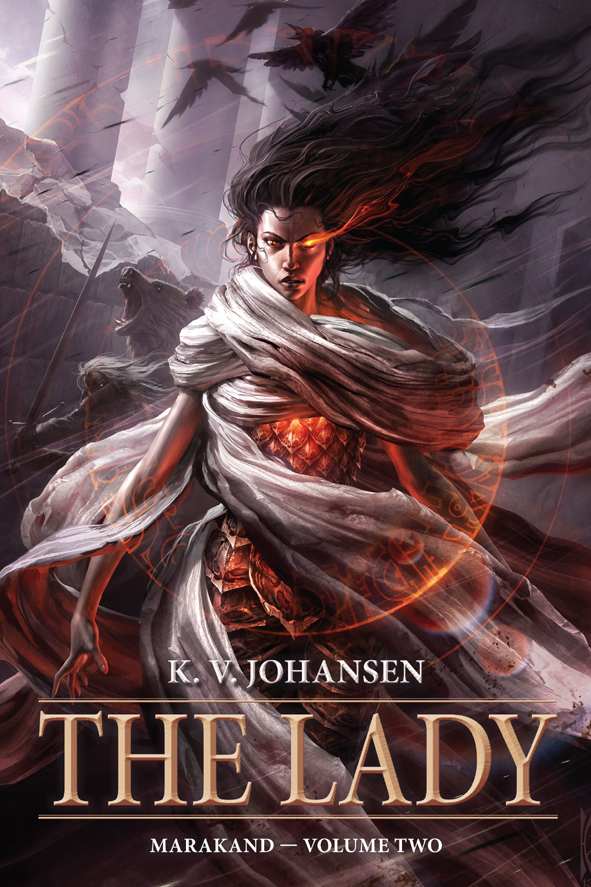
Every time I see a Raymond Swanland cover it makes me want to buy the book. Even if the subject matter of the book does not instantly appeal (which is not the case here), I want to have the book on my shelf so that I can gaze at the cover.
Note to art book publishers: let’s get a comprehensive Raymond Swanland art book together, can we?
Pyr Books sent me a copy of this recently, and I can attest that the cover is even more striking on the book itself than it is here. The warm colors really stand out strong on the cover.
I use the word “flow” every time I try (inadequately) to describe a Swanland cover. I do so because his covers always have this sense of movement, as if the air around his subject matter is both powerful and electric.
There are interesting things going on with the character, and the bear, and the birds, in the background, but it is hard to take my eyes off of this strong central character. You would definitely want to stay on the good side of this strong lady.
Title: Ticker
Author: Lisa Mantchev
Publisher: Skyscape
Release date: December 1st, 2014
Artist: Will Staehle

It could be legitimately argued that the layout of many of the books on Teen shelves have a sameness to them. You could argue the same thing about many genre books. I have read many complaints about the “head cut off” photo-realistic character covers, and I can sympathize with those opinions.
However, once in a while you see an artist take something that is overused and do something special with it. That is the case with the cover of Ticker.
By choosing a dichromatic color palette, and some very cool detail, the artist makes this cover stand out.
I shouldn’t have been surprised. When I read that it was Will Staehle who create this cover, it all made sense. Staehle has had a regular presence in the Cover Story posts this year.
He knows design and his creativity means that each book cover commission he gets will be interesting. I enjoy looking at his rejected designs on his website as much as I do the final covers.
Title: Father Christmas: A Wonder Tale of the North
Author: Charles Vess
Publisher: Tor.com
Release date: December 10th, 2014
Artist: Anna and Elena Balbusso
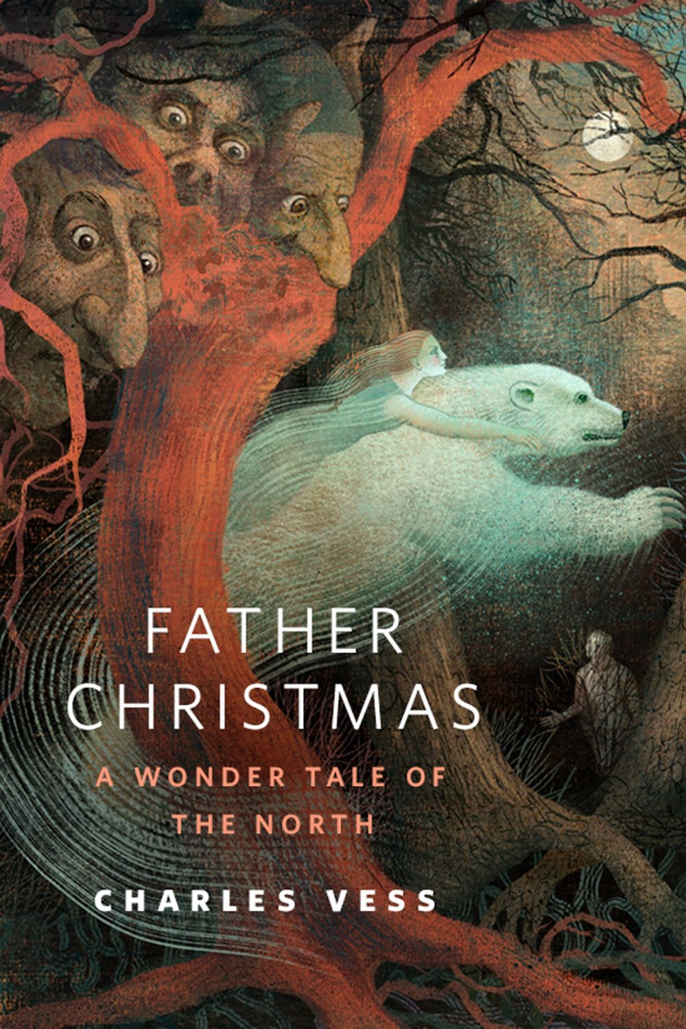
For the record, I would be grateful to Tor.com if all they did was publish great short stories for free. Luckily for me, and for you, the Creative Director for Tor also commissions artwork to go with their stories. So we have Irene Gallo to thank for introducing us to the work of twin Italian sisters Anna and Elena Balbusso.
There is something classic about their work, and every time I see a new piece I wonder how it is done. How do they collaborate, what is their process? Irene, we need to get them to Spectrum Fantastic Art Live!
I enjoy how their illustrations for Tor.com originals manage to work in multiple elements of the story. It makes it fun to refer back to the work while reading the short.
I love the Christmas season, and I’m really looking forward to reading this one, especially as it is written by another of my favorite artists, Charles Vess. I have to admit I did a double take when I saw his name listed as author, and not artist.
Anna and Elena Balbusso’s creation for Vess’ story evokes the mood of the holiday season.
Title: A Long Spoon
Author: Jonathan L. Howard
Publisher: Tor.com
Release date: December 17th, 2014
Artist: Greg Ruth

Irene Gallo offers up another great commission, this time by artist Greg Ruth, that is frankly quite creepy. If you click and view the larger version you can get a better sense of Ruth’s talent…and you can also be creeped out just that much more.
I’m a sucker for redheads, and I like the way he renders this character’s hair.
I am soooo curious about what happens in this story. The guy certainly looks to have wound up in quite the pickle.
Did he do so willingly? Did he know what he was getting himself into? Was it worth it?
Guess we will see on December 17th.
In the meantime, appreciate the warm colors that celebrate the fading of Autumn and try to keep one eye open while you sleep.
Title: Interzone Magazine, #252, Nov/Dec 2014
Author: Various
Publisher: TTA Press
Release date: November 2014
Artist: Wayne Haag
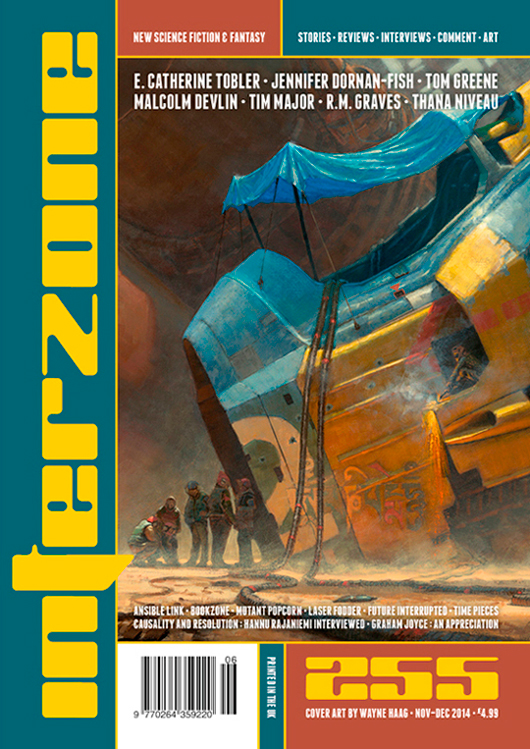
The folks at Interzone introduced me to Wayne Haag’s work earlier this year, and spending time on his website stirs my imagination. I want to read a story that references each image he creates.
I had to include the full image at the front of this post so that you could get the entire picture.
I look at this image and want to know how this moment arrived. When did the ship crash, or become good for nothing but to act as a market stall? place to live?
I enjoy the way that Haag economizes with brighter colors, using them sparingly in this image to communicate setting and mood.
I would strongly encourage you to check out the websites of all of the artists featured here in the December Cover Story. And while you are visiting Wayne Haag’s site, daydream of the kind of stories his images could inspire.
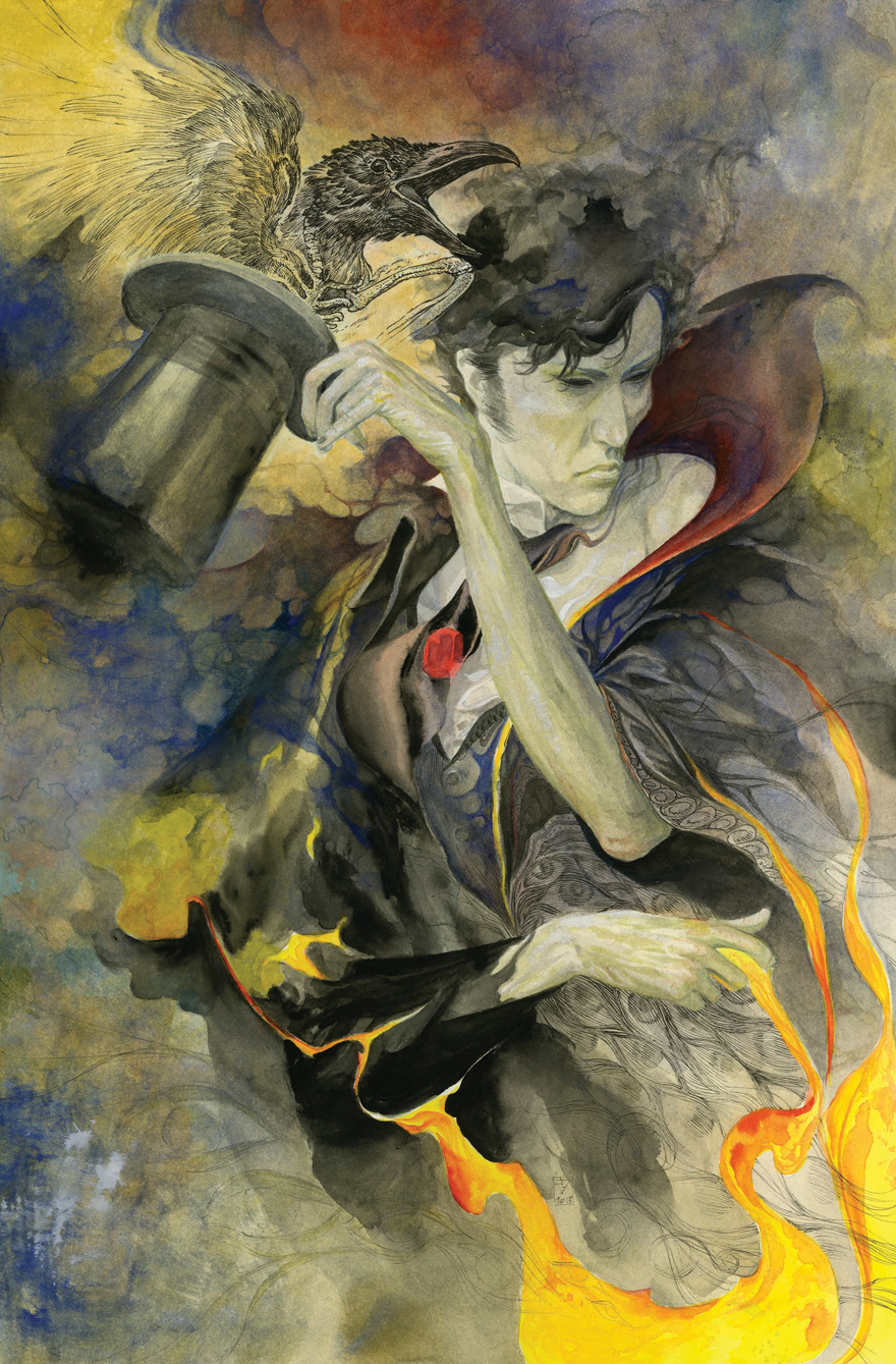
Title: Sandman Overture #4
Author: Neil Gaiman
Publisher: Vertigo Comics
Release date: December 17th, 2014
Artist: J.H. Williams, III
Sandman seems so long ago. I remember being in New York City back in the 90′s when my friend Scott introduced me to Gaiman’s work. It was right at the end of the Sandman run, and I was instantly hooked. I’m not sure any author has consistently hit all my buttons the way that Gaiman has.
I am collecting this return of Gaiman to Sandman but am admittedly waiting until it is complete to read it. In the meantime, I must admit that I am excited to pick up this issue this month simply because the cover is so great.
Artist J.H. Williams has created a nice, artistic piece for the upcoming issue.
I am assuming the raven is Matthew, and I like the way Williams conveys the idea of life and death with the rib cage of the bird being visible. I also like his vision of Morpheus.
I’m not sure if Williams actually painted this with watercolors, but I do like that look. I am drawn to the way he uses yellow on opposite sides of the top and bottom of the image to draw the eye around the painting.
Title: Fables, #147
Author: Bill Willingham and Russell Braun
Publisher: Vertigo Comics
Release date: December 17th, 2014
Artist: Nimit Malavia

And we conclude this month’s Cover Story with the upcoming cover for issue number 147 of Fables. This long-running series is slated to come to an end with issue number 150. I have been collecting it in single issue form since the first issue was released, and it will not surprise you to know that I started because of the cover art.
While I’ve not kept up with the reading, I’ve really enjoyed what I have read. Bill Willingham creates stories that merge with strong art to create something special.
I don’t know of any comic book series that has consistently hit homeruns month after month the way that Fables has. Every artist brought in to do covers for the series has been outstanding, and Nimit Malavia’s run is no exception. His work has been so beautiful. I love the way the color washes allow for the viewer to see the strength of his pencil work.
His work channels the essence of James Jean, the first artist who did cover work for Fables, while remaining purely his own creation.
Thanks, as always, to John DeNardo over at SF Signal for the work he does on tracking down new releases each month. Be sure to check out his looooong list of books set for release this month.
Let me know your thoughts on these, where you think I missed it, and feel free to suggest covers that both John and I missed.
Oh so many wonderful covers here! I’ve been a huge fan of Anna and Elena Balbusso’s art — and love the way they evoke the traditional style (along the lines of Gustaf Tenggren or John Bauer) but with a beautiful modern elegance of their own. This is such a great series Carl — thanks!
They really are wonderful, aren’t they? When I look at their work I feel like I’ve discovered some wonderful old classic work.
Thank you for coming over and sharing your thoughts.
as always you find plenty of fantastic artists ..and they do make a big difference when choosing a book! Like you, I have bought a book based on the cover alone! lol
Thankfully MOST of the time that I’ve bought a book based on cover only I’ve ended up liking it. Occasionally that doesn’t happen, but it is rare.
I love all these covers! The Wayne Haag cover is terrific! I just ordered THE ART OF JIM BURNS on Cyber Monday when AMAZON gave me an extra 30% any one book.
I was thumbing through a copy of that one at Barnes and Noble the other day, George. Looked like a really nice book, and an additional 30% off is great!
The Long Spoon is from the guy who did Johannes the Necromancer so I will certainly be checking it out.
Outside of that Cold Side Hill is my perfect kind of cover. All impression and color contrast. Wonderful.
Cold Hillside really is a great cover, isn’t it?
I’ve not read Howard, but the image creeps me out enough to want to read this story when it comes out in a few weeks.
First, I’d like to say that I really enjoy your Cover Art feature. It was cover art that drew me to SF back in 4th grade, starting with Heinlein’s “Have Spacesuit Will Travel”. More recently (~1990?) I was introduced to Orson Scott Card’s “Ender” series when I spotted “Ender’s Game” sitting on the shelf at a local book store.
As a reader of SF for over 50 years, I’ve been disturbed by a trend that seems to be going on with the propagation of electronic media. Book collecting seems to be a dying hobby, and I’m afraid eventually printing will also decline. Also, with more folks using electronic media, I’ve noticed a couple of favorite bookstores that trade in used books that have gone out of business the last couple of years. One (my favorite) was up in Cross Lake, Minnesota. I used to visit there each summer during our annual vacation, to look for a treasure or two to read in the serenity of the Minnesota North country. I became friends with the owner, and once I asked her why she had such a small section for Science Fiction. She informed me that SF readers, more than most other readers, treasure their books and seldom sell or trade them. Her words hit home with me, since looking back I realized that I still have EVERY SF book I ever purchased, beginning from back in elementary school. I still have a paperback copy of “Danny Dunn and the Anti-Gravity Paint” (Jay Williams & Raymond Abrashkin)
After she told me of her dilemma, I started paying attention at garage sales, and whenever I found SF books for sale, I purchased them with the intent of donating them to her for the store next time I was “up north”. Sadly, the following summer when I made the trip to her store, she was gone, and there is now a meat market in her old space. It is a sad loss for me, and I’m sure for hundreds of other readers that frequented her store.
I guess I am taking a long path to my point – SF readers are hoarders of their books, because they treasure the escape they provide, and also, I think, because of the unique and beautiful cover art!
Thanks for bringing this art form back to the fore-front with your Cover Story feature. It would be fun sometime to see you try doing some “niche” articles for cover art, perhaps covering 70’s SF, or Juvenile SF.
Balta Wolf
Thanks so much for the comment, and for taking the time to enjoy the art.
I love John Harris’ art for the Ender’s series. It took me forever to finally start reading them, not sure why, but I’ve been rocked by what I have read. And now the covers mean even more.
I think it is so cool that you have every SF book you ever purchased. I’ve lost or gotten rid of books over the years and while I don’t regret selling/giving away books that I didn’t personally purchase, or books I tried and decided just were not for me, I sometimes regret the special books that I culled from my collection over the years to make room. I love having shelves full of books. While I’ve embraced the Kindle for some reading, I still prefer to find books with covers that excite me and add them to my library.
We have lost some really good used bookstores here in the Kansas City area due to the economy, one in particular that had a very large science fiction and fantasy section. I hate to see them go. I’m sorry for the loss of your special store both for you and for the owner, who no doubt had a passion for selling used books and would still be open if she could have afforded to do so.
I’ve actually been thinking of expanding what I do a little with the art. It has been a long time since I’ve done a cover art post on older art work.
If you have not checked out his site, I strongly recommend you add Joachim’s site to your regular reading list:
http://sciencefictionruminations.wordpress.com/
He focuses solely on older science fiction and always has such interesting cover art in his posts. Some good, some bad, some downright strange, but all very entertaining, and he is a very good, thorough book review too.
I truly appreciate all you had to share and hope you will feel welcome to do so any time.
In Search of Lost Dragons is, I think, my favourite of this month’s covers, but Anna and Elena Balbusso’s cover is a very close second. Very close 🙂
I’d love to meet them sometime and see their work in person.
I’d have a really hard time choosing just one favorite out of this group.
The Wayne Haag image (full, not edited) is my favorite, followed by Vincent Haig’s cover for Cold Hillside. Wonderful!
So good to see another Cover Story post!
Thanks Richard. Wayne Haags paintings are wonderful. If you haven’t done so, you should go to his site and check out his blog. He has some nice detailed images of his paintings there.