Cover Story is a feature I host here at the beginning of each month which showcases genre cover art for works scheduled for publication within the current month*.
I do judge books by their covers, at least on the first pass.
It was the art on science fiction book covers that drew me in as a young reader, and I believe it is important to promote the artists and designers, and the book companies that employ them, for the efforts made to keep alive the grand tradition of eye-catching genre cover art.
(Monthly Disclaimer: I am not an art critic and have no formal artistic training. “Eye-catching” means exactly what it says, these images caught my eye and drew my attention to the works they grace, compelling me to search out more information about the book. Opinions contrary to mine, and suggestions for works that I missed that caught your eye, are always welcome.)
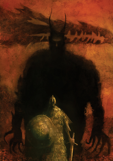
The opening image for this post was created for the current issue of the New Yorker by artist Jeffrey Alan Love. It was commissioned to accompany a piece on the recently released Tolkien translation of Beowulf.
*due to changes that can happen in publication dates, covers featured may have already seen publication prior to the current month or could possibly be delayed.
With those formalities out of the way, let’s get to the cover art, shall we?
Title: The Walking-Stick Forest
Author: Anna Tambour
Publisher: Tor.com
Release date: Available now
Artist: Karla Ortiz

I have only recently discovered the art of Karla Ortiz, thanks entirely to the folks at Tor.com beating the drum about her work.
I was disappointed to discover after the fact that she attended Spectrum Fantastic Art Live 3 in May. I would have loved to tell her personally how impressed I am with her work.
I admire the way the varying degree of focus with the trees conveys a sense of depth, and her characters exhibit a three-dimensional feel. If you check out her website you will see that her pencils are every bit as gorgeous as her paintings.
This illustration is particularly arresting in that it transmits a real sense of something ominous happening, and in so doing makes me want to read Anna Tambour’s short story. Part of the effectiveness of the piece is that the branch covering this young girl’s eyes feels really sinister.
Title: Cibola Burn
Author: James S.A. Corey
Publisher: Orbit Books
Release date: June 17, 2014
Artist: Daniel Dociu

I have been a fan of Daniel Dociu’s work for several years now and I am pleased that Orbit Books has chosen to maintain continuity with the Expanse series by repeatedly commissioning him to create the cover illustrations.
This series is space opera on a grand scale and I think Dociu’s work conveys that scale in the massive ships he envisions. The series also has its share of battles and Daniel Dociu reflects that in his illustrations as well.
I am always excited to see the cover art drop for the James S.A. Corey books. While there has been a similarity in the overall design of the covers, Daniel Dociu has used a wide and varied range of colors that makes each cover stand out in its own right.
On a personal note, I am completely caught up with the series and am particularly excited to dive right into this one when it comes out. I’m only sad that I may not be able to read it via Kindle if Amazon doesn’t get their act together soon.
Title: The Leopard
Author: K.V. Johansen
Publisher: Pyr
Release date: June 10, 2014
Artist: Raymond Swanland
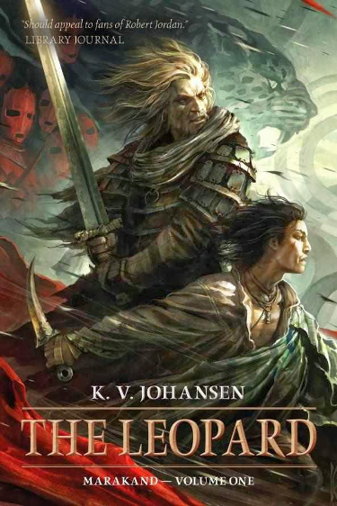
I have enjoyed artist Raymond Swanland’s cover art for many years now. There is a consistent sweeping movement to his illustrations that make them stand out as I peruse the bookstore shelves.
It is a fair bet that every time I find myself in the science fiction and fantasy section of a bookstore that I will pick up at least one book with a Swanland cover purely to enjoy the art.
Raymond Swanland works on many fantasy titles and understandably uses a lot of natural, earth-tone colors for his work. The cover for The Leopard stands out because of the inclusion of reds and blue/greens. This use of color frames the characters nicely. When I look at the image I want to know who these two gentlemen are, and I am convinced that there will be a great deal of action and adventure in the discovery.
Title: Koko Takes a Holiday
Author: Kieran Shea
Publisher: Titan Books
Release date: June 10, 2014
Artist: Unknown
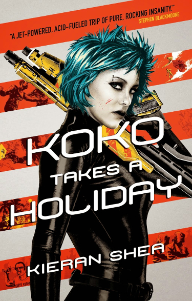
I was having little luck in tracking down the artist for this novel, and I welcome the sharing of the information if you have it.
It can be honestly said that many genre covers share a great deal of similarity with one another. If, like me, you happen to enjoy a particular type of cover, that can be a good thing. What is also a good thing is when a cover catches your eye because it goes against the norm.
This comic-book-ish cover, with its bold colors juxtaposed against areas of bright white fits the bill.
It stands out.
It also leads me to believe that Kieran Shea’s novel might be quite a lot of fun.
The colors, design, inclusion of the diagonal red stripes…everything about his cover works for me.
Title: Little Knife
Author: Leigh Bardugo
Publisher: Tor.com
Release date: June 24, 2014
Artist: Anna and Elena Balbusso
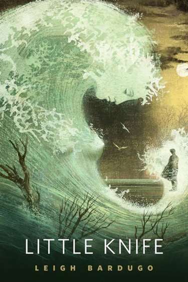
I want so badly for Anna and Elena Balbusso to come to a Spectrum Fantastic Art Live event. Their work is so incredible.
There is something about each image they create that feels as if it hearkens from another time. There is an old-world sensibility there, and I mean that as a compliment. I love their creativity, and the way in which, for the Tor.com stories, they capture elements of the story in the images they create.
The way the wave curls to both embrace the man on the right and to embody the female character on the left is very effective in drawing the eye between one and the other.
Is the space that separates them significant?
Are you as anxious as I am to learn their story?
Title: Dawn Song (reprint)
Author: Michael Marano
Publisher: ChiZine Publications
Release date: June 17, 2014
Artist: Erik Mohr

The cover created by artist Erik Mohr for the re-release of Michael Marano’s novel, Dawn Song, is indeed eye-catching.
The use of the negative space in the lower half of the picture makes the reds leap out at you, and I like the way in which the face of the female character comes into focus because of the glow that suffuses that part of the cover.
I also like the way in which the texture in the upper right-hand corner, along with the black, smokey tendrils, gives the image some texture.
The placement of the author and title font could have been a distraction, but their opacity serves to make the title clear while not trumping the image that was chosen to sell the book. The brightness of the cover would surely make it stand out on store shelves.
Title: Earth Awakens
Author: Orson Scott Card, Aaron Johnston
Publisher: Tor Books
Release date: June 10th, 2014
Artist: John Harris
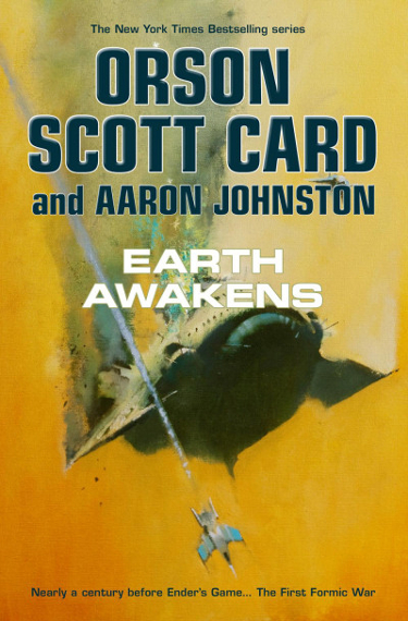
It shouldn’t be a surprise to see a cover by Hugo-nominated artist John Harris here in the mix. Thanks in large part to Tor Books, John Harris has been extremely prolific these past several years.
As a loooong time fan of his work, that makes me extremely happy.
Harris has never been shy about using color in his massive space landscapes, but lately I’ve noticed that he is getting even more bold with his use of color. I’m not sure if the use of the yellow color is meant to reflect a sun and tie in visually to the “awakens” part of the book’s title, but it works.
I recently reviewed the new John Harris art book, Beyond the Horizon, released last week by Titan Publishing. It contains many high quality reproductions of his cover illustrations, including several of the Tor titles.
I am happy to see that Tor continues to use John Harris for the Card books. Some of my earliest memories of falling for John Harris’ work is the time spent starting at the early Ender series covers.
Title: Headlong
Author: Simon Ings
Publisher: Gollancz
Release date: June 12, 2014
Artist: Jeffrey Alan Love
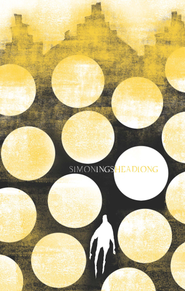
A frequent presence in the Cover Story posts this year has been artist Jeffrey Alan Love. My discovery of his work began with one of his illustrations for a Simon Ings book published by Gollancz.
Over the course of the year I’ve been happy to see his work not only cropping up on Gollancz covers, but also for stories by Tor.com, his recent Tolkien work featured above, and seeing his work being used for the Art Connection Academy posters.
I look at the cover for Headlong and I wonder about the man represented by the white silhouette.
Who is he, and to what/where is he heading?
I’ve enjoyed the way the author and title information has been incorporated into the design of these Gollancz covers.
Title: Clarkesworld, Issue 93
Author: Neil Clarke, ed
Publisher: Wyrm Publishing
Release date: Available Now
Artist: Artur Fast and Kemane Ba
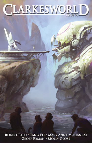
I love robots.
I love spaceships.
Two great tastes, that taste great…no, wait. Anyway…
As soon as I saw the cover for the June 2014 issue of Clarkesworld I knew I would be including it in this month’s Cover Story.
I truly don’t mind that the cover images for the print and online SFF magazines are not necessarily there to reflect a particular story. I really don’t.
And yet this image certainly tells a story, and my curious nature makes me want to know what that story is. It certainly appears as if the giant mecha has been there for some time. Is the figure standing on the platform going to just take a closer look? Is he/she going to step inside?
Additionally I wonder about the planet. Is this a leftover piece of a once-advanced society that has fallen into decline? So many questions…which is what a good illustration can do–generate questions and stir the imagination.
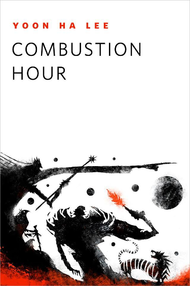
Title: Combustion Hour
Author: Yoon Le Ha
Publisher: Tor.com
Release date: June 18, 2014
Artist: Jeffrey Alan Love
And, since we haven’t featured him enough…
Here is some more Jeffrey Alan Love! 🙂
I would be hard pressed to pick my favorite of the Love images featured this month, but of all of them this one makes me the most curious about the story it was commissioned to accompany.
I see elements of fantasy, fairy tale, science fiction, mythology…what is Yoon Lee Ha’s story about?
As I’ve mentioned in other posts, Jeffrey Alan Love uses negative space as effectively as anyone I’ve seen.
He designs his illustrations to take advantage of that space to create impact, resulting in some truly stand-out covers.
Thus ends the June edition of Cover Story, or at least my part in it. It remains for you to agree, disagree, share your thoughts and share any covers that you feel I unjustly overlooked.
I will once again thank John DeNardo for the hard work he does to put together monthly book release posts (here is the one for June).
Remember, feel free to share your thoughts on my selections, agree or disagree, and don’t forget to point out any great covers coming out this month that I may have missed.
And for convenience sake, here are the previous 2014 issues of Cover Story in case you missed them:
January 2014 Cover Story
February 2014 Cover Story
March 2014 Cover Story
April 2014 Cover Story
May 2014 Cover Story
Have I said that I really enjoy these cover posts of yours? Even if I have, it bears repeating.
That Eric Mohr cover is very cool, almost enough to make me want the physical boo, which given that this is the first I’ve heard of it is no mean feat. Also nice to have a name for the artist for the recent Simon Ings editions, which are all very attractive. I’ve got the paperback of Wolves on preorder, and if it’s any good might be investing (yes, that’s the word I’ve chosen, and I’m sticking with it) in some more of his back catalogue.
On a more prurient level, I loved the Balbusso when I first saw it, but when I noticed the wave had breasts it kind of threw me, and now I can’t focus on anything else. I don’t know if it’s because they interrupt the natural line of the wave (golden spiral and all that) or if it’s just my subconscious flaring up again, and frankly I’m not so keen to find out…
Thanks Kamo. 🙂
Wolves was the first book I purchased because of a Jeffrey Alan Love cover. I would love to have the full Gollancz set. I need to read it soon so that I can make a similar choice about investing.
The breasts on the Balbusso image make me assume the story is about a mermaid, so I’m really curious to read it to find out if that assumption is way off base or not.
I love these posts, too, even if they’re dangerous for my TBR pile.
I sat down with a publicist from PYR at BEA last week and she had the covers for a couple of K.V. Johansen books and they were both really eye catching. A lot of movement in the lines. Really nice art, in my opinion. I also really like the art for the James S.A. Corey books. The colours, in particular.
They are for me as well, Kelly. Or rather John DeNardo’s new book posts are.
I just read a couple of fantastic reviews for K.V. Johansen’s novel, Blackdog, that make me interested in reading it. It too has a fantastic Swanland cover.
Thanks for these posts, Carl! I think my favorite is the Karla Ortiz: I tend to like clean lines (but illustrations, not photograph clean) with a good deal of contrast and active, central figures. Great stuff!
Her work is so lovely. I’ve been so impressed by her and hope she continues to get more and more exposure.
I’m a traditionalist, I guess. Cibola Burn and Earth Awakens top my favorites, but I really do love the Clarkesworld cover. Wish there were a story to go with it, or a novel… Your mention of the Harris book, and then seeing the Clarkesworld cover made me wish for a book collecting all the Clarkesworld covers, with text explaining why that cover and artist were picked. Me want.
I wouldn’t mind a book like that myself.
I meant to tell you that I’ve been watching for what’s coming in June, mostly on SF Signal, and thinking “What will Carl pick?” I had a half dozen guesses, and the only one we both picked was Cibola Burn. Interesting. I suppose now you’ll want to know my picks, so I’ll go figure that out and make a list to post here.
Its interesting, as there are not many novels that I will be picking up this month, at least not that I know of. And a few that I want to pick up do not have covers that excite me, but the story summaries do.
Alastair Reynolds – On the Steel Breeze
Amanda Sun – Rain
David J. Schow – The Shaft
Dima Zales – The Spell Realm
E.C. Tubbs – Only One Winner
Eric Silver – Push
H.A. Swain – Hungry
James A. Corey – Cibola Burn
M. R. Mathias – Rise of the Dragon King
– and for the sheer fun of it –
Sarah A. Hoyt – Night Shifters
So there you have my list, taken from the SF Signal Books Coming in June post.
Gotta love SF Signal.
I’ll be picking up the Reynolds, despite not having read the first one. I’m a fan of his work and want to get these hardcovers.
I’ll also be picking up Cibola Burn right away.
The Girl with all the Gifts looks really interesting.
I doubt I’ll pick up Koko Takes a Holiday, as it sounds more bawdy than what I want in my reading.
I have an ARC copy of The Leopard to read already, and I’ll certainly be taking advantage of the free fiction on Tor.com.
This list is based solely on the cover art, not on the author or probable content of the books.
I completely understand and relate, Richard.
I do love seeing your cover posts pop up in my feedly 🙂 That Beowulf one you chose as top billing is just wonderful.
And the Combustion Hour cover, love it.
So many great images here though its almost unfair to single out those two.
Isn’t the Tolkien/Beowulf image great? I wish it was in the actual book they just published and not just the magazine. I’m so happy Jeffrey Alan Love got that gig, though. That is a big deal.
Glad you enjoy the posts, Fence. They are fun to put together.
Stylistically it reminded me of this John Gardner Grendel cover (this is a great book if you haven’t read it).
http://books.google.com/books/about/Grendel.html?id=RXw4jDg7o40C
I remember that cover! I haven’t read the book, but am glad to hear good things about it.
I’m with you on John Harris and his use of yellow. It’s a bold cover! But each of the covers you present holds plenty of interest for us.
It is bold, isn’t it? I enjoy seeing him use color in this way.
So much “Wow”-ing going on as I read this post! I think the Karla Ortiz is my absolute favorite, though I really like a lot of these. Sort of surprised that that’s my favorite because for some reason I don’t usually tend to like covers with people on them. But this one is just so very, very striking indeed!
Isn’t her work amazing? She is certainly one of my new favorites.
I just wanted to let you know that I have a board on Pinterest, called “Beautiful book covers”, that grows bigger and bigger every “Cover story” post you publish 😀
Awesome art, awesome artist. Thanks for sharing all this awesomeness 🙂
Wonderful, I’ll check out that pinterest board!
i loved reading this, carl!
i particularly like the beowulf, headlong and clarkesword covers. i was so taken with the clarkesword one that i looked it up and found the full version here:
http://arturfast.tumblr.com/post/79966509602/mecha-collab-with-the-great-kemanski