Welcome to the April 2014 Edition of Cover Story, the monthly feature showcasing genre cover art for works scheduled for publication within said month. I do judge books by their covers, at least on the first pass. It was the art on science fiction book covers that drew me in as a young reader, and I believe it is important to promote the artists and designers, and the book companies that employ them, for the efforts made to keep alive the grand tradition of eye-catching genre cover art.
(Monthly Disclaimer: I am not an art critic and have no formal artistic training. “Eye-catching” means exactly what it says, these images caught my eye and drew my attention to the works they grace, compelling me to search out more information about the book. Opinions contrary to mine, and suggestions for works that I missed that caught your eye, are always welcome.)
With those formalities out of the way, let’s get to the cover art, shall we? I have some really nice variety for you this month.
Title: Unwrapped Sky
Author: Rjurik Davidson
Publisher: Tor Books
Release date: April 15, 2014
Artist: Allen Williams
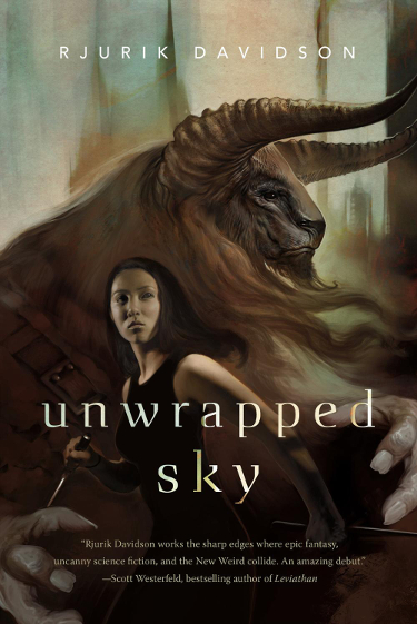
I was taken with the cover for Unwrapped Sky the moment I first saw Allen Williams’ cover image surface online. Minotaurs have always fascinated me and the way in which Williams rendered this creature Wow’s me.
I enjoy the way that Allen Williams has areas of very clear, detailed art in this illustration and others where it becomes more loose, almost concept-art style loose. Those detailed portions are the faces of the two characters and it draws the eye to each character in turn.
And oh, the detail. That minotaur looks wise and protective and frightening all at the same time. We get a sense of the scale of the creature in the way Williams rendered the image with the young girl in the foreground. These creatures are massive and the book presents them as a race of creatures…so there are many of them. I can imagine how awe-struck one would be seeing a huge number of these creatures descending on your town.
Tor does a really nice job with keeping the necessary book text to a minimum, allowing the illustration to stand out.
Title: Lagoon
Author: Nnedi Okorafor
Publisher: Hodder & Stoughton Ltd
Release date: April 10, 2014
Artist: Joey Hi-Fi
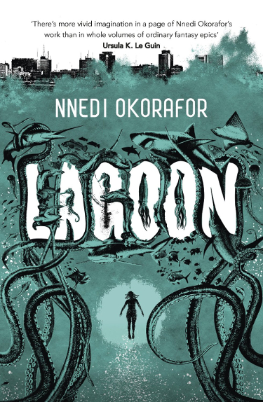
The cover for Lagoon is just plain fun, which is something I’ve come to expect in the brief time I’ve been aware of the work of Joey Hi-Fi.
The one color on top of blacks and whites works well and the image tells its own story and sets up interesting expectations for the book.
I like that the book’s title is actually worked into the design of the cover as it eliminates the problem of title graphics detracting from the cover art. Whether this was entirely the artists idea or was part of the art direction from Hodder & Stoughton, it is very effective and was a great choice.
What stands out the most with this cover is the amount of stuff going on in the image. I appreciate the way that the vastness of the sea is portrayed by having a small, central figure surrounded by larger creatures and the tentacles that seem to be stretching up from a long way below. Every time I look at the illustration I see some creature or detail that I missed on the previous viewing.
Title: Steles of the Sky
Author: Elizabeth Bear
Publisher: Tor Books
Release date: April 8, 2014
Artist: Donato Giancola
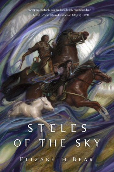
The covers for this series, all paintings by Donato Giancola, have been uniformly gorgeous and this one is no different.
It is an unusual style to see Donato paint central characters among a less-defined background, but the wispy, swirling colors add vibrant beauty to the overall painting.
The mountains in the background that I initially missed, and the prairie grasses, coupled with the horses and their riders are not atypical of the more realistic, grounded scenes that Donato paints so well.
Which is why the whirls of color are so effective–they give the overall image that fantasy/magical feel.
If you are unfamiliar with Donato Giancola’s work, I highly recommend a visit to his website. His paintings are truly pieces of fine art, and I can attest from his trips to Kansas City for Spectrum Fantastic Art Live (he will be in attendance again this year, folks!), that they are gorgeous pieces.
Title: City of the Iron Fish
Author: Simon Ings
Publisher: Gollancz
Release date: April 10, 2014
Artist: Jeffrey Alan Love
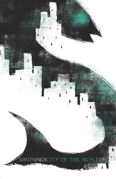
“It’s like deja-vu, all over again.”
I do love me some Jeffrey Alan Love cover illustration. Since discovering his work on the cover Gollancz’s release of Wolves, by Simon Ings, in January, Love’s work has been a frequent source of fascination.
I have mentioned several times how impressed I am at Gollancz for releasing (and re-releasing) these Simon Ings novels with cover illustrations by Jeffrey Alan Love. I want them all.
I enjoy the way in which Jeffrey Alan Love uses the negative space in his work to become actual elements of the image.
I am also impressed by the fact that these images generally use only one, sometimes two, colors along with a highly effective use of negative (white) space and blacks/shadows.
I like the way that the fish, in wending its way through the image, gives the impression that the City of Iron Fish is a rather large place.
Title: The Revolutions
Author: Felix Gilman
Publisher: Tor Books
Release date: April 1, 2014
Artist: Will Staehle
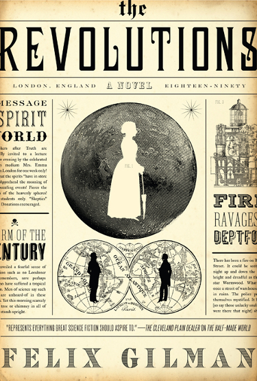
This is not the first time in 2014 that artist Will Staehle has made my monthly list of favorite covers. He has a flair for design that certainly catches my eye.
I enjoy old newspapers and advertising from the Victorian era on up through the early part of the twentieth century and I am naturally drawn to contemporary design that pays homage to the way things used to look. Knowing that The Revolutions is a “sweeping stand-alone tale of Victorian science fiction, arcane exploration, and planetary romance”, the cover fits perfectly.
What is equally impressive is the many other designs Will Staehle did for the cover that were ultimately rejected in favor of this one. If you’ve read this far I highly recommend following that link and letting me know which is your favorite.
I’m leaning towards the first, mostly dark, cover and the black and white cover that will give you vertigo if you stare at it for too long.
Title: Peacemaker
Author: Marianne De Pierres
Publisher: Angry Robot
Release date: April 29, 2014
Artist: Joey Hi-Fi
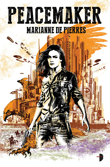
The second Joey Hi-Fi cover design to make the list this month.
I’ve seen this image on websites several times over the last few months as part of the author/publishers book promotion and also as a discussion piece about cover art. The opinions have been very mixed.
I personally like this one a great deal. The novel summary presents a futuristic western combination and I think the cover image reflects that quite well.
Like his cover for Lagoon, there is so much going on here if you look carefully. The male character mentioned in the book’s blurb makes an appearance on the female protagonist’s shirt, for example.
I appreciate the sparse use of color and the bold statement the mostly black inks make in creating the overall image.
Title: “Among the Thorns”
Author: Veronica Schanoes
Publisher: Tor.com Free Short Fiction
Release date: April 30,, 2014
Artist: Anna and Elena Balbusso
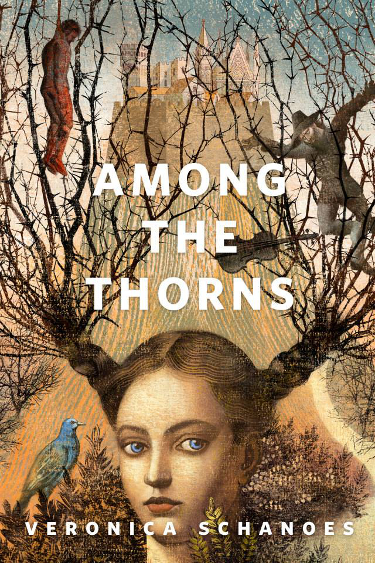
The Balbusso twins, hailing from Milan, created some of my favorite art out of the many wonderful images Tor.com commissioned for their free short fiction feature last year.
Their images have the look and feel of old world paintings and I always feel there is something strange and wonderful and mysterious going on. They do a great job of capturing both details from the story they are illustrating and also the spirit of the story.
I am anxious to read this story at the end of the month. There is a very disturbing, unsettling quality to this painting, in particular with the figures caught up among the thorns.
My eye is also drawn to the far distant city, in large part because of the way in which the sisters capture light in that part of the painting. The background practically glows, which softens the rather harsh foreground subject matter significantly.
Take some time and go check out there work, they have created some lush, richly colored paintings that will grab your attention. I will be keeping an eye on these two as the year progresses.
Title: “The End of the End of Everything”
Author: Dale Bailey
Publisher: Tor.com Free Short Fiction
Release date: April 23, 2014
Artist: Victo Ngai
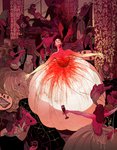
Tor.com is not only a wonderful website in which to revel in all things genre, but it is also a great place to discover new authors and new artists through their free short fiction releases.
Victo Ngai is another artist whose work came to my attention because of commissioned pieces to accompany short stories.
With a title like “The End of the End of Everything”, you would expect the story to have darker leanings and Ngai captures this feeling very effectively.
She has taken what might otherwise be a very festive image and given it this dark red hue, with the large crimson stain focused on the key character in the image. Looking at it you become instantly suspicious that all is not well.
Title: “Something Going Around”
Author: Harry Turtledove
Publisher: Tor.com Free Short Fiction
Release date: April 9, 2014
Artist: Greg Ruth
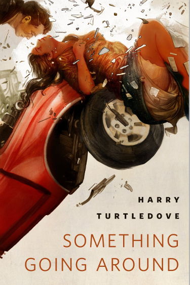
If the point of a cover image is to arrest the viewers attention and get them to take a chance on the story, and I believe it is, Tor.com has struck gold with their commissioned artwork for the stories being released in April.
If you have ever been in, or witnessed, a car wreck, Greg Ruth’s piece is jarring. And yet it is strangely beautiful at the same time.
He has captured this moment, this slice of a chaos, and the way in which he renders the characters’ arrested motion allows the viewer to see something lovely and unsettling at the same time.
Some of the detail, particularly in the girl’s shirt, is lost in this smaller image. I encourage you to click here to see a larger version of the artwork.
And visit Greg Ruth’s website, he is very prolific and has some stunning work on display.
Title: Clarkesworld, Issue 91
Author: Neil Clarke, ed
Publisher: Wyrm Publishing
Release date: April 1, 2014
Artist: Peter Mohrbacher
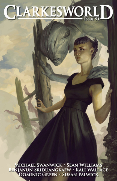
I get a nice little gift on the first of every month when I open my Kindle and find the latest issues of Clarkesworld and Lightspeed sitting in my carousel, waiting to be explored.
It is because of this sudden appearance of an image that the covers for these and other epub magazines are so very important. Clarkesworld delivers some great cover work.
This illustration, by Peter Mohrbacher, is captivating both because of the artistic skill on display and because of the eerie, moody vibe the piece gives off.
I have often heard/read artists talk about difficulty in rendering hands, and for some reason my eye is drawn to the female’s outstretched right arm and hand. It is very well done.
The artwork on a Clarkesworld cover does not necessarily reflect a story within the issue, or at least that has been my personal experience. It remains for me to read this issue to see if that is the case with this illustration. I would be very curious to read the story that would inspire this creation.
Title: Fables, Issue 140
Author: Bill Willingham
Publisher: Vertigo Comics
Release date: April 30, 2014
Artist: Nimit Malavia
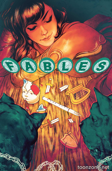
Not only has Bill Willingham’s Fables series been popular because of its story lines, but the cover art for each of its 140 issues (thus far…it will be ending at issue 150) has been a work of art from some of the most talented artists working in the field.
The name Nimit Malavia is new to me, but this illustration guarantees that I won’t forget his name any time soon. Wow!
The way this image is lit is fabulous. It exudes such a powerful, warm glow.
I am particularly taken with the way the orange and green colors play off of each other.
And, as Fables generally manages to do, the cover image makes me want to know what the story is behind it.
Fables has been, in my opinion, the most consistently frame-able comic produced. I would love to have a room with each issue nicely framed and equally spaced, floor to ceiling. That would be an impressive sight.
Title: Serenity: Leaves on the Wind Issue #4
Author: Zach Whedon
Publisher: Dark Horse Comics
Release date: April 30, 2014
Artist: Dan Dos Santos
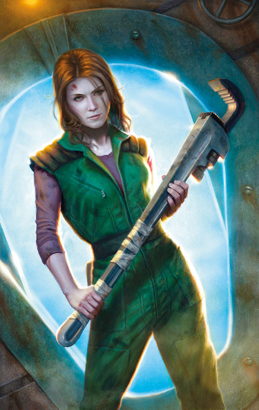
Did you really think I would get through the month without a Dan Dos Santos cover? Really? Do you know me at all?
Dan posted a bigger and better resolution copy of his cover painting here on the Muddy Colors blog. I saw it month’s ago and put it on my list for the April Cover Story post.
Kaylee is my favorite character from Firefly/Serenity. I had the pleasure of briefly seeing Jewel Staite at Kansas City’s Planet Comicon a few weekends back and she was as lovely in person as she was on the show.
Dan did such a great job capturing Kaylee’s spirit and fire by painting her holding this enormous wrench. That decision encapsulates so much about the character. I don’t think his rendering of the character is as true to the look of the actor as his covers have been for the other issues in this series (just a personal opinion), and I actually like that as I think his interpretation of Kaylee is very well done.
In case you missed them (for shame), here are the links to the other 2014 editions of Cover Story:
January 2014 Cover Story
February 2014 Cover Story
March 2014 Cover Story
As always, let me know your thoughts on these images and feel free to inform me about eye-catching April-release covers I might have missed. I recommend going to view the results of the always-hard-working John DeNardo and his visual list of 255 SF/F/H books being released in April 2014.
The more you look at the art for Giancola’s Elizabeth Bear covers, the more details you find. I thought, at first, that Range of Ghosts was just this beautiful wispy cover – and then I looked at it again and started seeing all this detail that I missed. Just gorgeous.
I was the same way with Range of Ghosts. I had seen it several times and then I looked at it in the store one day and had this “eureka” moment where I noticed other things going on in the image that I had overlooked several times.
Hi Carl,
I select the cover art as a stand-alone feature, so it’s just a happy coincidence if it ever matches a story in the issue. Someday, I’d like to do an original anthology of stories inspired by the art we’ve used.
-Neil
You find some amazing work, Neil!
And that would be a really cool idea.
I’m so excited for people to read End of the End of Everything. Victo nailed it. It’s an incredibly horrific story wrapped up in a colorful bow. I don’t read a lot if horror and I realized, while reding this, that I’ve had a much too narrow definition of the genre.
I don’t read a lot of horror either, but occasionally it can’t be helped, and Ngai’s image will draw me right into reading this one. I love that you guys post a preview of the stories that will coming out as they get me (and I’m sure many others) all excited.
(Ack, typos! I’d blame the use of a phone keyboard but anyone that knows me would laugh at that excuse. Sorry!)
I’m going to assume it is all the daytime drinking, Irene, but I’ll let you tell whatever story you like. 😉
I can’t believe I missed that Gilman had a new book out this month. I know this is a post of covers, but that is the first thing that caught my eye and now I have a situation to rectify.
Did you check out the Tor link and all the versions of the over Staehle did for the Gilman book? They are really fun. Hey, its about the books too. After all, I end up buying many of these that have great covers as they make me want to read them.
Excellent round-up and feasts for my eyes (and book lists). I love the cover for Lagoon and it’s probably the book I’m most looking forward to reading this month.
I’m pretty excited to see what Lagoon is all about. I need to make sure to grab that one. Unfortunately for my wallet, I’ll be getting many of these. 🙂
I love this feature. You do a terrific job, keep up the good work.
In order of my preference:
1. Unwrapped Sky
2. Clarkesworld
3. Fables # 140
4. Steles of the Sky
I also like the cover for April APEX magazine [http://www.sfsignal.com/archives/2014/04/table-of-contents-apex-magazine-59-april-2014/] which has a lot of depth of (possible) meaning. I haven’t read the contents, so I don’t know if the image goes with a story.
I thought the Apex cover was fun, but felt the image was just slightly off balance and it bugged me enough to not include it. Stupidly picky, I know. Apex does get some wonderful cover artists for their issues.
I’ll second (third…fourth…etc.) the idea of Clarkesworld doing a collection based on the imagery!
Lets get that petition going!
It’s amazing that the Lagoon cover manages to look clean and almost minimalistic despite how much is actually going on on the page! It’s covers like this one that make me look further into a book.
Jeffrey Alan Love has done it again. He is capable of amazing things. I really really like his aesthetic.
Also, the Clarkesworld cover is beautiful and intriguing! It’s a bummer that the cover doesn’t always represent a story inside. I would be very curious to read that story, as well!
It would be cool if the covers represented a story in the magazine, but that is also sort of an old school thing, dating back to the old pulp magazines, so I don’t mind it as an homage. In contrast it also makes it interesting to read the Tor.com stories which do have artwork inspired by the story it is attached to.
You are so right about the Lagoon cover. It is busy, but doesn’t look busy. I think the one color overlaying the blacks helps with that minimalist feel.
I’m a big fan of Love’s work and at the rate he is going I can certainly see him being one of my Best Artist nominees come next year in the Hugo nomination period.
I’m agree with Rick’s choices. You present a variety of artwork in different styles. Very nice!
Uh oh…you and Richard agreeing? Me thinks I feel a disturbance in the Force.
Hey, we agree most of the time! As do you and I.
🙂
I agree with Julianne, that cover for Lagoon looks so simply and clean but look at all that detail. Great work by the artist.
The Jeffrey Alan Love for City of Iron Fish is really intriguing as well. I read Wolves because of the cover and although I had problems with the book at first really felt it was worth the read. This cover makes me want to read City too!
Fables covers are always great 🙂
But I think my favourite of this month’s post has to be that minotaur by Allen William! Is it just me that is given a very faint hint of Star Wars & Chewie with that bandolier yoke?
I have yet to get to my copy of Wolves, but I eye it with longing every day. Soon…
Jeffrey Alan Love has been such a great discovery this year, I enjoy his work so much and he seems like such a really nice guy.
There is a bit of Chewie there.
Oh 🙁 was just looking at the UK version of Unwrapped Sky and the cover is different. I like it http://www.amazon.co.uk/Unwrapped-Sky-Rjurik-Davidson/dp/1447252373/ref=tmm_pap_title_0?ie=UTF8&qid=1396550428&sr=8-1
but I think I prefer the US version this time round.
I’m with you in that I prefer Alan William’s US cover. I hope he brings the original to Spectrum Fantastic Art Live 3.